shadcn.io is an independent project built on shadcn/ui
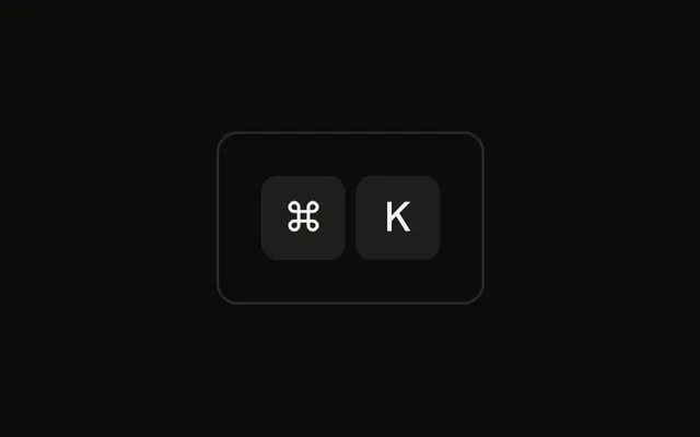
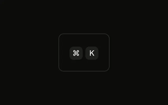
Both caps in the ⌘K group are 48 pixels tall, at least that wide, with 2xl type. The shortcut is painted. It is not wired up.
Keep this size for a hero or a slide, not a dense menu. A working control is a Button with a normal hint. In Svelte, Ark UI does not treat the big caps as keys.
Installation
Anatomy
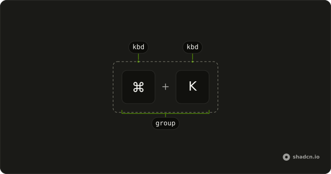
Usage
<div class="rounded-md border bg-background p-4"><KbdGroup><Kbd class="h-12 min-w-12 px-3 text-2xl">⌘</Kbd><Kbd class="h-12 min-w-12 px-3 text-2xl">K</Kbd></KbdGroup></div>FAQ
When should I use extra large key caps?
When the shortcut is the headline: a hero that introduces a command palette, a launch page, a slide, a demo video. Anywhere else, the large or default size is enough.
What are the proportions of the extra large caps?
48 pixels tall and at least 48 wide, with 2xl type and wider padding. Height and minimum width stay equal so ⌘ and K are square, and the gap from KbdGroup stays small, so the two caps still read as one shortcut.
What contexts justify extra large key caps?
Marketing pages, feature announcements, keynote slides and screen recordings, where the shortcut is the message. In an app's own interface, they look out of scale next to everything else.
Should I use extra large caps on mobile?
Use a smaller size on narrow screens, for example by switching classes at a breakpoint. Two 48-pixel caps fit, but a longer shortcut won't, and most phones have no keyboard to press it on.
API Reference
Kbd
No extra props in this demo. The rest is on the Kbd page.