shadcn.io is an independent project built on shadcn/ui
The trigger is a chip with an image icon and hero-banner.jpg. The card shows a 16:9 thumbnail and the line 1920 by 1080, 1.2 MB, JPEG.
Use it in a media library so people can recognize a file without opening it. A Popover covers the same preview on a tap. In Svelte, Ark UI does not fetch the picture. The demo points at one fixed image.
Installation
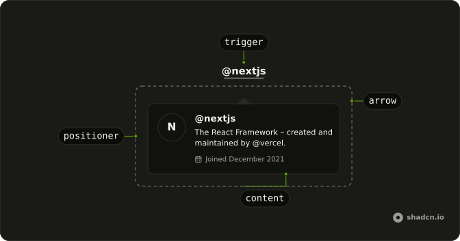
Anatomy
Usage
<HoverCard><HoverCardTrigger>{#snippet asChild(props)}<button {...props({ class: "flex items-center gap-2 rounded-md border px-3 py-2 text-sm hover:bg-accent", type: "button" })}><ImageIcon aria-hidden="true" class="size-4" /><span>hero-banner.jpg</span></button>{/snippet}</HoverCardTrigger><HoverCardContent class="w-80"><div class="flex flex-col gap-3"><div class="aspect-video overflow-hidden rounded-md bg-muted"><img alt="Abstract gradient artwork used as the hero banner" class="size-full object-cover" height={225} src="https://images.unsplash.com/photo-1618005182384-a83a8bd57fbe?w=400&h=225&fit=crop" width={400} /></div><div class="flex flex-col gap-1"><h4 class="font-semibold text-sm">hero-banner.jpg</h4><p class="text-muted-foreground text-xs">1920 × 1080 · 1.2 MB · JPEG</p></div></div></HoverCardContent></HoverCard>FAQ
What is in the card?
An aspect-video frame with the image cropped to fill it, object-cover, then the file name and 1920 × 1080 · 1.2 MB · JPEG.
How is the file chip made the trigger?
HoverCardTrigger renders the file chip through its asChild snippet.
What alt text does the thumbnail need?
A short description of the picture, as the demo gives. The file name is already beside it, so don't repeat it.
How do I change how fast the card opens and closes?
The card opens a moment after the pointer rests on the trigger and stays up long enough for the pointer to move into it. Both delays are in milliseconds.
Set openDelay and closeDelay on HoverCard; they default to 10 and 100. positioning picks another side than the bottom.
Does the card open from the keyboard and on touch screens?
Focusing the file chip opens the card, moving focus away or pressing Escape closes it. Touch screens have no hover, so keep what matters reachable elsewhere, or use a Popover when the card has to open on a tap.
API Reference
Hover Card
No extra props in this demo. The rest is on the Hover Card page.