shadcn.io is an independent project built on shadcn/ui
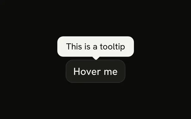
API Key sits next to a small info button. The button's tooltip reads Your secret API key for authentication.
Use an info button when the explanation is longer than a subtitle and not everyone needs it. A line under a Field label is better when everyone should see it. On Svelte, Ark UI does not write the tooltip.
Installation
Anatomy
Usage
<div class="flex items-center gap-1"><Label>API Key</Label><Tooltip><TooltipTrigger>{#snippet asChild(props)}<Button {...props({ "aria-label": "About the API key" })} size="icon-xs" variant="ghost"><InfoIcon aria-hidden="true" class="text-muted-foreground" /></Button>{/snippet}</TooltipTrigger><TooltipContent>Your secret API key for authentication</TooltipContent></Tooltip></div>FAQ
What does the info control open?
A tooltip that says Your secret API key for authentication. The label says API Key, and the label and the button sit in a row with flex items-center gap-1.
How is that control attached to the tooltip?
TooltipTrigger takes an asChild snippet that renders the button. No TooltipProvider is needed.
How do I change how soon the tooltip opens?
This demo leaves the delay at the default. Set it on the trigger or the provider.
Use openDelay and closeDelay on Tooltip, or delay and closeDelay on a TooltipProvider around several tooltips.
Does this tooltip open on a touch screen?
Not from a hover. Touch screens have no hover, so it shows when the trigger is focused. For a note people must be able to read on a phone, use a Toggle Tooltip, which opens on tap.
API Reference
Label
No extra props in this demo. The rest is on the Label page.
Tooltip
No extra props in this demo. The rest is on the Tooltip page.
Button
Sets props, aria-label, About, the, API and size="icon-xs". The rest is on the Button page.