shadcn.io is an independent project built on shadcn/ui
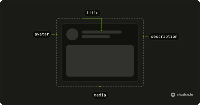
A bordered card shows a round avatar, two short lines for the name, and three lines of text that end short, like a paragraph.
Use it for a comment or a feed post while that person loads. If the shape of the result is still unknown, a Spinner is enough. In Svelte, Ark UI does not swap the bars for the text.
Installation
Anatomy
Usage
<div class="flex w-full max-w-sm flex-col gap-3 rounded-md border p-4"><div class="flex items-center gap-3"><Skeleton class="size-12 rounded-full" /><div class="flex flex-1 flex-col gap-2"><Skeleton class="h-4 w-24" /><Skeleton class="h-3 w-32" /></div></div><Skeleton class="h-4 w-full" /><Skeleton class="h-4 w-5/6" /><Skeleton class="h-4 w-4/6" /></div>FAQ
What wraps this card?
flex w-full max-w-sm flex-col gap-3 rounded-md border p-4. The header and the three text bars stack in that column.
How is the avatar row built?
flex items-center gap-3 holds a size-12 rounded-full circle and a flex-1 column with gap-2. The name bar is h-4 w-24. The line under it is h-3 w-32.
Why are the body lines different widths?
They are h-4 w-full, h-4 w-5/6 and h-4 w-4/6. The shorter lines read as a paragraph ending. Match the count to the text you swap in.
What makes the avatar a circle?
rounded-full on that Skeleton. Skeleton's own radius comes from your style, and rounded-full replaces it. The text bars keep the default radius.
API Reference
Skeleton
No extra props in this demo. The rest is on the Skeleton page.