shadcn.io is an independent project built on shadcn/ui
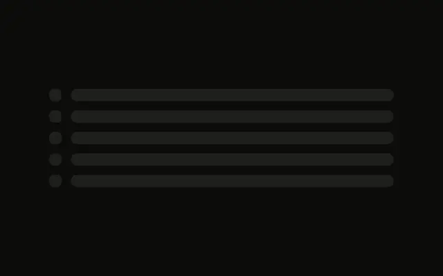
Rows of a small icon and a label form a tree. Child rows are indented, and the indent follows the writing direction.
Use it for a file tree or a table of contents while the nodes load. The control those bars stand in for is a Tree View. In Svelte, Ark UI does not expand a node.
Installation
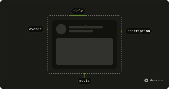
Anatomy
Usage
<div class="flex w-full max-w-md flex-col gap-3"><div class="flex items-center gap-3"><Skeleton class="size-4 rounded-sm" /><Skeleton class="h-4 flex-1" /></div><div class="flex items-center gap-3 ps-6"><Skeleton class="size-4 rounded-sm" /><Skeleton class="h-4 flex-1" /></div><div class="flex items-center gap-3 ps-6"><Skeleton class="size-4 rounded-sm" /><Skeleton class="h-4 flex-1" /></div><div class="flex items-center gap-3"><Skeleton class="size-4 rounded-sm" /><Skeleton class="h-4 flex-1" /></div><div class="flex items-center gap-3 ps-6"><Skeleton class="size-4 rounded-sm" /><Skeleton class="h-4 flex-1" /></div></div>FAQ
What does one row contain?
flex items-center gap-3: a size-4 rounded-sm icon and an h-4 flex-1 label. The list is max-w-md with gap-3.
How are the child rows indented?
Child rows add ps-6 on the same flex row. ps-6 is logical padding, so the indent follows the writing direction. Parent rows have no ps-6.
Which rows are children?
Five rows. The first is a parent, the next two are ps-6 children, then another parent, then one ps-6 child. Nothing in the file toggles them.
Why is the icon rounded-sm?
rounded-sm replaces the radius Skeleton gets from your style, so the icon block has its own small radius. The label keeps the default radius.
API Reference
Skeleton
No extra props in this demo. The rest is on the Skeleton page.