shadcn.io is an independent project built on shadcn/ui
UI library: Ark UI
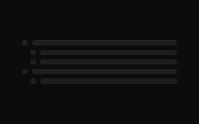
Five rows, each a small square and one line that fills the rest of the row.
Use it for a menu or a task list with one line per item. If that list has loaded and is empty, Empty is the right screen. In Svelte, Ark UI does not know how many items are coming.
Installation
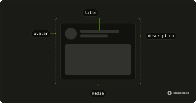
Anatomy
Usage
<div class="flex w-full max-w-md flex-col gap-3">{#each ROWS as row (row)}<div class="flex items-center gap-3"><Skeleton class="size-4 rounded-sm" /><Skeleton class="h-4 flex-1" /></div>{/each}</div>FAQ
What is in a row?
flex items-center gap-3: a size-4 rounded-sm block and an h-4 flex-1 bar. The bar fills whatever width the icon leaves.
Why is the icon rounded-sm?
rounded-sm replaces the style's default radius on that Skeleton. The text bar keeps the default. Both use bg-muted and animate-pulse.
What keys the rows?
The id from ROWS. The five rows are the same shape, so the key is what tells them apart.
API Reference
Skeleton
No extra props in this demo. The rest is on the Skeleton page.