shadcn.io is an independent project built on shadcn/ui
UI library: Ark UI
Two rows of side-by-side fields sit in a two-column grid, then one field across the form, then a button.
Use it for checkout or sign-up that pairs fields such as first and last name. If only submit is waiting, put a Spinner on the button. In Svelte, Ark UI does not lay out the real inputs.
Installation
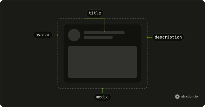
Anatomy
Usage
<div class="flex w-full max-w-2xl flex-col gap-6"><div class="grid grid-cols-2 gap-4"><div class="flex flex-col gap-2"><Skeleton class="h-4 w-20" /><Skeleton class="h-10 w-full" /></div><div class="flex flex-col gap-2"><Skeleton class="h-4 w-24" /><Skeleton class="h-10 w-full" /></div></div><div class="grid grid-cols-2 gap-4"><div class="flex flex-col gap-2"><Skeleton class="h-4 w-16" /><Skeleton class="h-10 w-full" /></div><div class="flex flex-col gap-2"><Skeleton class="h-4 w-20" /><Skeleton class="h-10 w-full" /></div></div><div class="flex flex-col gap-2"><Skeleton class="h-4 w-16" /><Skeleton class="h-10 w-full" /></div><Skeleton class="h-10 w-32" /></div>FAQ
How is the form laid out?
A max-w-2xl column with gap-6. Two grid grid-cols-2 gap-4 rows, then one full-width field, then a button.
What is inside a grid cell?
flex flex-col gap-2: an h-4 label and an h-10 w-full control. The four labels are w-20, w-24, w-16 and w-20.
Which field spans the form?
The third field has no grid. Its label is h-4 w-16 and its control is h-10 w-full, so it sits under both columns.
API Reference
Skeleton
No extra props in this demo. The rest is on the Skeleton page.