shadcn.io is an independent project built on shadcn/ui
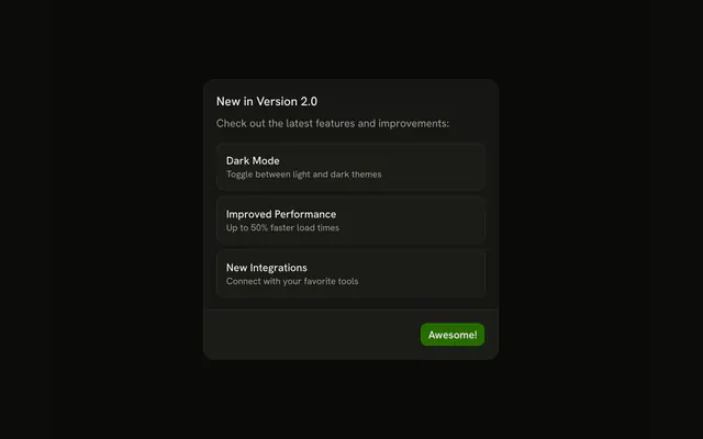
The header is centered. The description says 100 tasks were completed. The card reads Century Club. Those figures are static. Awesome does not grant anything.
Save this for a real milestone, not every save. A routine success is a Toast. In Vue, Ark UI does not count completed tasks.
Installation
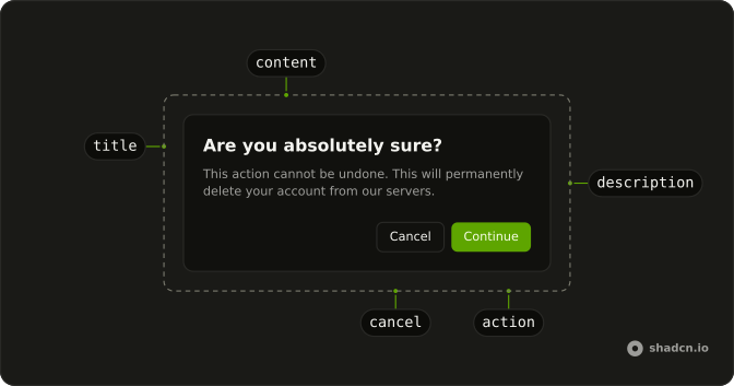
Anatomy
Usage
<AlertDialog>
  <AlertDialogTrigger :asChild="true">
    <Button>Complete Action</Button>
  </AlertDialogTrigger>
  <AlertDialogContent>
    <AlertDialogHeader class="sm:place-items-center sm:text-center">
      <div class="mb-2 flex size-12 items-center justify-center rounded-full bg-primary/10">
        <PartyPopperIcon aria-hidden="true" class="size-6 text-primary" />
      </div>
      <AlertDialogTitle>Milestone Achieved!</AlertDialogTitle>
      <AlertDialogDescription>
        Congratulations! You've completed 100 tasks. Keep up the great work!
      </AlertDialogDescription>
    </AlertDialogHeader>
    <div class="rounded-lg bg-linear-to-r from-primary/10 to-primary/5 p-4 text-center">
      <div class="font-medium text-muted-foreground text-xs uppercase">
        Achievement Unlocked
      </div>
      <div class="mt-1 font-semibold text-lg">Century Club</div>
    </div>
    <AlertDialogFooter>
      <AlertDialogClose :asChild="true">
        <AlertDialogAction>Awesome!</AlertDialogAction>
      </AlertDialogClose>
    </AlertDialogFooter>
  </AlertDialogContent>
</AlertDialog>
FAQ
When is a celebration better than a plain success?
For rare milestones most people won't reach every day. Celebrating routine completions wears the effect out.
How is the card styled?
bg-linear-to-r from-primary/10 to-primary/5, a soft wash of the theme's primary color that works in light and dark mode. Keep it subtle in a serious product.
Which icon suits a celebration?
A party popper for playful milestones, a trophy for competitive ones, a cake for anniversaries. It sits in a size-12 bg-primary/10 circle and is aria-hidden.
API Reference
Alert Dialog
Sets asChild. The rest is on the Alert Dialog page.
Button
No extra props in this demo. The rest is on the Button page.