shadcn.io is an independent project built on shadcn/ui
UI library: Ark UI
Getting Started is a small uppercase label with a chevron. It opens to Introduction, Installation, and Quick Start.
Use it for a short docs group. For the app's main navigation, use a Sidebar. In Vue, Ark UI does not remember which group was open.
Installation
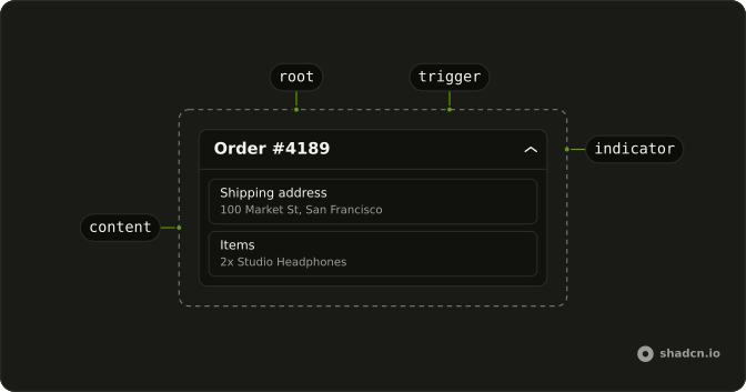
Anatomy
Usage
<Collapsible class="w-full max-w-lg">
  <CollapsibleTrigger class="group flex w-full items-center justify-between px-2 py-1 font-semibold text-muted-foreground text-xs uppercase tracking-wider hover:text-foreground">
    Getting Started<ChevronDownIcon aria-hidden="true" class="size-3 transition-transform duration-200 group-aria-expanded:rotate-180" />
  </CollapsibleTrigger>
  <CollapsibleContent>
    <nav class="mt-1 flex flex-col gap-1">
      <a
        v-for="link in links"
        class="rounded-md px-2 py-1.5 text-sm hover:bg-muted"
        href="#"
        :key="link"
      >
        {{ link }}
      </a>
    </nav>
  </CollapsibleContent>
</Collapsible>
FAQ
How is the Getting Started label styled?
The trigger is font-semibold text-xs uppercase tracking-wider in text-muted-foreground, and turns to the foreground color on hover.
Are Introduction, Installation, and Quick Start links?
Yes. They're anchors in a nav, with rounded-md px-2 py-1.5 text-sm and a muted hover fill. Point each href at its page.
What spaces the three rows?
The nav is mt-1 flex flex-col gap-1, so the links sit a step below the label with a small gap between them.
API Reference
Collapsible
No extra props in this demo. The rest is on the Collapsible page.