shadcn.io is an independent project built on shadcn/ui
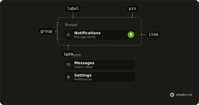
A pin list keeps a few favorite items in a Pinned section above everything else. Pressing a row's pin moves it up into that section, pressing it again sends it back to its place, and every row that shifts glides to its new spot. Use it for bookmarks, recent files, channels or saved views.
When people should set the whole order themselves, a sortable List lets them drag rows instead.
Installation
Anatomy
Usage
import { BellIcon, MailIcon } from "lucide-react";
import { PinList, type PinListItem } from "@/components/ui/pin-list";
const items: PinListItem[] = [
{ icon: BellIcon, id: "notifications", info: "Manage alerts", name: "Notifications" },
{ icon: MailIcon, id: "messages", info: "Check inbox", name: "Messages" },
];
<PinList defaultValue={["notifications"]} items={items} />;icon takes the icon component itself, BellIcon rather than an element, and the list draws it in a tile at the start of the row.
Accessibility
Each section is a ul labeled by the text above it. The pin is a real button, which Tab reaches and Enter or Space toggles. Its name is "Pin" and the item's name, and its aria-pressed is true while the item is pinned. After a press, focus follows the item to its new section, scrolled into view once it lands, and a status region announces "Calendar pinned" or "Calendar unpinned". An unpinned row's pin is invisible until the row is hovered or the button gets keyboard focus, and it always shows on a touch screen. What stays with you: an item name that reads well after "Pin", and translating the English words in components/ui/pin-list.
- Tab
- Moves focus to the next row's pin button, and after the last row, out of the list.
- Shift+Tab
- Moves focus to the previous row's pin button.
- Enter
- Pins or unpins the focused row, and focus moves with it.
- Space
- Pins or unpins the focused row, and focus moves with it.
Demos
Controlled
Four files with Launch brief.pdf pinned, and the pinned ids held in the demo's own state through value and onValueChange, so a count above the list stays in step. Pressing a pin glides the rows, and so does the Unpin all button, which changes value from outside. Control the list when something beside it reads or changes the pins.
Labels
Four bookmarks with no icons, each with its site on a second line, and Q3 roadmap pinned from the start. labels renames the sections Favorites and Everything else. With two lines of text, a row without an icon is as tall as one with it. Unpin the roadmap and the Favorites section goes away, label and all.
FAQ
What data does Pin List take?
An items array, where each item has an id and a name, and optionally an info line and an icon component. The unpinned section shows them in the order of that array.
Which items are pinned is a separate array of ids. Pass defaultValue to set the first pins and let the list track them from there, or value with onValueChange to hold them in your own state.
Where does a Pin List item go when I pin or unpin it?
A pinned item goes to the end of the Pinned section, so that section reads in the order things were pinned. An unpinned item goes back to its own place among the rest, wherever items lists it.
Each section has its label above it, and a section with no items is left out, label and all. Pin every item and only the Pinned section is left.
How do I save a Pin List's pinned items between visits?
Control the list and store the ids. Pass the saved array as value, and write the new one to local storage or your server each time the change callback fires. The array's order is the order the Pinned section shows, so store it as it comes.
An id in value that matches no item is skipped without an error, so a deleted item doesn't break the list. The id stays in the array the change callback hands back, though, so filter out ids you no longer have before saving.
How does the Pin List animate without a motion library?
With a FLIP animation. When a pin is pressed, the list measures every row and label, and after the update it puts each one back where it was with the CSS translate property, then lets go. The row's own transition carries it to its new place, and a row caught mid-move starts from where it is.
A change you make to value from your own code glides too, starting from where the rows last came to rest, as Unpin all does in the Controlled demo. Only a press moves focus and is announced, and a press whose change your code turns down announces nothing.
Can I pin Pin List items with the keyboard in React?
Yes. Each row's pin is a button named after the item, in the tab order even while it is invisible, and it shows once it has keyboard focus. Enter or Space toggles it, and aria-pressed reports whether the item is pinned.
Focus follows the item to its new section, so the next Tab continues from there. A status region announces what was pinned or unpinned.
Does the Pin List respect reduced motion?
Yes. When the system asks for reduced motion, the rows' and labels' transitions are turned off, so a pinned row lands in its new place at once and a section label appears without fading in.
Everything else works the same way: pinning and unpinning, focus moving with the item, and the status announcement.
How do I change the look of Pin List rows?
Edit components/ui/pin-list. Each row is the pin-list-item slot, a muted rounded block that turns to the accent color on hover. A pinned row also carries data-pinned, which fills the pin icon.
The pin button is the pin-list-pin slot, filled with the primary color while pressed. The glide's speed and curve are the row's transition classes, 450ms on a curve that overshoots a little before it settles.
Can a Pin List row be a link?
Not as it ships. The pin button stretches an invisible layer over the whole row, so a click anywhere on the row toggles the pin, and items have no field for a URL.
To make a row open something, edit components/ui/pin-list. Remove the after: classes from the pin button, so it covers only its own circle, and give the button a focus ring of its own, since the row's ring is drawn by that layer. Then add a URL field to PinListItem and wrap the name in a link to it.
API Reference
PinList
<div> data-slot="pin-list"
value?string[]
The pinned ids, in the order they show (controlled).
defaultValue?string[]
The ids pinned at first, when uncontrolled, in the order they show.
- Default
[]
onValueChange?(value: string[]) → void
Called with the pinned ids when an item is pinned or unpinned.
- Parameters
value– string[]- Returns
void
itemsPinListItem[]
Every item, in the order the unpinned ones show.
labels?object
The section labels.
- Type
{ pinned?: string; unpinned?: string }
className?string
Merged with the part's classes.
data-flip?stringdata-group?string
Mirrors id.
data-pinned?stringdata-value?string
Mirrors id.