shadcn.io is an independent project built on shadcn/ui
Resizable splits an area into panels with a handle between them, and dragging the handle gives one panel the space it takes from the other. Reach for it when people should choose the split themselves: a file tree beside an editor, a list of messages beside the open one, a query over its results.
For an app's main navigation that folds away, use a Sidebar. This Resizable wraps the Splitter from Ark UI and takes its props.
Installation
Anatomy
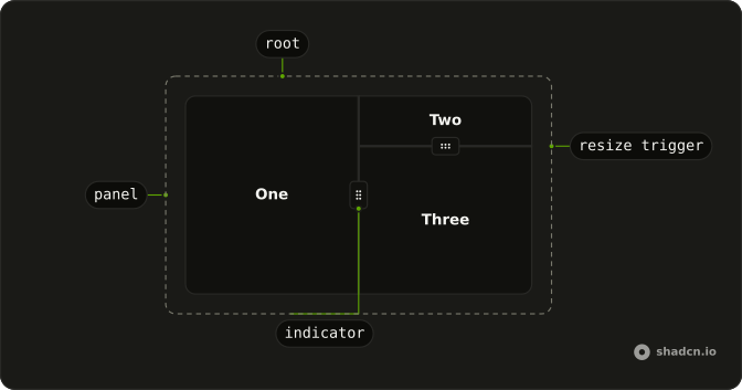
Usage
<script lang="ts">
import {
  Resizable, ResizablePanel, ResizableResizeTrigger,
} from "@/components/ui/resizable";
</script>
Every ResizablePanel needs an id that is listed in panels, and the trigger's id names the two panels it sits between, joined by a colon.
<Resizable
  class="min-h-48 max-w-md rounded-lg border"
  defaultSize={[30, 70]}
  panels={[
    { id: "files", minSize: 20 },
    { id: "editor", minSize: 30 },
  ]}
>
  <ResizablePanel id="files">
    <div class="p-4 text-sm">Files</div>
  </ResizablePanel>
  <ResizableResizeTrigger id="files:editor" withHandle />
  <ResizablePanel id="editor">
    <div class="p-4 text-sm">Editor</div>
  </ResizablePanel>
</Resizable>
Accessibility
Each handle is a focusable element with the separator role and the label Resize. It reports the size of the panel before it, as a percentage of the group, in aria-valuenow, with that panel's limits in aria-valuemin and aria-valuemax. Two things are left to you. Every handle gets the same label, so where a layout has more than one, pass aria-label to each ResizableResizeTrigger to name what it resizes, such as Resize file tree. And a collapsed panel keeps its content in the page, so set inert on the ResizablePanel itself while it is collapsed, as the Collapsible demo does, or Tab lands on links nobody can see.
- Tab
- Moves focus to the next handle or focusable element, in page order.
- Arrow Left
- In a horizontal group, moves the handle left by 1% of the group's width, or by 10% with Shift held.
- Arrow Right
- In a horizontal group, moves the handle right by 1% of the group's width, or by 10% with Shift held.
- Arrow Up
- In a vertical group, moves the handle up by 1% of the group's height, or by 10% with Shift held.
- Arrow Down
- In a vertical group, moves the handle down by 1% of the group's height, or by 10% with Shift held.
- Home
- Shrinks the panel before the handle to the smallest size its limits allow.
- End
- Grows the panel before the handle to the largest size its limits allow.
- Enter
- Collapses the panel before the handle, or expands it again, when that panel is collapsible.
- F6
- Moves focus to the next handle in the same group, wrapping from the last to the first.
- Shift+F6
- Moves focus to the previous handle in the same group.
Demos
Vertical
A header pane over a content pane, split a quarter to three quarters, with orientation set to vertical and a plain line for the handle. The group has min-h-[200px], because a vertical split divides whatever height its container gives it. Use this for a toolbar over a canvas, or a query editor over its results.
Handle
A sidebar pane and a content pane, a quarter and three quarters wide, with withHandle drawing a small grip on the line between them. The grip tells people the edge moves, which a 1px line on a light page doesn't. Leave it off where the panels' own borders already read as a split, as in the Vertical demo.
Collapsible
A file tree beside an editor, with collapsible and a minSize of 25 in the tree's entry in panels. The Hide files button in the editor's toolbar calls collapsePanel or expandPanel from useResizable, and dragging the handle past half the minimum snaps the tree shut. While it is collapsed the panel is inert, so Tab skips its files.
RTL
The nested layout from the top of the page with Arabic labels, inside a Direction provider set to rtl, which puts panel one on the right. Ark UI takes the direction from the provider, not a dir prop, writes it on every panel and handle, and mirrors ArrowLeft and ArrowRight. It measures a drag in screen coordinates, so the outer handle travels against the pointer. The vertical handle is unaffected.
FAQ
How do I set the starting size of each Resizable panel?
List the sizes in defaultSize on Resizable, one number per panel in the order of panels, each a percentage of the group: [30, 70] gives the first panel 30% of the width. A panel you leave without a size shares what remains with the others.
The Handle demo starts its sidebar at a quarter of the width this way.
How do I give a Resizable panel a minimum width?
Add minSize to that panel's entry in panels, and maxSize for a ceiling. A number there is a percentage of the group, so minSize: 20 stops the panel at a fifth of the width, and a string with a unit sets a fixed floor, such as "240px" or "16rem". Dragging and the arrow keys both stop at the limit.
A floor matters most for a file tree or a list whose names turn unreadable when squeezed. Make that panel collapsible as well if people should be able to close it entirely.
How do I stack a Resizable vertically?
Set orientation to vertical on Resizable, and the panels stack with the handle running across the width. A vertical group divides the height of its container, so give it a height or a minimum height, as the Vertical demo does with min-h-[200px].
Groups nest, too. Put a vertical Resizable inside one panel of a horizontal one, as the demo at the top of the page does, and the inner sizes become shares of that panel rather than of the page.
How do I save Resizable panel sizes between visits?
Read the sizes in onResizeEnd, whose details.size is an array of percentages in panel order, and write it to localStorage. On the next load, read it back and pass it as defaultSize, with your usual sizes as the fallback when nothing is stored. The callback runs once a drag is released and after each arrow key press, not on every pointer move.
How do I collapse a Resizable panel from a button?
Set collapsible to true and give a minSize in that panel's entry in panels. Dragging it more than halfway from minSize toward collapsedSize, which is 0 unless you set it, snaps it shut. For a button rendered inside Resizable, useResizable gives access to the splitter's API, whose collapsePanel and expandPanel take the panel's id.
Pressing Enter on the handle does the same for the panel before it. A collapsed panel's content stays in the page, so set inert on the panel while it is closed, as the Collapsible demo does.
Can I use a Resizable from the keyboard in Svelte?
Yes, every handle is a stop in the tab order, and once it has focus the arrow keys along the split move it 1% of the group per press, or 10% with Shift. Home and End push it to either limit, Enter collapses or expands a collapsible panel, and F6 jumps to the next handle in the group. Set keyboardResizeBy on Resizable to change the 1% step.
The Accessibility section lists every key.
How do I make the Resizable handle easier to see and grab?
Set withHandle to true on ResizableResizeTrigger to draw a small grip on the line, as the Handle demo does. The line itself is 1px wide, and the trigger's after pseudo-element lays a 4px strip over it.
That strip is all the pointer has to hit, so widen after:w-1 in components/ui/resizable, and after:h-1 for vertical groups, when the handle is hard to catch. The trigger sets data-dragging while it is dragged and data-focus while it has focus, so a class keyed on either can color the line.
API Reference
Resizable
<div> data-slot="resizable"
panelsPanelData[]
The size constraints of the panels.
defaultSize?PanelSize[]
The initial size of the panels when rendered. Use when you don't need to control the size of the panels.
dir?"ltr" | "rtl"
The document's text/writing direction.
- Type
"ltr" | "rtl"- Default
"ltr"
id?string
The unique identifier of the machine.
ids?object
The ids of the elements in the splitter. Useful for composition.
- Type
{ root?: string; resizeTrigger?: (id: string) → string; label?: (id: string) → string; panel?: (id: string | number) → string }
keyboardResizeBy?number | null
The number of pixels to resize the panel by when the keyboard is used.
- Type
number | null
nonce?string
The nonce for the injected splitter cursor stylesheet.
onCollapse?(details: ExpandCollapseDetails) → void
Function called when a panel is collapsed.
- Type
(details: ExpandCollapseDetails) → void- Parameters
details– { panelId: string; size: number }- Returns
void
onExpand?(details: ExpandCollapseDetails) → void
Function called when a panel is expanded.
- Type
(details: ExpandCollapseDetails) → void- Parameters
details– { panelId: string; size: number }- Returns
void
onResize?(details: ResizeDetails) → void
Function called when the splitter is resized.
- Parameters
details– { size: number[]; resizeTriggerId: string | null; layout: string; expandToSizes: Record<string, number> }- Returns
void
onResizeEnd?(details: ResizeEndDetails) → void
Function called when the splitter resize ends.
- Type
(details: ResizeEndDetails) → void- Parameters
details– { size: number[]; resizeTriggerId: string | null }- Returns
void
onResizeStart?() → void
Function called when the splitter resize starts.
- Returns
void
orientation?"horizontal" | "vertical"
The orientation of the splitter. Can be horizontal or vertical.
- Type
"horizontal" | "vertical"- Default
"horizontal"
registry?SplitterRegistry
The splitter registry to use for multi-drag support. When provided, enables dragging at the intersection of multiple splitters.
size?PanelSize[]
The controlled size data of the panels.
asChild?Snippet<[PropsFn]>
Render your own element: a snippet that gets the part's props to spread on it.
- Type
Snippet<[PropsFn]>
class?string
Merged with the part's classes.
data-dragging?string
Present when in the dragging state.
data-orientation"horizontal" | "vertical"
The orientation of the splitter.
- Type
"horizontal" | "vertical"
ResizablePanel
<div> data-slot="resizable-panel"
idstring
The element's id.
asChild?Snippet<[PropsFn]>
Render your own element: a snippet that gets the part's props to spread on it.
- Type
Snippet<[PropsFn]>
data-dragging?string
Present when in the dragging state.
data-idstring
Mirrors id.
data-indexstring
The index of the item.
data-orientation"horizontal" | "vertical"
The orientation of the panel.
- Type
"horizontal" | "vertical"
data-ownedbystring
Id of the root part.
ResizableResizeTrigger
<button>
id`${PanelId}:${PanelId}` | `${PanelId}:` | `:${PanelId}`
The element's id.
- Type
`${PanelId}:${PanelId}` | `${PanelId}:` | `:${PanelId}`
disabled?boolean
Whether the resize trigger is disabled.
withHandle?boolean
Whether to show the handle.
- Default
false
asChild?Snippet<[PropsFn]>
Render your own element: a snippet that gets the part's props to spread on it.
- Type
Snippet<[PropsFn]>
class?string
Merged with the part's classes.
data-disabled?string
Present when disabled.
data-dragging?string
Present when in the dragging state.
data-focus?string
Present when focused.
data-idstring
Mirrors id.
data-orientation"horizontal" | "vertical"
The orientation of the resizetrigger.
- Type
"horizontal" | "vertical"
data-ownedbystring
Id of the root part.