Autocomplete Select
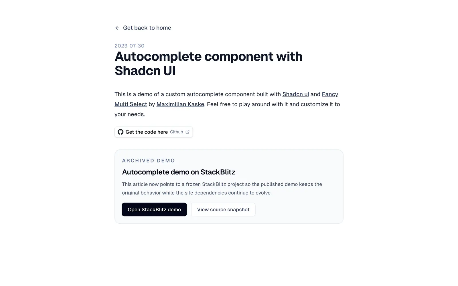
A tutorial and demo for an autocomplete built on shadcn/ui and the Fancy Multi Select pattern.
- Category
- Libraries & Components
- Added
About
About Autocomplete Select
This is a blog post by Armand Salle, dated July 2023, showing how to build a custom autocomplete from the shadcn/ui select component. It is based on Fancy Multi Select by Maximilian Kaske, and the post links to the code on GitHub plus an embedded demo you can play with and adapt.
The page now points to a frozen StackBlitz project so the published demo keeps its original behavior while the site's own dependencies move on, and a source snapshot is available. There is no package or CLI: you read the article, open the demo, and copy the code into your project. It suits developers who need an autocomplete field and want a worked example to start from rather than a library.
Autocomplete Select features
5 features
- Autocomplete built from the select component
- Based on Fancy Multi Select
- Archived StackBlitz demo
- Source snapshot to view
- Code available on GitHub
What you can build with Autocomplete Select
3 use cases
- Learning how to build an autocomplete from shadcn/ui parts
- Starting a tag or option picker from working code
- Comparing approaches before choosing a combobox library
Libraries & Components
Similar to Autocomplete Select
More libraries & components like Autocomplete Select: the closest by what they do, then the most starred.
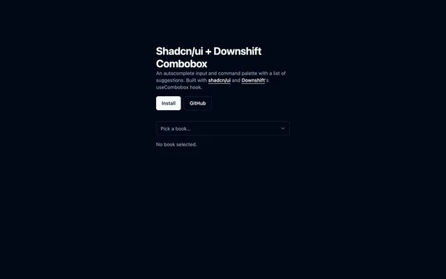
 Shadcn/ui + Downshift ComboboxLibraryCombobox for shadcn/ui driven by Downshift's useCombobox hook, giving you an autocomplete input with a list of suggestions. MIT licensed.
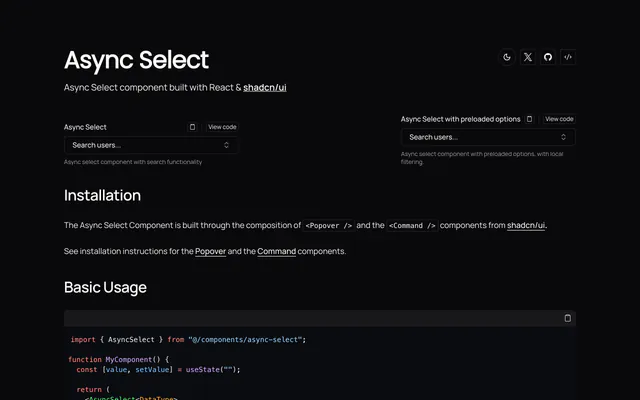
 Async SelectLibraryAsync Select is a React select for shadcn/ui that fetches options as you type or preloads them. It composes Popover and Command with generic typing.
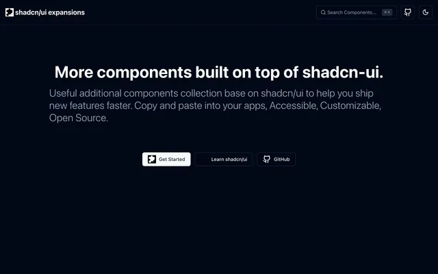
 shadcn/ui expansionsLibraryshadcn/ui expansions adds components the base set lacks: autosize textarea, datetime picker, multiple selector and infinite scroll. Copy and paste them.
 Country State DropdownLibraryCountry State Dropdown is a Next.js demo of linked country and state selects built with Tailwind CSS, shadcn/ui and Zustand. Copy it into your forms.
 SearchAddressLibrarySearchAddress is a React component that suggests addresses as users type, using Nominatim from OpenStreetMap with shadcn/ui parts and lucide-react icons.
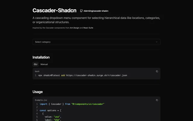
 Cascader-ShadcnLibraryCascader-Shadcn adds an Ant Design-style cascading dropdown to shadcn/ui for hierarchical data, with click or hover expansion. Install it via the CLI.
Pricing
Ship it with Pro
The directory is free. Pro adds 6,000+ blocks, 14 premium templates and the MCP server, so your AI editor installs them for you.
4.9/5 out of 5 · 150+ reviewsfrom 150+ founders and developers.
- Secure checkout via Stripe
- Code lives in your repo
- Keep what you've shipped if you cancel
- License terms
FAQ
Frequently asked questions
What Autocomplete Select is, how to install it, its license and its alternatives.
No. The page is an article with a demo and a code link, so you copy the code into your project.
The page says it now points to a frozen StackBlitz project, so the demo keeps the original behavior even as the site changes.
A tutorial and demo for an autocomplete built on shadcn/ui and the Fancy Multi Select pattern.
Autocomplete Select lists Autocomplete built from the select component, Based on Fancy Multi Select, Archived StackBlitz demo, Source snapshot to view and Code available on GitHub.
The directory lists these uses for Autocomplete Select: Learning how to build an autocomplete from shadcn/ui parts, Starting a tag or option picker from working code and Comparing approaches before choosing a combobox library.
The directory does not name a maker for Autocomplete Select. Its site is https://www.armand-salle.fr/post/autocomplete-select-shadcn-ui.
Autocomplete Select was added to the directory on December 27, 2024.
Autocomplete Select is in Libraries & Components. Component libraries and standalone components built on shadcn/ui, covering the data tables, pickers, editors and charts the core set leaves out.
Select and combobox, Inputs, Components, Copy and paste, Blog and Search. Each tag has a page listing the other resources that carry it.
Yes. Autocomplete Select's page has a Live tab beside the screenshot that loads its site in a frame.
The directory lists no install command for Autocomplete Select. Follow the instructions on its site at https://www.armand-salle.fr/post/autocomplete-select-shadcn-ui.
The directory lists no shadcn CLI command for Autocomplete Select. Check its docs at https://www.armand-salle.fr/post/autocomplete-select-shadcn-ui for how to add it.
The directory links no repository for Autocomplete Select. Its site is https://www.armand-salle.fr/post/autocomplete-select-shadcn-ui.
The directory links no separate docs for Autocomplete Select; start from its site at https://www.armand-salle.fr/post/autocomplete-select-shadcn-ui.
The directory records no license for Autocomplete Select. Check its repository or site before you use it.
The directory records no price for Autocomplete Select. Its site, https://www.armand-salle.fr/post/autocomplete-select-shadcn-ui, is where its pricing, if any, is stated.
No. Autocomplete Select is made by its own maker and listed here as a link. A shadcn.io Pro plan covers shadcn.io's own blocks, templates and tools.
Other resources in Libraries & Components, newest first: Shadcn/ui + Downshift Combobox, Async Select, shadcn/ui expansions and Country State Dropdown. Their pages are linked under Similar to Autocomplete Select.
Open its category, Libraries & Components, or one of its tags (Select and combobox, Inputs and Components): each page lists the resources that share it.
4.9 out of 5 from 150+ developers


Found your stack? Ship it.
6,000+ blocks, premium templates and MCP in every Pro plan. The directory stays free.
Get Pro