#select
16 resources tagged Select and combobox in Awesome shadcn/ui.
#select
16 resources
16 shadcn/ui resources for select and combobox: libraries, registries, templates and tools. Each with a screenshot, a write-up and its links.
16 resources.
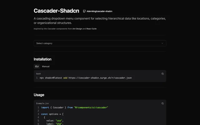
 Cascader-ShadcnLibraryCascader-Shadcn adds an Ant Design-style cascading dropdown to shadcn/ui for hierarchical data, with click or hover expansion. Install it via the CLI.
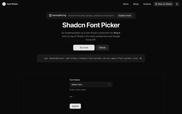
 Shadcn Font PickerLibraryShadcn Font Picker is a React component on shadcn/ui's input and command parts that browses the Google Fonts API, installable with one shadcn CLI command.
 Shadcn Icon PickerLibraryShadcn Icon Picker lets users choose a Lucide icon from a virtualized list built with shadcn/ui and TanStack Virtual, with controlled and custom modes.
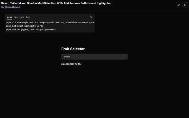
 Multi-SelectionLibraryMulti-Selection is a small React, Tailwind CSS and TypeScript demo of a multi-select field that adds and removes items and highlights the chosen ones.
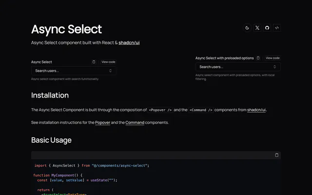
 Async SelectLibraryAsync Select is a React select for shadcn/ui that fetches options as you type or preloads them. It composes Popover and Command with generic typing.
 Autocomplete SelectLibraryA write-up and demo of a custom autocomplete for shadcn/ui, based on the select component and Maximilian Kaske's Fancy Multi Select. Code on GitHub.
 Plate Multi SelectLibraryPlate's multi-select editor turns tags into editor nodes, adding undo and redo, copy and paste, drag reordering and cmdk fuzzy search.
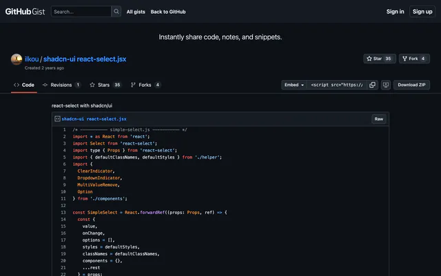
 react-select with shadcn/uiLibraryThis GitHub gist wraps react-select in unstyled mode and applies shadcn/ui Tailwind classes for the control, menu, tags and indicators.
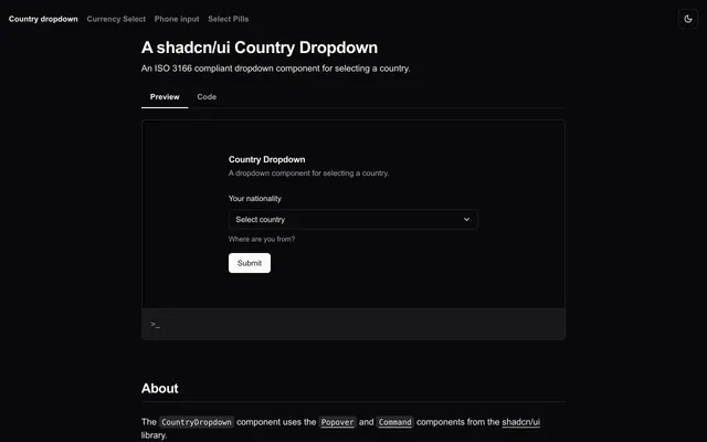
 shadcn/ui Country DropdownLibraryThe shadcn/ui Country Dropdown is an ISO 3166 compliant country selector built from the Popover and Command components, with circle flags for each country.
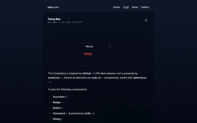
 Fancy BoxLibraryFancy Box is a multi-select combobox with label creation and editing, modeled on GitHub's pull request labels and built from shadcn/ui parts.
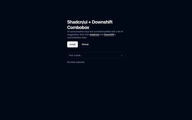
 Shadcn/ui + Downshift ComboboxLibraryCombobox for shadcn/ui driven by Downshift's useCombobox hook, giving you an autocomplete input with a list of suggestions. MIT licensed.
 Multi Select ComponentLibraryMulti Select Component is a React and TypeScript multi-select built with shadcn/ui and Radix UI, with search, animations, variants and accessibility.
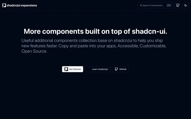
 shadcn/ui expansionsLibraryshadcn/ui expansions adds components the base set lacks: autosize textarea, datetime picker, multiple selector and infinite scroll. Copy and paste them.
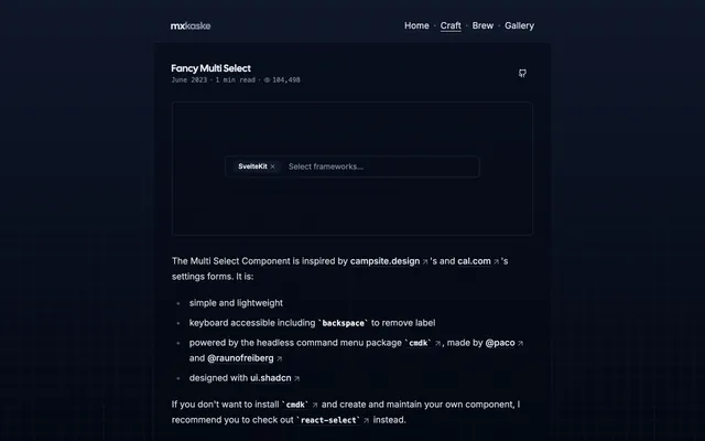
 Fancy Multi SelectLibraryFancy Multi Select is a simple multi-select input for React built with cmdk and shadcn styling, with keyboard support including Backspace removal.
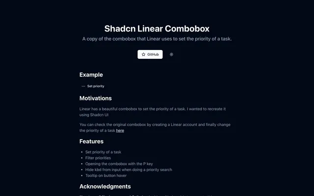
 Shadcn Linear ComboboxLibraryShadcn Linear Combobox recreates the priority selector from Linear using shadcn/ui, with filtering, a P key shortcut and tooltips on the trigger button.
 Country State DropdownLibraryCountry State Dropdown is a Next.js demo of linked country and state selects built with Tailwind CSS, shadcn/ui and Zustand. Copy it into your forms.


Pricing
Ship it with Pro
The directory is free. Pro adds 6,000+ blocks, 14 premium templates and the MCP server, so your AI editor installs them for you.
4.9/5 out of 5 · 150+ reviewsfrom 150+ founders and developers.
- Secure checkout via Stripe
- Code lives in your repo
- Keep what you've shipped if you cancel
- License terms
FAQ
Frequently asked questions
What the Select and combobox tag marks and what its resources have in common.
The Select and combobox tag marks resources in Awesome shadcn/ui that the directory describes by select and combobox. It is one of 108 tags, in the topics group.
16 resources, out of 521 in the directory.
Cascader-Shadcn, Shadcn Font Picker, Shadcn Icon Picker and Multi-Selection, in the directory's own order: curated, then newest first.
The Select and combobox tag is a topic tag. The tags page groups every tag by kind.
Libraries & Components (16). The category tells you what each is for.
15 resources: Cascader-Shadcn, Shadcn Font Picker, Shadcn Icon Picker and Multi-Selection.
4 resources tagged Select and combobox show a license GitHub confirmed: Cascader-Shadcn (MIT), Shadcn/ui + Downshift Combobox (MIT), Multi Select Component (MIT) and shadcn/ui expansions (MIT). Check the others' repositories.
3 resources tagged Select and combobox list a shadcn CLI install command. For example, Cascader-Shadcn lists `npx shadcn@latest add https://cascader-shadcn.surge.sh/r/cascader.json`.
Inputs, Components, React, Copy and paste and Tailwind CSS, ordered by how many resources they share with Select and combobox.
Open a related tag from the Also tagged row at the bottom of the page, or browse all 108 on the tags page.
Categories describe what a resource is for. Open the category of a Select and combobox resource to see its peers: the categories page lists all 11.
With 16 resources, the Select and combobox page is indexed by search engines.
Use the submit page: send the link to its website or repository through the contact form, which opens with the subject "Awesome shadcn/ui submission" already filled in. A person reads it and decides whether it is listed. Say what it is and what stack it uses; the tags are part of its record in the directory.
The directory holds no price, rating or star count, so a tag cannot say how good or how costly a resource is. Select and combobox only describes it; read each resource's site before you depend on it.
4.9 out of 5 from 150+ developers


Found your stack? Ship it.
6,000+ blocks, premium templates and MCP in every Pro plan. The directory stays free.
Get Pro