Grid
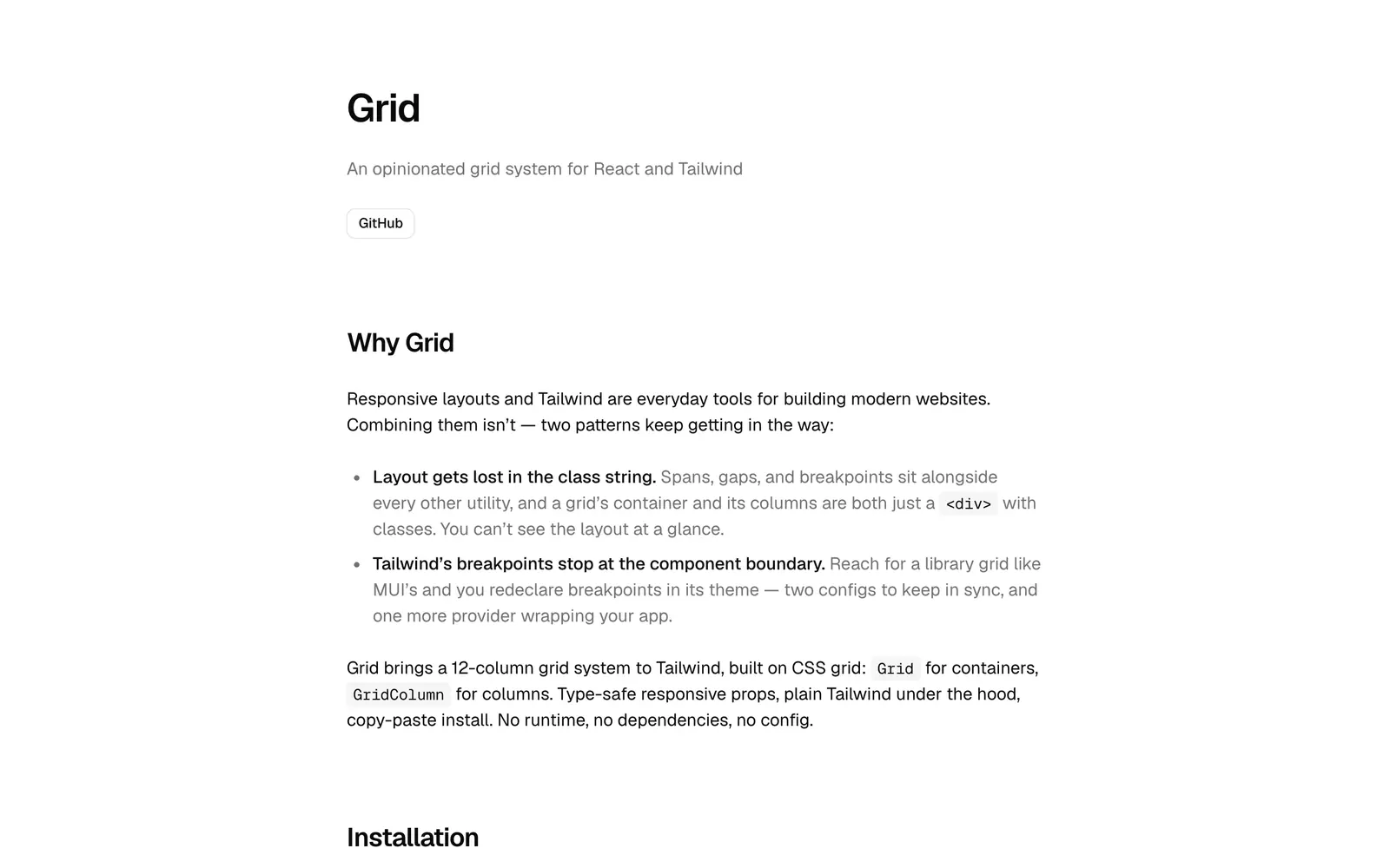
A 12-column grid for React and Tailwind CSS with type-safe responsive props and no runtime.
- Category
- Libraries & Components
- Added
About
About Grid
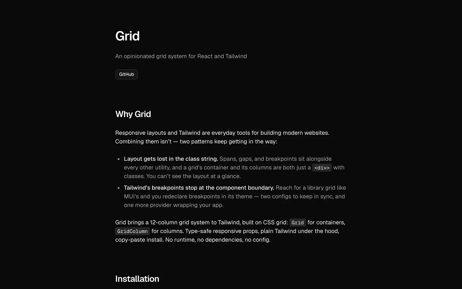
Grid is an opinionated layout system that brings a 12-column grid to Tailwind CSS. A Grid component is the container and GridColumn holds each column, with span, start and rowSpan props that accept responsive values such as { base: 12, md: 8 }. Under the hood it is CSS grid and plain Tailwind classes, with no runtime, dependencies or config.
The author's pitch is that layout otherwise disappears into long class strings, and that library grids force you to redeclare breakpoints. Install with pnpm dlx shadcn@latest add https://grid.joohyunpark.com/registry/grid.json, then import Grid and GridColumn from components/ui/grid. Ordering stays with Tailwind order utilities.
Grid features
6 features
- 12-column CSS grid
- Grid and GridColumn components
- Type-safe responsive props
- Column start and row span
- No runtime or dependencies
- Tailwind order utilities for reordering
Install Grid
1 command
Terminal
$ pnpm dlx shadcn@latest add https://grid.joohyunpark.com/registry/grid.jsonWhat you can build with Grid
3 use cases
- Laying out a dashboard with a main area and a sidebar
- Making page sections readable instead of long class strings
- Avoiding a second breakpoint config like a theme provider
Libraries & Components
Similar to Grid
More libraries & components like Grid: the closest by what they do, then the most starred.
 Dot MatrixLibraryDot Matrix is a React library of 55+ free dot matrix loaders. Add one through the shadcn registry, then edit the code in your own project.
 scificn-uiLibraryRetro sci-fi component library for React in a Cassette Futurism style. Built on Radix UI and Tailwind CSS v4, installed through the shadcn CLI.
 Calendar SchedulerLibraryCalendar Scheduler is a React booking component with month, week, day and agenda views, timezone conversion and slot availability. Add it via the CLI.
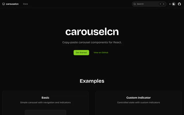
 carouselcnLibrarycarouselcn is a copy-paste carousel for React and Tailwind CSS with CSS transitions, drag and swipe, looping, indicators and ARIA labels. MIT licensed.
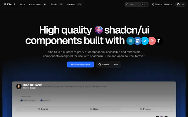
 Kibo UILibraryKibo UI is a free, open source registry of composable, accessible components for shadcn/ui, including Color Picker, QR Code, Image Zoom and Code Block.
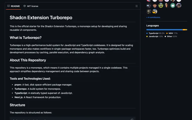
 shadcn-extensionLibraryshadcn-extension is an MIT-licensed collection of React components that extends shadcn/ui, developed in a Turborepo monorepo with Next.js docs.
Pricing
Ship it with Pro
The directory is free. Pro adds 6,000+ blocks, 14 premium templates and the MCP server, so your AI editor installs them for you.
4.9/5 out of 5 · 150+ reviewsfrom 150+ founders and developers.
- Secure checkout via Stripe
- Code lives in your repo
- Keep what you've shipped if you cancel
- License terms
FAQ
Frequently asked questions
What Grid is, how to install it, its license and its alternatives.
No. It uses Tailwind's own breakpoints, with no runtime, dependencies or config.
A 12-column grid for React and Tailwind CSS with type-safe responsive props and no runtime.
Grid lists 12-column CSS grid, Grid and GridColumn components, Type-safe responsive props, Column start and row span, No runtime or dependencies and Tailwind order utilities for reordering.
The directory lists these uses for Grid: Laying out a dashboard with a main area and a sidebar, Making page sections readable instead of long class strings and Avoiding a second breakpoint config like a theme provider.
The directory does not name a maker for Grid. Its site is https://grid.joohyunpark.com.
Grid was added to the directory on May 6, 2026.
Grid is in Libraries & Components. Component libraries and standalone components built on shadcn/ui, covering the data tables, pickers, editors and charts the core set leaves out.
Components, Registry, shadcn CLI, Copy and paste, React, Tailwind CSS, TypeScript and Customizable. Each tag has a page listing the other resources that carry it.
Yes. Grid's page has a Live tab beside the screenshot that loads its site in a frame.
Run pnpm dlx shadcn@latest add https://grid.joohyunpark.com/registry/grid.json, then import Grid and GridColumn.
Grid lists this command: `pnpm dlx shadcn@latest add https://grid.joohyunpark.com/registry/grid.json`.
Yes, according to its listing: Grid installs with `pnpm dlx shadcn@latest add https://grid.joohyunpark.com/registry/grid.json`.
The directory links no repository for Grid. Its site is https://grid.joohyunpark.com.
The directory links no separate docs for Grid; start from its site at https://grid.joohyunpark.com.
The directory records no license for Grid. Check its repository or site before you use it.
The directory records no price for Grid. Its site, https://grid.joohyunpark.com, is where its pricing, if any, is stated.
No. Grid is made by its own maker and listed here as a link. A shadcn.io Pro plan covers shadcn.io's own blocks, templates and tools.
Other resources in Libraries & Components, newest first: Dot Matrix, scificn-ui, Calendar Scheduler and carouselcn. Their pages are linked under Similar to Grid.
Open its category, Libraries & Components, or one of its tags (Components, Registry and shadcn CLI): each page lists the resources that share it.
4.9 out of 5 from 150+ developers


Found your stack? Ship it.
6,000+ blocks, premium templates and MCP in every Pro plan. The directory stays free.
Get Pro