Interlace UI
A shadcn-compatible registry of 145 React primitives with a theme bundle and an accessibility floor.
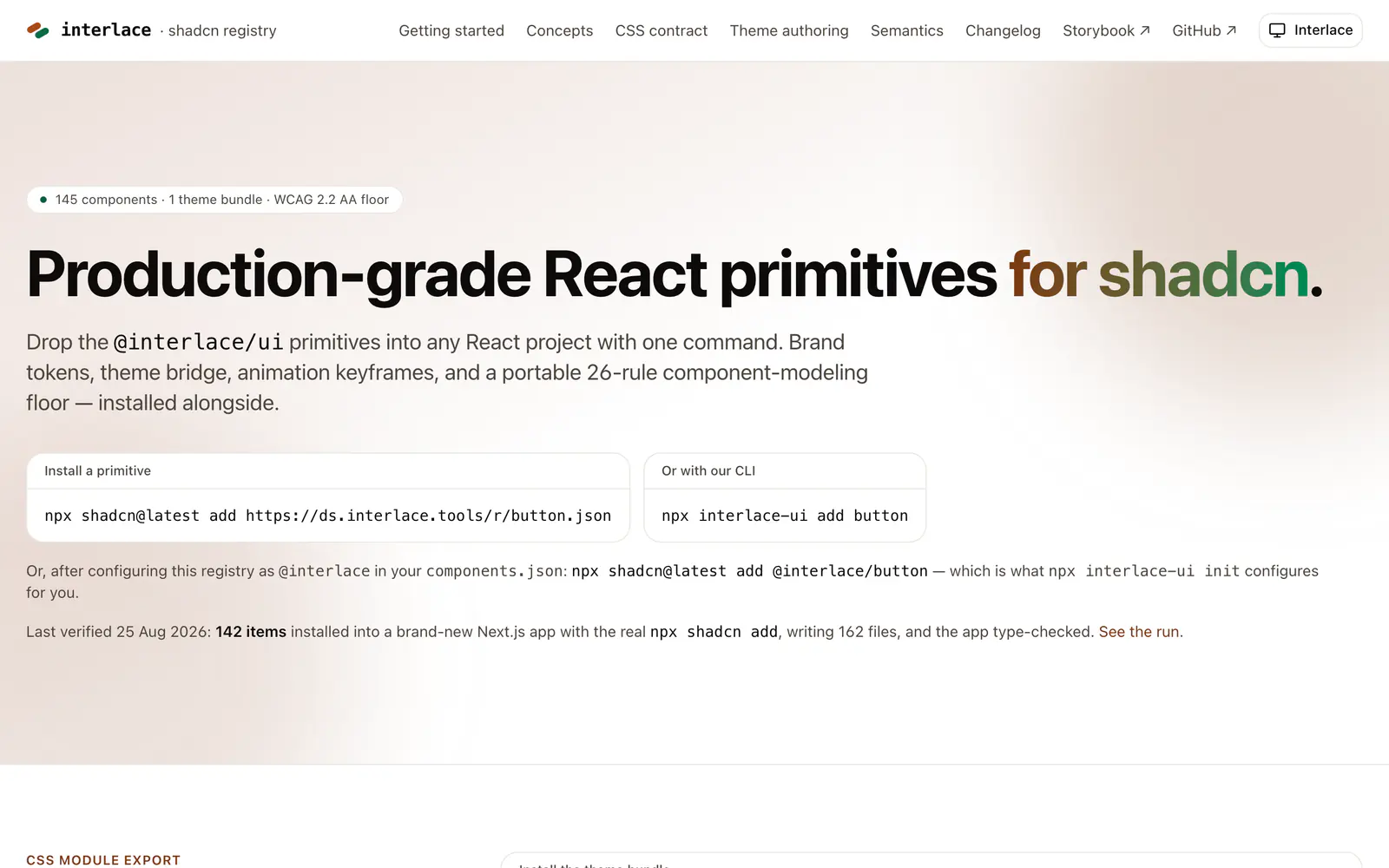
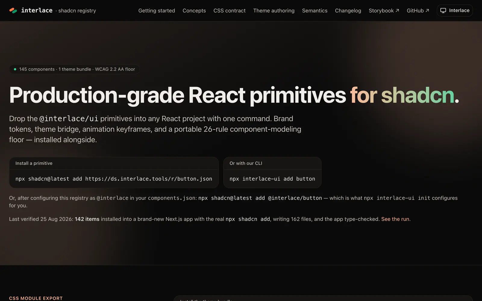
- Category
- Component Registries
- Added
About
About Interlace UI
Interlace Design System Registry distributes the @interlace/ui primitives to any React project. It lists 145 components and one theme bundle, with a WCAG 2.2 AA floor and a portable set of 26 component-modeling rules. The theme ships as a registry dependency and brings brand tokens, a shadcn token bridge, animation keyframes, and type, spacing and radius scales behind one index.css file.
Install a primitive with the shadcn CLI by URL, or with the project's own CLI, npx interlace-ui add button, which also configures the @interlace namespace. The registry pages cover concepts, the CSS contract, theme authoring and semantics, and link to Storybook. The team reports a check where 142 items installed into a fresh Next.js app and type-checked. It suits teams that want a documented design system.
Interlace UI features
6 features
- 145 React primitives
- Theme bundle with tokens and keyframes
- WCAG 2.2 AA floor
- 26 component-modeling rules
- Own CLI alongside the shadcn CLI
- Storybook for the components
Install Interlace UI
1 command
Terminal
$ npx shadcn@latest add https://ds.interlace.tools/r/button.jsonWhat you can build with Interlace UI
3 use cases
- Setting up a documented design system in a new React app
- Adding a themed button primitive by URL
- Authoring a custom theme on top of shared tokens
Links
1 link
Component Registries
Similar to Interlace UI
More component registries like Interlace UI: the closest by what they do, then the most starred.
 SkrewwwRegistrySkrewww is a design system of 58 token-driven React components with a shadcn-compatible registry, a paired Figma library and agent contracts.
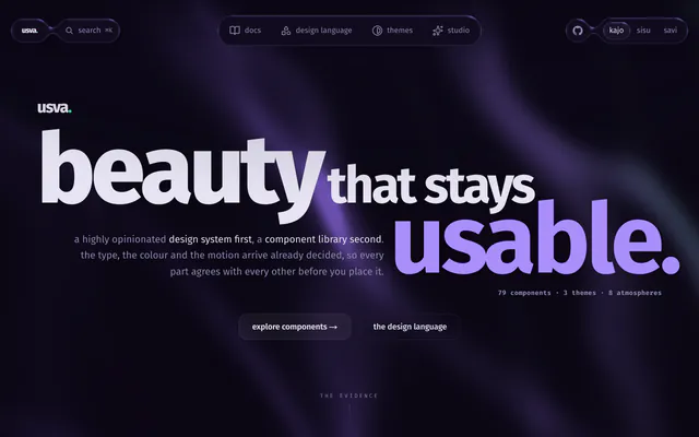
 usvaRegistryusva is a source-available React design system with 79 components and three themes on Base UI, installable from npm or a shadcn-compatible registry.
 Better DesignRegistryBetter Design is a registry of full design systems, 87 components each, with an MCP server that helps coding agents choose and install one.
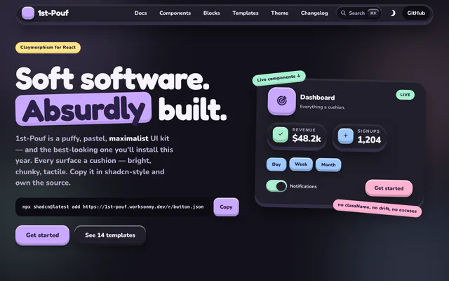
 1st-PoufRegistry1st-Pouf is a free claymorphism UI kit for React and Tailwind CSS 4, with 38 components, 14 blocks and 14 templates in a shadcn-style registry.
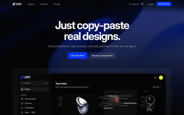
 21stRegistry21st is a library of 12,000+ React and Tailwind CSS components, templates and shadcn themes that you preview live and install with one command.
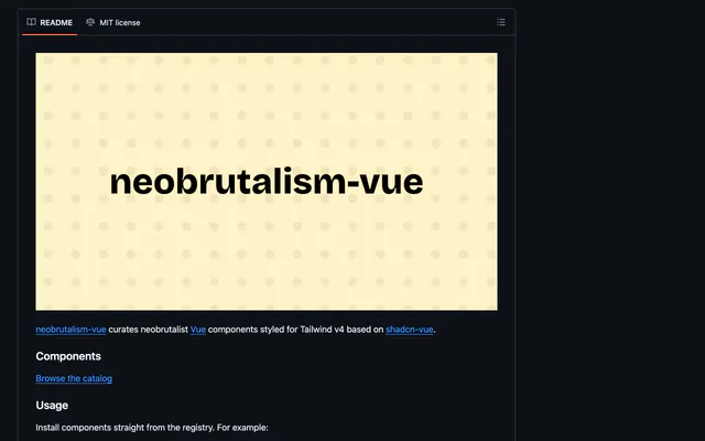
 neobrutalism-vueRegistryneobrutalism-vue is an MIT-licensed registry of neobrutalism-styled Vue components for Tailwind v4, based on shadcn-vue and Reka UI primitives.

Pricing
Ship it with Pro
The directory is free. Pro adds 6,000+ blocks, 14 premium templates and the MCP server, so your AI editor installs them for you.
4.9/5 out of 5 · 150+ reviewsfrom 150+ founders and developers.
- Secure checkout via Stripe
- Code lives in your repo
- Keep what you've shipped if you cancel
- License terms
FAQ
Frequently asked questions
What Interlace UI is, how to install it, its license and its alternatives.
Yes. Each primitive depends on the theme bundle, and you can also install it alone with npx shadcn@latest add @interlace/theme.
A shadcn-compatible registry of 145 React primitives with a theme bundle and an accessibility floor.
Interlace UI lists 145 React primitives, Theme bundle with tokens and keyframes, WCAG 2.2 AA floor, 26 component-modeling rules, Own CLI alongside the shadcn CLI and Storybook for the components.
The directory lists these uses for Interlace UI: Setting up a documented design system in a new React app, Adding a themed button primitive by URL and Authoring a custom theme on top of shared tokens.
The directory does not name a maker for Interlace UI. Its site is https://ds.interlace.tools.
Interlace UI was added to the directory on August 11, 2026.
Interlace UI is in Component Registries. Third-party registries you install from with the shadcn CLI: blocks, components and effects that land in your codebase as source you own.
Design system, Registry, Components, Themes, Accessible, Storybook, shadcn CLI and React. Each tag has a page listing the other resources that carry it.
No. Interlace UI's site cannot be framed, so its page shows screenshots of it and a link to the site.
Run npx shadcn@latest add https://ds.interlace.tools/r/button.json, or use npx interlace-ui add button. The second command also sets up the @interlace namespace.
Interlace UI lists this command: `npx shadcn@latest add https://ds.interlace.tools/r/button.json`. Its docs are at https://ds.interlace.tools/.
Yes, according to its listing: Interlace UI installs with `npx shadcn@latest add https://ds.interlace.tools/r/button.json`.
The directory links no repository for Interlace UI. Its site is https://ds.interlace.tools.
Interlace UI's docs are at https://ds.interlace.tools/.
The directory records no license for Interlace UI. Check its repository or site before you use it.
The directory records no price for Interlace UI. Its site, https://ds.interlace.tools, is where its pricing, if any, is stated.
No. Interlace UI is made by its own maker and listed here as a link. A shadcn.io Pro plan covers shadcn.io's own blocks, templates and tools.
Other resources in Component Registries, newest first: Skrewww, usva, Better Design and 1st-Pouf. Their pages are linked under Similar to Interlace UI.
Open its category, Component Registries, or one of its tags (Design system, Registry and Components): each page lists the resources that share it.
4.9 out of 5 from 150+ developers


Found your stack? Ship it.
6,000+ blocks, premium templates and MCP in every Pro plan. The directory stays free.
Get Pro