abui.io
ABUI
shadcn/ui-compatible registry of reusable components, blocks, and utilities
Component registries that support the shadcn CLI for easy installation.
30 resources
shadcn/ui-compatible registry of reusable components, blocks, and utilities
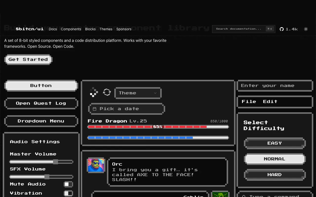
A set of 8-bit styled components for shadcn/ui. Works with your favorite frameworks. Open Source. Open Code.
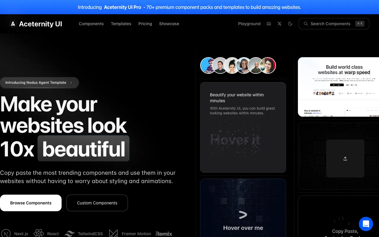
Professional Next.js, Tailwind CSS and Framer Motion components.
A component library to help you build AI-native applications faster. It provides pre-built components like conversations, messages and more.

Opinionated search experiences for your website needs, powered by Algolia.

Fully animated, open-source component distribution built with React, TypeScript, Tailwind CSS, Motion, and Shadcn CLI.
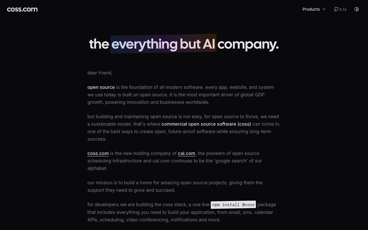
A new, modern UI component library built on top of Base UI. Built for developers and AI.
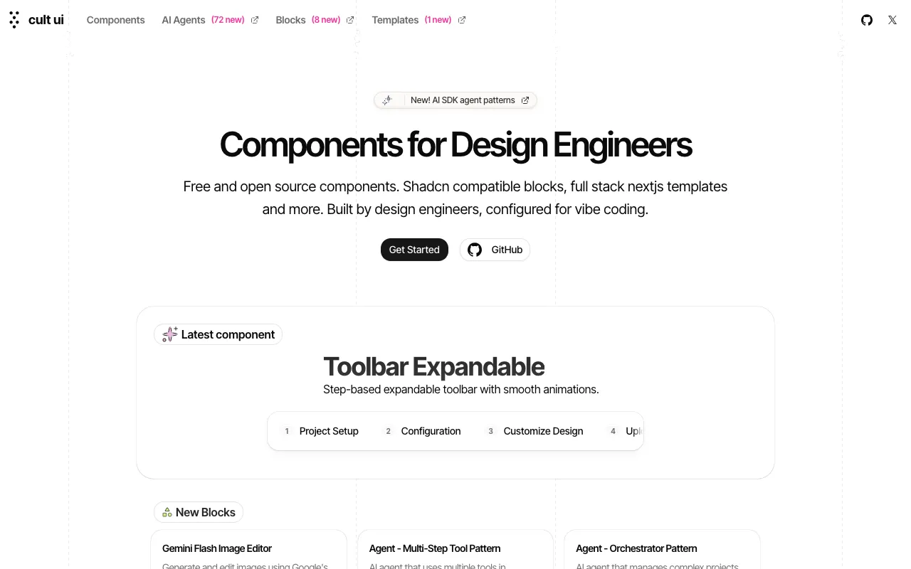
Components crafted for Design Engineers.
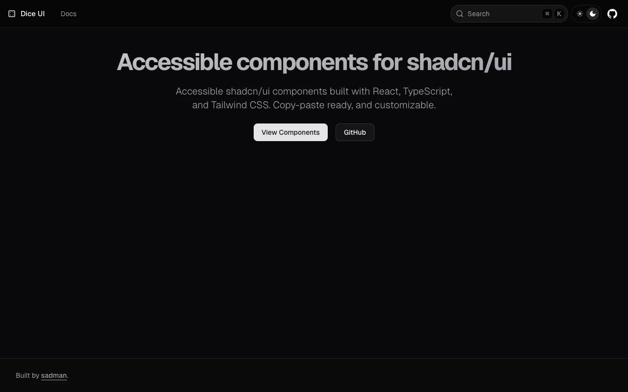
Accessible shadcn/ui components built with React, TypeScript, and Tailwind CSS. Copy-paste ready, and customizable.
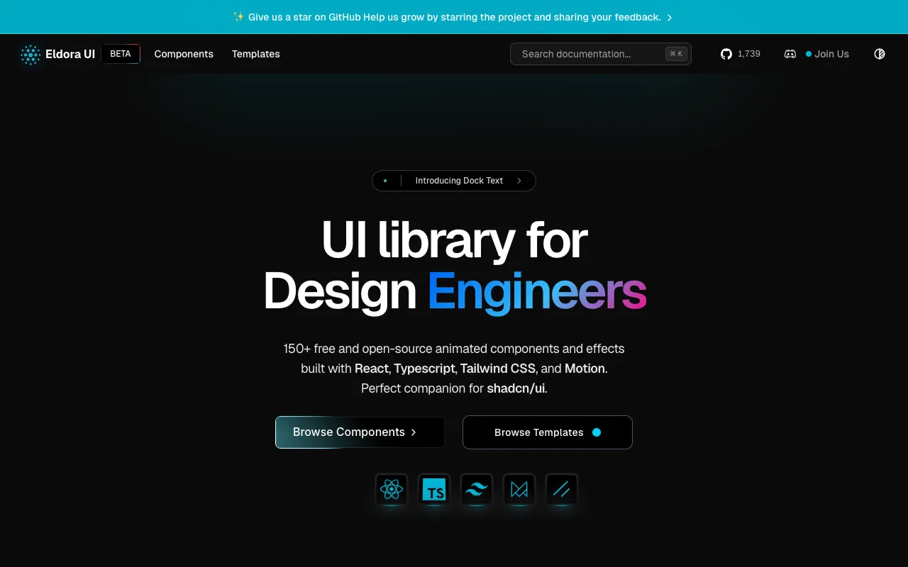
Eldora UI is a collection of re-usable components that you can copy and paste into your web apps. It primarily features components, blocks, and templates.
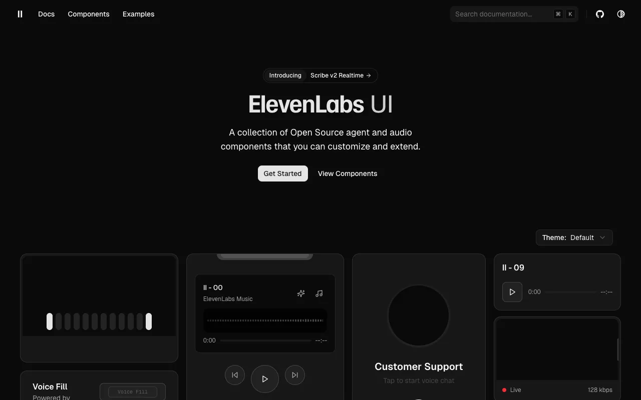
A collection of components designed for agent & audio applications, including orbs, waveforms, voice agents, audio players, and more.
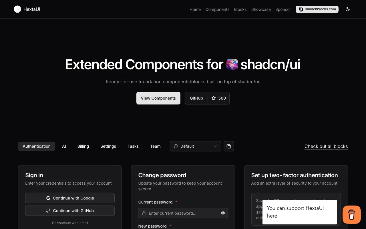
Extended Components & Blocks for shadcn/ui.
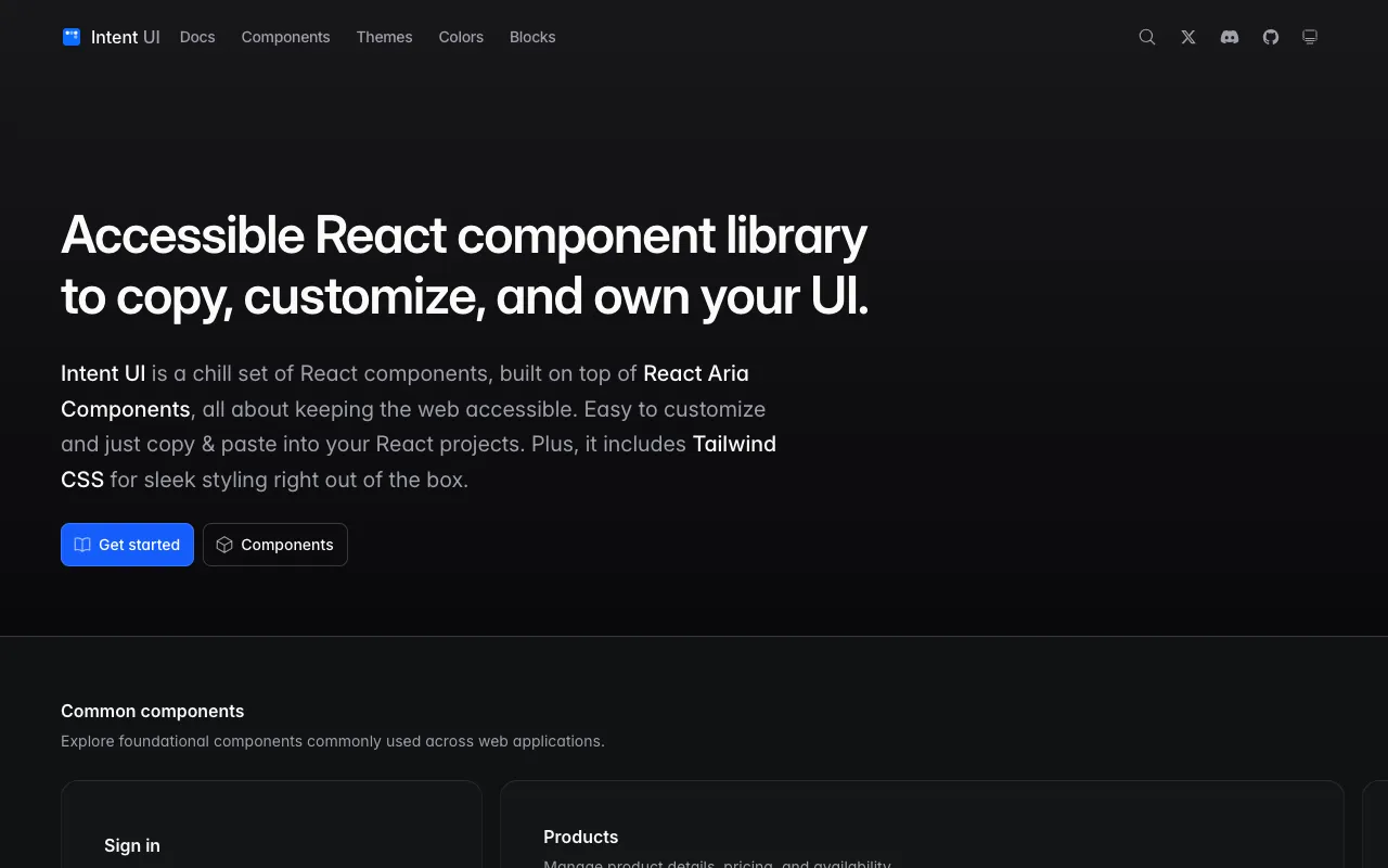
Accessible React component library to copy, customize, and own your UI.
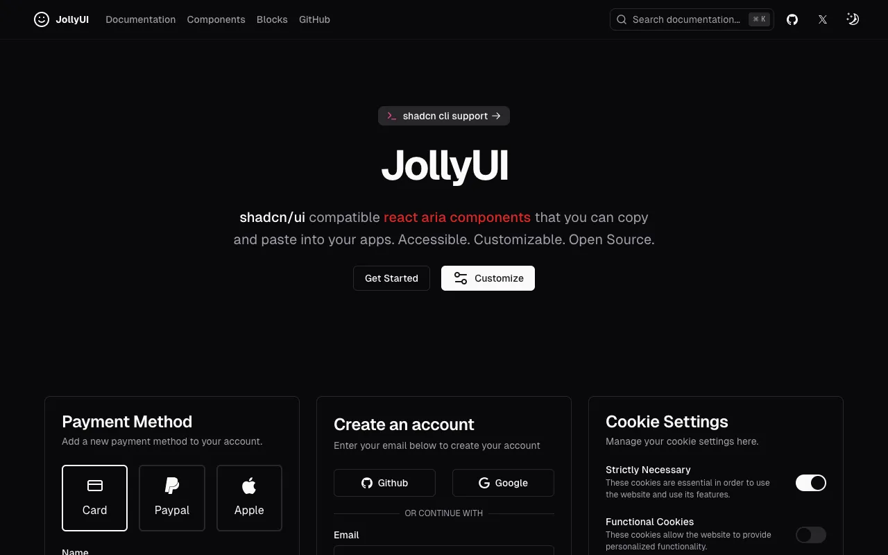
shadcn/ui compatible react aria components that you can copy and paste into your apps. Accessible. Customizable. Open Source.
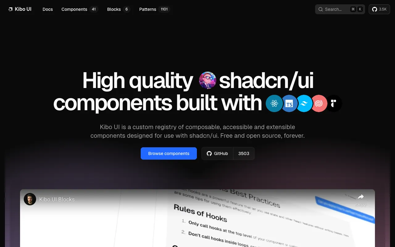
A custom registry of composable, accessible and open source components.
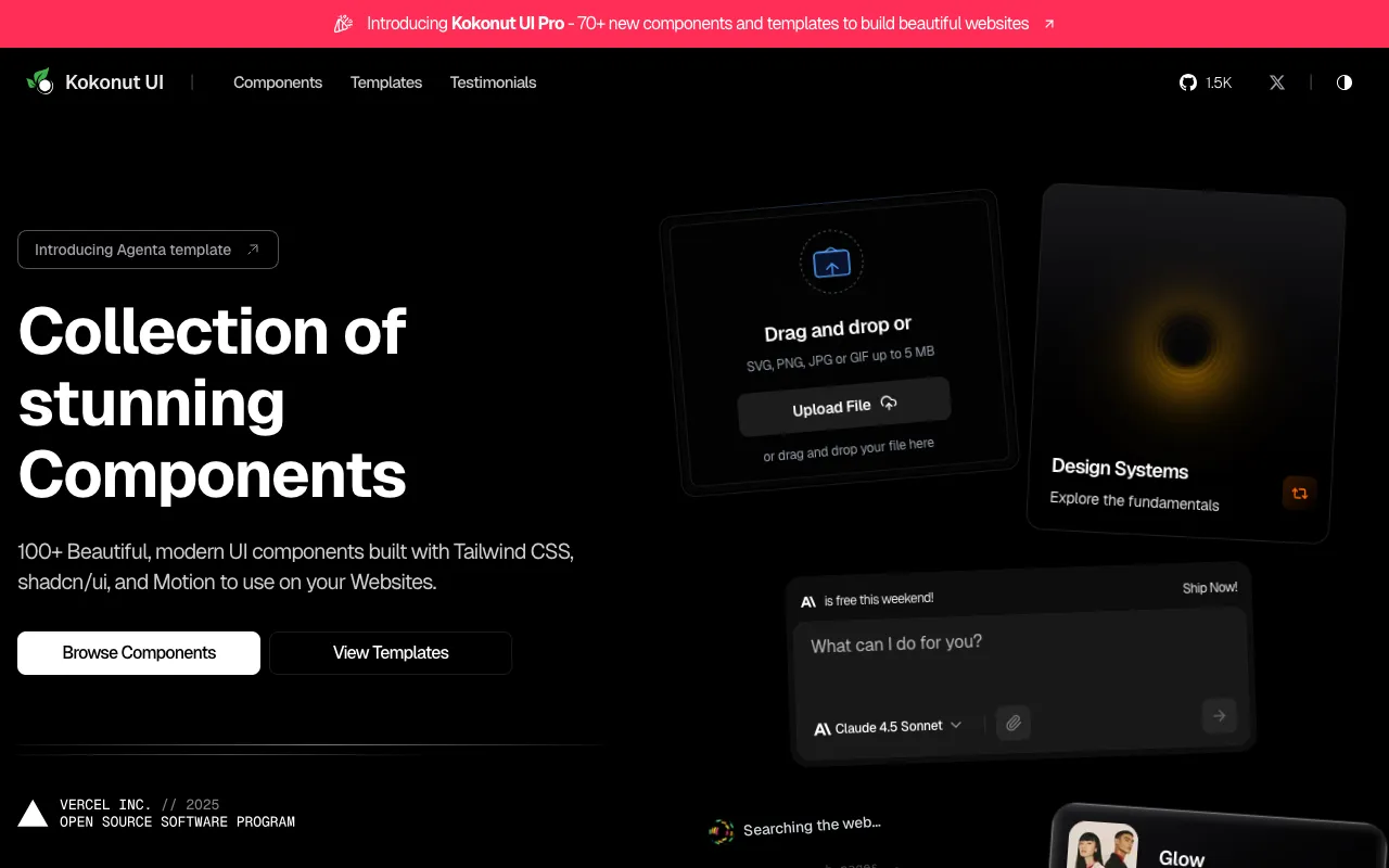
100+ UI components built with Tailwind CSS and shadcn/ui for Next.js.
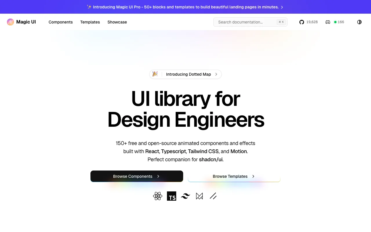
UI library for Design Engineers.
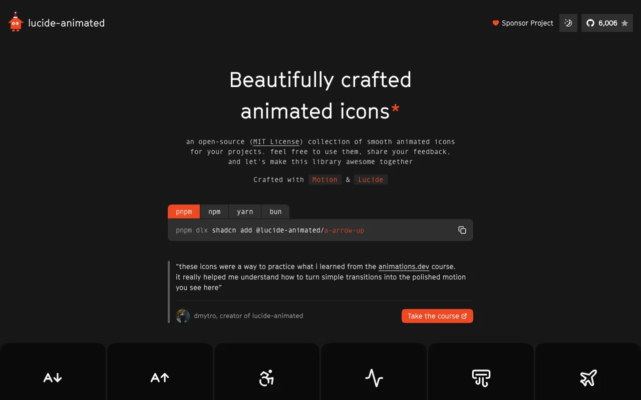
An open-source (MIT License) collection of smooth animated icons for your projects. Built with motion and lucide.
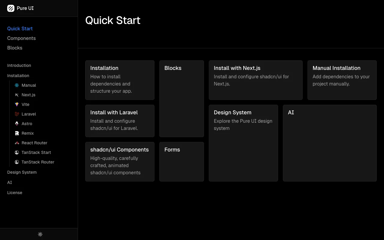
Perfect tools to build next-gen UI.
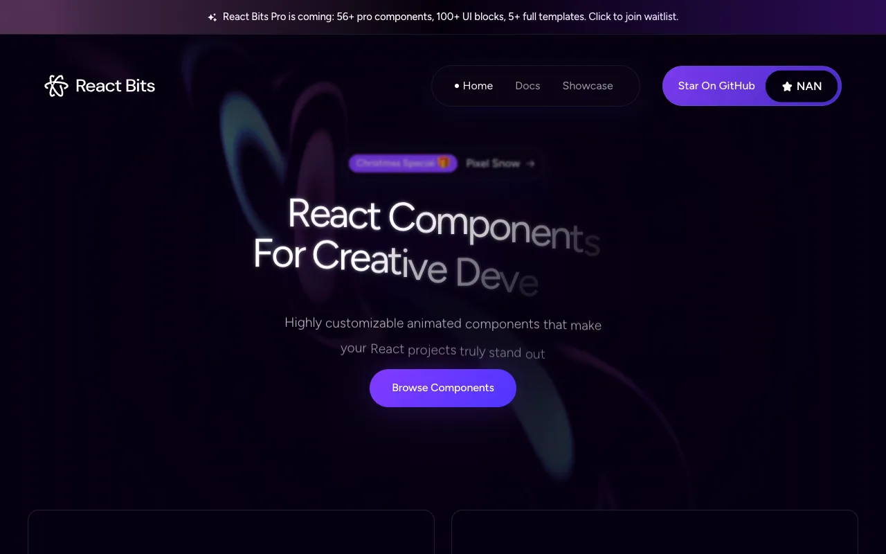
An open source collection of animated, interactive & fully customizable React components for building memorable websites.
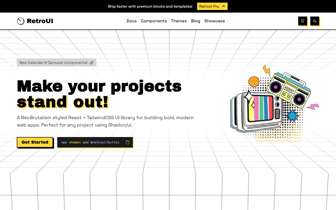
React based component library, inspired by neo-brutalism design system.
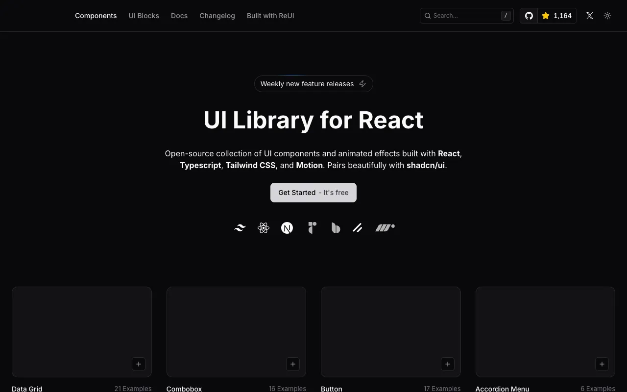
UI components and fully functional apps built with React, Next.js and Tailwind.
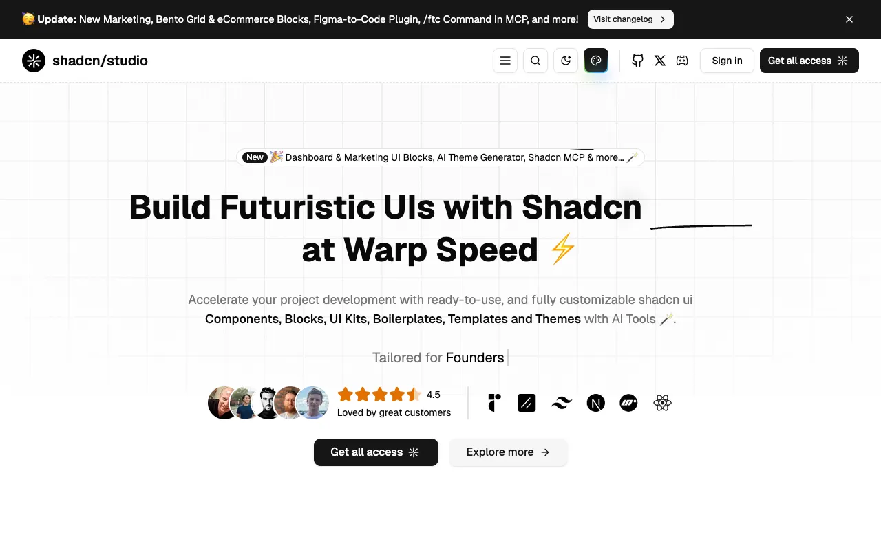
Ready-to-use, customizable shadcn/ui components, blocks, UI kits, boilerplates, templates, and themes — with AI tools.
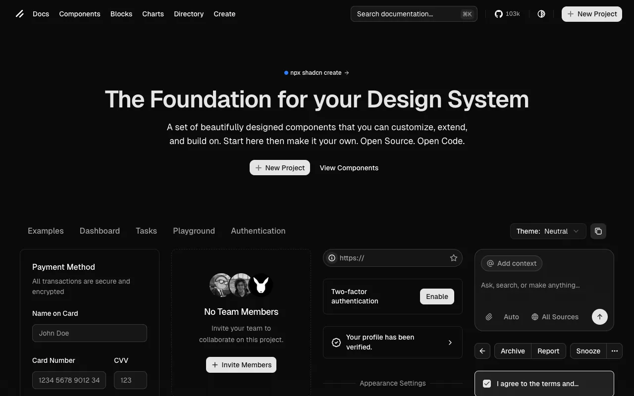
The official registry for shadcn/ui components.
A custom registry of production-ready, animated components for shadcn/ui. Built with React, Tailwind CSS, and Framer Motion.
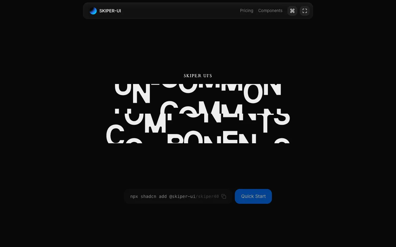
Skiper UI - Un-common Components for shadcn/ui.
Generate color palettes and typography styles. Tailored to your project. Distributed on shadcn. Edit the results to make it your own.
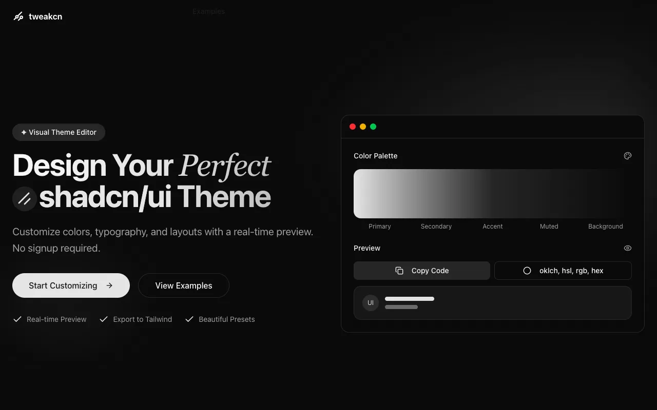
A powerful Theme Editor for shadcn/ui.
A collection of accessible components that fit perfectly with Shadcn.
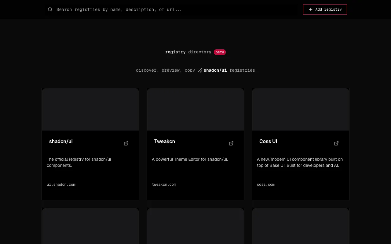
A curated directory to discover, preview, and copy shadcn/ui registries.