React Highlight Popover
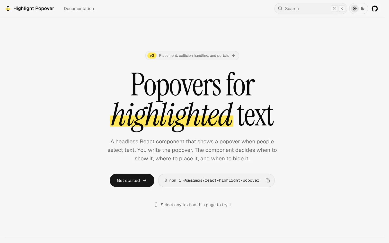
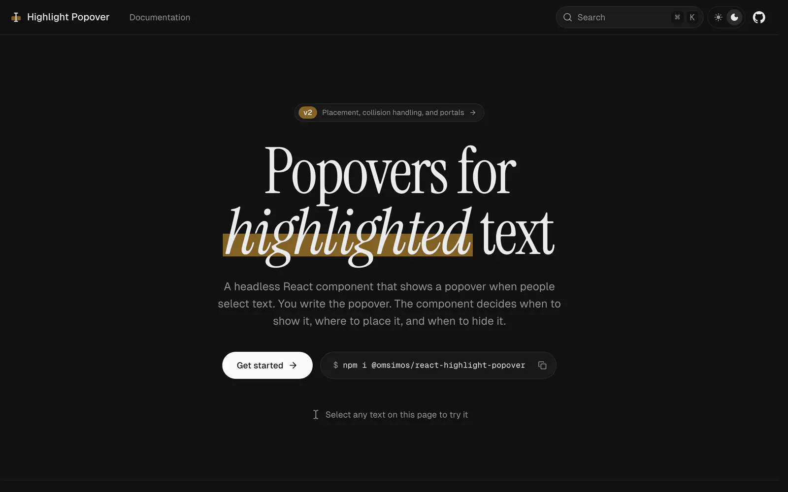
A headless React component that shows your own popover when someone selects text.
- Category
- Libraries & Components
- Added
- Price
- Free
About
About React Highlight Popover
React Highlight Popover handles the hard part of selection popovers while you supply the markup. You wrap the text people can select and pass a renderPopover function; the component decides when to show the popover, where to put it and when to hide it. The popover flips and shifts to stay on screen, follows the text on scroll and resize, and waits until the mouse is released instead of appearing mid-drag. Escape hides it, keyboard selections show it, and popoverProps sets ARIA attributes.
Install it with npm i @omsimos/react-highlight-popover. The build carries a use client directive, so you can render it from a Server Component, and a useHighlightPopover hook inside the popover reads the selection or closes it. It suits comment, quote, highlight and AI-rewrite features. MIT licensed, by omsimos.
React Highlight Popover features
6 features
- Headless with no styles of its own
- About 2.4 kB gzipped, no dependencies
- Collision handling that follows scroll
- Waits for mouse release
- Keyboard and ARIA support
- Server Component friendly
Install React Highlight Popover
1 command
Terminal
$ npm i @omsimos/react-highlight-popoverWhat you can build with React Highlight Popover
3 use cases
- Adding a comment button over highlighted article text
- Offering a share-quote popover in a blog
- Showing AI rewrite actions on selected text
Libraries & Components
Similar to React Highlight Popover
More libraries & components like React Highlight Popover: the closest by what they do, then the most starred.
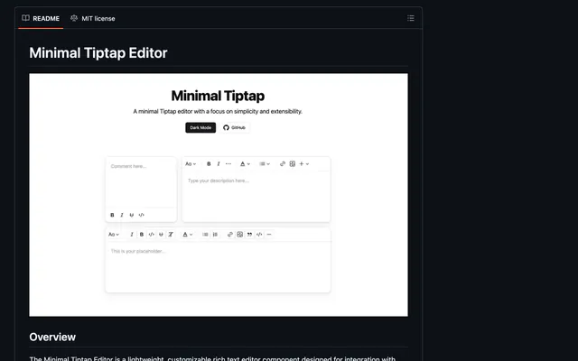
 Minimal TiptapLibraryMinimal Tiptap is a customizable rich text editor for shadcn/ui projects, with image upload, code blocks, tables and HTML, JSON or Markdown output.
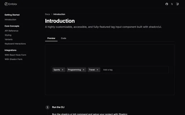
 EmblorLibraryEmblor is an npm package that adds a tag input to shadcn/ui forms. It is accessible, customizable and ready to drop into a React form with a few props.
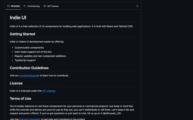
 Indie UILibraryIndie UI is a free, MIT-licensed collection of React and Tailwind CSS components with variants, dark mode support and TypeScript types for web apps.
 Shadcn Google MapsLibraryShadcn Google Maps is a Places autocomplete input for shadcn/ui built on Google's newer AutocompleteSuggestion API, with session tokens and typed results.
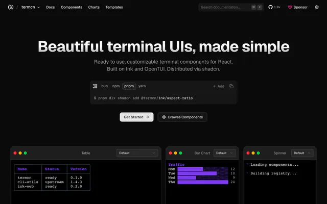
 termcnLibrarytermcn is a collection of customizable terminal UI components for React on Ink and OpenTUI, with dozens of color themes, installed via shadcn.
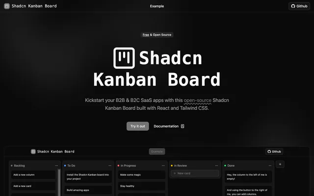
 Shadcn Kanban BoardLibraryShadcn Kanban Board is a free, open-source board for React and Tailwind CSS with drag and drop, screen-reader support and theming, installed via CLI.
Pricing
Ship it with Pro
The directory is free. Pro adds 6,000+ blocks, 14 premium templates and the MCP server, so your AI editor installs them for you.
4.9/5 out of 5 · 150+ reviewsfrom 150+ founders and developers.
- Secure checkout via Stripe
- Code lives in your repo
- Keep what you've shipped if you cancel
- License terms
FAQ
Frequently asked questions
What React Highlight Popover is, how to install it, its license and its alternatives.
No. It is headless: you write the popover markup and styling, and the component handles placement and timing.
A headless React component that shows your own popover when someone selects text.
React Highlight Popover lists Headless with no styles of its own, About 2.4 kB gzipped, no dependencies, Collision handling that follows scroll, Waits for mouse release, Keyboard and ARIA support and Server Component friendly.
The directory lists these uses for React Highlight Popover: Adding a comment button over highlighted article text, Offering a share-quote popover in a blog and Showing AI rewrite actions on selected text.
The directory does not name a maker for React Highlight Popover. Its site is https://react-highlight-popover.omsimos.com.
React Highlight Popover was added to the directory on December 27, 2024.
React Highlight Popover is in Libraries & Components. Component libraries and standalone components built on shadcn/ui, covering the data tables, pickers, editors and charts the core set leaves out.
Components, React, Accessible, Customizable and Free. Each tag has a page listing the other resources that carry it.
Yes. React Highlight Popover's page has a Live tab beside the screenshot that loads its site in a frame.
Run npm i @omsimos/react-highlight-popover, then wrap selectable text in HighlightPopover with a renderPopover function.
React Highlight Popover lists this command: `npm i @omsimos/react-highlight-popover`.
The directory lists no shadcn CLI command for React Highlight Popover. Check its docs at https://react-highlight-popover.omsimos.com for how to add it.
The directory links no repository for React Highlight Popover. Its site is https://react-highlight-popover.omsimos.com.
The directory links no separate docs for React Highlight Popover; start from its site at https://react-highlight-popover.omsimos.com.
The directory records no license for React Highlight Popover. Check its repository or site before you use it.
The directory records no price for React Highlight Popover. Its site, https://react-highlight-popover.omsimos.com, is where its pricing, if any, is stated.
No. React Highlight Popover is made by its own maker and listed here as a link. A shadcn.io Pro plan covers shadcn.io's own blocks, templates and tools.
Other resources in Libraries & Components, newest first: Minimal Tiptap, Emblor, Indie UI and Shadcn Google Maps. Their pages are linked under Similar to React Highlight Popover.
Open its category, Libraries & Components, or one of its tags (Components, React and Accessible): each page lists the resources that share it.
4.9 out of 5 from 150+ developers


Found your stack? Ship it.
6,000+ blocks, premium templates and MCP in every Pro plan. The directory stays free.
Get Pro