nativecn-ui
A CLI-driven React Native component set with NativeWind, CSS variables and built-in dark mode.
- Category
- Framework Ports
- Added
- GitHub stars
- 1.2k
- License
- MIT
- Price
- Free
About
About nativecn-ui
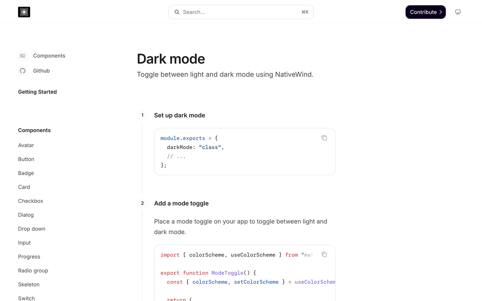
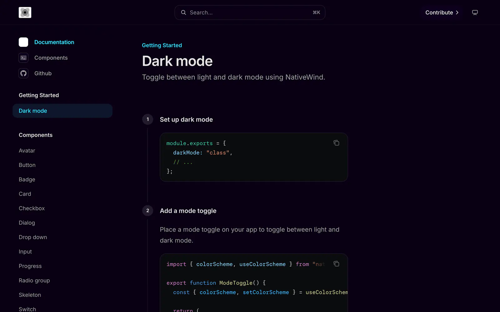
nativecn-ui offers customizable React Native components inspired by shadcn-ui. Styling runs on NativeWind with CSS variables, and dark mode is built in: the docs show how to set darkMode to class and add a mode toggle using NativeWind's useColorScheme. The checklist covers avatar, badge, button, card, checkbox, dialog, input, progress, radio group, select, switch, tabs and toast, with alert and form still in progress.
In an Expo project, run npx nativecn-ui init, then add components one by one with npx nativecn-ui add Avatar, or all at once with the -a flag. The docs are hosted on Mintlify. The repo has about 1,160 stars and an MIT license, but its last push was in September 2024.
nativecn-ui features
6 features
- Init and add commands
- NativeWind styling
- CSS variables for theming
- Built-in dark mode
- Avatar, dialog, select and tabs
- MIT license
Install nativecn-ui
1 command
Terminal
$ npx nativecn-ui initWhat you can build with nativecn-ui
3 use cases
- Starting an Expo app with a themed component set
- Adding a dark mode toggle to a React Native screen
- Pulling in a single avatar or toast component
Links
1 link
Framework Ports
Similar to nativecn-ui
More framework ports like nativecn-ui: the closest by what they do, then the most starred.
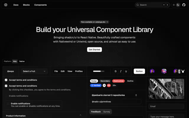
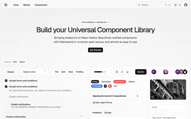 React Native ReusablesPortReact Native Reusables brings shadcn/ui to React Native with Nativewind or Uniwind styling, a live preview and open-source, MIT-licensed code.
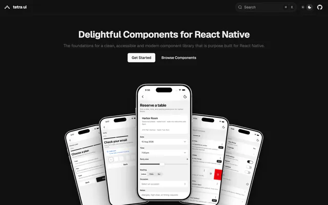
 tetra-uiPorttetra-ui adds 30-plus copy-paste React Native components with the shadcn CLI, styled with Uniwind and tuned for touch on Expo. MIT license.
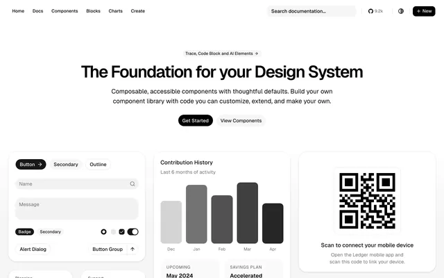 shadcn-sveltePortshadcn-svelte is the community Svelte port of shadcn/ui, with composable, accessible components built on Bits UI and Tailwind CSS under MIT.
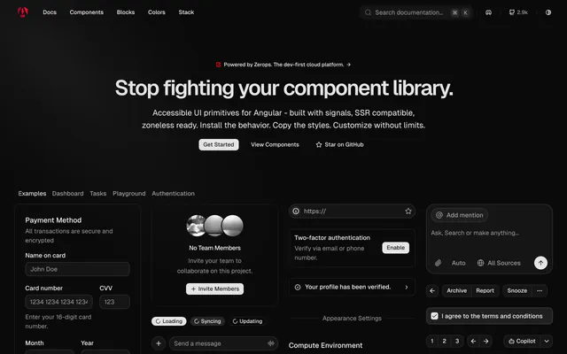
 spartanPortspartan is an Angular take on shadcn/ui: headless primitives built on signals, styled components you copy in, and an AnalogJs full-stack setup.
 shadcn-templPortshadcn-templ is an unofficial, MIT-licensed port of shadcn/ui for Go and templ. Components are open code you copy in and extend.
 SaladUIPortSaladUI is a Phoenix LiveView component library inspired by shadcn/ui, with Tailwind CSS styling, a live storybook and an MIT license.
Pricing
Ship it with Pro
The directory is free. Pro adds 6,000+ blocks, 14 premium templates and the MCP server, so your AI editor installs them for you.
4.9/5 out of 5 · 150+ reviewsfrom 150+ founders and developers.
- Secure checkout via Stripe
- Code lives in your repo
- Keep what you've shipped if you cancel
- License terms
FAQ
Frequently asked questions
What nativecn-ui is, how to install it, its license and its alternatives.
A CLI-driven React Native component set with NativeWind, CSS variables and built-in dark mode.
nativecn-ui lists Init and add commands, NativeWind styling, CSS variables for theming, Built-in dark mode, Avatar, dialog, select and tabs and MIT license.
The directory lists these uses for nativecn-ui: Starting an Expo app with a themed component set, Adding a dark mode toggle to a React Native screen and Pulling in a single avatar or toast component.
nativecn-ui is made by Mobilecn-UI, at https://github.com/Mobilecn-UI. Its site is https://github.com/Mobilecn-UI/nativecn-ui.
nativecn-ui was added to the directory on December 27, 2024.
nativecn-ui is in Framework Ports. shadcn/ui rebuilt for other frameworks and platforms: Vue, Svelte, Solid, Angular, Flutter, React Native and more.
Components, React Native, Expo, Tailwind CSS, Dark mode, CLI, Open source, MIT and Free. Each tag has a page listing the other resources that carry it.
No. nativecn-ui's site cannot be framed, so its page shows screenshots of it and a link to the site.
Run npx nativecn-ui init once in your Expo project, then npx nativecn-ui add followed by a component name such as Avatar.
Run npx nativecn-ui add -a.
nativecn-ui lists this command: `npx nativecn-ui init`. Its docs are at https://nativecn.mintlify.app.
The directory lists no shadcn CLI command for nativecn-ui. Check its docs at https://nativecn.mintlify.app for how to add it.
nativecn-ui's repository is https://github.com/Mobilecn-UI/nativecn-ui.
nativecn-ui's docs are at https://nativecn.mintlify.app.
GitHub lists nativecn-ui under the MIT license. Read the license file in its repository for the terms.
The directory records no price for nativecn-ui. Its site, https://github.com/Mobilecn-UI/nativecn-ui, is where its pricing, if any, is stated.
No. nativecn-ui is made by Mobilecn-UI and listed here as a link. A shadcn.io Pro plan covers shadcn.io's own blocks, templates and tools.
Other resources in Framework Ports, newest first: React Native Reusables, tetra-ui, shadcn-svelte and spartan. Their pages are linked under Similar to nativecn-ui.
Open its category, Framework Ports, or one of its tags (Components, React Native and Expo): each page lists the resources that share it.
4.9 out of 5 from 150+ developers


Found your stack? Ship it.
6,000+ blocks, premium templates and MCP in every Pro plan. The directory stays free.
Get Pro