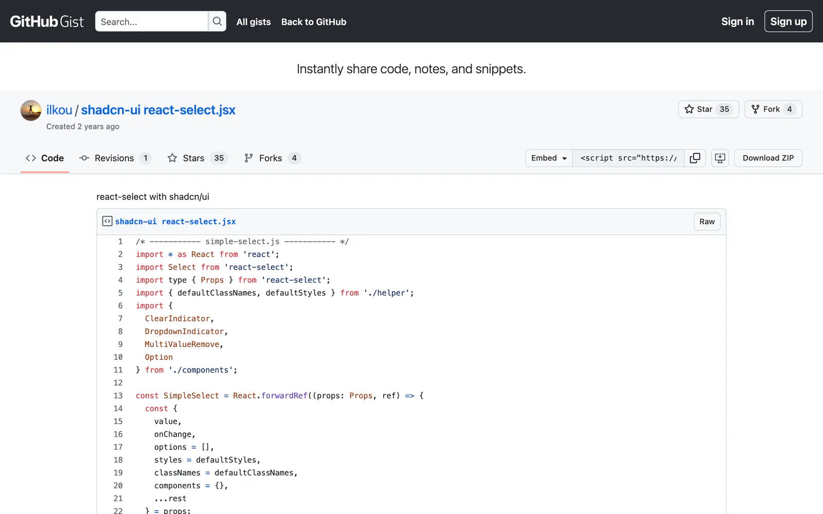
react-select with shadcn/ui
A gist that restyles the react-select library with shadcn/ui tokens, for single and multi selects.
- Category
- Libraries & Components
- Added
About
About react-select with shadcn/ui
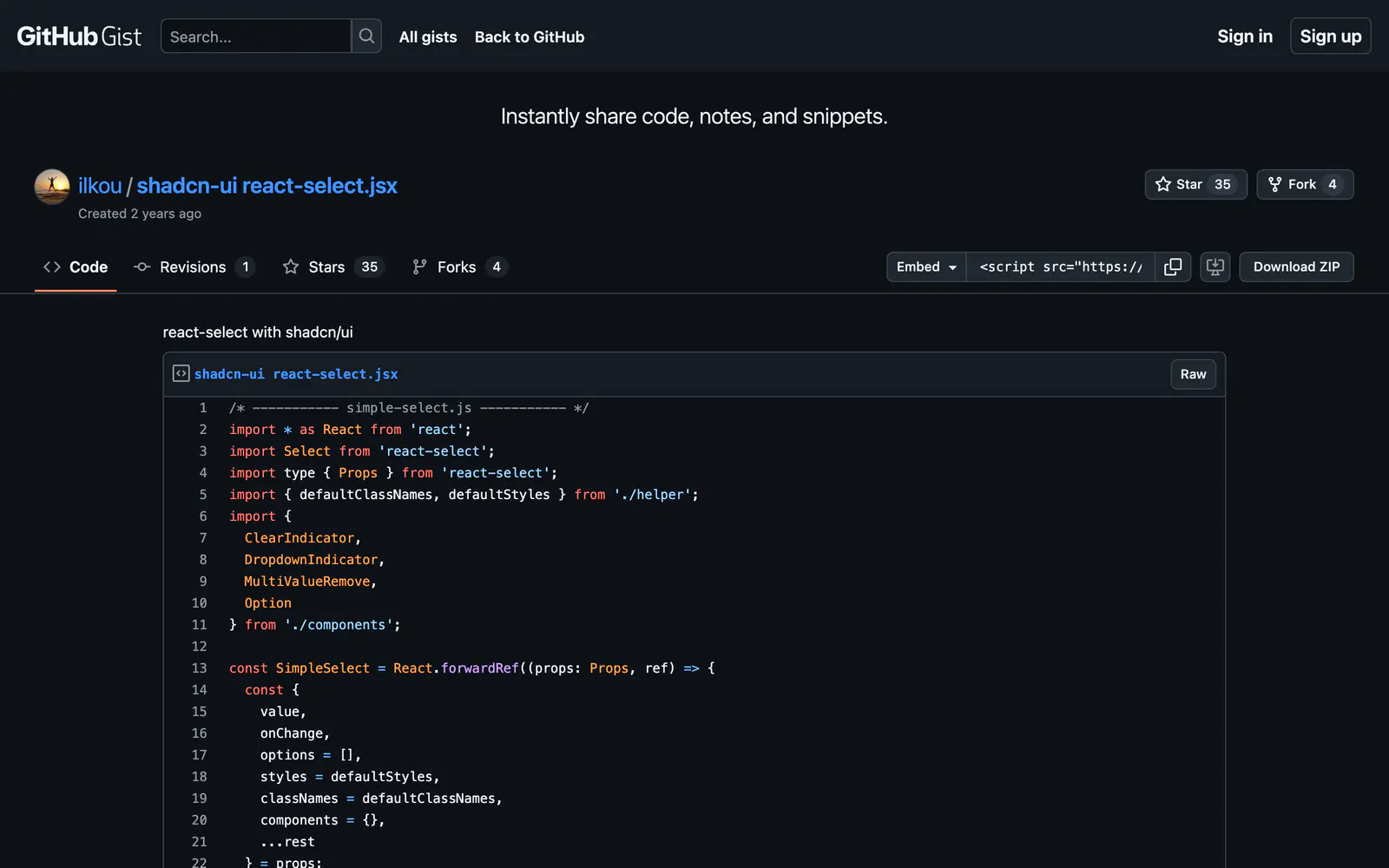
react-select with shadcn/ui is a code gist from ilkou that dresses the widely used react-select library in shadcn/ui's look. It renders react-select in unstyled mode and supplies Tailwind classes drawn from the shadcn token set: border-input and ring-ring on the control, bg-secondary tags for multiple values, and popover colors for the menu. Custom pieces replace the clear indicator, dropdown indicator, multi-value remove button and option rows.
Copy the gist's files into your project, a SimpleSelect wrapper plus a helper file with the style maps and a components file, and pass options the way you would to react-select. Because the underlying library stays, you keep its async, creatable and multi-select features. It suits projects that already depend on react-select and want a consistent theme. The gist has about 35 stars.
react-select with shadcn/ui features
5 features
- react-select in unstyled mode
- shadcn/ui token-based Tailwind classes
- Styled multi-value tags
- Custom clear and dropdown indicators
- Forwarded ref wrapper component
What you can build with react-select with shadcn/ui
3 use cases
- Matching an existing react-select field to a shadcn/ui theme
- Building a multi-select tag picker for a form
- Keeping react-select features while changing its look
Libraries & Components
Similar to react-select with shadcn/ui
More libraries & components like react-select with shadcn/ui: the closest by what they do, then the most starred.
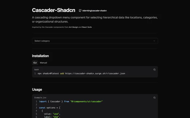
 Cascader-ShadcnLibraryCascader-Shadcn adds an Ant Design-style cascading dropdown to shadcn/ui for hierarchical data, with click or hover expansion. Install it via the CLI.
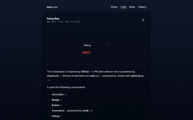
 Fancy BoxLibraryFancy Box is a multi-select combobox with label creation and editing, modeled on GitHub's pull request labels and built from shadcn/ui parts.
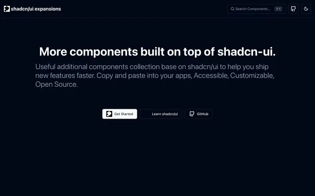
 shadcn/ui expansionsLibraryshadcn/ui expansions adds components the base set lacks: autosize textarea, datetime picker, multiple selector and infinite scroll. Copy and paste them.
 Country State DropdownLibraryCountry State Dropdown is a Next.js demo of linked country and state selects built with Tailwind CSS, shadcn/ui and Zustand. Copy it into your forms.
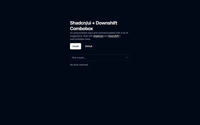
 Shadcn/ui + Downshift ComboboxLibraryCombobox for shadcn/ui driven by Downshift's useCombobox hook, giving you an autocomplete input with a list of suggestions. MIT licensed.
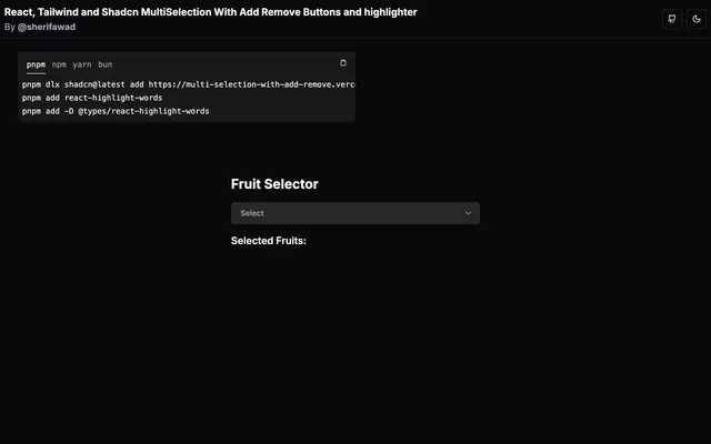
 Multi-SelectionLibraryMulti-Selection is a small React, Tailwind CSS and TypeScript demo of a multi-select field that adds and removes items and highlights the chosen ones.
Pricing
Ship it with Pro
The directory is free. Pro adds 6,000+ blocks, 14 premium templates and the MCP server, so your AI editor installs them for you.
4.9/5 out of 5 · 150+ reviewsfrom 150+ founders and developers.
- Secure checkout via Stripe
- Code lives in your repo
- Keep what you've shipped if you cancel
- License terms
FAQ
Frequently asked questions
What react-select with shadcn/ui is, how to install it, its license and its alternatives.
Copy the SimpleSelect component, the helper styles and the custom indicator components from the gist, then pass options and value as you would to react-select.
No. It wraps the react-select library and only changes the styling.
A gist that restyles the react-select library with shadcn/ui tokens, for single and multi selects.
react-select with shadcn/ui lists react-select in unstyled mode, shadcn/ui token-based Tailwind classes, Styled multi-value tags, Custom clear and dropdown indicators and Forwarded ref wrapper component.
The directory lists these uses for react-select with shadcn/ui: Matching an existing react-select field to a shadcn/ui theme, Building a multi-select tag picker for a form and Keeping react-select features while changing its look.
The directory does not name a maker for react-select with shadcn/ui. Its site is https://gist.github.com/ilkou/7bf2dbd42a7faf70053b43034fc4b5a4.
react-select with shadcn/ui was added to the directory on December 27, 2024.
react-select with shadcn/ui is in Libraries & Components. Component libraries and standalone components built on shadcn/ui, covering the data tables, pickers, editors and charts the core set leaves out.
Select and combobox, Inputs, Components, React, Tailwind CSS, Customizable and Copy and paste. Each tag has a page listing the other resources that carry it.
No. react-select with shadcn/ui's site cannot be framed, so its page shows screenshots of it and a link to the site.
The directory lists no install command for react-select with shadcn/ui. Follow the instructions on its site at https://gist.github.com/ilkou/7bf2dbd42a7faf70053b43034fc4b5a4.
The directory lists no shadcn CLI command for react-select with shadcn/ui. Check its docs at https://gist.github.com/ilkou/7bf2dbd42a7faf70053b43034fc4b5a4 for how to add it.
The directory links no repository for react-select with shadcn/ui. Its site is https://gist.github.com/ilkou/7bf2dbd42a7faf70053b43034fc4b5a4.
The directory links no separate docs for react-select with shadcn/ui; start from its site at https://gist.github.com/ilkou/7bf2dbd42a7faf70053b43034fc4b5a4.
The directory records no license for react-select with shadcn/ui. Check its repository or site before you use it.
The directory records no price for react-select with shadcn/ui. Its site, https://gist.github.com/ilkou/7bf2dbd42a7faf70053b43034fc4b5a4, is where its pricing, if any, is stated.
No. react-select with shadcn/ui is made by its own maker and listed here as a link. A shadcn.io Pro plan covers shadcn.io's own blocks, templates and tools.
Other resources in Libraries & Components, newest first: Cascader-Shadcn, Fancy Box, shadcn/ui expansions and Country State Dropdown. Their pages are linked under Similar to react-select with shadcn/ui.
Open its category, Libraries & Components, or one of its tags (Select and combobox, Inputs and Components): each page lists the resources that share it.
4.9 out of 5 from 150+ developers


Found your stack? Ship it.
6,000+ blocks, premium templates and MCP in every Pro plan. The directory stays free.
Get Pro