Shadcn Font Picker
A font picker for React that lists Google Fonts in a searchable dropdown built from shadcn/ui parts.
- Category
- Libraries & Components
- Added
About
About Shadcn Font Picker
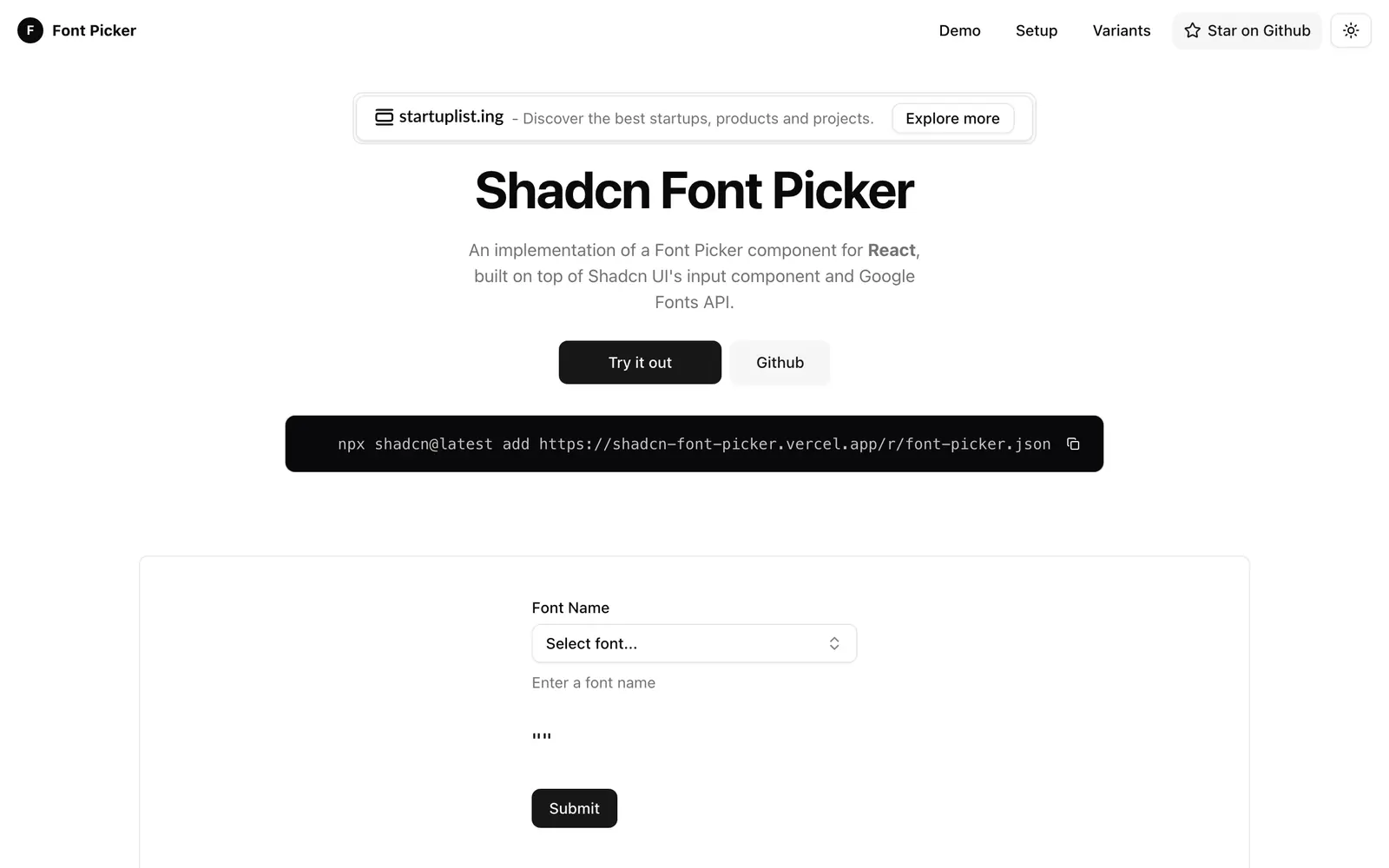
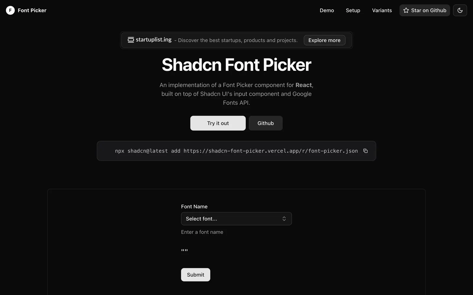
Shadcn Font Picker is a component for choosing a font by name. It is built on shadcn/ui's input components and the Google Fonts API, and the demo has a Select font control plus a field where you enter a font name. It uses react-window to keep long font lists responsive.
Install it with the shadcn CLI using the font-picker.json registry URL. The setup guide also has you add button, command, dropdown-menu and popover, install react-window and its types, create a Google Fonts API key in the Google console, and save it as NEXT_PUBLIC_GOOGLE_FONTS_API_KEY in your .env file. Check the project site for repository and license details. It suits editors, theme builders and brand settings pages where users pick a typeface for their content.
Shadcn Font Picker features
5 features
- Searchable list of Google Fonts
- Built on shadcn/ui command and popover
- react-window for long lists
- Install through the shadcn CLI
- Font name input field
Install Shadcn Font Picker
1 command
Terminal
$ npx shadcn@latest add https://shadcn-font-picker.vercel.app/r/font-picker.jsonWhat you can build with Shadcn Font Picker
3 use cases
- Choosing a heading font in a theme customizer
- Letting users style text blocks in a page builder
- Setting a brand typeface in workspace settings
Links
1 link
Libraries & Components
Similar to Shadcn Font Picker
More libraries & components like Shadcn Font Picker: the closest by what they do, then the most starred.
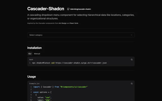
 Cascader-ShadcnLibraryCascader-Shadcn adds an Ant Design-style cascading dropdown to shadcn/ui for hierarchical data, with click or hover expansion. Install it via the CLI.
 Shadcn Icon PickerLibraryShadcn Icon Picker lets users choose a Lucide icon from a virtualized list built with shadcn/ui and TanStack Virtual, with controlled and custom modes.
 Multi Select ComponentLibraryMulti Select Component is a React and TypeScript multi-select built with shadcn/ui and Radix UI, with search, animations, variants and accessibility.
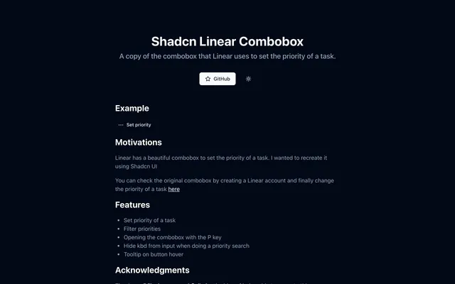
 Shadcn Linear ComboboxLibraryShadcn Linear Combobox recreates the priority selector from Linear using shadcn/ui, with filtering, a P key shortcut and tooltips on the trigger button.
 Country State DropdownLibraryCountry State Dropdown is a Next.js demo of linked country and state selects built with Tailwind CSS, shadcn/ui and Zustand. Copy it into your forms.
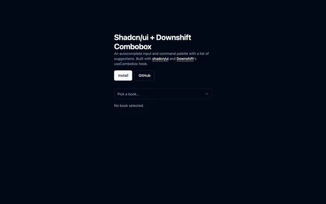
 Shadcn/ui + Downshift ComboboxLibraryCombobox for shadcn/ui driven by Downshift's useCombobox hook, giving you an autocomplete input with a list of suggestions. MIT licensed.


Pricing
Ship it with Pro
The directory is free. Pro adds 6,000+ blocks, 14 premium templates and the MCP server, so your AI editor installs them for you.
4.9/5 out of 5 · 150+ reviewsfrom 150+ founders and developers.
- Secure checkout via Stripe
- Code lives in your repo
- Keep what you've shipped if you cancel
- License terms
FAQ
Frequently asked questions
What Shadcn Font Picker is, how to install it, its license and its alternatives.
Yes. Generate a Google Fonts API key in the Google console and put it in your .env file as NEXT_PUBLIC_GOOGLE_FONTS_API_KEY.
A font picker for React that lists Google Fonts in a searchable dropdown built from shadcn/ui parts.
Shadcn Font Picker lists Searchable list of Google Fonts, Built on shadcn/ui command and popover, react-window for long lists, Install through the shadcn CLI and Font name input field.
The directory lists these uses for Shadcn Font Picker: Choosing a heading font in a theme customizer, Letting users style text blocks in a page builder and Setting a brand typeface in workspace settings.
The directory does not name a maker for Shadcn Font Picker. Its site is https://shadcn-font-picker.vercel.app.
Shadcn Font Picker was added to the directory on April 15, 2025.
Shadcn Font Picker is in Libraries & Components. Component libraries and standalone components built on shadcn/ui, covering the data tables, pickers, editors and charts the core set leaves out.
Components, Select and combobox, Inputs, shadcn CLI, React and Next.js. Each tag has a page listing the other resources that carry it.
Yes. Shadcn Font Picker's page has a Live tab beside the screenshot that loads its site in a frame.
Run npx shadcn@latest add with the font-picker.json URL from the site, after adding the button, command, dropdown-menu and popover components.
Shadcn Font Picker lists this command: `npx shadcn@latest add https://shadcn-font-picker.vercel.app/r/font-picker.json`. Its docs are at https://shadcn-font-picker.vercel.app/.
Yes, according to its listing: Shadcn Font Picker installs with `npx shadcn@latest add https://shadcn-font-picker.vercel.app/r/font-picker.json`.
The directory links no repository for Shadcn Font Picker. Its site is https://shadcn-font-picker.vercel.app.
Shadcn Font Picker's docs are at https://shadcn-font-picker.vercel.app/.
The directory records no license for Shadcn Font Picker. Check its repository or site before you use it.
The directory records no price for Shadcn Font Picker. Its site, https://shadcn-font-picker.vercel.app, is where its pricing, if any, is stated.
No. Shadcn Font Picker is made by its own maker and listed here as a link. A shadcn.io Pro plan covers shadcn.io's own blocks, templates and tools.
Other resources in Libraries & Components, newest first: Cascader-Shadcn, Shadcn Icon Picker, Multi Select Component and Shadcn Linear Combobox. Their pages are linked under Similar to Shadcn Font Picker.
Open its category, Libraries & Components, or one of its tags (Components, Select and combobox and Inputs): each page lists the resources that share it.
4.9 out of 5 from 150+ developers


Found your stack? Ship it.
6,000+ blocks, premium templates and MCP in every Pro plan. The directory stays free.
Get Pro