Tour
A component for building step-by-step onboarding tours that fits into a shadcn/ui project.
- Category
- Libraries & Components
- Added
About
About Tour
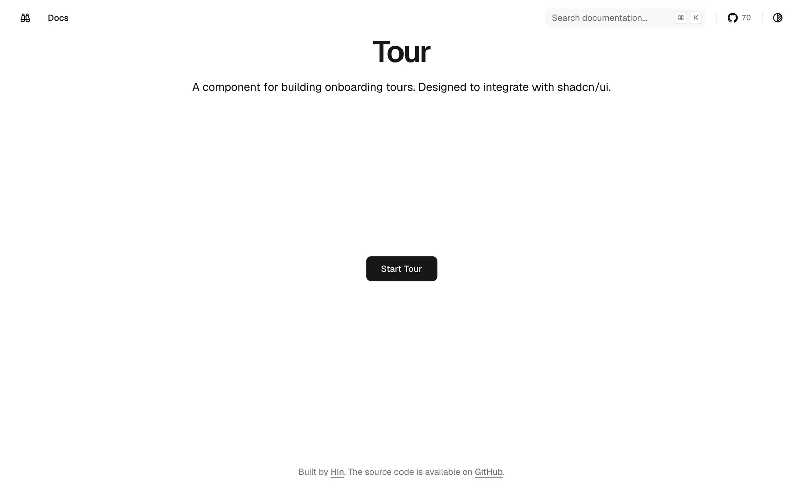
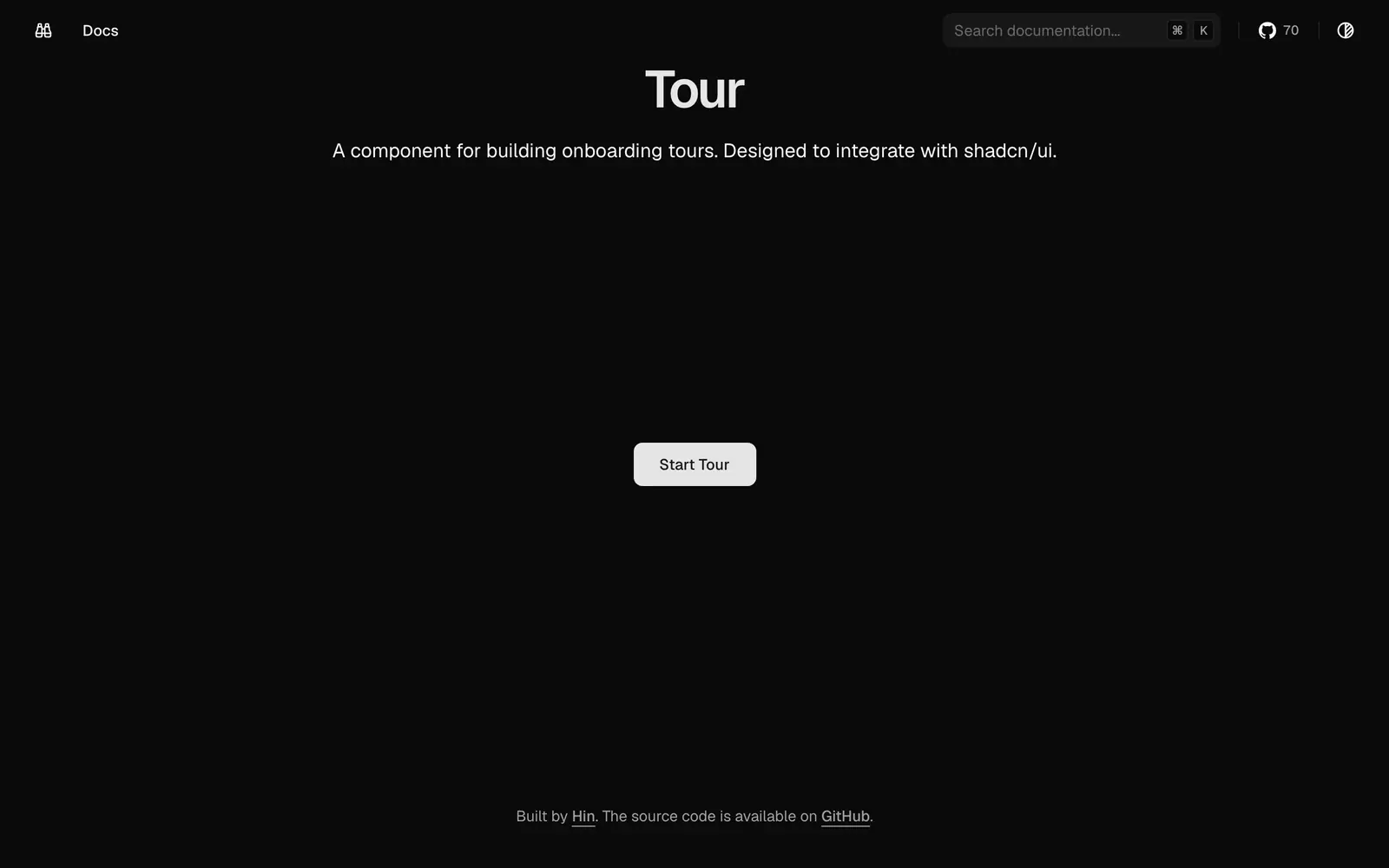
Tour is a component for building onboarding tours, designed to integrate with shadcn/ui. The demo site is minimal: a heading and a Start Tour button that launches the walkthrough on the page itself.
Look at the demo and its code before adopting it. A component like this fits first-run product tours, feature announcements and guided setup flows in apps that already use shadcn/ui and want the highlight steps to follow the same styling as the rest of the interface rather than pulling in a separate tour library.
Tour features
4 features
- Onboarding tour component
- Designed for shadcn/ui
- Start Tour trigger
- Step-by-step walkthrough
What you can build with Tour
3 use cases
- Guiding new users through a dashboard on first login
- Announcing a new feature with a short walkthrough
- Explaining a multi-step setup screen
Libraries & Components
Similar to Tour
More libraries & components like Tour: the closest by what they do, then the most starred.
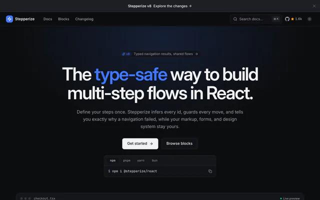
 StepperizeLibraryStepperize builds type-safe multi-step flows in React: define steps once, guard each move, and render them in your own shadcn/ui markup.
 Tour KitLibraryTour Kit (userTourKit) is a headless onboarding toolkit for React with tours, hints, checklists and surveys. WCAG 2.1 AA, designed for shadcn/ui.
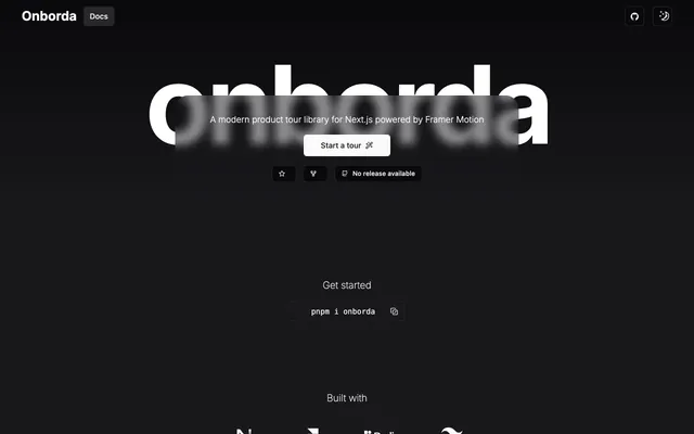
 OnbordaLibraryOnborda builds multi-step product tours in Next.js, using Framer Motion and Radix Portal for animated steps that can follow users across routes.
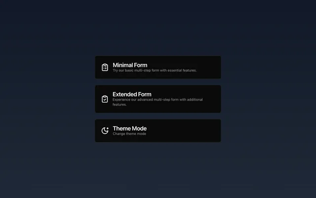
 next-stepperLibrarynext-stepper is a Next.js multi-step form built with shadcn/ui, Zustand and Framer Motion, with progress tracking and conditional step filtering.
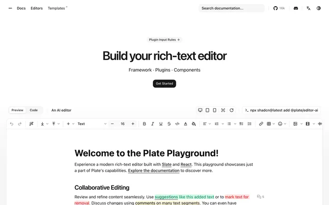 PlateLibraryPlate is an open-source rich-text editor built on Slate and React, with plugins for AI, comments, suggestions, tables and Yjs collaboration.
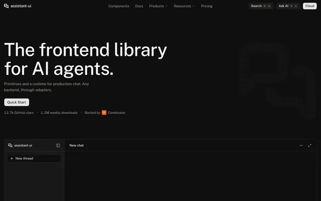
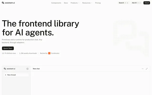 assistant-uiLibraryassistant-ui is an open-source TypeScript library for AI chat in React. It handles streaming, tools and attachments, with AI SDK and LangGraph adapters.
Pricing
Ship it with Pro
The directory is free. Pro adds 6,000+ blocks, 14 premium templates and the MCP server, so your AI editor installs them for you.
4.9/5 out of 5 · 150+ reviewsfrom 150+ founders and developers.
- Secure checkout via Stripe
- Code lives in your repo
- Keep what you've shipped if you cancel
- License terms
FAQ
Frequently asked questions
What Tour is, how to install it, its license and its alternatives.
A component for building step-by-step onboarding tours that fits into a shadcn/ui project.
Tour lists Onboarding tour component, Designed for shadcn/ui, Start Tour trigger and Step-by-step walkthrough.
The directory lists these uses for Tour: Guiding new users through a dashboard on first login, Announcing a new feature with a short walkthrough and Explaining a multi-step setup screen.
The directory does not name a maker for Tour. Its site is https://onboarding-tour.vercel.app.
Tour was added to the directory on December 4, 2025.
Tour is in Libraries & Components. Component libraries and standalone components built on shadcn/ui, covering the data tables, pickers, editors and charts the core set leaves out.
Onboarding, Components and React. Each tag has a page listing the other resources that carry it.
Yes. Tour's page has a Live tab beside the screenshot that loads its site in a frame.
The directory lists no install command for Tour. Follow the instructions on its site at https://onboarding-tour.vercel.app.
The directory lists no shadcn CLI command for Tour. Check its docs at https://onboarding-tour.vercel.app for how to add it.
The directory links no repository for Tour. Its site is https://onboarding-tour.vercel.app.
The directory links no separate docs for Tour; start from its site at https://onboarding-tour.vercel.app.
The directory records no license for Tour. Check its repository or site before you use it.
The directory records no price for Tour. Its site, https://onboarding-tour.vercel.app, is where its pricing, if any, is stated.
No. Tour is made by its own maker and listed here as a link. A shadcn.io Pro plan covers shadcn.io's own blocks, templates and tools.
Other resources in Libraries & Components, newest first: Stepperize, Tour Kit, Onborda and next-stepper. Their pages are linked under Similar to Tour.
Open its category, Libraries & Components, or one of its tags (Onboarding, Components and React): each page lists the resources that share it.
4.9 out of 5 from 150+ developers


Found your stack? Ship it.
6,000+ blocks, premium templates and MCP in every Pro plan. The directory stays free.
Get Pro