Wensity UI
Animated React components, blocks and a background studio for Next.js and Tailwind CSS v4.
- Category
- Component Registries
- Added
- Price
- Free, with paid plans
About
About Wensity UI
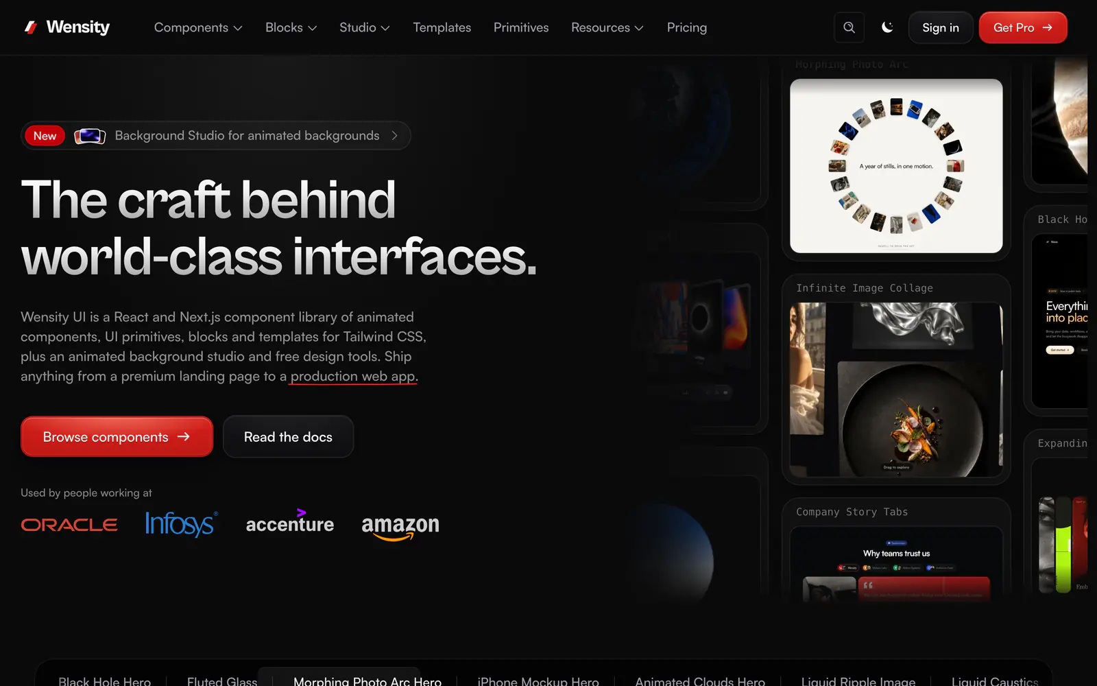
Wensity UI is a library of animated React components, UI primitives, blocks and templates for Next.js and Tailwind CSS, plus an animated background studio and free design tools. The showcase includes a Siri orb drawn with a WebGL shader, an animated MacBook, a peel effect, a liquid metal button and a black hole hero. Theming comes from a single design token contract.
It installs through its own CLI: npx wensity@latest init creates a wensity.json, then wensity add copies a component's source into your app, so you keep the code. Items are labeled Free or Pro, and Pro access needs a signed-in token. It suits developers who want showy landing page pieces without writing shader or spring code themselves.
Wensity UI features
6 features
- Animated components and UI primitives
- Blocks and templates
- Animated background studio
- Single design token contract
- Own CLI that copies source into your app
- Free and Pro catalog
Install Wensity UI
1 command
Terminal
$ npx wensity@latest initWhat you can build with Wensity UI
3 use cases
- Adding a WebGL orb or hero to a landing page
- Prototyping an animated SaaS homepage
- Generating animated backgrounds for a marketing site
Component Registries
Similar to Wensity UI
More component registries like Wensity UI: the closest by what they do, then the most starred.
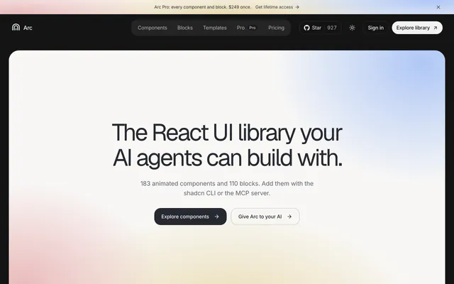
 Arc UIRegistryArc UI is a registry of 183 animated React components and 110 blocks, added with the shadcn CLI or an MCP server. A free MIT set; the rest is Pro.
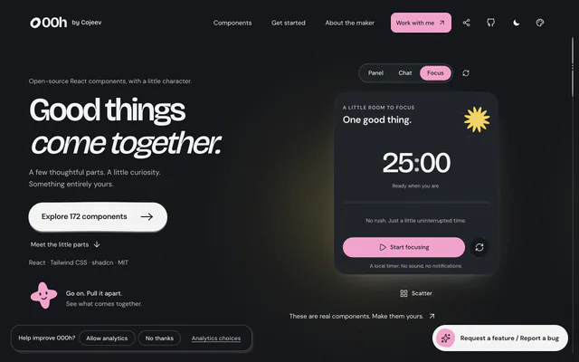
 000hRegistry000h is an MIT-licensed shadcn registry of 172 React components with organic shapes and motion, covering charts, drawers and WebGL art.
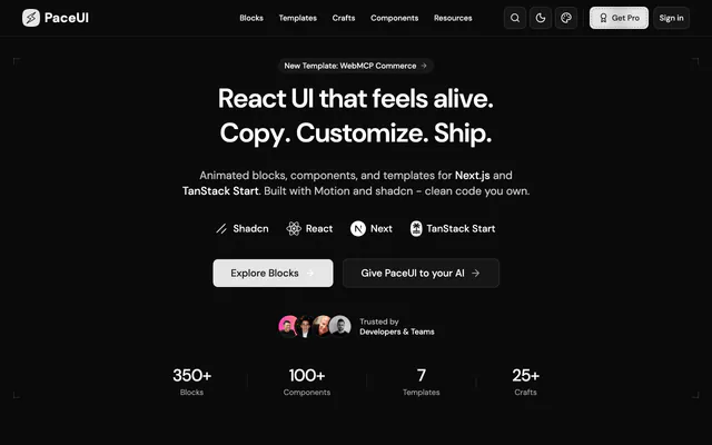
 PaceUIRegistryPaceUI is a shadcn registry of 350+ animated blocks, 100+ components and 7 templates on Motion, for Next.js and TanStack Start.
 React BitsRegistryReact Bits is a free, open-source collection of 217 animated React components for text, backgrounds, cards and micro interactions.
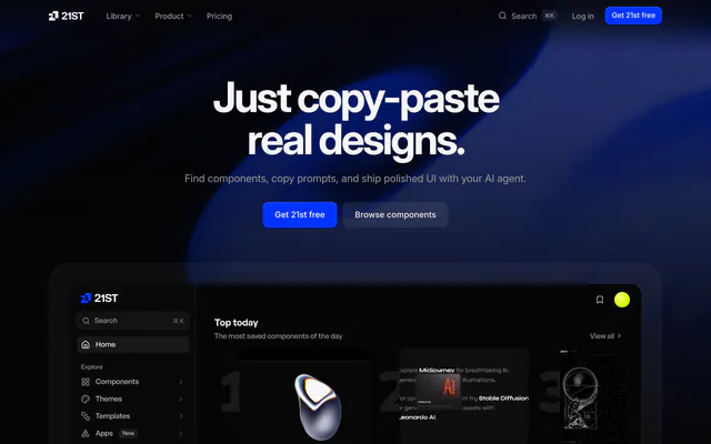
 21stRegistry21st is a library of 12,000+ React and Tailwind CSS components, templates and shadcn themes that you preview live and install with one command.
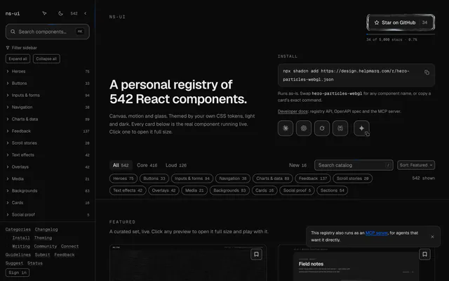
 ns-uiRegistryns-ui is an open-source registry of 542 React components, each built around one interaction, themed by your CSS tokens in light and dark.
Pricing
Ship it with Pro
The directory is free. Pro adds 6,000+ blocks, 14 premium templates and the MCP server, so your AI editor installs them for you.
4.9/5 out of 5 · 150+ reviewsfrom 150+ founders and developers.
- Secure checkout via Stripe
- Code lives in your repo
- Keep what you've shipped if you cancel
- License terms
FAQ
Frequently asked questions
What Wensity UI is, how to install it, its license and its alternatives.
Animated React components, blocks and a background studio for Next.js and Tailwind CSS v4.
Wensity UI lists Animated components and UI primitives, Blocks and templates, Animated background studio, Single design token contract, Own CLI that copies source into your app and Free and Pro catalog.
The directory lists these uses for Wensity UI: Adding a WebGL orb or hero to a landing page, Prototyping an animated SaaS homepage and Generating animated backgrounds for a marketing site.
The directory does not name a maker for Wensity UI. Its site is https://ui.wensity.com.
Wensity UI was added to the directory on September 19, 2026.
Wensity UI is in Component Registries. Third-party registries you install from with the shadcn CLI: blocks, components and effects that land in your codebase as source you own.
Components, Blocks, Animation, Backgrounds, React, Next.js, Tailwind CSS and Freemium. Each tag has a page listing the other resources that carry it.
No. Wensity UI's site cannot be framed, so its page shows screenshots of it and a link to the site.
Run npx wensity@latest init in your project, then wensity add with a component name. The files are written into your source tree.
Wensity UI lists this command: `npx wensity@latest init`.
Wensity UI is listed under Component Registries, a category of resources that support the shadcn CLI. Its docs give the exact command.
The directory links no repository for Wensity UI. Its site is https://ui.wensity.com.
The directory links no separate docs for Wensity UI; start from its site at https://ui.wensity.com.
Part of the catalog is free and labeled that way in the CLI list, while Pro items need an authenticated Pro plan.
The directory records no license for Wensity UI. Check its repository or site before you use it.
The directory records no price for Wensity UI. Its site, https://ui.wensity.com, is where its pricing, if any, is stated.
No. Wensity UI is made by its own maker and listed here as a link. A shadcn.io Pro plan covers shadcn.io's own blocks, templates and tools.
Other resources in Component Registries, newest first: Arc UI, 000h, PaceUI and React Bits. Their pages are linked under Similar to Wensity UI.
Open its category, Component Registries, or one of its tags (Components, Blocks and Animation): each page lists the resources that share it.
4.9 out of 5 from 150+ developers


Found your stack? Ship it.
6,000+ blocks, premium templates and MCP in every Pro plan. The directory stays free.
Get Pro