shadcn.io is an independent project built on shadcn/ui
Swirl Background for Solid
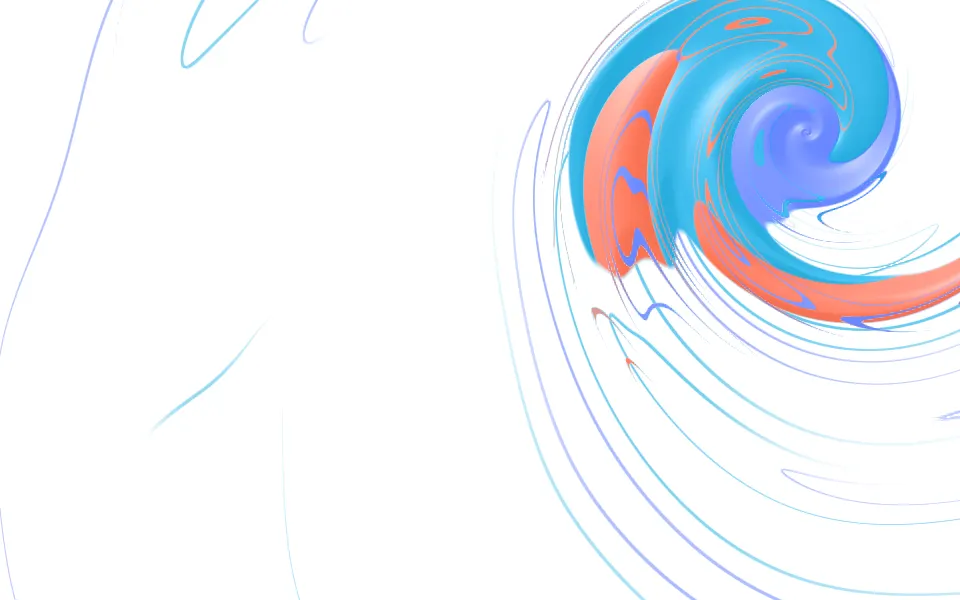
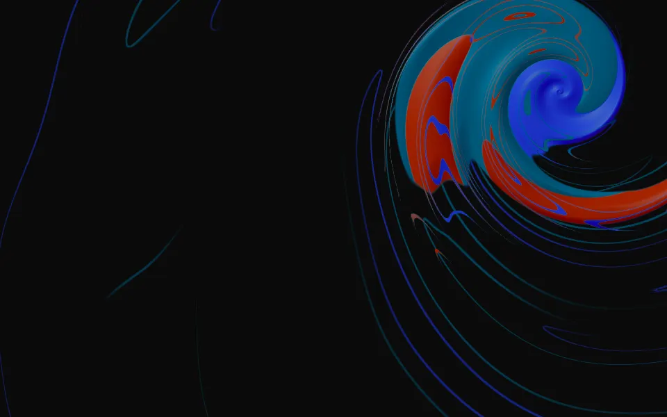
Thick paint stirred into a spiral, with fine marbling and long strands. For Solid with Ark UI, when a page needs one bold shape.
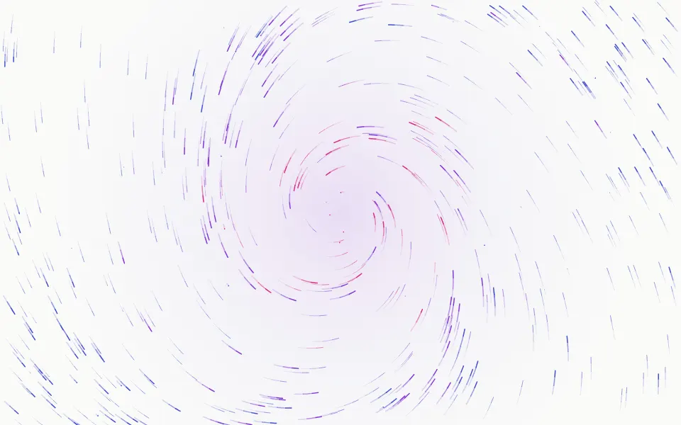
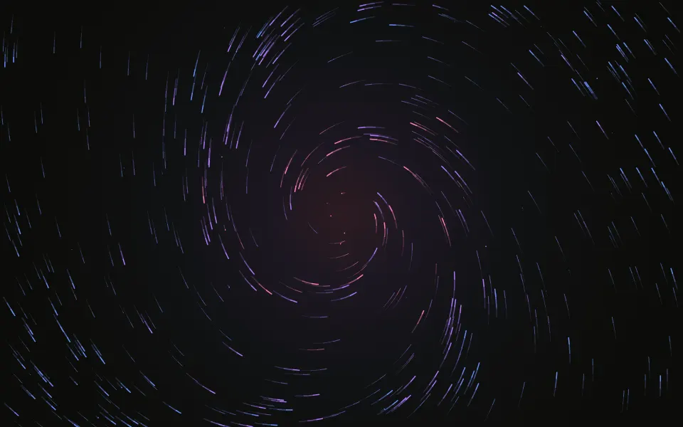
Thick paint stirred in a slow spiral: bands of color wound around a center, fine threads of the next color folded through them, and long strands that carry the spiral on across the box. It's a GLSL scene on WebGL2 with no dependency. The paint is lit, so each band reads as a ribbon with a groove where it meets the next, and the surface is wound in between the bands as one more color, white on a light page and near-black on a dark one. The center leans toward the pointer, and a press stirs it harder.
Use it behind a hero with the copy to one side, on a launch page or at the top of a card. For color with no shape at all, use Gradient Animation; for plumes of pigment that drift and thin out, Ink; for polished stone with veins and no spiral, Marble. With reduced motion it holds one still frame.
Installation
Usage
import { Swirl } from "@/components/ui/swirl";<Swirl class="flex min-h-[32rem] items-center justify-center">
<h1 class="text-5xl font-semibold">Mixed to the color you saw</h1>
</Swirl>Swirl is a container: whatever you put inside sits on top of the paint, in normal flow. It fills its own box, so give it a height or content. For a backdrop behind the whole page, render it empty with className="fixed inset-0 -z-10".
Presets
<Swirl /><Swirl
centerX={0.5}
centerY={0.5}
colors={["#7c3aed", "#ec4899", "#4338ca"]}
coverage={0.4}
scale={1.6}
turns={3}
/><Swirl
centerX={0.5}
centerY={0.5}
colors={["#6f4e37", "#c8a27c", "#f3e5d0"]}
coverage={0.7}
detail={0.8}
shading={0.3}
softness={0.5}
turns={2.5}
/><Swirl
colors={["var(--foreground)", "var(--muted-foreground)"]}
detail={1}
shading={0.3}
/><Swirl
centerX={0.5}
centerY={0.5}
colors={["#ff8fab", "#ffc978", "#b8e0ff"]}
coverage={0.8}
scale={0.7}
shading={0.4}
softness={0.6}
/><Swirl
centerX={0.1}
centerY={0.95}
colors={["#0f766e", "#34d399", "#a7f3d0"]}
coverage={0.9}
scale={0.7}
turns={0.9}
/><Swirl
centerX={0.5}
centerY={0.5}
coverage={1}
softness={0.4}
turns={2}
/>Each preset is a set of props, so copy one and keep tuning. Stir is the default, a swirl in the upper right that thins out to strands. Whirl covers the whole box from its middle, Latte is three browns wound tight and blended soft, Tide sweeps broad tongues of green in from the lower left, and Mono takes its two colors from your theme.
Examples
Hero
The default look behind a centered hero. The paint keeps to the upper right, and what crosses the rest of the box is strands a pixel or two wide, so the copy sits on plain surface. Where the headline does meet the paint, the colors are held to a tone the foreground color reads on.
Colors
colors are the paints, wound in order: here espresso, caramel and milk foam on a dark surface. centerX and centerY put the spiral in the middle, turns={2.5} winds it tighter, softness={0.5} lets neighboring bands blend, and shading={0.3} flattens the ridges.
In a card
A small swirl at the top of a card: coverage={0.45} keeps the paint near its center, at centerX={0.7} and centerY={0.3}, with turns={1.6}. The strands run down behind the copy.
Customization
Every color is a CSS color, so a theme variable works and follows a theme switch: colors={["var(--chart-1)", "var(--chart-2)"]}. centerX and centerY place the spiral, coverage sets how far the paint reaches before it thins out to strands (1 fills the box), and turns and scale set how tightly it's wound and how wide the bands are. detail is the marbling and the strands, softness runs from crisp bands to one smooth gradient, and shading from a flat print to ridges that catch the light.
The surface is the root's own background, bg-background by default, and it shows between the bands as if it were one more paint. Give the root another (bg-stone-950, a brand color) and the scene adapts: the paint is lifted to lighter tones over a light surface and deepened over a dark one. fade masks an edge, opacity turns the whole effect down, and grain adds film grain.
<Swirl
  centerX={0.2}
  centerY={0.7}
  class="min-h-[32rem] bg-slate-950"
  colors={["var(--chart-1)", "var(--chart-2)", "var(--chart-4)"]}
  coverage={0.7}
  grain={0.15}
/>
Performance
It's one WebGL2 canvas and one fragment shader. The paint is three samples of simplex noise read through a spiral twist, plus one for the wander of the arms and one for the strands. Where there is paint, the lighting reads it once more, a pixel and a half across the arm, for the slope: a painted pixel costs eight samples and a bare one five, with nothing to march. It draws only while it's on screen and the tab is visible, shares one frame loop with every other background on the page, and lowers its own resolution if frames run long. quality sets the render scale yourself, and paused holds the frame.
Accessibility
The paint is decoration: it's hidden from assistive tech and lets every click through to your content. With reduced motion it draws one still frame and ignores the pointer. Nothing flashes: a press winds the spiral tighter over a fraction of a second and it eases back over a few.
At contrast 1 or lower the paint is held to a tone that copy in the foreground color (text-foreground) reads on. With the default palette the worst frame measured 6:1 on a light surface and 5:1 on a dark one, anywhere in the box. Bands of different colors under one line of text are still harder to read than a plain surface, so put long copy clear of the center. Past contrast 1 the colors run at full strength.
FAQ
How do I change the colors?
Pass two to eight CSS colors to colors. They're wound in that order, so neighbors in the list sit side by side as bands, and the thin threads in each band take the color after it. Hex, oklch() and theme variables such as var(--chart-1) all work, and a variable follows your theme when it changes.
How do I move the center of the spiral?
centerX runs from 0 at the left edge to 1 at the right, and centerY from 0 at the top to 1 at the bottom. The default, 0.84 and 0.22, puts it in the upper right so a centered headline stays clear. At 0 or 1 the center sits on an edge, and you see only the arms sweeping in.
Can the paint fill the whole box?
Yes: coverage={1}. Below that the paint is thick near the center and thins out with distance, leaving strands, and the surface shows between the bands. The Whirl preset fills the box from its middle; expect a much louder background, and keep copy on a ground of its own.
Does it work on a light page and a dark one?
Yes, with no prop to set. The scene reads the color behind it and treats it as one of the paints. On a light surface the colors are lifted to lighter tones and the shaded side of each ribbon stays shallow; on a dark one they're deepened. Set the surface with a class on the component, such as bg-stone-950.
What does the pointer do?
The center of the spiral leans a little toward the pointer, about an eighth of the way, and eases back when it leaves. A press stirs the paint: the spiral winds tighter and turns, then relaxes over a few seconds. interactive={false} turns off both, and touch never moves it.
How do I put it behind the whole page?
Render it empty with className="fixed inset-0 -z-10". It still follows the pointer there, since it listens on the window. To put it behind one section, wrap that section's content in it and give it a height, such as min-h-svh.
Does it work with Next.js and server components?
Yes. Import it into a server component and it renders its box and your content on the server; the canvas starts in the browser and fades in over the surface. It needs WebGL2, which every current browser has. Without it the box keeps its background, or the fallback you pass.
API Reference
Swirl
data-slot="swirl"
centerX?number
Where the center of the spiral sits across the box, from 0 (the left edge) to 1 (the right).
- Default
0.84
centerY?number
Where the center of the spiral sits down the box, from 0 (the top) to 1 (the bottom).
- Default
0.22
colors?string[]
Two to eight CSS colors of paint, wound in that order. Theme variables
such as var(--chart-1) follow your theme.
- Default
["#2747d8", "#35b6e6", "#ff7a5c"]
contrast?number
How strongly the paint shows, from 0 to 2. Up to 1 it stays in a tone copy reads on; past 1 the colors run at full strength.
- Default
1
coverage?number
How far the paint reaches from the center, from 0.25 to 1 (the whole box). It thins out to threads at its rim, and the surface is wound in between the bands as a band of its own.
- Default
0.5
detail?number
How much fine marbling runs through the bands, from 0 to 1.
- Default
0.6
fade?"none" | "radial" | "top" | "bottom" | "left" | "right"
Which edges fade out to the surface: radial keeps the middle, the
others name the side that fades.
- Type
"none" | "radial" | "top" | "bottom" | "left" | "right"- Default
"none"
fallback?string
What shows until the first frame and in browsers without WebGL2: a CSS
background value that looks like the scene.
grain?number
Film grain over the scene, from 0 to 1.
- Default
0
interactive?boolean
Whether the scene follows the pointer and answers a press. Touch never moves it, so scrolling a page on a phone isn't disturbed.
- Default
true
opacity?number
How strongly the scene shows over the surface, from 0 to 1.
- Default
1
paused?boolean
Holds the current frame.
- Default
false
quality?number
Render scale, from 0.25 to 1, of the screen's pixels (capped at 2×). Lower is cheaper and softer.
- Default
1
scale?number
The width of the bands, from 0.5 to 2: higher packs more, thinner ones.
- Default
1
seed?number
Another pour of the same paint, from 0 to 20.
- Default
0
shading?number
How thick the paint looks, from 0 (flat, like a print) to 1 (ridges that catch the light).
- Default
0.6
softness?number
How far neighboring colors blend, from 0 (crisp bands of unmixed paint) to 1 (one smooth gradient).
- Default
0.15
speed?number
Animation speed: 1 is normal, 0 holds the frame.
- Default
1
time?number
A fixed moment, in seconds: draws it and doesn't animate.
turns?number
How many times the paint is wound around the center, from 0.75 to 3.
- Default
1.2