shadcn.io is an independent project built on shadcn/ui
Circles Background for Svelte
Concentric rings carry arcs with bright heads, each turning its own way. For Svelte with Ark UI, when a hero should look precise and calm.
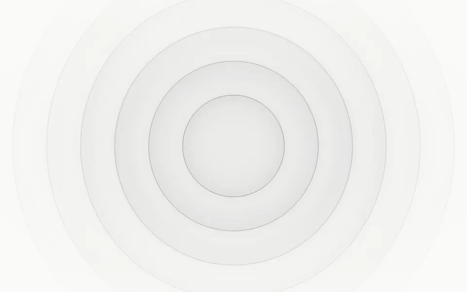
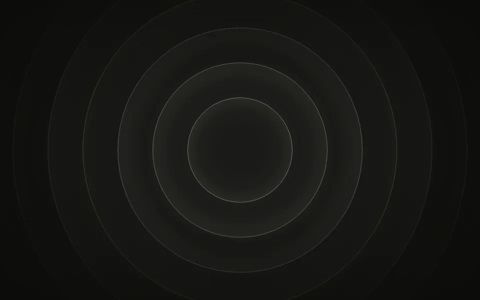
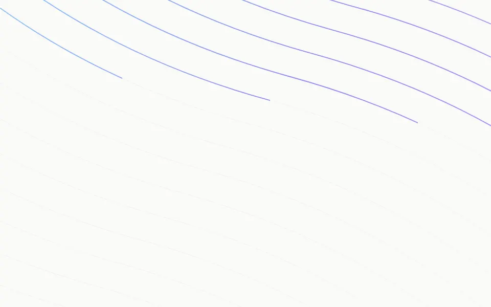
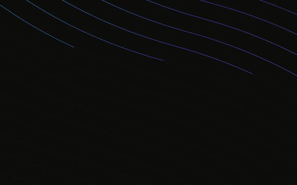
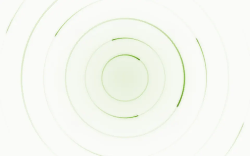
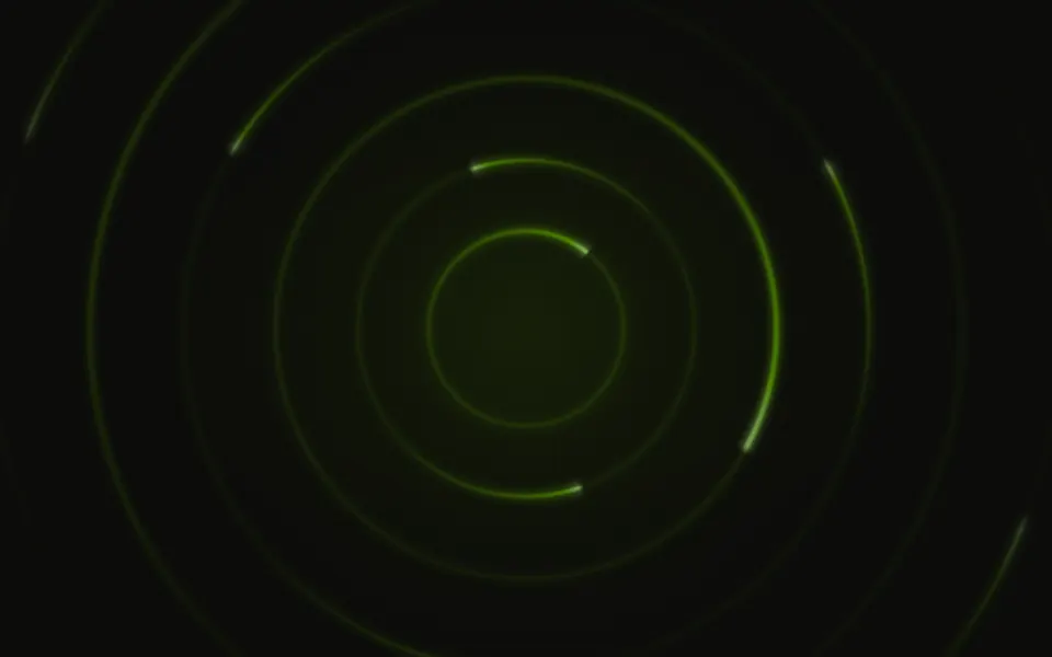
Concentric rings sit around one point, each a hairline with arcs travelling along it: a bright round head and a tail that narrows and fades out behind it. Every ring turns at its own pace, a full turn in 25 to 60 seconds, and every other one the other way. It's a GLSL scene on WebGL2 with no dependency, drawn in your theme's colors: dark lines on a light surface, light ones with a soft glow on a dark one. The rings near the pointer brighten.
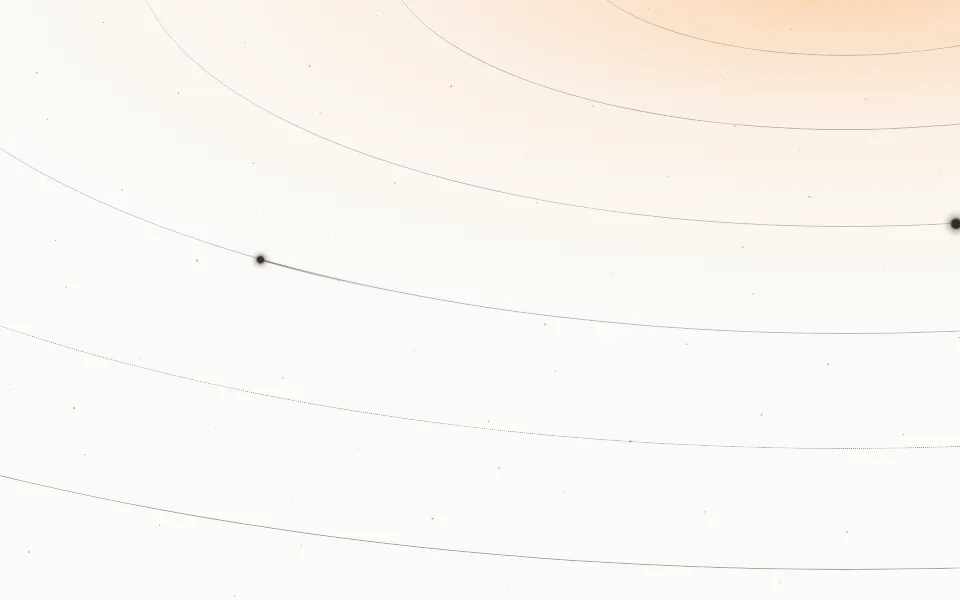
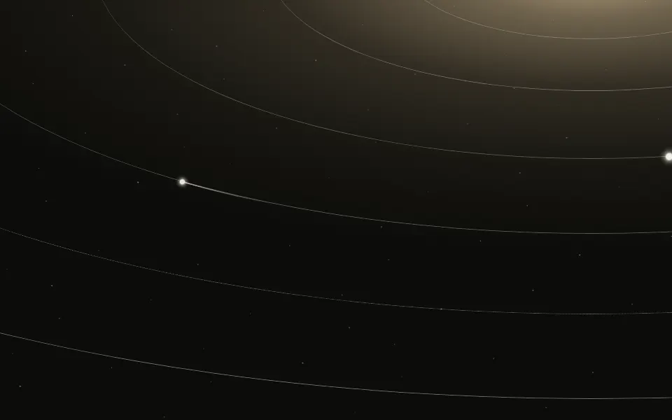
Use it behind a centered headline, a loading or syncing state, or as the emblem of a card. For rings that pulse outward and fade, use Ripple; for tilted orbits with bodies travelling along them, Orbits; for a radar sweep with blips, Sonar. With reduced motion it holds one still frame.
Installation
Usage
<script lang="ts">
import { Circles } from "@/components/ui/circles";
</script>
<Circles class="flex min-h-[32rem] flex-col items-center justify-center">
  <h1 class="text-5xl font-semibold">Every device, always in step</h1>
</Circles>
Circles is a container: whatever you put inside sits on top of the rings, in normal flow. It fills its own box, so give it a height or content. The rings are sized in pixels, not by the box: size is the innermost radius and spacing the step to the next, so the outermost ring is size plus rings minus one times spacing from the origin, 292 pixels by default. For a backdrop behind the whole page, render it empty with className="fixed inset-0 -z-10".
Presets
<Circles /><Circles
arc={0.3}
count={1}
lineWidth={1}
rings={12}
size={32}
spacing={20}
track={0.8}
/><Circles
accentColor="#22d3ee"
arc={0.8}
color="#64748b"
count={3}
lineWidth={3}
rings={5}
spacing={38}
/><Circles accentColor="#f43f5e" color="#6366f1" seed={7} /><Circles
accentColor="#f59e0b"
color="#f97316"
count={1}
origin="bottom"
rings={8}
size={80}
spacing={32}
track={1}
/><Circles arc={0.9} count={1} glow={1.6} track={0} />Each preset is a set of props, so copy one and keep tuning. Orbit is the default. Ion is five rings with three thick cyan arcs each for a dark page, Fine packs twelve rings 20 pixels apart with one short arc each, Trace hides the rings and leaves long arcs, and Sunrise draws eight amber rings around the middle of the bottom edge.
Examples
Hero
The copy is centered on the origin and the rings frame it. Away from their heads the arcs are 2 pixels wide at most and partly transparent, so the headline stays easy to read where one passes behind it. No props are set.
Ion
accentColor is the head of each arc and color its tail and the ring under it: here cyan heads on slate rings, on a dark surface. count={3} puts three arcs on each of five rings, arc={0.8} makes each fill most of its third, and lineWidth={3} thickens them.
In a card
origin="top" centers the rings on the middle of the top edge, so half of each shows and the card's text sits under them. One arc travels on each of five rings 36 pixels apart.
Customization
color and accentColor take any CSS color, so a theme variable works and follows a theme switch: they're var(--foreground) and var(--primary) by default. On the default theme those are close, so the arcs read as one tone; give accentColor a hue to make the heads stand out. Along each tail the two are mixed in OKLab. A color close to the surface in tone is drawn stronger, so pale lines still show on white.
The surface is the root's own background, bg-background by default. Give the root another (bg-slate-950, a gradient) and the light around each head adapts: it glows on a dark surface and is only a faint tint on a light one. track sets how visible the full rings are, fade="radial" masks the outer ones, opacity turns the whole effect down, and grain adds film grain.
<Circles
  accentColor="var(--chart-1)"
  class="min-h-[32rem] bg-slate-950"
  color="var(--chart-3)"
  fade="radial"
  rings={8}
  track={0.3}
/>
Performance
It's one WebGL2 canvas and one fragment shader with no dependency. For each pixel it takes one arctangent, then loops over the rings, 12 at most, with one hash, three strokes and two exponentials each: there is no noise and no texture. It draws only while it's on screen and the tab is visible, shares one frame loop with every other background on the page, and lowers its own resolution if frames run long. quality sets the render scale yourself, and paused holds the frame.
Accessibility
The rings are decoration: the canvas is hidden from assistive tech and lets every click through to your content. With reduced motion it draws one still frame and ignores the pointer and presses. Nothing flashes: the fastest ring takes 25 seconds a turn.
Use the foreground color (text-foreground) for every line on top. The rings are hairlines at under a fifth of the color's strength and the arcs fade along their tails, but the head of an arc is solid: with the default colors it's the color of your text, so the 12 head dots and the first pixels behind them (0.1 to 0.2% of the box) give no contrast where they cross a glyph. Lower intensity, or give accentColor a hue, if that matters for small text.
FAQ
How do I change the colors?
accentColor sets the head of each arc and color its tail and the ring under it; along the tail one runs into the other. Both take any CSS color: hex, oklch() or a theme variable, which follows your theme when it changes. The defaults are var(--primary) and var(--foreground).
Does it work on a light page?
Yes, with no prop to set. The default colors come from your theme, so the lines are dark on a light theme and light on a dark one, and the scene reads the surface behind it: the light around each head glows on a dark surface and is kept to a faint tint on a light one, where a glow would look like a smudge.
How do I make the rings turn faster or slower?
speed is the time scale of the whole scene: speed={2} turns every ring twice as fast, speed={0.5} half as fast, and speed={0} holds the frame. Each ring keeps its own pace inside that, between 25 and 60 seconds a turn at speed={1}, and every other ring turns the other way. seed picks another set of paces and starting angles.
Can I have arcs without the rings, or rings without arcs?
track={0} hides the full rings and leaves the arcs. For rings alone there's no switch, but arc={0.05} with glow={0} shrinks each arc to a dot on its ring. count sets how many arcs travel on each ring, from 1 to 4, and arc how much of its share of the ring each one covers.
How do I put it behind the whole page?
Render it empty with className="fixed inset-0 -z-10". The rings are sized in pixels, so on a large screen raise rings or spacing until the outermost one reaches the edges: its radius is size plus rings minus one times spacing. It still answers the pointer there, since it listens on the window.
What does the pointer do?
The rings and arcs within about 120 pixels of the pointer are drawn stronger, and a press on the background sends a ring of light out from that point, which brightens what it passes for about 2 seconds. Presses on links, buttons and fields don't count. interactive={false} turns both off. Touch never moves it, so scrolling on a phone isn't disturbed.
Does it work with Next.js and server components?
Yes. Import it into a server component and it renders its box and your content on the server; the canvas starts in the browser and fades in over the surface. It needs WebGL2, which every current browser has. Without it the box keeps its background, or the fallback you pass.
API Reference
Circles
data-slot="circles"
accentColor?string
The color of each arc's head, any CSS color. A theme variable such as
var(--primary) follows your theme.
- Default
"var(--primary)"
arc?number
How long each arc is, as a share of its part of the ring, from 0.05 to 0.95. Arcs vary a little around it from ring to ring.
- Default
0.5
color?string
The color of the rings and of each arc's tail, any CSS color. A theme
variable such as var(--foreground) follows your theme.
- Default
"var(--foreground)"
count?number
How many arcs travel on each ring, from 1 to 4, evenly spaced around it.
- Default
2
fade?"none" | "radial" | "top" | "bottom" | "left" | "right"
Which edges fade out to the surface: radial keeps the middle, the
others name the side that fades.
- Type
"none" | "radial" | "top" | "bottom" | "left" | "right"- Default
"none"
fallback?string
What shows until the first frame and in browsers without WebGL2: a CSS
background value that looks like the scene.
glow?number
How much soft light surrounds the head of each arc, from 0 to 2.
- Default
1
grain?number
Film grain over the scene, from 0 to 1.
- Default
0
intensity?number
How strongly the rings and arcs show.
- Default
1
interactive?boolean
Whether the scene follows the pointer and answers a press. Touch never moves it, so scrolling a page on a phone isn't disturbed.
- Default
true
lineWidth?number
The thickness of the arcs, in pixels, from 0.5 to 4. The rings under them are always hairlines.
- Default
2
opacity?number
How strongly the scene shows over the surface, from 0 to 1.
- Default
1
origin?"center" | "top" | "bottom" | "left" | "right"
The point the rings are drawn around: the center of the box or the middle of one of its edges.
- Type
"center" | "top" | "bottom" | "left" | "right"- Default
"center"
paused?boolean
Holds the current frame.
- Default
false
quality?number
Render scale, from 0.25 to 1, of the screen's pixels (capped at 2×). Lower is cheaper and softer.
- Default
1
rings?number
How many rings there are, from 1 to 12.
- Default
6
seed?number
Another layout of the same look: where each arc starts and how fast it turns.
- Default
0
size?number
The radius of the innermost ring, in pixels, from 8 to 240.
- Default
72
spacing?number
The distance from one ring to the next, in pixels, from 12 to 160.
- Default
44
speed?number
Animation speed: 1 is normal, 0 holds the frame.
- Default
1
time?number
A fixed moment, in seconds: draws it and doesn't animate.
track?number
How visible the full ring under each arc is, from 0 (arcs only) to 1.
- Default
0.6