shadcn.io is an independent project built on shadcn/ui
Installation
The command adds the example above to components/charts/ and, the first time, the chart kit to components/ui/charts/. Both are source files in your project from then on: read them, change them, delete what you don't use.
Usage
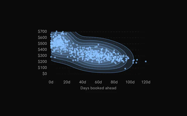
Rows are observations, as in a scatter plot: a number under xDataKey and one under yDataKey. Add groupDataKey to estimate each group on its own.
import {
  DensityChart,
  DensityContours,
  DensityPoints,
  DensityTooltip,
  DensityXAxis,
  DensityYAxis,
} from "@/components/ui/charts";

const bookings = [
  { days: 4, fare: 540 },
  { days: 12, fare: 470 },
  { days: 38, fare: 360 },
  { days: 55, fare: 320 },
  { days: 61, fare: 300 },
  { days: 90, fare: 260 },
];

export const BookingsChart = () => (
  <DensityChart
    ariaLabel="Fares by days booked ahead"
    data={bookings}
    xDataKey="days"
    yDataKey="fare"
  >
    <DensityContours />
    <DensityPoints />
    <DensityXAxis label="Days booked ahead" />
    <DensityYAxis />
    <DensityTooltip xLabel="Booked ahead" yLabel="Fare" />
  </DensityChart>
);
Anatomy
The bands always sit under the points, whatever order you write them in. Only the points react to the pointer, so a chart without DensityPoints has no tooltip.
<DensityChart data={data} xDataKey="days" yDataKey="fare">
  <DensityGrid />
  <DensityContours />
  <DensityPoints />
  <DensityXAxis label="Days booked ahead" />
  <DensityYAxis />
  <DensityTooltip />
</DensityChart>DensityChart: Holds the observations, the scales and, withgroupDataKey, the groups.DensityGrid: Dashed guide lines behind the bands.DensityContours: The estimate as nested filled bands, 8 levels by default.DensityPoints: The observations as dots. Hover, the tooltip and keyboard focus land on these.DensityXAxis: Tick labels along the bottom, with an optionallabel.DensityYAxis: Tick labels on the left, with an optionallabel.DensityTooltip: The hovered point's x and y, titled with its group.DensityLegend: Each group and its color. It needsgroupDataKey.
Smoothing and levels
bandwidth on <DensityContours> is the smoothing radius in pixels, 20 by default. Raise it for broad, soft shapes, or lower it to keep nearby clusters apart. Because it's in pixels, the same data looks smoother on a small chart.
thresholds is the number of levels (8), or an array of exact density values when two charts must draw the same levels.
Groups
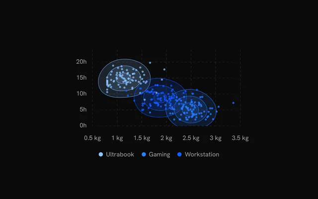
Set groupDataKey and each group gets its own estimate, colored --chart-1, --chart-2 and so on in order of appearance. groupColors maps group names to colors of your own.
<DensityLegend /> lists the groups under the plot, and the tooltip uses the hovered point's group as its title.
Contours on their own
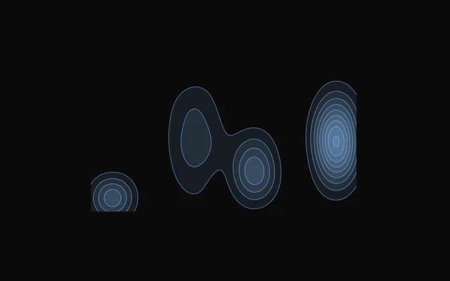
Leave out <DensityPoints> and the axes to show only where things land, like taps on a screen. More levels with a lower fillOpacity give finer bands.
Without points there's nothing to hover or focus, so add an ariaDescription that says what the shape shows.
Customization
The kit is in your project, in components/ui/charts/: your framework's components over a shared core/. Change a default there and every chart picks it up.
className goes on the chart's container, so size and spacing are utility classes.
The bands' look is on <DensityContours>: fillOpacity for each band (0.14, so stacked levels darken toward a peak), strokeWidth and strokeOpacity for the outlines, and color for one color across every group.
content on <DensityTooltip> gets the hovered row as point and its index in data, so the panel can show fields that aren't on either axis.
<DensityTooltip
  content={({ point }) => (
    <div className="px-3 py-2 text-sm">
      {String(point.route)}, booked {Number(point.days)} days ahead
    </div>
  )}
/>
Where a part renders content of its own, you pass it in. In React:
DensityTooltip:content={({ point, index }) => …}
Loading state
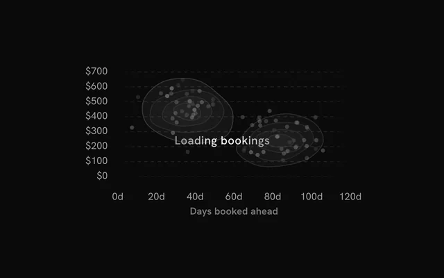
With status="loading", two clusters of skeleton bands breathe in the plot, with skeleton dots when the chart has <DensityPoints>. The axes and grid stay, and the pointer is ignored.
Switch to "ready" and the real bands rise level by level. loadingLabel puts a short line of text over the skeleton.
Animation
The bands rise one level at a time, outermost first, spread over animationDuration (900 ms). The points follow 200 ms later in a wave from left to right.
Change revealSignature to play it again. animate={false} and reduced motion both show the chart at rest.
Theming
Every color in the kit is one of your theme's tokens or a mix of them, except --chart-positive, a fixed green. A preset or the .dark class restyles the chart, and overriding a token in your CSS changes it everywhere.
Groups take --chart-1 to --chart-5 in order of appearance, and a chart without groups draws in --chart-1. Past five groups the colors repeat, so pass groupColors for the rest.
| Token | Default | Paints |
|---|---|---|
--chart-1 | your theme's | the first series |
--chart-2 | your theme's | the second series |
--chart-3 | your theme's | the third series |
--chart-grid | --border | grid lines |
--chart-label | --muted-foreground | tick labels |
--chart-tooltip-background | --popover | the tooltip panel |
:root {
  --chart-grid: var(--muted);
  --chart-label: var(--foreground);
}
Accessibility
The chart is announced as an image named by ariaLabel ("Density chart" by default). Describe the clusters in ariaDescription, since the bands themselves can't be read out.
Keyboard focus moves through the points, not the bands, so keep <DensityPoints> when people need to reach the values.
- Tab
- Moves focus to the chart, on its leftmost point.
- Arrow Right
- Moves to the next point to the right. ArrowDown does the same.
- Arrow Left
- Moves to the previous point. ArrowUp does the same.
- Home
- Jumps to the leftmost point.
- End
- Jumps to the rightmost point.
API reference
DensityChart
datareadonly SpatialRow[]
The observations: one row per point. Rows without a finite x or y are left out.
xDataKeystring
Key of the horizontal value in each row.
yDataKeystring
Key of the vertical value in each row.
groupDataKey?string
Key of each row's group: each group gets its own density estimate and color (--chart-1, --chart-2… in order of appearance).
groupColors?Readonly<Record<string, string>>
Colors of the groups by name, over the palette.
- Type
Readonly<Record<string, string>>
xDomain?readonly [number, number]
The x range shown. Defaults to the data's, rounded out to nice values.
yDomain?readonly [number, number]
The y range shown. Defaults to the data's, rounded out to nice values.
aspectRatio?string
Aspect ratio of the chart as "width / height".
- Default
"16 / 9"
margin?Partial<SpatialMargin>
Space around the plot in pixels. Any side you omit keeps its default.
- Type
Partial<SpatialMargin>
animate?boolean
Play the entrance animation.
- Default
true
animationDuration?number
Length of the entrance sweep in milliseconds: the time from the first mark starting to the last one.
- Default
900
revealSignature?string
Changing this value replays the entrance animation.
status?ChartStatus
"loading" draws a pulsing skeleton of the chart's shape in place of its marks (the axes, grid and land stay) and ignores the pointer; switching to "ready" plays the entrance.
- Default
"ready"
loadingLabel?string
Text shown centered over the chart, with a shimmer, while status is "loading". Nothing is shown when it is unset or empty.
className?string
Additional class name for the chart container.
children?ReactNode
The chart's carriers: its layers, axes, grid, tooltip and legend.
ariaLabel?string
Accessible label of the chart.
ariaDescription?string
Longer accessible description of the chart.
DensityContours
bandwidth?number
Smoothing of the estimate: the Gaussian kernel's bandwidth, in pixels. Larger is smoother.
- Default
20
thresholds?number | readonly number[]
The number of levels, or the exact density levels (observations per square pixel).
- Type
number | readonly number[]- Default
8
fillOpacity?number
Opacity of each band's fill; nested bands add up, so the densest areas read darkest.
- Default
0.14
strokeWidth?number
Width of each level's outline, in pixels (0: none).
- Default
1
strokeOpacity?number
Opacity of each level's outline.
- Default
0.55
color?string
A single color for every band; defaults to each group's color (--chart-1 without groups).
inactiveOpacity?number
Opacity of the bands while a point is hovered or focused.
- Default
0.5
fadeOnHover?boolean
Dim the layer's other marks while one is hovered or focused.
- Default
true
DensityPoints
radius?number
Radius of each dot, in pixels.
- Default
2.5
opacity?number
Opacity of the dots at rest.
- Default
0.7
fadeOnHover?boolean
Dim the layer's other marks while one is hovered or focused.
- Default
true
inactiveOpacity?number
Opacity of the other marks while one is hovered or focused.
- Default
0.35
DensityGrid
horizontal?boolean
Show horizontal grid lines, at the y axis's ticks.
- Default
true
vertical?boolean
Show vertical grid lines, at the x axis's ticks.
- Default
false
stroke?string
Color of the grid lines.
- Default
"var(--chart-grid)"
strokeDasharray?string
Dash pattern of the grid lines.
- Default
"4 4"
DensityXAxis
numTicks?number
Target number of tick labels.
- Default
5
formatValue?(value: number) => string
Formats a tick value into its label. Defaults to the number, thousands abbreviated (2k).
- Type
(value: number) => string
label?string
A title for the axis, drawn beside its labels.
DensityYAxis
numTicks?number
Target number of tick labels.
- Default
5
formatValue?(value: number) => string
Formats a tick value into its label. Defaults to the number, thousands abbreviated (2k).
- Type
(value: number) => string
label?string
A title for the axis, drawn beside its labels.
DensityTooltip
xLabel?string
The x row's label. Defaults to DensityXAxis' label, else xDataKey.
yLabel?string
The y row's label. Defaults to DensityYAxis' label, else yDataKey.
content?(args: DensityTooltipArgs) => ReactNode
Custom tooltip content. Replaces the default title and rows, inside the same panel.
- Type
(args: DensityTooltipArgs) => ReactNode
formatValue?(value: number) => string
Formats the value row of the default content.
- Type
(value: number) => string- Default
the number with thousands separators
valueLabel?string
The label of the value row of the default content.
className?string
Additional class name for the tooltip panel.
panelStyle?CSSProperties
Inline styles merged onto the tooltip panel.
backgroundColor?string
Background color of the tooltip panel. Overrides the theme's popover color.
DensityLegend
title?string
A title before the legend's items.
formatValue?(value: number) => string
Formats the values the legend shows.
- Type
(value: number) => string- Default
the number, thousands abbreviated (`2k`)
align?"start" | "center" | "end"
Where the legend sits in the row under the plot.
- Type
"start" | "center" | "end"- Default
"center"
className?string
Additional class name for the legend.
Examples
4 examples on React, each live with its code and its own install command.