shadcn.io is an independent project built on shadcn/ui
Installation
The command adds the example above to components/charts/ and, the first time, the chart kit to components/ui/charts/. Both are source files in your project from then on: read them, change them, delete what you don't use.
Usage
Pass one tree. Each node has a name and either a value or children, and a parent's size is the sum of its children. Node ids are the names on the path joined with " / ", so siblings need different names.
import {
  SunburstCenter,
  SunburstChart,
  SunburstHint,
  SunburstLabels,
} from "@/components/ui/charts";

const data = {
  children: [
    {
      children: [
        { name: "Salaries", value: 420 },
        { name: "Contractors", value: 95 },
      ],
      name: "People",
    },
    {
      children: [
        { name: "Cloud", value: 180 },
        { name: "Licenses", value: 60 },
      ],
      name: "Tools",
    },
    { name: "Office", value: 75 },
  ],
  name: "Spend",
};

export const SpendSunburst = () => (
  <SunburstChart ariaLabel="Spend by category" data={data} size={360}>
    <SunburstCenter />
    <SunburstLabels />
    <SunburstHint />
  </SunburstChart>
);
Anatomy
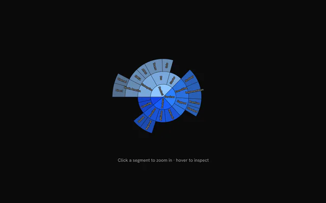
SunburstChart lays out the whole tree from data, and the other parts are optional. Without SunburstLabels the rings are bare. Without SunburstCenter, Escape or a breadcrumb is the only way back out.
<SunburstChart data={data} size={420}>
  <SunburstSegment color="var(--chart-3)" index={0} />
  <SunburstCenter />
  <SunburstLabels fontSize={12} />
  <SunburstHint />
</SunburstChart>SunburstChart: Lays out the tree as rings and handles hover, zoom and the keyboard.SunburstSegment: Overrides one arc byindex: itscolor,fillorfillOpacity.SunburstCenter: The disc in the middle that zooms back out a level once you've zoomed in.SunburstLabels: Segment names, on the segments with room for them.SunburstBreadcrumb: A slot above the chart for your own trail of crumbs.SunburstHint: One line under the chart: the hovered path, or how to zoom.
Drilling down
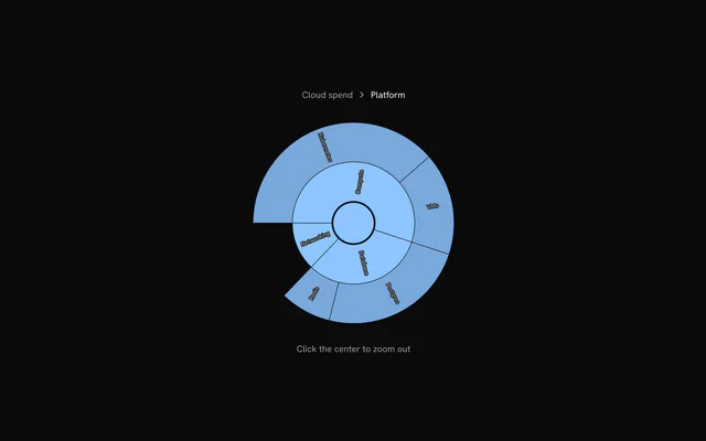
Clicking a segment that has children zooms into it. SunburstCenter turns the middle into a disc that zooms back out a level, and Escape does the same.
Pass focusId and onFocusChange to hold the zoom in your own state. Put a trail inside <SunburstBreadcrumb> and call useSunburstBreadcrumbItems() in it for the crumbs and a zoomTo function, or derive the crumbs from focusId yourself, as this example does.
Coloring segments
Each top-level branch takes the next chart color and its descendants share it, fading with depth. color on a node recolors it and everything under it.
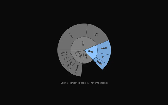
For a single arc, render a <SunburstSegment> whose index is that arc's arcIndex in buildArcs(data).arcs. This example gives every arc one, coloring one branch and graying out the rest.
Patterns
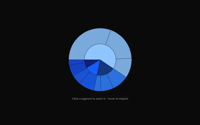
A segment's fill takes url(#id). Define a PatternLines or a gradient as a child of the chart and point a node's fill, or a SunburstSegment's, at its id.
Driven from a legend
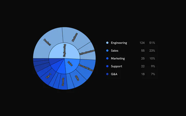
On hover, the segment and the ones on its path grow outward by hoverPop (8 px), and everything outside that branch fades to 25%. hoveredIndex takes an arc index, so a list beside the chart can trigger the same thing, and onHoverChange reports the chart's own hover back to it.
Here each row also sets focusId when it's clicked, zooming the rings into that department.
Customization
The kit is in your project, in components/ui/charts/: your framework's components over a shared core/. Change a default there and every chart picks it up.
class goes on the chart's container, so size and spacing are utility classes.
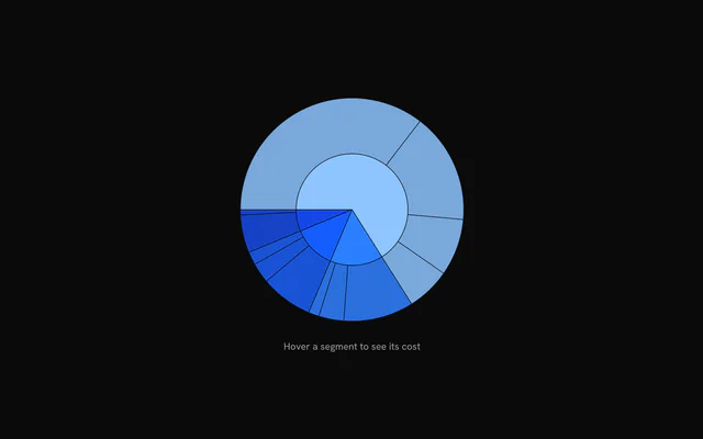
SunburstHint writes one line under the chart: the hovered path, or how to zoom. Give it a function as its child to write your own. It gets the default hintText, the hoveredArc with its name, value and trail, and the current focus.
SunburstLabels takes fontSize, fill and the halo's stroke and strokeWidth (0 turns the halo off).
<SunburstHint>
  {({ hintText, hoveredArc }) => (
    hoveredArc ? (
      <span>
        {hoveredArc.name}: {hoveredArc.value.toLocaleString()}
      </span>
    ) : (
      <span>{hintText}</span>
    )
  )}
</SunburstHint>
Where a part renders content of its own, you pass it in. In Solid:
SunburstHint:{({ hintText, hoveredArc, focus }) => …}
Loading state
There's no loading state. A round Skeleton at the chart's size keeps the space until the tree arrives.
Animation
The rings sweep in clockwise from the top, one after another, and each label fades in once its segment is drawn. enterTransition sets the sweep (a 1.1 s tween unless you pass one), enterStaggerScale the gaps between rings, and a new playKey plays it again.
Zooming morphs the segments in place: the opened branch spreads round the full circle while everything else folds away.
Theming
Every color in the kit is one of your theme's tokens or a mix of them, except --chart-positive, a fixed green. A preset or the .dark class restyles the chart, and overriding a token in your CSS changes it everywhere.
Top-level branches take --chart-1 to --chart-5 in order, and each one's descendants share its color, fading with depth to 45% opacity.
Labels are --chart-label over a halo of --chart-background, which keeps them readable on top of the segments.
| Token | Default | Paints |
|---|---|---|
--chart-1 | your theme's | the first series |
--chart-2 | your theme's | the second series |
--chart-3 | your theme's | the third series |
--chart-4 | your theme's | the fourth series |
--chart-5 | your theme's | the fifth series |
--chart-label | --muted-foreground | tick labels |
:root {
  --chart-label: var(--foreground);
}
Accessibility
The chart is an image named by ariaLabel, "Sunburst chart of" and the root's name unless you pass one. Its default ariaDescription explains the keys below to screen reader users, so keep that sentence if you write your own.
Zooming with the keyboard keeps the focus inside the chart, so the arrow keys carry on through the new rings.
- Tab
- Moves focus to the chart.
- Arrow Right
- Moves to the next segment, down each branch before the next one. ArrowDown does the same.
- Arrow Left
- Moves to the previous segment. ArrowUp does the same.
- Home
- Jumps to the first segment.
- End
- Jumps to the last segment.
- Enter
- Zooms into the focused branch, or out a level on the center disc. Space does the same.
- Escape
- Zooms out one level.
API reference
Solid takes the same props as React, with class for className. A render prop is a function, called again when its arguments change, so destructured parameters stay current.
SunburstChart
dataSunburstNode
Hierarchical data tree. Parent values are summed from their children.
size?number
Chart diameter in pixels. The chart shrinks to fit narrower containers.
- Default
520
playKey?number
Change this number to replay the enter animation.
- Default
0
class?string
Additional class name for the chart wrapper.
focusId?string
Controlled drill-down focus: the id of the focused node (names from the root joined with " / "). Omit for uncontrolled drill-down.
onFocusChange?(focusId: string) => void
Called with the new node id when the focus changes through a segment click, the center hub, a keyboard zoom or a breadcrumb.
- Type
(focusId: string) => void
hoveredIndex?number | null
Controlled hover: the index of the hovered arc in the arcs array returned by buildArcs, or null for none.
- Type
number | null
onHoverChange?(index: number | null) => void
Called with the arc index (or null) when the hovered arc changes.
- Type
(index: number | null) => void
hoverPop?number
How far in pixels the hovered segment grows outward.
- Default
8
padding?number
Inset in pixels reserved inside the chart for hover growth, relative to size.
- Default
derived from the tree depth, `size` and `hoverPop`
enterTransition?SunburstEnterTransition
Overrides the enter animation: a tween's duration (in seconds) and ease (a cubic-bezier as 4 numbers, or an easing function), or a spring.
- Default
{ duration: 1.1, ease: [0.85, 0, 0.15, 1] }
enterStaggerScale?number
Scales the stagger between rings and segments during the enter animation.
- Default
1
ariaLabel?string
Accessible label of the chart.
- Default
"Sunburst chart of " followed by the root's `name`
ariaDescription?string
Longer accessible description of the chart.
- Default
the keyboard instructions: arrow keys to inspect, Enter or Space to zoom in, Escape or the center disc to zoom out
childrenReactNode
SunburstSegment, SunburstCenter, SunburstLabels, SunburstBreadcrumb and SunburstHint children, and the patterns (PatternLines…) and gradients (LinearGradient, RadialGradient) a segment's fill references. Render one SunburstSegment per arc index to customize individual segments.
SunburstSegment
indexnumber
Arc index to customize, from the arcs array returned by buildArcs.
color?string
Color override for this segment.
fill?string
Fill override: a color, or a pattern or gradient as url(#id) (a PatternLines… or LinearGradient child of the chart, ids scoped to it). Overrides color.
fillOpacity?number
Fill opacity override (0 to 1).
- Default
1 for the innermost visible ring, then fading with depth down to 0.45
SunburstCenter
class?string
Class name of the center hub's group.
SunburstLabels
fontSize?number
Label font size in pixels.
- Default
11
fill?string
Label text color.
- Default
"var(--chart-label)"
stroke?string
Color of the halo behind the label text.
- Default
"var(--chart-background)"
strokeWidth?number
Width in pixels of the halo behind the label text. Use 0 to disable it.
- Default
2.5
class?string
Class name of the group that holds the labels.
SunburstBreadcrumb
class?string
Class name of the wrapping nav element.
childrenReactNode
Breadcrumb UI, usually built from useSunburstBreadcrumbItems.
SunburstHint
class?string
Class name of the hint element.
children?ReactNode | ((context: SunburstHintContext) => ReactNode)
Custom hint content, or a function receiving the hint context. Defaults to the hovered path or zoom instructions.
- Type
ReactNode | ((context: SunburstHintContext) => ReactNode)
Examples
6 examples on Solid, each live with its code and its own install command.