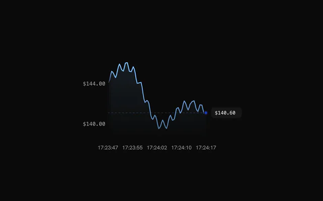
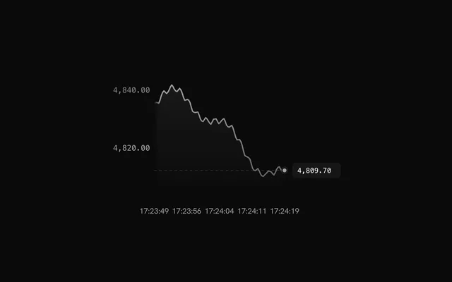
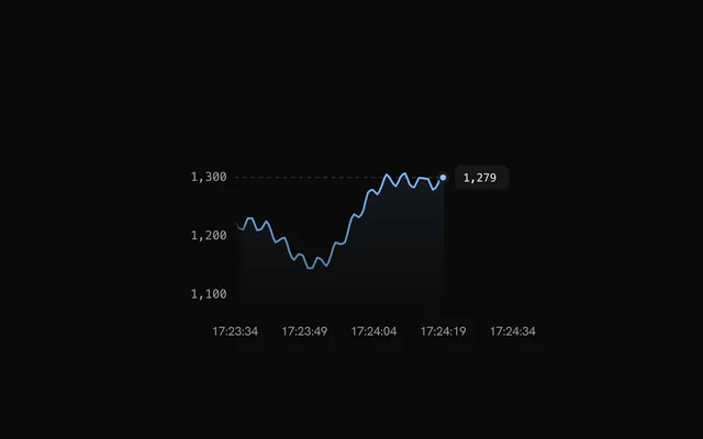
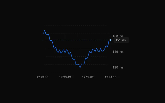
shadcn.io is an independent project built on shadcn/ui
Installation
The command adds the example above to components/charts/ and, the first time, the chart kit to components/ui/charts/. Both are source files in your project from then on: read them, change them, delete what you don't use.
Usage
Keep the samples in state as { time, value }, with time in Unix seconds, and append each one as it arrives. Pass the newest value as value and give the chart a height.
import {
  createEffect,
  createMemo,
  createSignal,
  on,
  onCleanup,
} from "solid-js";
import {
  ChartTooltip,
  LiveLine,
  LiveLineChart,
  type LiveLinePoint,
  LiveXAxis,
  LiveYAxis,
} from "@/components/ui/charts";

/** The last minute of readings, plus the new one. */
const append = (points: LiveLinePoint[], value: number): LiveLinePoint[] => {
  const now = Date.now() / 1000;
  return [...points.filter((point) => point.time > now - 60), { time: now, value }];
};

export const LatencyChart = () => {
  const [points, setPoints] = createSignal<LiveLinePoint[]>([]);
  const latest = createMemo(() => points().at(-1)?.value ?? 0);

  // Stand-in for your socket or poll: a reading every 500 ms.
  createEffect(
    on(points, () => {
      const timer = setTimeout(() => {
        setPoints(append(points(), 40 + Math.random() * 20));
      }, 500);
      onCleanup(() => clearTimeout(timer));
    })
  );

  return (
    <LiveLineChart
      ariaLabel="API latency"
      data={points()}
      style={{ height: "240px" }}
      value={latest()}
    >
      <LiveLine dataKey="value" label="Latency" />
      <ChartTooltip showDatePill={false} />
      <LiveXAxis />
      <LiveYAxis />
    </LiveLineChart>
  );
};
Anatomy
The chart owns the clock and the window. LiveLine draws the series, and the axes are their own live versions that scroll and ease with it.
<LiveLineChart data={points} style={{ height: "240px" }} value={latest}>
  <Grid horizontal />
  <LiveLine dataKey="value" label="Latency" />
  <ChartTooltip showDatePill={false} />
  <LiveXAxis />
  <LiveYAxis />
</LiveLineChart>LiveLineChart: Holds the samples, the time window and the latestvalue, and scrolls.LiveLine: The line, its fill, the live dot and the value badge.Grid: Horizontal guide lines. Vertical ones aren't drawn here.LiveXAxis: Clock times that scroll with the line.LiveYAxis: Value labels that ease as the range moves.ChartTooltip: The crosshair and the hovered sample's panel.
Window and pause
window is how many seconds stay in view (30). nowOffsetUnits={1} leaves one tick of room between the live dot and the right edge.
Set paused to freeze the line while someone reads a value off it. Keep appending samples in the meantime: the line shows them as soon as it resumes.
Momentum colors
Pass momentumColors={{ up, down, flat }} to the LiveLine and the line, the fill and the live dot take the color of the current trend. detectMomentum is exported if you want the same reading elsewhere, such as a badge in the header.
Tight range and right axis
By default the y range is padded so small moves look small. exaggerate fits it tightly to the data in view, which suits a metric that hovers in a narrow band.
<LiveYAxis position="right" /> moves the labels to the right, next to the badge.
Target bands
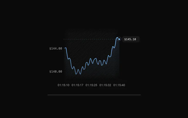
<ReferenceArea y1={141} y2={144} /> shades a target range that stays put while the line scrolls past it. showMarkers adds a small triangle on each edge, and pattern swaps the flat shade for a hatch.
Backgrounds
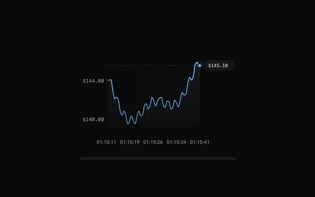
<Background /> behind the line instead of a Grid gives the plot a texture that fades toward its edges. pattern="dots" draws a dot grid.
Customization
The kit is in your project, in components/ui/charts/: your framework's components over a shared core/. Change a default there and every chart picks it up.
class goes on the chart's container, so size and spacing are utility classes.
formatValue on the LiveLine formats the badge, the tooltip and the y labels at once. Give LiveYAxis its own formatValue when the axis needs a shorter form, and LiveXAxis a formatTime for something other than HH:MM:SS.
fill={false}, pulse={false} and badge={false} turn off the area under the line, the pulse around the live dot and the value badge.
<LiveLine
  badge={false}
  dataKey="value"
  fill={false}
  formatValue={(value) => `${Math.round(value)} ms`}
  label="p95 latency"
  stroke="var(--chart-2)"
/>
Where a part renders content of its own, you pass it in. In Solid:
ChartTooltip:content={({ point, index }) => …}
Loading state
The live chart has no loading state. While the stream connects, render <LineChartLoading /> at the same height, with style={{ aspectRatio: "unset", height: 260 }}, and swap in the live chart once samples arrive.
Animation
There's no entrance. The line scrolls continuously, and the value it shows at the edge and the y range ease toward their targets. lerpSpeed (0 to 1, 0.08 by default) sets how quickly, so a jump in the data glides instead of snapping.
Theming
Every color in the kit is one of your theme's tokens or a mix of them, except --chart-positive, a fixed green. A preset or the .dark class restyles the chart, and overriding a token in your CSS changes it everywhere.
stroke on the LiveLine colors the line and its fill, --chart-line-primary by default. The live dot turns --chart-1 while the value rises and --chart-5 while it falls, unless momentumColors says otherwise.
| Token | Default | Paints |
|---|---|---|
--chart-line-primary | --chart-1 | a series with no color of its own |
--chart-1 | your theme's | the first series |
--chart-5 | your theme's | the fifth series |
--chart-grid | --border | grid lines |
--chart-label | --muted-foreground | tick labels |
--chart-crosshair | --muted-foreground at 75% | the hover line |
--chart-tooltip-background | --popover | the tooltip panel |
--chart-background | --card | dot halos, the gaps between stacked marks |
:root {
  --chart-line-primary: var(--chart-3);
  --chart-grid: var(--muted);
}
Accessibility
The chart is announced as an image named by ariaLabel ("Live line chart" by default). It doesn't announce each new value, so when the number matters, show it as text beside the chart too, as the examples' footers do.
- Tab
- Moves focus to the chart.
- Arrow Right
- Moves to the next sample. ArrowDown does the same.
- Arrow Left
- Moves to the previous sample. ArrowUp does the same.
- Home
- Jumps to the oldest sample in view.
- End
- Jumps to the latest sample.
API reference
Solid takes the same props as React, with class for className. A render prop is a function, called again when its arguments change, so destructured parameters stay current.
LiveLineChart
dataLiveLinePoint[]
The streaming samples, oldest first. Append new points as they arrive.
valuenumber
The latest value. The chart eases its display toward it.
dataKey?string
Key used for the value field.
- Default
"value"
window?number
Visible time window in seconds.
- Default
30
numXTicks?number
Number of x axis labels; also sizes the leading offset.
- Default
5
nowOffsetUnits?number
Leading offset in x tick units. 0 puts "now" at the right edge.
- Default
0
exaggerate?boolean
Use a tight y range around the data instead of the default padded one.
- Default
false
lerpSpeed?number
How fast the displayed value and y range ease toward their targets (0 to 1).
- Default
0.08
margin?Partial<ChartMargin>
Space around the plot area in pixels. Missing sides use the default.
- Type
Partial<ChartMargin>- Default
{ top: 24, right: 16, bottom: 32, left: 16 }
paused?boolean
Freeze the scrolling.
- Default
false
childrenReactNode
The layers to draw: LiveLine, Grid (its horizontal rows; vertical columns are not drawn), LiveXAxis, LiveYAxis, ChartTooltip.
class?string
Extra CSS class name for the chart container.
style?CSSProperties
Inline styles for the chart container. Set height to size the chart.
ariaLabel?string
Accessible name of the chart.
- Default
"Live line chart"
ariaDescription?string
Longer accessible description of the chart, exposed as aria-description.
LiveLine
dataKeystring
Key of the data field that holds the y values.
label?string
Series name in the default tooltip row, for example "Price". Defaults to the dataKey, as in bklit-ui.
stroke?string
Stroke color of the line.
- Default
"var(--chart-line-primary)"
strokeWidth?number
Stroke width of the line in px.
- Default
2
fill?boolean
Show the gradient fill under the line.
- Default
true
pulse?boolean
Show the pulsing live dot at the right edge.
- Default
true
dotSize?number
Radius of the live dot in px.
- Default
4
badge?boolean
Show the value badge at the live tip.
- Default
true
formatValue?(value: number) => string
Formats a value for the badge, the tooltip and the y axis labels. Defaults to two decimals.
- Type
(value: number) => string
momentumColors?MomentumColors
Colors the line, fill and dot by momentum direction. Overrides stroke for the line.
LiveXAxis
numTicks?number
Number of time labels. Defaults to the chart's numXTicks.
formatTime?(time: number) => string
Formats a time (in milliseconds since the epoch) into its label. Defaults to HH:MM:SS.
- Type
(time: number) => string
LiveYAxis
minGap?number
Minimum gap in px between labels.
- Default
36
position?"left" | "right"
Side of the plot the labels sit on.
- Type
"left" | "right"- Default
"left"
formatValue?(value: number) => string
Formats a tick value into its label. Defaults to the LiveLine formatValue.
- Type
(value: number) => string
allowDecimals?boolean
Allow fractional tick values.
- Default
true
Grid
horizontal?boolean
Show horizontal grid lines.
- Default
true
vertical?boolean
Show vertical grid lines.
- Default
false
numTicksRows?number
Number of horizontal grid lines. Ignored when rowTickValues is set.
- Default
5
numTicksColumns?number
Number of vertical grid lines.
- Default
10
rowTickValues?number[]
Explicit y values for the horizontal grid lines. Overrides numTicksRows.
stroke?string
Color of the grid lines.
- Default
"var(--chart-grid)"
loadingStroke?string
Grid color while the chart is loading. Falls back to stroke.
strokeOpacity?number
Opacity of the grid lines.
- Default
1
strokeWidth?number
Width of the grid lines in px.
- Default
1
strokeDasharray?string
Dash pattern of the grid lines.
- Default
"4,4"
highlightRowValues?number[]
Y values of horizontal lines drawn with the highlight styling, for example a zero baseline.
highlightRowStroke?string
Color of the highlighted rows.
- Default
"var(--chart-foreground-muted)"
highlightRowStrokeOpacity?number
Opacity of the highlighted rows.
- Default
1
highlightRowStrokeWidth?number
Width of the highlighted rows in px.
- Default
1
highlightRowStrokeDasharray?string
Dash pattern of the highlighted rows.
- Default
"0"
fadeHorizontal?boolean
Fade the horizontal lines toward transparent at the left and right edges.
- Default
true
fadeVertical?boolean
Fade the vertical lines toward transparent at the top and bottom edges.
- Default
false
hideHorizontalEdgeLines?boolean
Drop the first and last horizontal line (kept when two or fewer remain).
- Default
false
hideVerticalEdgeLines?boolean
Drop the first and last vertical line (kept when two or fewer remain).
- Default
false
shimmer?boolean
While the chart is loading, sweep a bright band across the grid.
- Default
false
shimmerStroke?string
Color of the shimmer band.
- Default
"color-mix(in oklch, var(--bkm-foreground) 68%, transparent)"
shimmerSpeed?number
Speed multiplier of the shimmer sweep. 2 is twice as fast.
- Default
1
ChartTooltip
showDatePill?boolean
Show the date pill that rides along the bottom of the plot.
- Default
true
showCrosshair?boolean
Show the vertical crosshair line. Bar charts leave it off unless this is true (the dots and the category pill mark the bar).
- Default
true
showDots?boolean
Show a dot on every series at the hovered position.
- Default
true
dotVariant?"dot" | "ring"
Dot style: a filled "dot" or a transparent "ring" square. Read by BarChart only.
- Type
"dot" | "ring"- Default
"dot"
dotSize?number
Dot radius in px.
- Default
5
dotRadiusFraction?number
Corner radius of the "ring" variant as a fraction of its side (0 is square, 0.5 is a circle). Read by BarChart only.
- Default
0.25
dotScale?number
Multiplier applied to the dot or ring size. Read by BarChart and LiveLineChart.
- Default
1
dotStrokeWidth?number
Stroke width of the dots in px.
- Default
2
indicatorColor?string | ((point: Record<string, unknown>) => string)
Color of the crosshair. Only a string is applied; the function form that bklit-ui accepts is ignored and the default is used.
- Type
string | ((point: Record<string, unknown>) => string)- Default
"var(--chart-crosshair)"
content?(props: { point: Record<string, unknown>; index: number; pinned?: boolean; dismiss?: () => void }) => ReactNode
Replaces the default tooltip panel body. Receives the hovered data row and its index; with pinnable, also whether the panel is pinned and a dismiss that unpins it (for a close button in a pinned panel's detail).
- Type
(props: { point: Record<string, unknown>; index: number; pinned?: boolean; dismiss?: () => void }) => ReactNode
pinnable?boolean
A click (or Enter, or Space) on the chart pins the tooltip where it is: the panel takes the pointer, so its content can grow into detail and hold controls, until another click, Escape or dismiss lets it go.
- Default
false
rows?(point: Record<string, unknown>) => { readonly color: string; readonly label: string; readonly value: string | number }[]
Replaces the default rows (one per series) with your own list of { color, label, value }.
- Type
(point: Record<string, unknown>) => { readonly color: string; readonly label: string; readonly value: string | number }[]
dotColor?string | ((point: Record<string, unknown>, line: ChartLineConfig) => string)
Fill of the tooltip dots. A function receives the hovered row and the series config, and is called again each time the hovered row changes. Defaults to each series' color; a ProfitLossLine's dot takes the color of the hovered value's sign.
- Type
string | ((point: Record<string, unknown>, line: ChartLineConfig) => string)
children?ReactNode
Extra content rendered below the rows in the default panel, for example marker details. Without it, a chart with ChartMarkers lists the markers on the hovered date there.
class?string
Extra class name for the tooltip panel.
springConfig?SpringConfig
Spring for the floating panel when matchCrosshair is on. Defaults to the chart's tooltip spring.
matchCrosshair?boolean
Make the floating panel follow the pointer with the same spring as the crosshair instead of damping.
- Default
false
damping?number
Spring damping for the floating panel when matchCrosshair is off, on bklit's 0 to 100 scale: lower is bouncier, higher slower, 0 moves the panel instantly. The default, 20, is the snappy hover spring (stiffness 3600, damping 120); every other value is bklit's spring for it played six times faster.
- Default
20
indicatorDasharray?string
Dash pattern of the crosshair. Omit for a solid line.
indicatorFadeEdges?IndicatorFadeEdges
Vertical fade of the crosshair: both ends, the top, the bottom, or none (solid).
- Default
"both"
indicatorFadeLength?number
Size of the crosshair's fade, as a percentage of its height (2 to 40).
- Default
10
indicatorEndColor?string
Bottom colour of the crosshair: it ramps from indicatorColor at the top to this at the bottom (composes with the fade).
indicatorEnd?"plot" | "point"
How far down the crosshair reaches: the whole plot, or down to the hovered point of the first series.
- Type
"plot" | "point"- Default
"plot"
dotHaloBlur?number
Blur in px on the dots' halo, for a soft glow.
- Default
0
topOffset?number
Extra gap in px between the top of the plot and the tooltip panel.
- Default
0
dateLabels?readonly string[]
The date pill's text for each data row, in row order (pair it with XAxis labels).
boxSpringConfig?SpringConfig
Spring for the floating panel. Takes priority over matchCrosshair and damping.
indicatorWidth?IndicatorWidth
Thickness of the crosshair: a width in px, or "line" (1px), "thin" (2px), "medium" (4px) or "thick" (8px).
- Default
"line"
Examples
9 examples on Solid, each live with its code and its own install command.