Brex Design System
Brex's design system as a DESIGN.md file.
About Brex DESIGN.md
Curated by Dov AzencotUpdated Source brex.com
- Fintech & Crypto
- Banking & Payments
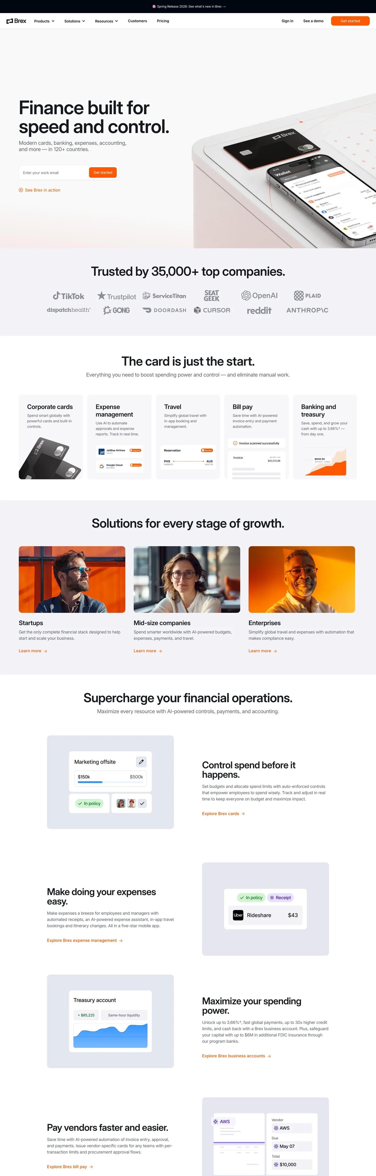
Brex's marketing surface is the warmest of the current fintech category. Where Stripe carries indigo `#533afd`, Ramp carries lime, and Mercury carries near-monochrome — Brex commits to a single warm orange `#ff5900` as the sole filled-CTA voltage. The hex hits the page in just three background spots (the "Get started" button, an inline accent dot, and a hover-reveal underline), but every primary action across every band rides that one color. Beneath it sits a near-black ink `#15191e` for type and an off-white canvas `#fcfcfd` for surface — the chromatic system has only one accent and it earns the contrast.
This page packages the full system into a single DESIGN.md file. Inside: 18 colors, 11 type tokens, 5 corner radii, 8 spacing values, and 17 components — primary and secondary buttons, a 60px sticky top-nav with a `--brex-nav-height` token, feature cards with `rgba(66,87,138,0.15)` cool-blue hairlines, the cream-card surface, a 36px-tall text-input, and the eyebrow-cap label pattern with `0.05em` letter-spacing and uppercase text-transform. Every hex is quoted; every token name traces back to a Brex `--_1k5xs26*` CSS custom property captured live from the homepage.
Feed the file to Claude, Cursor, or GitHub Copilot. The AI writes React components and Tailwind classes that match Brex's warm-orange-anchored hierarchy — single-voltage CTA placement, Inter weight-500 display, 10px-radius pill geometry, cool-blue hairlines, the 8/24/72px spacing rhythm — instead of a generic fintech theme. Where most spend-management tools default to bold-weight display headlines at 600 or 700, Brex commits its entire 14–72px display tier to weight 500 — the result reads architectural rather than aggressive.
What makes it distinct
- Warm orange CTA voltage`#ff5900` is the only filled button color, three background appearances against forty text/border uses
- Inter weight-500 display architecturethe entire 14–72px display tier renders at one weight with negative tracking from -0.14px to -1.44px
- Tight 10px-radius pill button36px tall, 12px horizontal padding, no shadow on rest, the brand's whole transactional surface
- Cool-blue hairline border`rgba(66,87,138,0.15)` edges every card and input, a chromatic counterpoint to the warm orange
- Three-family typographic chordInter for product chrome, Flecha for editorial serif moments, Space Mono for numeric callouts
Live at brex.com
A snapshot of the brand in production. Hover the frame to scroll the page; click to visit.
 brex.com
Explore Brex
Pick what you want to see — mockups, colors, typography, layout, or the full component list.
Brand & Accent
Sparing, CTA-only voltage.
Surface
Page and card backgrounds.
Text
Headlines, body, captions, muted.
Borders & Hairlines
Dividers, outlines, structural rules.
Other
Specialty colors.
Brex design system FAQ
Common questions about Brex's tokens, components, and how to use this DESIGN.md in your project.
Related reading
Specs, directories, and component libraries that pair with this design system.
Browse all design systems
The full directory of DESIGN.md files on shadcn.io, with live mockups for each.
Brex — official site
Brex's finance-software platform for company cards, banking, expenses, and accounting.
The DESIGN.md specification
Google Labs' open spec for machine-readable design system files — the format this page is built on.