Domino's Design System
A steel-blue header, One Dot Condensed Bold all-caps headings and Arial body on a near-monochrome palette. Domino's DESIGN.md for React and AI tools.
- Primary color
- #10789f
- Typeface
- One Dot Condensed Bold
- Shape
- Sharp
- Base radius
- 0px
- Colors
- 9
- Type tokens
- 6
- Components
- 13
- Spacing values
- 8
About Domino's DESIGN.md
Curated by Dov Azencot, updated May 19, 2026. Source dominos.com (opens in a new tab).
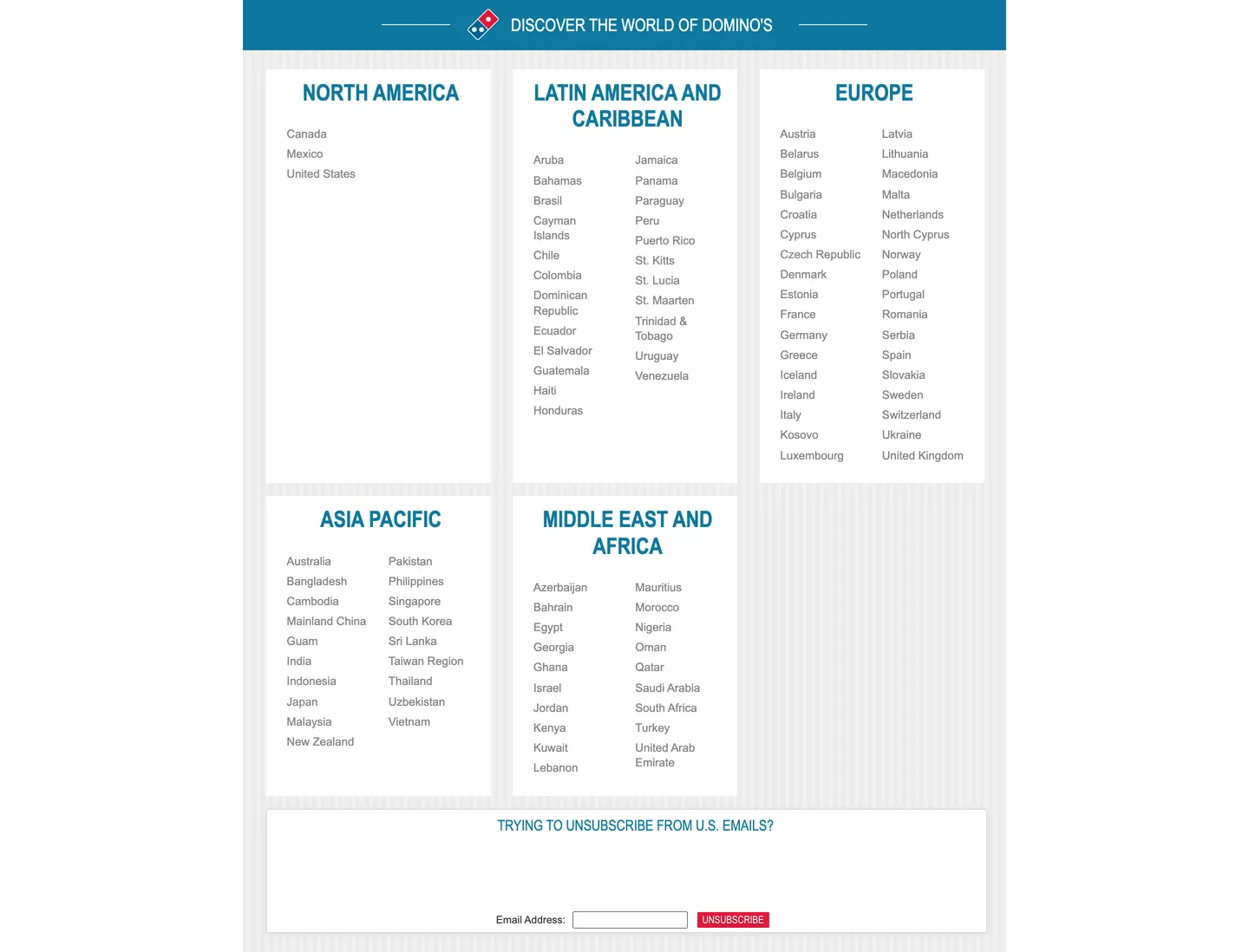
Domino's international landing page is so disciplined in its restraint that describing it almost requires listing what is not there. No gradient. No photography. No shadow. No radius beyond a single 3px chip. The page is a functional directory: five geographic regions, each in a white card, region names in One Dot Condensed Bold uppercase steel-blue, and country names in plain Arial at 13.2px weight 400 beneath them. The header is a flat steel-blue bar with the domino-tile logo and a centered all-caps banner headline. That is the entire visual vocabulary above the unsubscribe form at the bottom. Where Pizza Hut and Papa Johns run photography-led heroes with gradient CTAs, Domino's international surface is closer to a government directory than a consumer marketing page.
The DESIGN.md file packages the system into a machine-readable spec for React and AI tools. Inside: 9 colors tokens drawn from a near-monochrome palette of dark graphite (#333333), medium gray (#858585), white, steel-blue (#10789f), and a single brand red (#e3193b) appearing once as an "UNSUBSCRIBE" button fill. Six typography tokens span One Dot Condensed Bold (at 17–26px uppercase for headings) and Arial (at 12–13.2px for all body, labels, and interactive text). One radius token at 3px — the minimum in the scale. Ten spacing tokens from 1px to 30px. Thirteen component definitions covering the steel-blue header bar, all-uppercase region headers, white country-list cards, the minimal text input, and the single red CTA button.
Feed this file to Claude or Cursor and it will reproduce Domino's exact moves on this surface: flat steel-blue header with centered uppercase display, white square-corner cards holding two-column country link grids in Arial 13.2px, and a near-zero radius language that signals function over form. The system is worth studying as a case study in typographic hierarchy without chromatic hierarchy — all the differentiation between region title, country link, and global header comes from typeface, case, and size rather than from color diversity.
What makes it distinct
5 highlights
- One Dot Condensed Bold all-capsThe custom brand typeface locks every heading in uppercase condensed, regardless of size, creating a uniform announcement register
- Steel blue as structural brand voltage#10789f carries the header bar fill and every h3 heading color on the international page; the brand red appears only once as a CTA fill
- Near-monochrome workhorse98 of 98 nav-link and body text instances run in Arial at 13.2px; the brand typeface is reserved for headings only
- Almost no radiusA single 3px chip radius is the only rounding in the captured surface; every card, input, and container is square-cornered
- Graphite-heavy palette#333333 (dark gray) and #858585 (medium gray) account for 459 of 462 total color occurrences; the system reads as graphite-and-steel
Live at dominos.com
Domino's in production, as captured. Scroll the window to see the whole page.
9 colors
Domino's's system runs on #10789f as its primary voltage, used in 5 of 13 components. Type is set in One Dot Condensed Bold across 6 tokens from 12px to 26px, weights 400–700. Shape language is sharp — components average 0px corner radius, favoring crisp rectangles.
Brand & Accent
Sparing, CTA-only voltage · 2
Surface
Page and card backgrounds · 2
Text
Headlines, body, captions · 4
Borders & Hairlines
Dividers, outlines, rules · 1
6 type tokens
Set in One Dot Condensed Bold across 6 tokens, from 12px to 26px, weights 400–700. Shown in its own stack: where the font isn't installed, the fallback the file names stands in.
- display-lg26px · weight 700 · lh 30pxThe quick brown fox jumps over the lazy dog
- display-md20px · weight 400 · lh 58pxThe quick brown fox jumps over the lazy dog
- heading-sm17px · weight 400 · lh 22pxThe quick brown fox jumps over the lazy dog
- button-sm12px · weight 400 · lh 16pxThe quick brown fox jumps over the lazy dog
- body-md13px · weight 400 · lh 17pxThe quick brown fox jumps over the lazy dog
- caption12px · weight 400 · lh 12pxThe quick brown fox jumps over the lazy dog
Radii and spacing
2 corner radii and 8 spacing values. Shape language: sharp, on a 0px base radius.
Radii2
- none0px
- xs3px
Spacing8
- xxs1px
- xs2px
- sm6px
- md8px
- base12px
- lg15px
- xl22px
- 2xl30px
13 components
Each rendered from its tokens (color, type, radius, padding) on Domino's's own canvas.
- Button PrimaryButton Primarybutton-primary
- Button SecondaryButton Secondarybutton-secondary
- Top NavTop Navtop-nav
- Nav LinkNav Linknav-link
- Hero HeadingHero Headinghero-heading
- Section HeadingSection Headingsection-heading
- Body ParagraphBody Paragraphbody-paragraph
- CardCardcard
- Region CardRegion Cardregion-card
- Country LinkCountry Linkcountry-link
- Type here…Text Inputtext-input
- Divider RuleDivider Ruledivider-rule
- FooterFooterfooter
The system, in use
Domino's's tokens on the kind of product it builds.
Your favorites, delivered fresh
Order from the menu you love and follow it to your door in minutes.
Domino's design system FAQ
Domino's's tokens, its components and how to use this DESIGN.md in your project.
Related reading
Specs, directories and component libraries that pair with this design system.
- Browse all design systemsThe full directory of DESIGN.md files on shadcn.io, with live mockups for each.shadcn.io
- Domino's — official siteDomino's public marketing site — the source of truth for the live tokens captured in this file.dominos.com (opens in a new tab)
- The DESIGN.md specificationGoogle Labs' open spec for machine-readable design system files — the format this page is built on.github.com (opens in a new tab)
Use Domino's in your project
One machine-readable file. Drop it into Claude Code, Cursor, VS Code or any AI tool that reads DESIGN.md.
Download the DESIGN.md
One machine-readable file: every color, type, radius, spacing, and component token of Domino's.
Feed it to your AI tool
Drop it into Claude, Cursor, or GitHub Copilot. The agent writes React components and Tailwind classes that match Domino's's visual language.
Reference the tokens directly
Or paste the values into your Tailwind config, CSS variables, or component library: every color, size and radius is a quoted, ready-to-copy value.
Read the full DESIGN.md overview, rationale, do’s and don’ts
Overview
Domino's international landing page is not a consumer marketing surface — it is a typographic hierarchy without chromatic hierarchy. Every distinction between the global banner, the regional header, and the individual country link comes from typeface, case, and size rather than from color variation. One Dot Condensed Bold renders uppercase at 26px for regional headers; the same face at 20px uppercase for the page banner; Arial at 13.2px lowercase for each country name below. The structural move is notable because it contradicts the fast-food category default: Pizza Hut, McDonald's, and Papa John's all run photography-heavy international pages with gradient CTAs. Domino's delivers a flat, data-forward directory where the design system's job is legibility at scale across 90+ countries, not brand enthusiasm.
The palette confirms the function-first orientation. Graphite-and-steel: #333333 dark gray and #858585 medium gray account for 459 of 462 measured color occurrences. The steel blue (#10789f) adds brand identity to the header, the regional h3 headings, and decorative line-rules flanking the banner — 14 occurrences total. The brand red (#e3193b) classified as layer: "brand" appears once: the UNSUBSCRIBE button at the bottom of the page. The near-monochrome discipline means a developer can implement the entire page with four colors.
Key Characteristics:
- One Dot Condensed Bold all-caps for every heading tier — the custom face is reserved strictly for headlines and banner labels; it never appears in body or interactive copy.
- Arial at 13.2px as the universal body and link typeface — 98 occurrences, the most-used typographic signature by far.
- Steel blue (
{colors.primary}— #10789f) fills the header bar and carries every regional heading; the brand red appears once. - Near-zero radius — a single 3px chip token and square corners everywhere else.
- White square-corner cards for each geographic region, holding two-column country-name link grids.
- Graphite divider lines using steel-blue at low opacity to separate geographic sections.
- No shadow, no gradient, no photography, no animation — the captured international surface is static HTML with 270 elements scanned.
Colors
Brand
- Steel Blue (
{colors.primary}— #10789f): frequency 14. Used as text (6), background (2), border (6). The structural brand voltage on this surface — fills the global header bar, carries every h3 regional heading, and renders as the decorative line-rules flanking the banner title. Not in any CSS custom property on this surface; hard-coded per element. - Brand Red (
{colors.brand-red}— #e3193b): frequency 1, background only. Classified aslayer: "brand"in the extraction. Appears once as the fill of the UNSUBSCRIBE button. The classic Domino's red — dominant in product-facing surfaces (pizza.com order flow) but reduced to a single CTA use on the international directory page.
Text
- Ink (
{colors.ink}— #333333): frequency 263. Used as text (132) and border (131). The dominant text and rule color — every country-name link, every body label, every card-divider rule runs in this dark graphite. Not pure black; a slightly softened dark that sits comfortably at small sizes. - Ink Muted (
{colors.ink-muted}— #858585): frequency 196. Used as text (98) and border (98). The secondary text color — navigation links, placeholder text, and secondary nav labels. Exactly half the frequency of the primary ink at every counted role. - Ink Light (
{colors.ink-light}— #767676): frequency 1, border only. Used as the text-input border in the email unsubscribe form. - Ink Black (
{colors.ink-black}— #000000): frequency 3. Appears in the email input text and two border instances — pure black, contrasted against the text-input white background.
Surface
- Canvas (
{colors.canvas}— #ffffff): frequency 14, used as text (3), background (8), and border (3). The page floor and card fill — pure white, no warm tint. - Surface 1 (
{colors.surface-1}— #eeeeee): frequency 1, background only. A light cool gray used as a section background — the dimmest non-white surface on the page. - Hairline (
{colors.hairline}— #d9d9d9): frequency 2, used once as border and once as shadow. The card-divider tone — a pale gray that separates white region cards from the white page canvas at very low contrast.
Typography
Font Families
The system runs two typefaces: One Dot Condensed Bold (a proprietary brand font) for all heading and banner text, and Arial for all body, link, label, and interactive text. One Dot Condensed Bold always renders uppercase — there is no mixed-case use in the captured surface. Arial carries 98 of the 106 extracted typography instances; it is the true workhorse of the system.
Where most brand typographies pair a custom display face with a humanist secondary, Domino's pairs its condensed display with a system default. This is not a budget choice — it is a legibility decision: Arial at 13.2px renders predictably across every OS and browser on the planet, which matters for a 90-country directory.
Hierarchy
| Token | Size | Weight | Line Height | Use |
|---|---|---|---|---|
{typography.display-lg} | 26px | 700 | 30px | Regional h3 headers (NORTH AMERICA, EUROPE, ASIA PACIFIC…) |
{typography.display-md} | 20px | 400 | 58px | Global banner h2 (DISCOVER THE WORLD OF DOMINO'S) |
{typography.heading-sm} | 17px | 400 | 22px | Sub-regional or category labels |
{typography.button-sm} | 12px | 400 | 16px | Button labels in One Dot Condensed Bold uppercase |
{typography.body-md} | 13px | 400 | 17px | Country-name links, all nav text, form labels (Arial) |
{typography.caption} | 12px | 400 | 12px | Form field label, footnote text (Arial) |
Principles
One Dot Condensed Bold stays uppercase regardless of context; there is no sentence-case heading in the captured surface. The 26px / 700 regional h3 in steel blue is the typographic anchor of the page — it appears five times (one per geographic region) and carries all the brand warmth the near-monochrome palette does not. Arial at 13.2px / 400 carries everything else. No medium weight (500) or semibold (600) exists in the captured surface — the system is binary: condensed-bold display or regular-weight body.
Note on Font Substitutes
One Dot Condensed Bold is a proprietary brand typeface. Bebas Neue replicates the all-caps condensed character at zero cost; Barlow Condensed Bold at 700 is closer in x-height. Arial is universally available as a system font. No substitution needed for the body tier.
Layout
Spacing System
- Base unit: 6px — the dominant padding value in the extracted surface (89 occurrences); used as the vertical gap between country-name links.
- Tokens:
{spacing.xxs}1px ·{spacing.xs}2px ·{spacing.sm}6px ·{spacing.md}8px ·{spacing.base}12px ·{spacing.lg}15px ·{spacing.xl}22px ·{spacing.2xl}30px. - Header padding: 0px 30px 0px 70px on the banner h2 — left-heavy, offset to the right of the domino-tile logo.
- Card internal padding: 22px on the region cards.
- Country-link spacing: 6px vertical gap between each link — tight, directory-style rhythm.
Grid & Container
- Max content width: ~980px centered on a white canvas.
- Region cards: three-column layout (North America / Latin America / Europe across the top; Asia Pacific / Middle East and Africa across the bottom) with a proportionally narrower third card for lighter-content regions.
- Country links within cards: two-column grid for regions with many countries; single-column for sparse regions (North America: 3 countries, no grid needed).
Rhythm
The page runs at tight, directory cadence — 6px between links, 22px of card padding, and the header as the only generous spatial moment. There are no hero photography bands, no section-separator ornaments, and no whitespace breathing sections. The surface reads as pure data delivery with brand clothing.
Elevation
The system has no shadow tier. The 270 scanned elements produced two hairline occurrences ({colors.hairline} — #d9d9d9) and one shadow occurrence at the same value. Depth comes entirely from the contrast between white region cards and the very slightly gray page background. There is no elevation hierarchy beyond card-vs-canvas.
- Flat (no shadow): header bar, banner, all card surfaces — 100% of surfaces.
- Hairline lift: white region cards sit on a white canvas with a 1px
{colors.hairline}border; visible only at high contrast.
Shapes
The radius language is sharply functional:
{rounded.none}0px — all cards, the header bar, input fields, and the UNSUBSCRIBE button. Square corners everywhere in the captured surface.{rounded.xs}3px — a single chip-style element; the minimum non-zero radius in the system.
No 8px, no 16px, no pill. The Domino's international surface is the most zero-radius brand in the food delivery category captured in this directory.
Components
button-primary — Brand red {colors.brand-red} fill, white text, One Dot Condensed Bold 12px uppercase, square corners, 8×10px padding, 32px height. The UNSUBSCRIBE button is the canonical instance — the only primary CTA in the captured surface.
button-secondary — Steel blue {colors.primary} fill, white text, same geometry as the primary. Used for supplementary CTAs that don't carry the full brand-red urgency.
top-nav — Steel blue {colors.primary} bar, 58px height, white One Dot Condensed Bold 20px headline centered between decorative line-rules and the domino-tile logo. The single chromatic header moment.
nav-link — Transparent background, dark graphite {colors.ink} text in {typography.body-md} (Arial 13.2px), 6px vertical padding.
hero-heading — Steel blue {colors.primary} background, white text, One Dot Condensed Bold 20px uppercase. The banner headline "DISCOVER THE WORLD OF DOMINO'S" renders inside the header bar with 0×30px 0×70px padding to clear the logo.
section-heading — Transparent background, steel blue text in {typography.display-lg} (One Dot Condensed Bold 26px / 700). Regional h3 headers — NORTH AMERICA, EUROPE, etc.
body-paragraph — Transparent background, dark graphite {colors.ink} text at {typography.body-md}.
card — White {colors.canvas} fill, 0px radius, 22px internal padding, pale gray {colors.hairline} border. The standard region container.
region-card — Same as card — white surface, square corners, hairline border. Holds a region heading in steel blue above a two-column country-link grid.
country-link — Transparent background, dark graphite text at {typography.body-md} (Arial 13.2px). 6px vertical padding between links. The most-repeated component on the page — ~90 country names.
text-input — White {colors.canvas} fill, pure black text, ink-light border, square corners (0px), 1×2px padding, 20px height. The email input in the unsubscribe form — minimal field dimensions.
divider-rule — Decorative horizontal rules in steel blue flanking the banner headline. 1px height; the sole decorative use of the primary color.
footer — White {colors.canvas} canvas, muted gray text, 15×12px padding. The "TRYING TO UNSUBSCRIBE" prompt bar at the bottom of the page.
Do's and Don'ts
Do reserve One Dot Condensed Bold strictly for uppercase heading and banner text. The face has no body or sentence-case role in this system; mixing it with lowercase prose reads as a typo rather than a design choice.
Do use steel blue ({colors.primary} — #10789f) as the heading color for geographic or regional section titles. The pairing of One Dot Condensed Bold at 26px in steel blue is the system's recognizable heading treatment — changing the color to ink-graphite loses the brand signal.
Do use Arial at 13.2px for every country-link, nav-link, and form-label instance. The system does not use custom fonts at body scale; introducing a sans-serif substitute for Arial adds visual noise to a surface where legibility is the primary value.
Do keep card containers at 0px border-radius. The square corner treatment is the sharpest in the food-delivery category; introducing even 4px rounding softens the functional-directory character.
Don't use the brand red ({colors.brand-red} — #e3193b) for more than one CTA per page section. On this surface it appears once; multiplying it into multiple buttons or headings competes with the steel-blue structural signal and creates two competing brand voltages.
Don't use {colors.ink-muted} (#858585) for primary heading text. At 196 occurrences it is a secondary label color — using it at heading scale (26px One Dot Condensed) would read as a disabled or deprecated section title.
Don't add padding above 22px to the country-list cards. The directory rhythm depends on the 6px link-gap and 22px card padding staying tight; generous padding makes geographic regions feel like editorial sections rather than data containers.
Don't introduce a shadow tier. The system runs zero elevation beyond the hairline card border; adding drop shadows to region cards imports a visual vocabulary (rgba blur, layered elevation) the design does not use anywhere.
Known Gaps
- Product-ordering surface: the captured page is the international directory only — the US ordering flow (dominos.com/en/) carries a richer system with hero photography, red-dominant CTAs, pricing components, and pizza-configuration selectors. None of that richer surface is represented here.
- Brand red at scale: #e3193b appears once in this capture; the full brand system uses it much more broadly on the ordering surface. The red token is likely under-represented.
- Hover and focus states: no hover or focus states were captured; the country-link hover treatment (likely a color shift to steel blue or underline) is not documented.
- Mobile layout: the captured surface is desktop-width. The mobile directory presumably collapses to a single-column card list with a hamburger or accordion for regions.
- Dark mode: not declared. The international surface is light-only.
- Custom property system: unlike Panera's rich CSS variable layer, Domino's international page exposes no CSS custom properties — all values are hard-coded inline, which makes this spec fully representative of the captured surface but limits token inference for product variants.
More systems like this
Chipotle, Five Guys, Instacart and 12 more in Food & Delivery: each brand's colors, type and components in one file your AI agent builds from.
Build it with Pro
The DESIGN.md files are free. Pro adds 6,000+ blocks, premium templates and the MCP server, so your AI editor builds in your system for you.
4.9/5 out of 5 · 150+ reviewsfrom 150+ founders and developers.
Billing
Billed once a year in USD. Cancel anytime.
- How many people can use the license.
- Client work, SaaS products and anything you charge for.
- Page sections in 56 categories, from heroes and pricing tables to dashboards and settings, on every framework and UI library, in your theme.
- Complete Next.js sites for startups, SaaS, agencies and portfolios, every page designed, ready to ship.
- Your AI agent searches, previews and installs any component, block, icon or DESIGN.md from a prompt: 22 tools in Claude Code, Cursor, VS Code and 35 more clients.
- Buttons with motion and states of their own, from an arrow that slides in to a burst of confetti.
- Typewriters, scrambles, counters and more, for headlines, labels and numbers.
- Animated backgrounds for heroes, sections and cards, from a soft aurora to a flock that flees the cursor. Most are pure CSS.
- WebGPU shaders, from a slow aurora to a black hole, each drawing only while it's on screen.
- One design and one theme on all four: the components, blocks and effects are built for each framework.
- React on Base UI, Radix UI, React Aria or Ark UI: install the version for the library your project already uses. Vue, Svelte and Solid run on Ark UI.
- From a button to a date picker, a color picker or a guided tour: accessible, typed in TypeScript, each with live demos.
- Real-world patterns built from the components, in 53 galleries: forms, tables, menus, dialogs and more.
- Area, bar, line, pie, radar and radial charts on TanStack Charts, on every framework. React also gets the Recharts originals.
- Debounce, local storage, media queries and more: each hook is one typed file you own.
- From 222 libraries, Lucide, Heroicons, Tabler and Material Symbols among them, as SVG or a React component in one command.
- Stripe, Linear, Apple and 497 more: a brand's colors, typography and components in one file your AI agent builds from.
- Restyle every component and block at once: 8 styles, 8 grays, 18 colors and 5 radii, shared as a shadcn preset code.
- Priority requests are answered first.
Individual
For personal projects & open source
$32instead of $49/mo
$389 billed yearly
- Seats: 1 seat
- Commercial use: Personal & open source only
- Blocks: All 6,181 blocks
- Templates: All 14 templates
- MCP server: 38 AI clients
- Animated buttons: All 35 buttons
- Text effects: All 97 effects
- Backgrounds: All 100 backgrounds
- Shaders: All 100 shaders
- Frameworks: React, Vue, Svelte, Solid
- UI libraries: Base UI, Radix, Aria, Ark
- Components: All 174 components
- Examples: All 1,103 examples
- Charts: All 70 charts
- React hooks: All 35 hooks
- Icons: 294k+ icons
- DESIGN.md files: All 500 brands
- Theme builder: 8 styles × 18 colors
- Support: Standard
Team
Most popularFor freelancers, agencies & startups
$66instead of $99/mo
$789 billed yearly · ≈ $13/dev/mo
- Seats: Up to 5 seats
- Commercial use: Included
- Blocks: All 6,181 blocks
- Templates: All 14 templates
- MCP server: 38 AI clients
- Animated buttons: All 35 buttons
- Text effects: All 97 effects
- Backgrounds: All 100 backgrounds
- Shaders: All 100 shaders
- Frameworks: React, Vue, Svelte, Solid
- UI libraries: Base UI, Radix, Aria, Ark
- Components: All 174 components
- Examples: All 1,103 examples
- Charts: All 70 charts
- React hooks: All 35 hooks
- Icons: 294k+ icons
- DESIGN.md files: All 500 brands
- Theme builder: 8 styles × 18 colors
- Support: Priority
Organization
For companies with larger teams
$132instead of $199/mo
$1,589 billed yearly
- Seats: Unlimited seats
- Commercial use: Included
- Blocks: All 6,181 blocks
- Templates: All 14 templates
- MCP server: 38 AI clients
- Animated buttons: All 35 buttons
- Text effects: All 97 effects
- Backgrounds: All 100 backgrounds
- Shaders: All 100 shaders
- Frameworks: React, Vue, Svelte, Solid
- UI libraries: Base UI, Radix, Aria, Ark
- Components: All 174 components
- Examples: All 1,103 examples
- Charts: All 70 charts
- React hooks: All 35 hooks
- Icons: 294k+ icons
- DESIGN.md files: All 500 brands
- Theme builder: 8 styles × 18 colors
- Support: Priority
Billed once a year in USD. Cancel anytime.
Individual
For personal projects & open source
$32instead of $49/mo
$389 billed yearly
- How many people can use the license.Seats: 1 seat
- Client work, SaaS products and anything you charge for.Commercial use: Personal & open source only
- Page sections in 56 categories, from heroes and pricing tables to dashboards and settings, on every framework and UI library, in your theme.Blocks: All 6,181 blocks
- Complete Next.js sites for startups, SaaS, agencies and portfolios, every page designed, ready to ship.Templates: All 14 templates
- Your AI agent searches, previews and installs any component, block, icon or DESIGN.md from a prompt: 22 tools in Claude Code, Cursor, VS Code and 35 more clients.MCP server: 38 AI clients
- Buttons with motion and states of their own, from an arrow that slides in to a burst of confetti.Animated buttons: All 35 buttons
- Typewriters, scrambles, counters and more, for headlines, labels and numbers.Text effects: All 97 effects
- Animated backgrounds for heroes, sections and cards, from a soft aurora to a flock that flees the cursor. Most are pure CSS.Backgrounds: All 100 backgrounds
- WebGPU shaders, from a slow aurora to a black hole, each drawing only while it's on screen.Shaders: All 100 shaders
- One design and one theme on all four: the components, blocks and effects are built for each framework.Frameworks: React, Vue, Svelte, Solid
- React on Base UI, Radix UI, React Aria or Ark UI: install the version for the library your project already uses. Vue, Svelte and Solid run on Ark UI.UI libraries: Base UI, Radix, Aria, Ark
- From a button to a date picker, a color picker or a guided tour: accessible, typed in TypeScript, each with live demos.Components: All 174 components
- Real-world patterns built from the components, in 53 galleries: forms, tables, menus, dialogs and more.Examples: All 1,103 examples
- Area, bar, line, pie, radar and radial charts on TanStack Charts, on every framework. React also gets the Recharts originals.Charts: All 70 charts
- Debounce, local storage, media queries and more: each hook is one typed file you own.React hooks: All 35 hooks
- From 222 libraries, Lucide, Heroicons, Tabler and Material Symbols among them, as SVG or a React component in one command.Icons: 294k+ icons
- Stripe, Linear, Apple and 497 more: a brand's colors, typography and components in one file your AI agent builds from.DESIGN.md files: All 500 brands
- Restyle every component and block at once: 8 styles, 8 grays, 18 colors and 5 radii, shared as a shadcn preset code.Theme builder: 8 styles × 18 colors
- Priority requests are answered first.Support: Standard
Team
Most popularFor freelancers, agencies & startups
$66instead of $99/mo
$789 billed yearly · ≈ $13/dev/mo
Everything in Individual, plus
- How many people can use the license.Seats: Up to 5 seats
- Client work, SaaS products and anything you charge for.Commercial use: Included
- Priority requests are answered first.Support: Priority
Organization
For companies with larger teams
$132instead of $199/mo
$1,589 billed yearly
Everything in Team, plus
- How many people can use the license.Seats: Unlimited seats
- Secure checkout via Stripe
- Code lives in your repo
- Keep what you've shipped if you cancel
- License terms
4.9 out of 5 from 150+ developers


Your system, built for you
Every block, template and icon, installed by your AI agent in your design system. The DESIGN.md files stay free.
- Cancel anytime
- Keep what you've shipped