Hume Design System
A soft cream canvas with a named pastel spectrum of lavender, blush, amber, sky and mint, Fellix headings and mono labels. For React and AI coding tools.
- Primary color
- #c094e4
- Typeface
- Fellix
- Shape
- Soft
- Base radius
- 12px
- Colors
- 15
- Type tokens
- 13
- Components
- 16
- Spacing values
- 8
About Hume DESIGN.md
Curated by Dov Azencot, updated May 18, 2026. Source hume.ai (opens in a new tab).
Hume's marketing surface makes a claim through color that its text repeats in words: emotions have distinct identities, and each one deserves its own hue. The page runs a warm cream canvas — not white, not gray, a cream that reads as body-temperature — and against that ground it places six named pastel accents: lavender for classification, blush pink for empathy, amber orange for energy, sky blue for analysis, mint for calm, and coral for alertness. These aren't decorative; they're the visual vocabulary of Hume's Emotional Intelligence API, where each color labels a distinct emotion dimension in the research product. Where competing AI voice platforms (ElevenLabs, Play.ai, Cartesia) reach for dark canvases and high-voltage CTAs to signal technical authority, Hume reaches for softness and warmth as the primary credibility signal.
The DESIGN.md file packages the system into a machine-readable spec. Inside: 15 colors tokens covering the cream canvas, near-black ink, and the full six-color emotion spectrum; 12 typography tokens spanning Fellix (the custom humanist sans at the signature weight 520) and PP Fraktion Mono (the uppercase monospace running every label, button, and navigation item); 5 border-radius tokens from pill-shaped 9999px buttons to 24px cards; 8 spacing values; and 16 components definitions including the pill-CTA button in near-black, the horizontal comparison chart, and the pastel-gradient full-bleed footer section.
Feed this file to an AI coding tool and it reproduces Hume's specific moves: warm cream instead of white, six distinct pastel accents used as surface tints rather than as interactive fills, PP Fraktion Mono in uppercase for every label-sized text, and Fellix at 520 weight for headings that stop short of bold authority. The system rewards study if you're building an AI product that must read as technically grounded and emotionally trustworthy at the same time — it is one of the few examples in the category that achieves both without compromising either.
What makes it distinct
5 highlights
- Pastel emotion spectrumSix named accent colors (lavender, pink, orange, blue, mint, coral) used as card backgrounds and gradient orbs rather than as CTA fills
- PP Fraktion Mono in uppercase for all labels and buttonsThe only monospace-as-UI-voice system in the AI-platform category
- Fellix weight 520A non-standard weight between regular and semibold that softens headings without reaching bold
- Warm cream canvas (#ffffff resolved from #fff9f3) keeps the emotional palette reading as inviting rather than clinical
- Full-bleed pastel gradient section at the page bottomThe only brand-color background surface in the system
Live at hume.ai
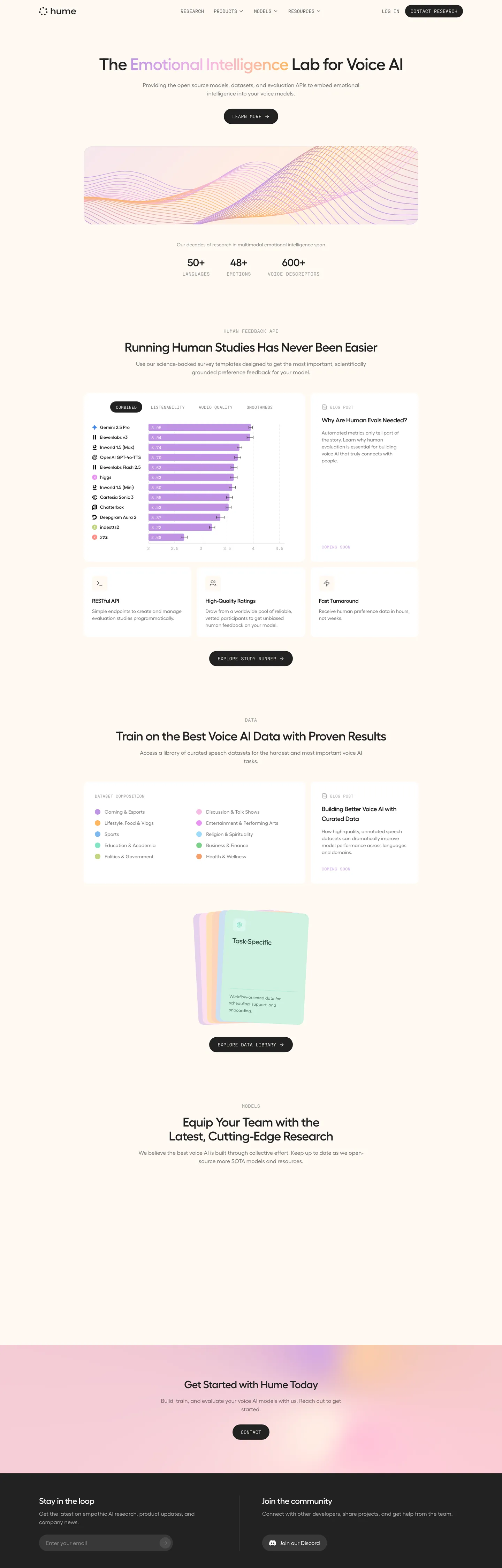
Hume in production, as captured. Scroll the window to see the whole page.
15 colors
Hume's system runs on #c094e4 as its primary voltage, used in 2 of 16 components. Type is set in Fellix across 13 tokens from 10px to 48px, weights 400–520. Shape language is soft — components average 16px corner radius, with no sharp interactive edges.
Brand & Accent
Sparing, CTA-only voltage · 10
Surface
Page and card backgrounds · 3
Text
Headlines, body, captions · 2
13 type tokens
Set in Fellix across 13 tokens, from 10px to 48px, weights 400–520. Shown in its own stack: where the font isn't installed, the fallback the file names stands in.
- display-xl48px · weight 520 · lh 48px · tracking -1.2pxThe quick brown fox jumps over the lazy dog
- display-lg36px · weight 520 · lh 40px · tracking -0.9pxThe quick brown fox jumps over the lazy dog
- display-md30px · weight 520 · lh 36px · tracking -0.75pxThe quick brown fox jumps over the lazy dog
- heading-lg24px · weight 520 · lh 32px · tracking -0.6pxThe quick brown fox jumps over the lazy dog
- heading-md20px · weight 520 · lh 25px · tracking -0.5pxThe quick brown fox jumps over the lazy dog
- heading-sm18px · weight 520 · lh 28px · tracking -0.45pxThe quick brown fox jumps over the lazy dog
- heading-xs16px · weight 520 · lh 24px · tracking -0.4pxThe quick brown fox jumps over the lazy dog
- body-lg16px · weight 400 · lh 24pxThe quick brown fox jumps over the lazy dog
- body-md14px · weight 400 · lh 20pxThe quick brown fox jumps over the lazy dog
- body-sm12px · weight 400 · lh 19.5pxThe quick brown fox jumps over the lazy dog
- label-mono14px · weight 400 · lh 20px · tracking 0.35pxThe quick brown fox jumps over the lazy dog
- label-mono-sm12px · weight 400 · lh 16px · tracking 0.3pxThe quick brown fox jumps over the lazy dog
- label-mono-xs10px · weight 400 · lh 15px · tracking 0.25pxThe quick brown fox jumps over the lazy dog
Radii and spacing
6 corner radii and 8 spacing values. Shape language: soft, on a 12px base radius.
Radii6
- none0px
- sm8px
- md12px
- lg16px
- xl24px
- full9999px
Spacing8
- xs4px
- sm8px
- md12px
- base16px
- lg24px
- xl32px
- 2xl48px
- 3xl64px
16 components
Each rendered from its tokens (color, type, radius, padding) on Hume's own canvas.
- Button PrimaryButton Primarybutton-primary
- Button SecondaryButton Secondarybutton-secondary
- Button CtaButton Ctabutton-cta
- Top NavTop Navtop-nav
- Nav LinkNav Linknav-link
- Hero HeadingHero Headinghero-heading
- Section HeadingSection Headingsection-heading
- Body ParagraphBody Paragraphbody-paragraph
- Section LabelSection Labelsection-label
- CardCardcard
- Card LavenderCard Lavendercard-lavender
- Card PeachCard Peachcard-peach
- Type here…Text Inputtext-input
- Stat NumberStat Numberstat-number
- Tag ChipTag Chiptag-chip
- Footer SectionFooter Sectionfooter-section
The system, in use
Hume's tokens on the kind of product it builds.
Think bigger with an AI at your side
Ask anything, write and analyze, and build with an assistant that understands your work.
Hume design system FAQ
Hume's tokens, its components and how to use this DESIGN.md in your project.
What are the color tokens in the Hume DESIGN.md?
What is Hume's primary color hex code?
How do I use Hume's colors in Tailwind CSS?
What is Hume's primary brand color?
How should I use Hume's pastel colors — as text, background, or border?
What fonts does Hume use?
What is Hume's type scale?
What can I use if I don't have Hume's font?
What typefaces does Hume use, and what are the best substitutes?
Which components does the Hume DESIGN.md define?
What corner radius and spacing does Hume use?
Why does Hume use PP Fraktion Mono in uppercase for labels and buttons?
How do I apply the Hume design system to a shadcn/ui project?
How do I use the Hume DESIGN.md with Claude Code or Cursor?
Is the Hume DESIGN.md free to download?
How was the Hume DESIGN.md made?
Is the Hume DESIGN.md official?
Is Hume's background pure white or a tinted cream?
Related reading
Specs, directories and component libraries that pair with this design system.
- Browse all design systemsThe full directory of DESIGN.md files on shadcn.io, with live mockups for each.shadcn.io
- Hume — official siteHume's public marketing site — the source of truth for the live tokens captured in this file.hume.ai (opens in a new tab)
- The DESIGN.md specificationGoogle Labs' open spec for machine-readable design system files — the format this page is built on.github.com (opens in a new tab)
Use Hume in your project
One machine-readable file. Drop it into Claude Code, Cursor, VS Code or any AI tool that reads DESIGN.md.
Download the DESIGN.md
One machine-readable file: every color, type, radius, spacing, and component token of Hume.
Feed it to your AI tool
Drop it into Claude, Cursor, or GitHub Copilot. The agent writes React components and Tailwind classes that match Hume's visual language.
Reference the tokens directly
Or paste the values into your Tailwind config, CSS variables, or component library: every color, size and radius is a quoted, ready-to-copy value.
Read the full DESIGN.md overview, rationale, do’s and don’ts
Overview
Hume's marketing site arrives at an answer few AI brands attempt: that scientific rigor and emotional warmth can coexist on the same page without either conceding to the other. Emotional register as palette. The six pastel accents — lavender, blush pink, amber orange, sky blue, mint, and coral — are not arbitrary decoration; they are the visual naming system of Hume's Emotional Intelligence API, where each hue corresponds to a distinct emotion dimension the model tracks. The warm cream canvas keeps this spectrum from reading as clinical, the way a pure-white lab ground would. Where voice-AI competitors like ElevenLabs and Cartesia reach for dark canvases and high-saturation CTAs to signal technical power, Hume reaches for warmth and multiplicity.
Typography reinforces the tension. Fellix — a custom humanist sans — runs headings at the non-standard weight 520, stopping precisely between regular and semibold to avoid the authoritative push that weight 600+ would deliver. Every label, button, and navigation item runs PP Fraktion Mono in uppercase: the mono uppercase is the scientific-register signal, the thin-stroked humanist heading is the empathy signal, and the two never trade places.
Key Characteristics:
- Warm cream canvas (resolved from #fff9f3) rather than clinical white, maintaining body-temperature approachability against the pastel emotion spectrum.
- Six named pastel accents used as card fills and gradient orbs — never as interactive fill on buttons or links.
- PP Fraktion Mono uppercase runs every label-sized and button-sized text, creating the scientific-register micro-voice.
- Fellix at weight 520 for all headings — a variable-font interpolation that lands between regular and semibold.
- Near-black (#222222) pill buttons with cream text are the only interactive fill in the system.
- Full-bleed lavender-to-pink gradient footer band — the single section where pastel becomes structural background rather than card tint.
- No shadow tier; card depth comes from hairline borders on the cream canvas.
Colors
Brand Pastels
- Lavender (
#c094e4— frequency 17): Used as text (7), bg (2), border (7). The highest-frequency brand color; labels the emotional-classification dimension and serves as the footer gradient anchor. The brand's most recognizable pastel. - Blush Pink (
#f7bbe6— frequency 5): Used as bg (2), border (1), gradient (1). Empathy register; appears in card backgrounds and the gradient orb cluster in the hero. - Amber Orange (
#ffb760— frequency 5): Used as bg (2), border (1), gradient (1). Energy register; the warmest accent, anchoring the peach card variant. - Sky Blue (
#7fb8ef— frequency 3): Used as bg (1), border (1). Analysis register; appears in card tints and the feature icon set. - Mint (
#85e4c5— frequency 3): Used as bg (1), border (1). Calm register; the most desaturated accent in the spectrum. - Coral (
#f89d6b— frequency 3): Used as bg (1), border (1). Alertness register; sits between the orange and the pink in the emotional temperature sequence. - Magenta (
#ea93f3— frequency 1): Used as bg (1). Supplementary accent; appears in one gradient orb below the fold. - Sky Light (
#9ddbfb— frequency 1): Used as bg (1). Lighter blue variant in the data visualization section. - Green (
#7bd289— frequency 1): Used as bg (1). Positive-valence accent; appears in the model-comparison chart rows. - Lime (
#c1d581— frequency 1): Used as bg (1). Curiosity register; the most yellow-shifted accent.
Structural
- Ink (
#222222— frequency 323): Used as text (157), bg (9), border (157). The primary text color and the primary CTA button fill — the only dark-on-cream interactive pattern in the system. - Canvas (
#ffffff— frequency 102): Used as text (45), bg (14), border (43). The near-white cream canvas, resolving from #fff9f3 in the CSS variable but landing perceptually as warm white. - Surface Lavender (
#f0e0f0— frequency 2): Used in gradient (2). Pale lavender tint; appears in the footer gradient band as the lighter stop. - Surface Peach (
#fde8e0— frequency 2): Used in gradient (2). Pale peach tint; appears in the warm card zone in the data section. - Pure Black (
#000000— frequency 2): Used as text (1), border (1). Appears only in gradient stops; not in UI chrome.
Typography
Font Families
The system runs two typefaces in strict role separation. Fellix (custom humanist sans-serif, wired as --font-sans and --default-font-family) handles every heading and body text. PP Fraktion Mono (from Pangram Pangram, wired as --font-mono and --default-mono-font-family) handles every label, button, tag, and navigation item — always uppercase, always at weight 400.
Hierarchy
| Token | Size | Weight | Line Height | Use |
|---|---|---|---|---|
display-xl | 48px | 520 | 48px | Hero h1 |
display-lg | 36px | 520 | 40px | Section pull-quote |
display-md | 30px | 520 | 36px | Section h2 |
heading-lg | 24px | 520 | 32px | Sub-section h2 |
heading-md | 20px | 520 | 25px | Card titles, h3 |
heading-sm | 18px | 520 | 28px | Smaller card h3 |
heading-xs | 16px | 520 | 24px | Compact h3 |
body-lg | 16px | 400 | 24px | Navigation links, standard prose |
body-md | 14px | 400 | 20px | Card body, default running text |
body-sm | 12px | 400 | 19.5px | Captions, small descriptors |
label-mono | 14px | 400 | 20px | Buttons, nav labels (uppercase) |
label-mono-sm | 12px | 400 | 16px | Section tags, chips (uppercase) |
label-mono-xs | 10px | 400 | 15px | Micro labels (uppercase) |
Weight 520 and Substitutes
Fellix's weight 520 is a variable-font interpolation that exists between regular (400) and semibold (600). It softens headings without the authority push of weight 600+. Plus Jakarta Sans at weight 500 is the closest open substitute for the heading voice; IBM Plex Mono in uppercase at weight 400 approximates PP Fraktion Mono's label cadence. Geist Mono is also acceptable for the label mono tier.
Layout
The page uses a centered single-column content column with a maximum width of roughly 1200px, with internal sections switching between two-column and three-column card grids. Section vertical spacing follows a generous rhythm: the hero runs 160px top padding, major sections use 48-64px vertical padding, and card grids pad internally at 16-24px.
- Base unit: 4px (8px dominant module, 16px base).
- Card padding:
spacing.base(16px) on compact cards;spacing.lg(24px) on larger feature cards. - Section padding:
spacing.2xl(48px) vertical minimum between sections. - Hero horizontal: 32px rail with the heading constrained to roughly 960px.
The comparison chart section uses a distinctive horizontal bar layout where model names run a left column and colored bars extend rightward — the pastel accent colors tag each model provider with a distinct bar color, one of the few places brand pastels function as data encoding.
Elevation
The system carries no shadow tier. Elevation on the warm cream canvas is communicated exclusively through hairline borders: cards use a 1px near-black (#222222) border at rounded.md or rounded.lg radius. The absence of shadows keeps the surface reading as a flat, printed-paper aesthetic rather than a soft-light UI. The only depth effect is the subtle pastel card fills lifting certain content blocks against the cream ground through color contrast alone, not through drop shadow.
Shapes
The radius scale spans from pill buttons to square hero images:
rounded.none(0px) — not used in UI chrome; only for straight-edged image frames.rounded.sm(8px) — small chips, tags, compact UI elements.rounded.md(12px) — standard cards and mid-size containers.rounded.lg(16px) — larger feature cards and data visualization containers.rounded.xl(24px) — the largest card format, used on the full-bleed gradient sections.rounded.full(9999px) — all buttons. Every CTA in the system is pill-shaped; there are no rectangular buttons.
The pill button is the system's most consistent shape signal. At 36px height for compact CTAs and 48px for hero CTAs, all filled with near-black, the pill shape runs from the top-nav "Contact Research" button through every in-page action. The pill reads as approachable rather than corporate — consistent with the brand's warmth positioning.
Components
button-primary — Near-black (#222222) pill, cream-white text in PP Fraktion Mono uppercase 14px, 9999px radius, 8x16 padding, 36px height. "CONTACT RESEARCH" is the canonical nav instance. The only interactive fill color in the system — pastels never appear as button fills.
button-secondary — Transparent fill, near-black text and 1px near-black border, same pill geometry. Used for "LEARN MORE" and secondary page actions.
button-cta — Taller pill (44px) version of button-primary, 12x24 padding, used in the hero zone for the primary conversion action.
top-nav — Cream canvas background, 56px height, 32px horizontal padding. Houses the Hume wordmark at left, navigation links in 16px Fellix body at center, and the near-black "CONTACT RESEARCH" pill at right. No divider line — the nav sits flush with the cream canvas.
nav-link — Transparent, near-black Fellix 16px weight 400, no padding decoration. No uppercase treatment — one of the few places in the nav where Fellix rather than Fraktion Mono runs.
hero-heading — Near-black Fellix 48px weight 520, letter-spacing -1.2px. The "Emotional Intelligence" fragment of the h1 renders in lavender (#c094e4) inline — the one place a brand pastel highlights text rather than fills a surface.
section-heading — Fellix 30px weight 520, near-black, -0.75px tracking. Introduces major content sections ("Running Human Studies Has Never Been Easier", "Train on the Best Voice AI Data").
body-paragraph — Fellix 14px weight 400, near-black, standard line height. The workhorse prose throughout the page.
section-label — PP Fraktion Mono 14px uppercase, near-black. Labels content sections ("HUME FEEDBACK API", "DATA", "MODELS") — the mono uppercase as organizational taxonomy signal.
card — Cream fill, 1px near-black hairline border, 16px internal padding, 16px radius. The default content card on the cream canvas.
card-lavender — Lavender (#c094e4) fill, 16px radius, 16px padding. Used for featured comparison chart rows and highlight cards.
card-peach — Amber orange (#ffb760) fill, 16px radius, 16px padding. Warm-register variant for energy-tone feature cards.
text-input — Cream fill, white text, 9999px pill radius, 12x48x12x20 padding, 48px height. The email capture field in the footer "Stay in the loop" section. Pill input matches the pill button geometry.
stat-number — Fellix 30px weight 520, near-black. Used for the "50+ languages", "48+ emotions", "600+ audio descriptions" stats above the comparison section.
tag-chip — PP Fraktion Mono 12px uppercase, transparent fill, 1px near-black border, pill radius, 4x12 padding. Section taxonomy tags.
footer-section — Full-bleed lavender (#c094e4) to pink gradient background, near-black text, 64x32 padding. The page's single pastel-as-structure moment, where the emotion palette becomes the dominant ground rather than a card tint.
Do's and Don'ts
Do keep PP Fraktion Mono uppercase for every label, button, and navigational element. The mono uppercase is Hume's scientific-register micro-voice — switching to Fellix or Title Case in these slots removes the tension between the warm headings and the precise labels that defines the brand.
Do use the six pastel colors exclusively as surface fills and gradient stops. The system assigns each pastel to a semantic emotional register; use lavender for classification contexts, amber orange for energy contexts, and sky blue for analytical contexts to maintain the encoding logic.
Do use hairline borders (1px near-black on cream) rather than shadows for card elevation. The flat hairline aesthetic reads as research-grade precision — adding drop shadows shifts the page toward consumer-app softness that undercuts the scientific credibility.
Do keep the heading weight at 520 via the Fellix variable font, or at weight 500 on the substitute. Bumping to 600+ crosses into editorial authority that conflicts with the brand's empathy positioning.
Don't fill any button with a pastel color. Buttons in this system are near-black on cream, never lavender or mint — if you use {colors.primary} (#c094e4) as a button fill, the interactive grammar collapses into decoration and the scarcity that gives the pastels emotional weight disappears.
Don't use {colors.accent-orange} (#ffb760) as a link or text color. Its frequency of 1 in the text role comes from a gradient SVG edge, not from readable text. At 14px on cream it fails WCAG AA contrast.
Don't introduce a rectangular button variant. Every CTA in the system is {rounded.full} (9999px) — mixing pill buttons with 8px or 12px-radius buttons would import a visual grammar from a different design system entirely.
Don't replace the warm cream canvas (#fff9f3) with pure white (#ffffff). The half-degree warmth difference is precisely what keeps the six-color pastel spectrum reading as inviting rather than clinical. On pure white, the pastels look like a child's palette; on warm cream they read as intentional emotional registers.
Known Gaps
- Hover and focus states: the extraction captured resting states only. Hover variants for the pill buttons, nav links, and comparison chart rows are not documented here.
- Dark mode: the marketing surface is light-only. The Hume EVI product interface may carry a dark theme not represented in this file.
- Motion: the pastel gradient orbs in the hero animate (radial pulse and drift), but the spec captures end-state values only. Easing and timing parameters are not documented.
- Form states: the email input resting state is captured; error, focused, and filled states are absent.
- Chart internals: the horizontal comparison bar chart uses pastel-coded model bars. The specific color assignments per model provider are not mapped here — they may change with model updates.
- Responsive breakpoints: the desktop-1440px layout is captured; mobile and tablet column collapse behavior is not documented.
- Sub-brand assets: the Hume EVI product icon, the Study Runner sub-product, and the Data Library have distinct visual treatments not fully captured from the marketing surface.
More systems like this
Algolia, Anthropic, Arc and 61 more in AI & LLM Platforms: each brand's colors, type and components in one file your AI agent builds from.
Build it with Pro
The DESIGN.md files are free. Pro adds 6,000+ blocks, premium templates and the MCP server, so your AI editor builds in your system for you.
4.9/5 out of 5 · 150+ reviewsfrom 150+ founders and developers.
Billing
Billed once a year in USD. Cancel anytime.
- How many people can use the license.
- Client work, SaaS products and anything you charge for.
- Page sections in 56 categories, from heroes and pricing tables to dashboards and settings, on every framework and UI library, in your theme.
- Complete Next.js sites for startups, SaaS, agencies and portfolios, every page designed, ready to ship.
- Your AI agent searches, previews and installs any component, block, icon or DESIGN.md from a prompt: 22 tools in Claude Code, Cursor, VS Code and 35 more clients.
- Buttons with motion and states of their own, from an arrow that slides in to a burst of confetti.
- Typewriters, scrambles, counters and more, for headlines, labels and numbers.
- Animated backgrounds for heroes, sections and cards, from a soft aurora to a flock that flees the cursor. Most are pure CSS.
- WebGPU shaders, from a slow aurora to a black hole, each drawing only while it's on screen.
- One design and one theme on all four: the components, blocks and effects are built for each framework.
- React on Base UI, Radix UI, React Aria or Ark UI: install the version for the library your project already uses. Vue, Svelte and Solid run on Ark UI.
- From a button to a date picker, a color picker or a guided tour: accessible, typed in TypeScript, each with live demos.
- Real-world patterns built from the components, in 53 galleries: forms, tables, menus, dialogs and more.
- Area, bar, line, pie, radar and radial charts on TanStack Charts, on every framework. React also gets the Recharts originals.
- Debounce, local storage, media queries and more: each hook is one typed file you own.
- From 222 libraries, Lucide, Heroicons, Tabler and Material Symbols among them, as SVG or a React component in one command.
- Stripe, Linear, Apple and 497 more: a brand's colors, typography and components in one file your AI agent builds from.
- Restyle every component and block at once: 8 styles, 7 grays, 18 colors and 5 radii, shared as a shadcn preset code.
- Priority requests are answered first.
Individual
For personal projects & open source
$32instead of $49/mo
$389 billed yearly
- Seats: 1 seat
- Commercial use: Personal & open source only
- Blocks: All 6,181 blocks
- Templates: All 14 templates
- MCP server: 38 AI clients
- Animated buttons: All 35 buttons
- Text effects: All 97 effects
- Backgrounds: All 100 backgrounds
- Shaders: All 100 shaders
- Frameworks: React, Vue, Svelte, Solid
- UI libraries: Base UI, Radix, Aria, Ark
- Components: All 174 components
- Examples: All 1,103 examples
- Charts: All 70 charts
- React hooks: All 35 hooks
- Icons: 294k+ icons
- DESIGN.md files: All 500 brands
- Theme builder: 8 styles × 18 colors
- Support: Standard
Team
Most popularFor freelancers, agencies & startups
$66instead of $99/mo
$789 billed yearly · ≈ $13/dev/mo
- Seats: Up to 5 seats
- Commercial use: Included
- Blocks: All 6,181 blocks
- Templates: All 14 templates
- MCP server: 38 AI clients
- Animated buttons: All 35 buttons
- Text effects: All 97 effects
- Backgrounds: All 100 backgrounds
- Shaders: All 100 shaders
- Frameworks: React, Vue, Svelte, Solid
- UI libraries: Base UI, Radix, Aria, Ark
- Components: All 174 components
- Examples: All 1,103 examples
- Charts: All 70 charts
- React hooks: All 35 hooks
- Icons: 294k+ icons
- DESIGN.md files: All 500 brands
- Theme builder: 8 styles × 18 colors
- Support: Priority
Organization
For companies with larger teams
$132instead of $199/mo
$1,589 billed yearly
- Seats: Unlimited seats
- Commercial use: Included
- Blocks: All 6,181 blocks
- Templates: All 14 templates
- MCP server: 38 AI clients
- Animated buttons: All 35 buttons
- Text effects: All 97 effects
- Backgrounds: All 100 backgrounds
- Shaders: All 100 shaders
- Frameworks: React, Vue, Svelte, Solid
- UI libraries: Base UI, Radix, Aria, Ark
- Components: All 174 components
- Examples: All 1,103 examples
- Charts: All 70 charts
- React hooks: All 35 hooks
- Icons: 294k+ icons
- DESIGN.md files: All 500 brands
- Theme builder: 8 styles × 18 colors
- Support: Priority
Billed once a year in USD. Cancel anytime.
Individual
For personal projects & open source
$32instead of $49/mo
$389 billed yearly
- How many people can use the license.Seats: 1 seat
- Client work, SaaS products and anything you charge for.Commercial use: Personal & open source only
- Page sections in 56 categories, from heroes and pricing tables to dashboards and settings, on every framework and UI library, in your theme.Blocks: All 6,181 blocks
- Complete Next.js sites for startups, SaaS, agencies and portfolios, every page designed, ready to ship.Templates: All 14 templates
- Your AI agent searches, previews and installs any component, block, icon or DESIGN.md from a prompt: 22 tools in Claude Code, Cursor, VS Code and 35 more clients.MCP server: 38 AI clients
- Buttons with motion and states of their own, from an arrow that slides in to a burst of confetti.Animated buttons: All 35 buttons
- Typewriters, scrambles, counters and more, for headlines, labels and numbers.Text effects: All 97 effects
- Animated backgrounds for heroes, sections and cards, from a soft aurora to a flock that flees the cursor. Most are pure CSS.Backgrounds: All 100 backgrounds
- WebGPU shaders, from a slow aurora to a black hole, each drawing only while it's on screen.Shaders: All 100 shaders
- One design and one theme on all four: the components, blocks and effects are built for each framework.Frameworks: React, Vue, Svelte, Solid
- React on Base UI, Radix UI, React Aria or Ark UI: install the version for the library your project already uses. Vue, Svelte and Solid run on Ark UI.UI libraries: Base UI, Radix, Aria, Ark
- From a button to a date picker, a color picker or a guided tour: accessible, typed in TypeScript, each with live demos.Components: All 174 components
- Real-world patterns built from the components, in 53 galleries: forms, tables, menus, dialogs and more.Examples: All 1,103 examples
- Area, bar, line, pie, radar and radial charts on TanStack Charts, on every framework. React also gets the Recharts originals.Charts: All 70 charts
- Debounce, local storage, media queries and more: each hook is one typed file you own.React hooks: All 35 hooks
- From 222 libraries, Lucide, Heroicons, Tabler and Material Symbols among them, as SVG or a React component in one command.Icons: 294k+ icons
- Stripe, Linear, Apple and 497 more: a brand's colors, typography and components in one file your AI agent builds from.DESIGN.md files: All 500 brands
- Restyle every component and block at once: 8 styles, 7 grays, 18 colors and 5 radii, shared as a shadcn preset code.Theme builder: 8 styles × 18 colors
- Priority requests are answered first.Support: Standard
Team
Most popularFor freelancers, agencies & startups
$66instead of $99/mo
$789 billed yearly · ≈ $13/dev/mo
Everything in Individual, plus
- How many people can use the license.Seats: Up to 5 seats
- Client work, SaaS products and anything you charge for.Commercial use: Included
- Priority requests are answered first.Support: Priority
Organization
For companies with larger teams
$132instead of $199/mo
$1,589 billed yearly
Everything in Team, plus
- How many people can use the license.Seats: Unlimited seats
- Secure checkout via Stripe
- Code lives in your repo
- Keep what you've shipped if you cancel
- License terms
4.9 out of 5 from 150+ developers


Your system, built for you
Every block, template and icon, installed by your AI agent in your design system. The DESIGN.md files stay free.
- Cancel anytime
- Keep what you've shipped