J.P. Morgan Design System
One typeface, Amplitude, from 64px light display to 12px labels, with blue-gray ink on white and a teal CTA. J.P. Morgan's site for React and AI tools.
- Primary color
- #1a7b99
- Typeface
- Amplitude
- Shape
- Sharp
- Base radius
- 0px
- Colors
- 11
- Type tokens
- 12
- Components
- 16
- Spacing values
- 8
About J.P. Morgan DESIGN.md
Curated by Dov Azencot, updated May 19, 2026. Source jpmorgan.com (opens in a new tab).
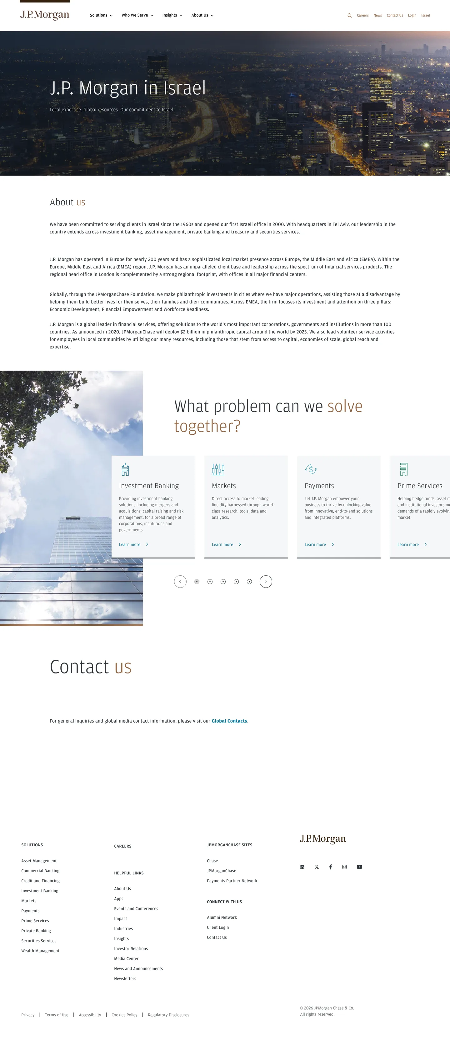
J.P. Morgan's site presents institutional restraint as its primary design gesture. The hero is a dark photograph of Tel Aviv at night, with "J.P. Morgan in Israel" set in Amplitude at 64px / weight 300 — the lightest weight at the largest size in any financial-services brand in this directory. Where Citibank and Goldman Sachs push their display headlines to weight 600–700, J.P. Morgan holds at 300 and lets the sizing do the authority work. The body of the page returns to white canvas, with a near-blue-gray ink (#31373d) as the text color — not pure black, not charcoal, but a corporate blue-gray that reads as precision without aggression. Teal (#1a7b99) handles all interactive elements: CTA buttons, inline link text, and focus rings alike.
The DESIGN.md file captures 11 colors tokens, 12 typography tokens, and 16 components definitions from the J.P. Morgan marketing surface. The color palette is spare: three chromatic tones (teal #1a7b99 as the primary CTA accent, earth-brown #936846 as an editorial secondary, deep teal #005075 for hover/focus states) plus structural neutrals. The typography is a single family — Amplitude, a proprietary humanist sans with Arial, Helvetica fallbacks — running from 64px display at weight 300 through 12px nav labels at weight 400. The CSS exposes a named component token system (--cwm-actionable-accented-*) that wires teal and deep teal into a four-state interactive model: resting, hover, active, focus. The corner palette variable --cwm-palette-corner-default is set to 3, making 3px the system-wide interactive element radius.
Feed this file to an AI coding tool and it will reproduce J.P. Morgan's specific moves: weight-300 display at 64px, teal reserved exclusively for interactive elements, earth-brown for editorial accents on article links and section dividers, nearly square-cornered inputs at 3px, and white canvas with blue-gray text throughout. The move worth studying is the interactive-token system: unlike most brand specs that treat hover and focus as implicit, J.P. Morgan's CSS explicitly wires --cwm-actionable-accented-bold-background (#1a7b99), --cwm-actionable-accented-bold-background-hover (#005075), and --cwm-actionable-accented-bold-foreground (#ffffff) as first-class named tokens, suggesting the system was built for component-library reuse rather than one-off page styling.
What makes it distinct
5 highlights
- Weight 300 at 64px displayAmplitude runs feather-light at large sizes; authority comes from restraint, not mass, diverging from Citibank's weight-700 approach
- Teal accent as the sole interactive voltage#1a7b99 wired into --cwm-actionable-accented-* CSS properties carries every CTA, hover state, and focus ring
- Earth-brown editorial accent#936846 appears 26 times as text and border, marking featured-article links and section dividers with a warmth the teal primary does not carry
- Corner default of 3The --cwm-palette-corner-default CSS variable is set to 3, yielding 3px radius on inputs and interactive elements; the system is nearly square-cornered throughout
- Single-family typographyAmplitude handles every tier from 64px hero to 12px caption with no second voice, unlike bank competitors that run a separate serif for editorial moments
Live at jpmorgan.com
J.P. Morgan in production, as captured. Scroll the window to see the whole page.
11 colors
J.P. Morgan's system runs on #1a7b99 as its primary voltage, used in 3 of 16 components. Type is set in Amplitude across 12 tokens from 12px to 64px, weights 300–700. Shape language is sharp — components average 2px corner radius, favoring crisp rectangles.
Brand & Accent
Sparing, CTA-only voltage · 3
Surface
Page and card backgrounds · 2
Text
Headlines, body, captions · 3
Other
Specialty colors · 3
12 type tokens
Set in Amplitude across 12 tokens, from 12px to 64px, weights 300–700. Shown in its own stack: where the font isn't installed, the fallback the file names stands in.
- display-xl64px · weight 300 · lh 72pxThe quick brown fox jumps over the lazy dog
- display-lg56px · weight 300 · lh 64pxThe quick brown fox jumps over the lazy dog
- display-md32px · weight 300 · lh 40px · tracking 0.32pxThe quick brown fox jumps over the lazy dog
- heading-md24px · weight 300 · lh 32px · tracking 0.24pxThe quick brown fox jumps over the lazy dog
- body-lg16px · weight 400 · lh 24px · tracking 0.32pxThe quick brown fox jumps over the lazy dog
- body-md14px · weight 400 · lh 20px · tracking 0.28pxThe quick brown fox jumps over the lazy dog
- body-sm14px · weight 300 · lh 20px · tracking 0.28pxThe quick brown fox jumps over the lazy dog
- body-md-bold16px · weight 700 · lh 24px · tracking 0.32pxThe quick brown fox jumps over the lazy dog
- label-md14px · weight 500 · lh 24px · tracking 0.28pxThe quick brown fox jumps over the lazy dog
- caption12px · weight 400 · lh 17.14pxThe quick brown fox jumps over the lazy dog
- button-md14px · weight 400 · lh 20px · tracking 0.28pxThe quick brown fox jumps over the lazy dog
- nav-link16px · weight 400 · lh 24pxThe quick brown fox jumps over the lazy dog
Radii and spacing
4 corner radii and 8 spacing values. Shape language: sharp, on a 0px base radius.
Radii4
- none0px
- xs3px
- full9999px
- circle50%
Spacing8
- xxs5px
- xs8px
- sm12px
- base16px
- lg24px
- xl30px
- 2xl40px
- 3xl64px
16 components
Each rendered from its tokens (color, type, radius, padding) on J.P. Morgan's own canvas.
- Button PrimaryButton Primarybutton-primary
- Button Primary HoverButton Primary Hoverbutton-primary-hover
- Button GhostButton Ghostbutton-ghost
- Top NavTop Navtop-nav
- Nav LinkNav Linknav-link
- Hero SectionHero Sectionhero-section
- Hero HeadingHero Headinghero-heading
- Section HeadingSection Headingsection-heading
- Body ParagraphBody Paragraphbody-paragraph
- CardCardcard
- Article LinkArticle Linkarticle-link
- Inline LinkInline Linkinline-link
- Service TileService Tileservice-tile
- AvatarAvataravatar
- Type here…Text Inputtext-input
- FooterFooterfooter
The system, in use
J.P. Morgan's tokens on the kind of product it builds.
Money that moves as fast as you do
Send, save and spend with an account built for the way you live and work.
J.P. Morgan design system FAQ
J.P. Morgan's tokens, its components and how to use this DESIGN.md in your project.
Related reading
Specs, directories and component libraries that pair with this design system.
- Browse all design systemsThe full directory of DESIGN.md files on shadcn.io, with live mockups for each.shadcn.io
- J.P. Morgan — official siteJ.P. Morgan's public marketing site — the source of truth for the live tokens captured in this file.jpmorgan.com (opens in a new tab)
- The DESIGN.md specificationGoogle Labs' open spec for machine-readable design system files — the format this page is built on.github.com (opens in a new tab)
Use J.P. Morgan in your project
One machine-readable file. Drop it into Claude Code, Cursor, VS Code or any AI tool that reads DESIGN.md.
Download the DESIGN.md
One machine-readable file: every color, type, radius, spacing, and component token of J.P. Morgan.
Feed it to your AI tool
Drop it into Claude, Cursor, or GitHub Copilot. The agent writes React components and Tailwind classes that match J.P. Morgan's visual language.
Reference the tokens directly
Or paste the values into your Tailwind config, CSS variables, or component library: every color, size and radius is a quoted, ready-to-copy value.
Read the full DESIGN.md overview, rationale, do’s and don’ts
Overview
J.P. Morgan's marketing site reads like a precisely formatted document — white canvas, blue-gray ink, teal interactive accents, and a typeface running at weight 300 everywhere that matters most. Institutional featherweight: where Citibank and Capital One run display headlines at weight 600–700 to claim authority through mass, J.P. Morgan runs Amplitude at 300 across every large-scale moment — 64px hero, 56px section headers, 32px mid-page displays — trusting scale alone to do the authority work. The system conveys gravitas by showing how little visual force it needs to hold the page together.
The interactive token system reveals a component-library mindset that goes beyond typical marketing-site CSS. The CSS custom properties begin with --cwm-actionable-accented-* and wire a full four-state interactive model (resting, hover, focus, active) into teal (#1a7b99) and dark teal (#005075) with explicit foreground, background, and border values for each. Where most marketing sites define hover states inline, J.P. Morgan declares them as first-class tokens — a signal that this CSS serves a shared design system rather than a single-page stylebook. No other financial-services brand in this directory exposes this level of token architecture on a marketing surface.
The secondary earth-brown (#936846) breaks the otherwise cool palette with a warmth that suggests history and depth. It appears 26 times as text and border edges on featured article links and divider marks — not the interactive accent but the editorial one, connoting longevity rather than action.
Key Characteristics:
- Amplitude at weight 300 for display (64px, 56px, 32px) — the lightest display weight in any financial-services brand in this directory.
- Teal (#1a7b99) as the sole interactive voltage, wired through a named --cwm-actionable-accented-* CSS token family.
- Near-blue-gray ink (#31373d) for all body text — not charcoal, not black, a cool institutional slate at lightness 33%.
- Earth-brown (#936846) as the editorial secondary accent — 26 occurrences on article links and section dividers.
- Corner default of 3px (--cwm-palette-corner-default: 3) — near-square throughout, matching the institutional document register.
- Single-family typography: Amplitude from display to caption, no second voice.
- White canvas with no warm-cream variation — pure #ffffff throughout the below-fold surfaces.
Colors
Interactive Accent
- Primary Teal (
#1a7b99): frequency 14. Used as text (7) and border (7) — CTA button fills, inline link text, and active border states. Wired as --cwm-actionable-accented-bold-background and --cwm-actionable-accented-borderColor. The sole interactive voltage on the page. - Primary Hover (
#005075): frequency 0 in resting capture (hover state only). Wired as --cwm-actionable-accented-bold-background-hover and --cwm-focused-bold-outline. Darkens the teal for both hover and keyboard-focus states.
Editorial Accent
- Earth Brown (
#936846): frequency 26. Used as text (13) and border (13) — featured article titles, section divider lines, and editorial link accents. Not wired into the interactive token system. A warm amber-brown at oklch hue 59°, providing editorial warmth against the cool blue-gray ink.
Surface
- Canvas (
#ffffff): frequency 18 as background. The body floor for all below-fold sections, card surfaces, and the top-nav. Pure white with no cream drift. - Canvas Light (
#f5f7f8): merged with canvas in the extraction cluster. A near-imperceptible blue-white used for card backgrounds in the services section. - Brand Dark (
#35210d): frequency 1 as background, classified brand layer. The very dark brown that appears as the footer's section strip or a featured-image overlay. - Shadow Dark (
#101820): frequency 1 as gradient. A near-black indigo-blue used as the gradient foundation on the hero photograph overlay.
Text
- Ink (
#31373d): frequency 511 total (255 text, 255 border). The dominant text color for body paragraphs, section headings below the fold, and the top-nav links. Merges #31373d and #373739 — a cool blue-gray slate at lightness 33%. - Ink Black (
#000000): frequency 10 (5 text, 5 border). Appears on the highest-contrast text moments, likely the logo and main heading anchor text. - Ink Muted (
#808080): frequency 2. Secondary caption and metadata text. - Focus Ring (
#005075): frequency 0 in visual render; declared as --cwm-focused-bold-outline and --cwm-focused-outline. Keyboard focus ring color, matching the hover state.
Typography
Font Family
J.P. Morgan runs Amplitude across every typographic tier — display at 64px, body at 14–16px, caption at 12px, and nav links at 16px all share the same humanist sans. Fallbacks are Arial, Helvetica, sans-serif. There is no editorial serif, no monospace accent, and no secondary display family. The full typographic range is expressed through size and weight variation within a single voice.
The weight strategy is distinct: display sizes run at 300, body sizes at 300–400, labels at 400–500, and a single bold instance at 700 (inline <b> emphasis). Weight 700 appears once across all captured typography. The system's authority comes from 64px at 300, not from bold.
Hierarchy
| Token | Size | Weight | Line Height | Letter Spacing | Use |
|---|---|---|---|---|---|
{typography.display-xl} | 64px | 300 | 72px | 0 | Hero h1 ("J.P. Morgan in Israel") |
{typography.display-lg} | 56px | 300 | 64px | 0 | Major section h2 headings |
{typography.display-md} | 32px | 300 | 40px | 0.32px | Mid-level section headings |
{typography.heading-md} | 24px | 300 | 32px | 0.24px | Section sub-titles, article headings |
{typography.body-lg} | 16px | 400 | 24px | 0.32px | Lead paragraphs, service descriptions |
{typography.body-md} | 14px | 400 | 20px | 0.28px | Default body copy |
{typography.body-sm} | 14px | 300 | 20px | 0.28px | Secondary running text |
{typography.body-md-bold} | 16px | 700 | 24px | 0.32px | Inline emphasis only |
{typography.label-md} | 14px | 500 | 24px | 0.28px | Category labels, service chip text |
{typography.caption} | 12px | 400 | 17.14px | 0 | Fine-print metadata, footnote rows |
{typography.button-md} | 14px | 400 | 20px | 0.28px | CTA button labels |
{typography.nav-link} | 16px | 400 | 24px | 0 | Top-nav link labels |
Note on Font Substitutes
Amplitude is a licensed proprietary typeface. The closest open-source substitute at weight 300 is Source Sans 3 (Google Fonts) — it matches Amplitude's humanist proportions and has a genuine weight 300 that reads without the optical thinness some sans-serifs produce. Nunito Sans at weight 300 is a second option with similar counters. Preserve the 0.28px / 0.32px letter-spacing that appears on most sizes — it is a global CSS declaration, not an occasional override, and removing it noticeably tightens the system.
Layout
Spacing System
- Base unit: 8px — the dominant extracted padding value.
- Tokens:
{spacing.xxs}5px ·{spacing.xs}8px ·{spacing.sm}12px ·{spacing.base}16px ·{spacing.lg}24px ·{spacing.xl}30px ·{spacing.2xl}40px ·{spacing.3xl}64px. - Hero padding: 64px top, with the photograph filling the full viewport.
- Card internal padding: 20×24px — compact for an institutional brand, reflecting the density of financial-services information.
- Section vertical rhythm: ~40px between major sections below the fold; looser 64px on the hero-adjacent band.
Grid and Container
- Container width: ~1122px for body text and paragraph columns (confirmed by bodyText.widthPx in extraction).
- Service cards: a 4-column grid ("Investment Banking", "Markets", "Payments", "Prime Services") carrying equal-weight service descriptions.
- Article grid: a responsive article-card layout below the service section showing editorial photography with earth-brown title accents.
- Footer: multi-column link grid with the J.P. Morgan logo at right.
Rhythm
The page's pacing is dense-to-comfortable — the hero section with its dark photograph and single headline h1 is generous, but the "About us" body section that follows packs a multi-paragraph institutional narrative at compact 16px body text with modest 40px vertical margins between sections. The service-card grid is the densest moment: four equal tiles with 24px padding, no visible gap between them. The "Contact us" section at the bottom opens up again with generous top padding.
Elevation
J.P. Morgan's marketing surface shows no shadow tier in the captured extraction. Elevation comes from surface-color contrast: the hero photograph provides depth through photography, and card surfaces use a slight canvas-light background (#f5f7f8) to lift off the pure-white page floor. Zero box-shadow values were detected in the rendered components. The institutional document aesthetic specifically avoids drop shadows — depth in financial documents comes from column structure, not visual layering.
- Flat: hero band, article grid, service tiles, footer.
- Tonal lift: canvas-light (#f5f7f8) cards sit on white (#ffffff) canvas — barely perceptible, enough to distinguish interactive cards from editorial copy.
- Border demarcation: the hairline (#808080 / near-invisible) separates nav from content; the teal border (#1a7b99) marks active interactive elements.
Shapes
The corner system reduces to three values: 0px for editorial surfaces, 3px for interactive elements (the CSS --cwm-palette-corner-default value), and 50% for circular avatars.
- 0px: hero photography tiles, section bands, the footer, body paragraphs — the overwhelming majority of surfaces.
- 3px (
{rounded.xs}): CTA buttons, form inputs, service card containers — wherever a cursor is expected to interact. The 3px value prevents the hairline "corner fold" visual artifact on high-DPI screens without adding any perceptible softness. - 50% (
{rounded.circle}): leadership-team avatars, staff photograph thumbnails, circular icon containers.
Unlike consumer financial brands (Klarna at 24px, Affirm at 16px), J.P. Morgan's near-square geometry reads as institutional precision rather than consumer friendliness.
Components
hero-section — A dark night-photograph of Tel Aviv at near-black (#101820) overlay gradient, 64×24px padding. Holds the hero heading in white Amplitude and a subheading beneath in body text.
hero-heading — White text on the dark photograph, Amplitude 64px / weight 300. "J.P. Morgan in Israel" is the canonical instance — the lightest-weight hero heading in this directory at any financial brand.
section-heading — Ink (#31373d) text in Amplitude 32px / weight 300. Used for "About us" and "What problem can we solve together?" and other mid-page section titles.
body-paragraph — Ink text at Amplitude 16px / weight 400, 0.32px tracking. Default running text for institutional descriptions and service summaries.
button-primary — Teal (#1a7b99) fill, white text, Amplitude 14px / weight 400, 3px radius, 1×6px padding, 32px height. The CTA buttons on service tiles ("Learn more").
button-primary-hover — Deepens to dark teal (#005075), same proportions. Wired as --cwm-actionable-accented-bold-background-hover.
button-ghost — Transparent fill, teal text, 1px teal border, 3px radius. The ghost variant of the CTA button for secondary actions.
top-nav — White canvas surface, charcoal ink text at Amplitude 16px / weight 400, 64px height. J.P. Morgan wordmark at left, primary navigation center (About Us, Products, Insights, Regions), login/search right.
nav-link — Transparent background, ink text at Amplitude 16px / weight 400. No visible hover background in the captured surface.
card — White canvas fill, 3px radius, light canvas-light border, 20×24px padding. Used for service description tiles and article cards.
article-link — Transparent background, earth-brown (#936846) text at Amplitude 24px / weight 300. Featured article headings and editorial section links.
inline-link — Transparent background, teal (#1a7b99) text at body-md. In-prose text links and CTA text links.
service-tile — White canvas fill, ink text, Amplitude 14px / weight 400, 3px radius, 24px padding. The four-column service grid ("Investment Banking", "Markets", "Payments", "Prime Services").
avatar — Canvas-light fill, 50% circle radius. Leadership-team profile photographs and staff thumbnail circles.
text-input — White canvas fill, ink border, Amplitude 14px, 3px radius, 8×16px padding, 40px height. Contact-form fields.
footer — Ink-dark (#31373d or deeper) surface, white text, Amplitude 14px / weight 300. Multi-column link grid with J.P. Morgan logo at right, legal text at bottom.
Do's and Don'ts
Do run Amplitude at weight 300 for all display sizes (32px and above). The featherweight display is the system's authority signal — its restraint is what makes J.P. Morgan's page feel institutional rather than promotional.
Do use the full --cwm-actionable-accented-* token family when building interactive components. The CSS explicitly wires resting, hover, and focus states as named tokens; implementing hover as an ad-hoc darker shade instead of the declared #005075 would break the system's state consistency.
Do keep earth-brown (#936846) reserved for editorial content — article headlines, section dividers, featured-story links. Placing it on interactive elements (buttons, nav links) would blur the teal/brown division between action and editorial.
Do use 3px radius ({rounded.xs}) on all interactive surfaces. The --cwm-palette-corner-default value of 3 is a system-wide declaration; rounding buttons or inputs further would conflict with the institutional document geometry.
Don't use weight 700 for display sizes. The single captured weight-700 occurrence is an inline <b> tag in body prose. Bumping section headings to weight 700 turns the editorial restraint into SaaS marketing energy and loses the institutional register.
Don't substitute #936846 for teal on link text. Earth-brown is the editorial accent; teal is the interactive accent — mixing them collapses the two-register system into visual noise. Every clickable element should use teal or dark teal.
Don't add shadow elevation to service tiles or article cards. The captured surface has zero shadow occurrences; adding drop shadows would soften the institutional document aesthetic into something that reads as a consumer dashboard.
Don't deviate from the 0.28px / 0.32px letter-spacing values on body and CTA text. These are explicit CSS declarations present across 30+ extracted typography samples — they are design intent, not browser defaults, and removing them visibly tightens the system's reading rhythm.
Known Gaps
- Extraction captured a regional sub-page (jpmorgan.com/IL/en/about-us) rather than the global homepage. The global homepage at jpmorgan.com likely exposes a richer hero treatment, additional product-surface patterns, and possibly a different primary color from the wealth-management or investment-banking sub-brands.
- Primary button not extracted: the
components.primaryButtonslot returned null — the teal CTA buttons were identified from the --cwm-actionable-accented-* CSS variables rather than from a direct DOM extraction. Button dimensions (padding: 1×6px, height 32px) come from the CTA<button>elements in the service grid. - Hover and focus states: documented via CSS variable inspection only; no hover screenshots were captured. The --cwm-focused-outline value (#005075) is declared but its rendered appearance on focus-visible is not confirmed from the capture.
- Dark mode: no dark-mode CSS custom properties were exposed. The hero section uses a dark photograph with white text overlay but this is not a system dark-mode — it is a single dark surface on an otherwise white-canvas page.
- Sub-brand palettes: J.P. Morgan Asset Management, J.P. Morgan Private Bank, and Chase (consumer) operate as distinct sub-brands with their own color systems. This spec covers only the jpmorgan.com institutional marketing surface.
- Typography at full homepage scale: the highest observed font size in the extraction is 64px (hero h1); the global homepage may deploy larger or more varied display moments than the regional about-us page.
- Motion: no easing or animation values are captured. The page has scroll-triggered section reveals but transition timing is not represented.
More systems like this
Afterpay, Barclays, Betterment and 47 more in Banking & Payments: each brand's colors, type and components in one file your AI agent builds from.
Build it with Pro
The DESIGN.md files are free. Pro adds 6,000+ blocks, premium templates and the MCP server, so your AI editor builds in your system for you.
4.9/5 out of 5 · 150+ reviewsfrom 150+ founders and developers.
Billing
Billed once a year in USD. Cancel anytime.
- How many people can use the license.
- Client work, SaaS products and anything you charge for.
- Page sections in 56 categories, from heroes and pricing tables to dashboards and settings, on every framework and UI library, in your theme.
- Complete Next.js sites for startups, SaaS, agencies and portfolios, every page designed, ready to ship.
- Your AI agent searches, previews and installs any component, block, icon or DESIGN.md from a prompt: 22 tools in Claude Code, Cursor, VS Code and 35 more clients.
- Buttons with motion and states of their own, from an arrow that slides in to a burst of confetti.
- Typewriters, scrambles, counters and more, for headlines, labels and numbers.
- Animated backgrounds for heroes, sections and cards, from a soft aurora to a flock that flees the cursor. Most are pure CSS.
- WebGPU shaders, from a slow aurora to a black hole, each drawing only while it's on screen.
- One design and one theme on all four: the components, blocks and effects are built for each framework.
- React on Base UI, Radix UI, React Aria or Ark UI: install the version for the library your project already uses. Vue, Svelte and Solid run on Ark UI.
- From a button to a date picker, a color picker or a guided tour: accessible, typed in TypeScript, each with live demos.
- Real-world patterns built from the components, in 53 galleries: forms, tables, menus, dialogs and more.
- Area, bar, line, pie, radar and radial charts on TanStack Charts, on every framework. React also gets the Recharts originals.
- Debounce, local storage, media queries and more: each hook is one typed file you own.
- From 222 libraries, Lucide, Heroicons, Tabler and Material Symbols among them, as SVG or a React component in one command.
- Stripe, Linear, Apple and 497 more: a brand's colors, typography and components in one file your AI agent builds from.
- Restyle every component and block at once: 8 styles, 8 grays, 18 colors and 5 radii, shared as a shadcn preset code.
- Priority requests are answered first.
Individual
For personal projects & open source
$32instead of $49/mo
$389 billed yearly
- Seats: 1 seat
- Commercial use: Personal & open source only
- Blocks: All 6,181 blocks
- Templates: All 14 templates
- MCP server: 38 AI clients
- Animated buttons: All 35 buttons
- Text effects: All 97 effects
- Backgrounds: All 100 backgrounds
- Shaders: All 100 shaders
- Frameworks: React, Vue, Svelte, Solid
- UI libraries: Base UI, Radix, Aria, Ark
- Components: All 174 components
- Examples: All 1,103 examples
- Charts: All 70 charts
- React hooks: All 35 hooks
- Icons: 294k+ icons
- DESIGN.md files: All 500 brands
- Theme builder: 8 styles × 18 colors
- Support: Standard
Team
Most popularFor freelancers, agencies & startups
$66instead of $99/mo
$789 billed yearly · ≈ $13/dev/mo
- Seats: Up to 5 seats
- Commercial use: Included
- Blocks: All 6,181 blocks
- Templates: All 14 templates
- MCP server: 38 AI clients
- Animated buttons: All 35 buttons
- Text effects: All 97 effects
- Backgrounds: All 100 backgrounds
- Shaders: All 100 shaders
- Frameworks: React, Vue, Svelte, Solid
- UI libraries: Base UI, Radix, Aria, Ark
- Components: All 174 components
- Examples: All 1,103 examples
- Charts: All 70 charts
- React hooks: All 35 hooks
- Icons: 294k+ icons
- DESIGN.md files: All 500 brands
- Theme builder: 8 styles × 18 colors
- Support: Priority
Organization
For companies with larger teams
$132instead of $199/mo
$1,589 billed yearly
- Seats: Unlimited seats
- Commercial use: Included
- Blocks: All 6,181 blocks
- Templates: All 14 templates
- MCP server: 38 AI clients
- Animated buttons: All 35 buttons
- Text effects: All 97 effects
- Backgrounds: All 100 backgrounds
- Shaders: All 100 shaders
- Frameworks: React, Vue, Svelte, Solid
- UI libraries: Base UI, Radix, Aria, Ark
- Components: All 174 components
- Examples: All 1,103 examples
- Charts: All 70 charts
- React hooks: All 35 hooks
- Icons: 294k+ icons
- DESIGN.md files: All 500 brands
- Theme builder: 8 styles × 18 colors
- Support: Priority
Billed once a year in USD. Cancel anytime.
Individual
For personal projects & open source
$32instead of $49/mo
$389 billed yearly
- How many people can use the license.Seats: 1 seat
- Client work, SaaS products and anything you charge for.Commercial use: Personal & open source only
- Page sections in 56 categories, from heroes and pricing tables to dashboards and settings, on every framework and UI library, in your theme.Blocks: All 6,181 blocks
- Complete Next.js sites for startups, SaaS, agencies and portfolios, every page designed, ready to ship.Templates: All 14 templates
- Your AI agent searches, previews and installs any component, block, icon or DESIGN.md from a prompt: 22 tools in Claude Code, Cursor, VS Code and 35 more clients.MCP server: 38 AI clients
- Buttons with motion and states of their own, from an arrow that slides in to a burst of confetti.Animated buttons: All 35 buttons
- Typewriters, scrambles, counters and more, for headlines, labels and numbers.Text effects: All 97 effects
- Animated backgrounds for heroes, sections and cards, from a soft aurora to a flock that flees the cursor. Most are pure CSS.Backgrounds: All 100 backgrounds
- WebGPU shaders, from a slow aurora to a black hole, each drawing only while it's on screen.Shaders: All 100 shaders
- One design and one theme on all four: the components, blocks and effects are built for each framework.Frameworks: React, Vue, Svelte, Solid
- React on Base UI, Radix UI, React Aria or Ark UI: install the version for the library your project already uses. Vue, Svelte and Solid run on Ark UI.UI libraries: Base UI, Radix, Aria, Ark
- From a button to a date picker, a color picker or a guided tour: accessible, typed in TypeScript, each with live demos.Components: All 174 components
- Real-world patterns built from the components, in 53 galleries: forms, tables, menus, dialogs and more.Examples: All 1,103 examples
- Area, bar, line, pie, radar and radial charts on TanStack Charts, on every framework. React also gets the Recharts originals.Charts: All 70 charts
- Debounce, local storage, media queries and more: each hook is one typed file you own.React hooks: All 35 hooks
- From 222 libraries, Lucide, Heroicons, Tabler and Material Symbols among them, as SVG or a React component in one command.Icons: 294k+ icons
- Stripe, Linear, Apple and 497 more: a brand's colors, typography and components in one file your AI agent builds from.DESIGN.md files: All 500 brands
- Restyle every component and block at once: 8 styles, 8 grays, 18 colors and 5 radii, shared as a shadcn preset code.Theme builder: 8 styles × 18 colors
- Priority requests are answered first.Support: Standard
Team
Most popularFor freelancers, agencies & startups
$66instead of $99/mo
$789 billed yearly · ≈ $13/dev/mo
Everything in Individual, plus
- How many people can use the license.Seats: Up to 5 seats
- Client work, SaaS products and anything you charge for.Commercial use: Included
- Priority requests are answered first.Support: Priority
Organization
For companies with larger teams
$132instead of $199/mo
$1,589 billed yearly
Everything in Team, plus
- How many people can use the license.Seats: Unlimited seats
- Secure checkout via Stripe
- Code lives in your repo
- Keep what you've shipped if you cancel
- License terms
4.9 out of 5 from 150+ developers


Your system, built for you
Every block, template and icon, installed by your AI agent in your design system. The DESIGN.md files stay free.
- Cancel anytime
- Keep what you've shipped