Klarna Design System
Klarna's payments design system as a DESIGN.md file.
About Klarna DESIGN.md
Curated by Dov AzencotUpdated Source klarna.com
- Banking & Payments
- Fintech & Crypto
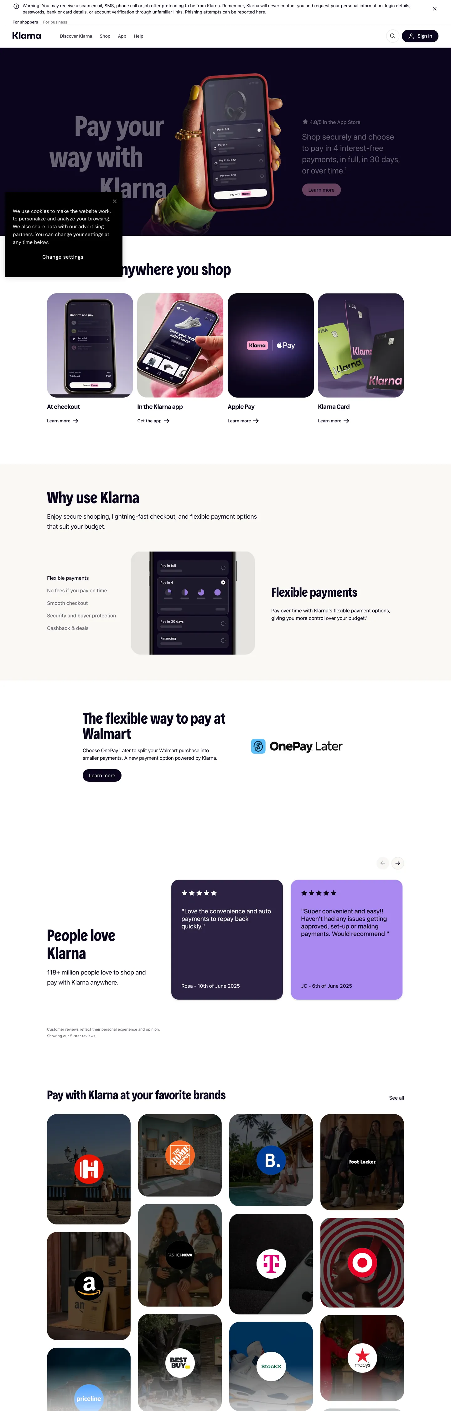
Klarna's marketing surface opens on a dark violet-near-black hero "#0b051d" — the brand's "Klarna Black" — overlaid with a phone-mockup that carries the only saturated pink moment on the page: a soft pink-wash badge ("#ffd0e2") behind a checkout illustration. Inverted text "#ffffff" runs across the hero copy. Below the fold the canvas inverts: a white "#ffffff" page surface carries the "Use Klarna anywhere you shop" tile strip, the four product cards, and the "Pay with Klarna at your favorite brands" merchant grid, with "#0b051d" doing all the text work and "#c4c3ca" plus "#e2e2e7" carrying the input chrome and tile hairlines. The single brand voltage, Klarna Pink "#ffa8cd", appears exactly once — the "Sign up" pill in the top nav (`--colors-btn-brand`). Every other surface that needed a pink mood receives it via the softer "#ffd0e2" wash or, more often, a flat illustration of a phone screen.
This page packages the system into a single DESIGN.md file written to the Google Labs open specification. Inside: 20 color tokens grouped into brand (Klarna Pink, Klarna Eggplant, the Stickynote lime), surface (canvas, page, ink-inverse, the elevated panel), text (the brand's ink, a four-step grayscale ramp), and semantic (positive green, negative red, warning amber, the focus indigo "#7b57d8"); 11 typography levels split across Klarna Title for display, Klarna Text for brand UI, and the platform-stack `-apple-system` family for body and nav; a 6-step rounded vocabulary that's effectively three values (2px hairlines, 16px panels, 32px pills); a 9-step spacing scale anchored on the observed 4px / 8px / 16px / 32px / 48px / 80px rhythm; and 18 component entries covering the dark "Sign in" pill, the pink "Sign up" pill, the merchant tile, the product card, the testimonial purple card, the email-capture input, the footer-CTA strip, and the dashboard mockup chrome.
Feed the file to Claude, Cursor, or GitHub Copilot and the agent reproduces Klarna's particular dialect — the dark hero that inverts to a white canvas, the once-per-page pink pill that signals "Sign up" and only "Sign up", the 32px pill geometry that hits 89 times, and the two-family Klarna Title / Klarna Text register — instead of inventing a generic fintech checkout theme with rounded purple gradients. The proprietary Klarna Title and Klarna Text faces are not licensed for redistribution; Inter Display at weight 700 with -0.2px tracking is the closest open-source approximation for the title role, and Inter Variable at weight 400 for the body register. The reason this system rewards study is the discipline of its brand-voltage allocation: where most BNPL competitors fill every CTA with a saturated pink or violet, Klarna ships one pink pill per page and lets the rest of the chrome speak in indigo-black.
What makes it distinct
- Ink-as-canvas inversionKlarna Black #0b051d carries 1321 uses split between text (681) and border (635), the rare token that does both jobs at once
- Rationed pink voltageKlarna Pink #ffa8cd appears exactly one time on the homepage, scoped to the navigation sign-up pill, with #ffd0e2 doing the soft-wash background work
- 32px pill as house geometrythe 32px radius hits 89 times across buttons, cards, dashboard chrome, and the hero phone mockup, with 2px hairlines and 16px panels filling the rest
- Two-typeface economyKlarna Title at 41–90px handles display, Klarna Text at 14–24px handles brand UI, and a platform-stack fallback runs every body paragraph at 14–16px / weight 400
- Hero at 90px / weight 700 with line-height 99pxdisplay is the most-confident voice in the system, and the body register holds at weight 400 underneath
Live at klarna.com
A snapshot of the brand in production. Hover the frame to scroll the page; click to visit.
 klarna.com
Explore Klarna
Pick what you want to see — mockups, colors, typography, layout, or the full component list.
Brand & Accent
Sparing, CTA-only voltage.
Surface
Page and card backgrounds.
Text
Headlines, body, captions, muted.
Borders & Hairlines
Dividers, outlines, structural rules.
Semantic
Status, errors, success, inline links.
Other
Specialty colors.
Klarna design system FAQ
Common questions about Klarna's tokens, components, and how to use this DESIGN.md in your project.
Related reading
Specs, directories, and component libraries that pair with this design system.
Browse all design systems
The full directory of DESIGN.md files on shadcn.io, with live mockups for each.
Klarna — official site
The buy-now-pay-later payments product whose marketing surface this DESIGN.md captures.
The DESIGN.md specification
Google Labs' open spec for machine-readable design system files.