Land Rover Design System
A deep navy-black canvas, LandRoverWeb-Bold display, AvenirNext UI and zero-radius forms. Land Rover's site as a DESIGN.md for React, Next.js and AI tools.
- Primary color
- #e4e4e4
- Typeface
- AvenirNext
- Shape
- Sharp
- Base radius
- 0px
- Colors
- 7
- Type tokens
- 7
- Components
- 11
- Spacing values
- 7
About Land Rover DESIGN.md
Curated by Dov Azencot, updated May 19, 2026. Source landrover.com (opens in a new tab).
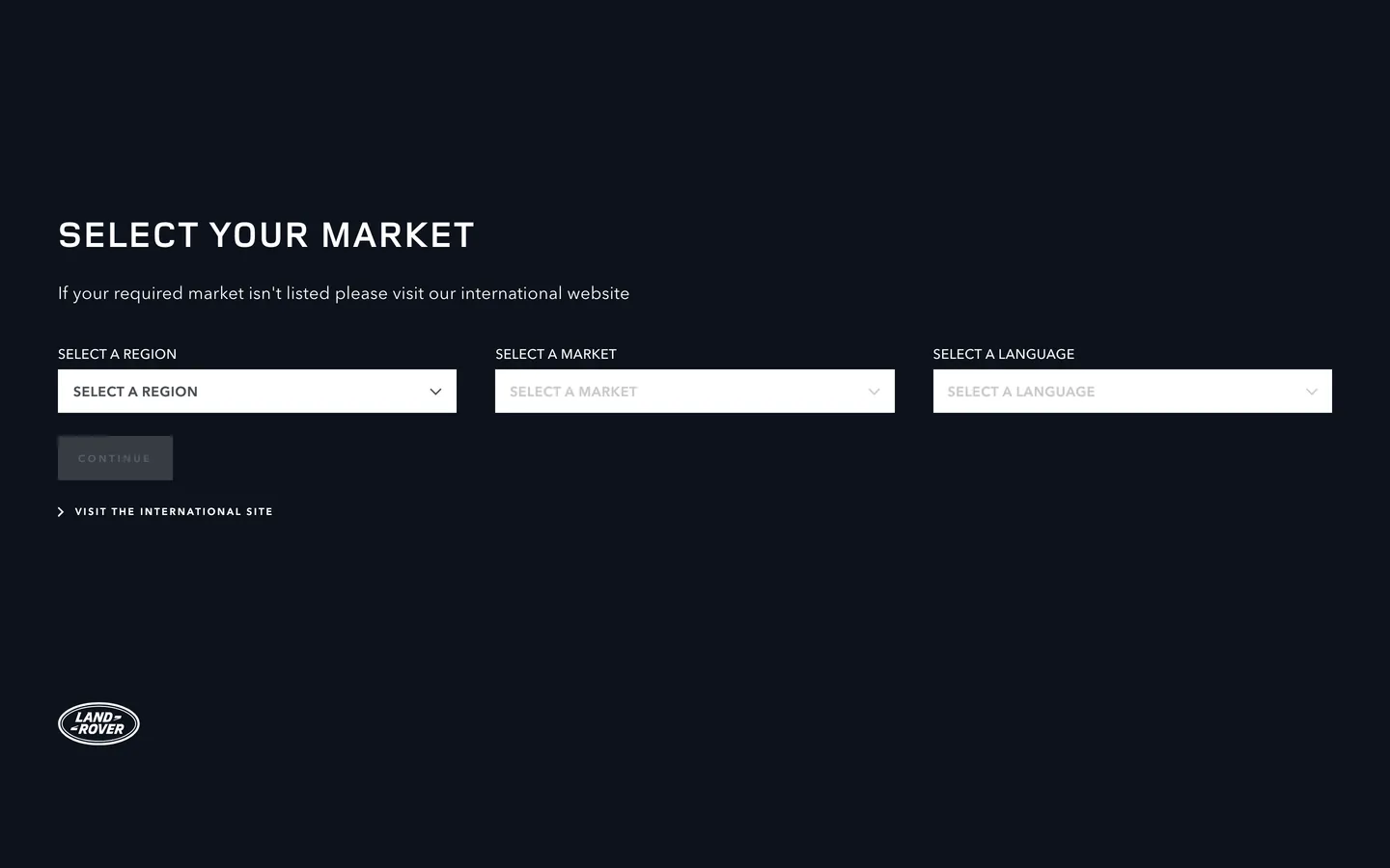
Land Rover's market-selector page is quieter than Jaguar's but no less considered. Where Jaguar fills its canvas with abstract violet-blue photography, Land Rover presents a near-empty dark field: a deep navy-black floor (#0c121c), a bold all-caps display heading in the brand's proprietary LandRoverWeb-Bold font, a short body paragraph, three sharp-cornered dropdowns, a "CONTINUE" button, and the oval Land Rover badge at the bottom left. Nothing else. The system is one of the most reduced market-gate pages in the luxury automotive category — no background image, no product photography, no gradient, no decorative shape.
The DESIGN.md file packages this system for React tooling. Inside: 7 colors tokens, all monochrome — the navy-black canvas (#0c121c), slate-gray (#4a4f54) for borders and secondary labels, white (#ffffff) for all text, and a near-black (#000000) for sparse rule elements. LandRoverWeb-Bold carries the single display moment at 38px / weight 700 / 1.9px letter-spacing; AvenirNext runs all other surfaces across six distinct size-and-weight combinations. Every component sits at 0px border-radius. The 18px body paragraph under the heading — unusually generous for a form gate — signals that the brand wants this gatekeeping moment to feel more like an editorial greeting than a bureaucratic redirect.
Feed this file to Claude or Cursor and it reproduces Land Rover's specific stance: navy-black canvas that reads as expedition-dark rather than luxury-neutral, LandRoverWeb-Bold display reserved for a single heading, all UI chrome in monochrome AvenirNext, and zero-radius forms at 45px height. The one move worth isolating: the #0c121c canvas hue is not an arbitrary dark — it carries a blue-green undertone that, against white text and gray borders, creates a colder and more remote atmosphere than a neutral near-black like #141414 achieves. That coldness is the brand positioning made ambient.
What makes it distinct
5 highlights
- Navy-black canvas#0c121c is a blue-shifted near-black that reads as expedition-dark rather than the neutral charcoal most automotive brands use
- Two-family type splitLandRoverWeb-Bold exclusively for the display heading, AvenirNext for all UI surfaces, navigation, and body
- Zero border-radiusEvery form element and button uses 0px corners, matching JLR sibling Jaguar and distinguishing both from BMW and Mercedes
- Body copy at 18pxThe subhead paragraph runs AvenirNext 18px / weight 400, unusually generous for an automotive form gate
- Wide-tracked micro labelsAvenirNext at 10px / 2–3px letter-spacing for navigation and form category labels, the system's primary decorative typographic move
Live at landrover.com
Land Rover in production, as captured. Scroll the window to see the whole page.
7 colors
Land Rover's system anchors on #e4e4e4 (hairline-light) as its primary color. Type is set in AvenirNext across 7 tokens from 10px to 38px, weights 400–700. Shape language is sharp — components average 0px corner radius, favoring crisp rectangles.
Surface
Page and card backgrounds · 2
Text
Headlines, body, captions · 2
Borders & Hairlines
Dividers, outlines, rules · 2
Other
Specialty colors · 1
7 type tokens
Set in AvenirNext across 7 tokens, from 10px to 38px, weights 400–700. Shown in its own stack: where the font isn't installed, the fallback the file names stands in.
- display-xl38px · weight 700 · lh 38px · tracking 1.9pxThe quick brown fox jumps over the lazy dog
- body-lg18px · weight 400 · lh 24px · tracking 0.2pxThe quick brown fox jumps over the lazy dog
- body-md14px · weight 500 · lh 19px · tracking 0.2pxThe quick brown fox jumps over the lazy dog
- label-md14px · weight 600 · lh 19px · tracking 0.57pxThe quick brown fox jumps over the lazy dog
- label-sm10px · weight 600 · lh 16px · tracking 2pxThe quick brown fox jumps over the lazy dog
- button-md10px · weight 700 · lh 12px · tracking 3pxThe quick brown fox jumps over the lazy dog
- nav-link10px · weight 700 · lh 12px · tracking 3pxThe quick brown fox jumps over the lazy dog
Radii and spacing
1 corner radii and 7 spacing values. Shape language: sharp, on a 0px base radius.
Radii1
- none0px
Spacing7
- xs7px
- sm14px
- md20px
- lg30px
- xl40px
- 2xl42px
- section60px
11 components
Each rendered from its tokens (color, type, radius, padding) on Land Rover's own canvas.
- Button PrimaryButton Primarybutton-primary
- Button SecondaryButton Secondarybutton-secondary
- Top NavTop Navtop-nav
- Nav LinkNav Linknav-link
- Hero HeadingHero Headinghero-heading
- Body ParagraphBody Paragraphbody-paragraph
- Form LabelForm Labelform-label
- CardCardcard
- Type here…Text Inputtext-input
- Select DropdownSelect Dropdownselect-dropdown
- FooterFooterfooter
The system, in use
Land Rover's tokens on the kind of product it builds.
Engineered for every road ahead
The performance, comfort and technology that make every drive feel new.
Land Rover design system FAQ
Land Rover's tokens, its components and how to use this DESIGN.md in your project.
What are the color tokens in the Land Rover DESIGN.md?
What is Land Rover's primary color hex code?
How do I use Land Rover's colors in Tailwind CSS?
What fonts does Land Rover use?
What is Land Rover's type scale?
What can I use if I don't have Land Rover's font?
What fonts does Land Rover use and what are the open-source substitutes?
Which components does the Land Rover DESIGN.md define?
What corner radius and spacing does Land Rover use?
How do I apply the Land Rover design system to a shadcn/ui project?
How do I use the Land Rover DESIGN.md with Claude Code or Cursor?
Is the Land Rover DESIGN.md free to download?
How was the Land Rover DESIGN.md made?
Is the Land Rover DESIGN.md official?
Why does Land Rover use #0c121c instead of a standard near-black?
How does Land Rover's design system differ from Jaguar's?
Why does Land Rover use 18px body text on a market-selector form page?
Where is Land Rover's distinctive heritage green in the web system?
Related reading
Specs, directories and component libraries that pair with this design system.
- Browse all design systemsThe full directory of DESIGN.md files on shadcn.io, with live mockups for each.shadcn.io
- Land Rover — official siteLand Rover's public marketing site — the source of truth for the live tokens captured in this file.landrover.com (opens in a new tab)
- The DESIGN.md specificationGoogle Labs' open spec for machine-readable design system files — the format this page is built on.github.com (opens in a new tab)
Use Land Rover in your project
One machine-readable file. Drop it into Claude Code, Cursor, VS Code or any AI tool that reads DESIGN.md.
Download the DESIGN.md
One machine-readable file: every color, type, radius, spacing, and component token of Land Rover.
Feed it to your AI tool
Drop it into Claude, Cursor, or GitHub Copilot. The agent writes React components and Tailwind classes that match Land Rover's visual language.
Reference the tokens directly
Or paste the values into your Tailwind config, CSS variables, or component library: every color, size and radius is a quoted, ready-to-copy value.
Read the full DESIGN.md overview, rationale, do’s and don’ts
Overview
Land Rover's market-selector page communicates the brand's positioning without a single image. Expedition Dark. The canvas is a deep navy-black (#0c121c) — not a neutral charcoal but a blue-shifted dark that reads as cold, remote, and intentional. A single display heading in the proprietary LandRoverWeb-Bold font sits at the top of the form block; a generous 18px body paragraph follows; three zero-radius dropdowns and a button complete the interaction. The Land Rover oval badge appears at the lower left — the only identifiable brand mark — and the page ends. No photography, no gradient, no decorative shape element.
The system is structurally closer to a high-end mineral-water brand entry page than to most automotive landing gates. Where BMW places a vehicle silhouette above its region picker, Land Rover withholds all product and trusts the dark canvas and display typography to do the identity work. Compared to Cloudflare's voltage-as-canvas orange or Jaguar's abstract photographic backdrop, Land Rover's move is the most austere: the brand's dark-expedition identity lives entirely in the floor tone.
Key Characteristics:
- Navy-black canvas (
{colors.canvas}— #0c121c) with a OKLCH hue angle at approximately 260°, creating the coldest ambient register of any automotive brand canvas here. - LandRoverWeb-Bold for the single display heading only — the proprietary font does one job and disappears.
- AvenirNext across all other surfaces from 10px button labels to 18px body paragraph — a single family managing six distinct size-and-weight variations.
- Zero border-radius (
{rounded.none}— 0px) on every element, matching JLR sibling Jaguar. - Slate mid-tone (
{colors.surface-1}— #4a4f54) used for both form borders and secondary text — 21 combined occurrences. - Wide-tracked micro typography at 2–3px letter-spacing on labels and button text, the system's decorative move.
- No brand-layer color — heritage Grasmere Green does not appear in any structural token.
Colors
Surface
- Canvas (
{colors.canvas}— #0c121c): frequency 5. Used as text (2), background (2), border (1). The page floor — a navy-black with a blue-violet undertone that reads as expedition-dark. The only canvas in this directory with a hue angle this far from neutral at near-black lightness. - Pure Black (
{colors.pure-black}— #000000): frequency 2. Used as text (1), border (1). Rule elements and the footer edge strip.
Text & Border
- Ink (
{colors.ink}— #ffffff): frequency 53. Used as text (23), border (26), background (4). The dominant text color and structural border tone. White on navy-black, not off-white — the canvas color is cool enough that pure white reads without harshness. - Ink Muted (
{colors.ink-muted}/{colors.surface-1}— #4a4f54): frequency 21. Used as text (12), border (9). Slate mid-tone serving both form borders and secondary label text. One tone doing two jobs across 21 occurrences. - Hairline Light (
{colors.hairline-light}— #e4e4e4): frequency 1. Background only — the disabled/placeholder dropdown background in the unselected state.
Typography
Font Families
The system divides typographic duty between LandRoverWeb-Bold (the proprietary display font) and AvenirNext (the workhorse sans). LandRoverWeb-Bold appears exactly once — on the page heading — and carries all the brand's typographic authority in a single deployment. AvenirNext runs everything else: body paragraph, form labels, button labels, option text, and navigation links.
Hierarchy
| Token | Size | Weight | Line Height | Letter Spacing | Use |
|---|---|---|---|---|---|
{typography.display-xl} | 38px | 700 | 38px | 1.9px | Hero heading (SELECT YOUR MARKET) — LandRoverWeb-Bold only |
{typography.body-lg} | 18px | 400 | 24px | 0.2px | Body paragraph below the heading |
{typography.body-md} | 14px | 500 | 19px | 0.2px | Dropdown option text, running UI body |
{typography.label-md} | 14px | 600 | 19px | 0.57px | Button-tier labels on select dropdowns |
{typography.label-sm} | 10px | 600 | 16px | 2px | Form field category labels above dropdowns |
{typography.button-md} | 10px | 700 | 12px | 3px | Primary button (CONTINUE) |
{typography.nav-link} | 10px | 700 | 12px | 3px | Skip-to-content and navigation link accent |
Principles
LandRoverWeb-Bold at 38px / 700 / 1.9px tracking is the loudest typographic moment — tight leading (38px/38px, 1:1) and moderate tracking give the heading a compressed, rigid character that echoes the vehicle design language. The 18px body paragraph below is the system's most generous UI text size, positioned to read as an editorial greeting rather than a form label. AvenirNext's micro sizes (10px / 2–3px tracking) carry the same wide-tracking gesture as Jaguar's equivalent tier, confirming a JLR-platform decision rather than a per-brand choice.
Note on Font Substitutes
LandRoverWeb-Bold is proprietary. Montserrat Bold or Barlow Condensed Bold at the same size and tracking level (approximately 0.05em) transfers the compressed geometric character. For AvenirNext across all sizes, DM Sans is the closest open-source equivalent; Nunito Sans is slightly softer. At the 10px button tier, apply 0.3em explicit letter-spacing to any substitute to match the original tracking.
Layout
Spacing System
- Base module: 7px (appears 3× in the extraction, the dominant gap value).
- Tokens:
{spacing.xs}7px ·{spacing.sm}14px ·{spacing.md}20px ·{spacing.lg}30px ·{spacing.xl}40px ·{spacing.2xl}42px ·{spacing.section}60px. - Form elements:
10px 34px 10px 14pxpadding — right-heavy to accommodate the dropdown chevron. - Section top padding: approximately 223px before the heading, 60px horizontal margins — a generous vertical push that places the form block in the lower third of the viewport.
Grid & Container
- Layout: no background image — the navy-black canvas is the only background. The form block sits left-aligned.
- Three-column dropdowns: equal-width selectors side by side at approximately 430px each at 1440px viewport.
- Badge position: the Land Rover oval badge appears at the lower left, approximately 40px from the bottom edge.
Rhythm
A single vertical sequence: heading → body paragraph → label row → dropdown row → button → secondary link. No section rhythm and no band variation — the page is one panel, one floor, one moment.
Elevation
No shadow tier. The near-empty canvas makes the absence of shadows feel absolute rather than minimal. Form elements are distinguished from the floor solely by their {colors.surface-1} (#4a4f54) border — a hairline-weight slate outline against navy-black. No glow, no elevation gradient, no backdrop blur. The form reads as cut into the dark surface rather than floating above it.
Shapes
The radius philosophy is absolute zero:
{rounded.none}0px — every element, without exception.
Buttons, all three dropdowns, and any card surface use hard right angles. This matches JLR sibling Jaguar exactly and distinguishes both from every other automotive brand in the directory. The sharpness reads as the group's shared platform-level decision, not an individual brand quirk.
Components
button-primary — Navy-black {colors.canvas} fill, white text, AvenirNext 10px / weight 700 / 3px tracking, 0px radius, 1px 24px 0px padding, 45px height, slate {colors.surface-1} border. The "CONTINUE" CTA.
button-secondary — Transparent fill, white text, same AvenirNext button specs, hairline-white border, 0px radius. "VISIT THE INTERNATIONAL SITE" secondary link with chevron prefix.
top-nav — Transparent background, white wordmark and links, 72px height. Floats above the navy floor.
nav-link — Transparent, white text, AvenirNext 10px / 700 / 3px tracking. Skip-link and secondary navigation anchors.
hero-heading — White text, LandRoverWeb-Bold 38px / weight 700 / 1.9px tracking. The single display moment in the system.
body-paragraph — White text, AvenirNext 18px / weight 400 / 0.2px tracking. The helper paragraph below the heading — generous for a form gate.
form-label — White text, AvenirNext 10px / weight 600 / 2px tracking. All-caps category labels above dropdowns.
select-dropdown — Navy-black fill, white text, AvenirNext 14px / weight 600 / 0.57px tracking, 0px radius, 10px 34px 10px 14px padding, 45px height, slate {colors.surface-1} border.
text-input — Same as select-dropdown spec; AvenirNext 14px / weight 500 for text input variant.
card — Navy-black fill, white text, 0px radius, 24px padding, slate hairline border.
footer — Navy-black canvas, slate muted text, 24px padding. The narrow strip at the base with the Land Rover badge.
Do's and Don'ts
Do use the navy-black canvas ({colors.canvas} — #0c121c) rather than substituting a neutral near-black. The blue-green undertone is the system's ambient identity carrier. A neutral near-black like Jaguar's charcoal or a standard dark surface reads as generic dark; the navy-black canvas reads as expedition-cold.
Do reserve LandRoverWeb-Bold ({typography.display-xl}) for the single display heading. The proprietary font does its identity work through scarcity — one deployment, maximum authority. Using it for section headings or card titles dilutes it to a commodity.
Do run the body paragraph at 18px rather than the standard 14–16px. The generosity signals that this is a considered entry experience, not a form gate to minimize. Shrinking to 14px converts the paragraph from an editorial voice to a footnote.
Do use {colors.surface-1} (#4a4f54) simultaneously as form borders and as secondary text color. The palette is intentionally minimal; letting one mid-tone do two jobs keeps the count at a monochrome minimum without sacrificing structural clarity.
Don't introduce any border-radius. The 0px commitment is the sharpest signal shared across the JLR platform. Adding even 2px to dropdowns softens the identity into a generic luxury-app aesthetic.
Don't place the heritage Grasmere Green in any structural token. The green appears in physical brand materials and campaign photography but is not part of the web system's structural palette. Introducing it as a button fill or link accent would conflict with the monochrome chrome discipline.
Don't reduce button label size below 10px or reduce letter-spacing below 2px. The wide-tracked micro text is the system's decorative layer; compressing it loses the signature typographic tension.
Don't add a background image or gradient behind the form. The bare dark canvas is the deliberate design statement. Introducing photography would convert this into a different brand expression entirely.
Known Gaps
- Heritage green: the Grasmere Green associated with Land Rover's Defender and Range Rover identities does not appear in any captured token; it is assumed to appear in vehicle-model pages not captured here.
- Full product pages: the extraction covers the market-selector only. The full landrover.com model pages carry vehicle configurators, color-swatch pickers, and comparison tables with a richer token set.
- Hover and focus states: no interactive state transitions are captured in the static extraction. The presence of a 45px button with a slate border suggests a visible hover state exists but is not represented.
- Light mode: the captured surface is dark-only; no light-canvas variant is exposed on the market-selector gate.
- Mobile navigation: the full product navigation (Defender, Discovery, Range Rover, Evoque product links) is not present on the market-selector page.
- Animation tokens: no easing or transition duration values are exposed in the CSS variables extracted from this surface.
More systems like this
Acura, Alfa Romeo, BMW and 40 more in Automotive: each brand's colors, type and components in one file your AI agent builds from.
Build it with Pro
The DESIGN.md files are free. Pro adds 6,000+ blocks, premium templates and the MCP server, so your AI editor builds in your system for you.
4.9/5 out of 5 · 150+ reviewsfrom 150+ founders and developers.
- Secure checkout via Stripe
- Code lives in your repo
- Keep what you've shipped if you cancel
- License terms
4.9 out of 5 from 150+ developers


Your system, built for you
Every block, template and icon, installed by your AI agent in your design system. The DESIGN.md files stay free.
- Cancel anytime
- Keep what you've shipped