Mercury Design System
Mercury's business-banking design system as a DESIGN.md file.
About Mercury DESIGN.md
Curated by Dov AzencotUpdated Source mercury.com
- Banking & Payments
- Fintech & Crypto
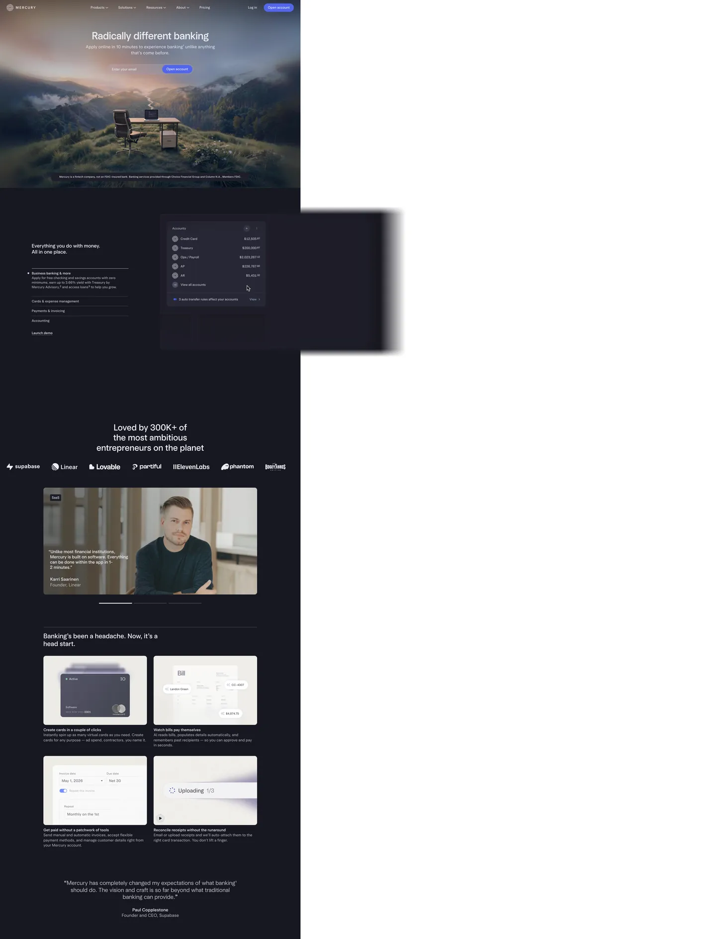
Mercury's design language is what happens when a business-banking brand decides the dark canvas is non-negotiable. The page opens on indigo-black "#171721" — a deep violet-tinted near-black, never pure "#000000" — with atmospheric mountain photography bleeding into the hero. Inverted text "#ededf3" carries the entire reading surface. The single brand voltage, indigo "#5266eb", appears only as the "Open account" pill — one filled CTA per band, never two competing in the same hero. Light blue accents "#9cb4e8" and "#cdddff" haunt the gradient washes and product mockups but are kept off buttons; they're decoration, not action. The whole system reads as a confident inversion of the Stripe-era fintech default — where most banking sites push a white canvas with indigo accents, Mercury pushes the inverse and trusts photography to do the warmth.
This page packages the full system into a single DESIGN.md file. Inside: 18 color tokens (2 brand, 16 structural), 14 typography levels across the proprietary Arcadia and Arcadia Display families, 6 corner radii, 9 spacing values, and 19 components — buttons, the email-capture pill, the dashboard mockup chrome, the product scene card, and the inverted-canvas nav. Every hex is quoted; every Arcadia weight (360, 400, 420, 480) is reproducible. The format is the Google Labs DESIGN.md spec — plain text, machine-readable, and grep-friendly.
Feed the file to Claude, Cursor, or GitHub Copilot. The AI writes React components and Tailwind classes that match Mercury's particular dialect — dark-canvas-first surfaces, the 420-weight body register, 32px pill CTAs, and the indigo-on-near-black hierarchy — instead of a generic dark-mode fintech theme. Inter Variable at weight 420 with positive 0.4px tracking on display sizes is the closest open-source path; the Arcadia family is proprietary and not licensed for redistribution.
What makes it distinct
- Dark canvas as defaultevery marketing surface sits on indigo-black #171721, with #ededf3 doing all the text work
- Single voltage CTAindigo #5266eb fills exactly one pill per band, never two filled buttons in the same hero
- Arcadia weight 420Mercury's body type lives at a non-standard 420, between regular and medium, the brand's quiet typographic signature
- Positive 0.42px letter-spacing on displayopposite of the Stripe/Sohne negative-tracking convention; Mercury wants its serif-leaning display to breathe
- 32px pill CTAs on a 4px radius basethe workhorse 4px appears 91 times, the pill 9 times, with 12px and 40px as the only intermediate steps
Live at mercury.com
A snapshot of the brand in production. Hover the frame to scroll the page; click to visit.
 mercury.com
Explore Mercury
Pick what you want to see — mockups, colors, typography, layout, or the full component list.
Brand & Accent
Sparing, CTA-only voltage.
Surface
Page and card backgrounds.
Text
Headlines, body, captions, muted.
Borders & Hairlines
Dividers, outlines, structural rules.
Semantic
Status, errors, success, inline links.
Mercury design system FAQ
Common questions about Mercury's tokens, components, and how to use this DESIGN.md in your project.
Related reading
Specs, directories, and component libraries that pair with this design system.