Skip to content

MINI Design System

MINI's site as a DESIGN.md: full-bleed photos, 64px uppercase MINIBold serif headlines, MINISans chrome and round scroll buttons, for React and AI tools.

Primary color
#000000
Typeface
MINISansReg
Shape
Sharp
Base radius
0px
Colors
4
Type tokens
7
Components
10
Spacing values
10

About MINI DESIGN.md

Curated by Dov Azencot, updated May 19, 2026. Source mini.com (opens in a new tab).

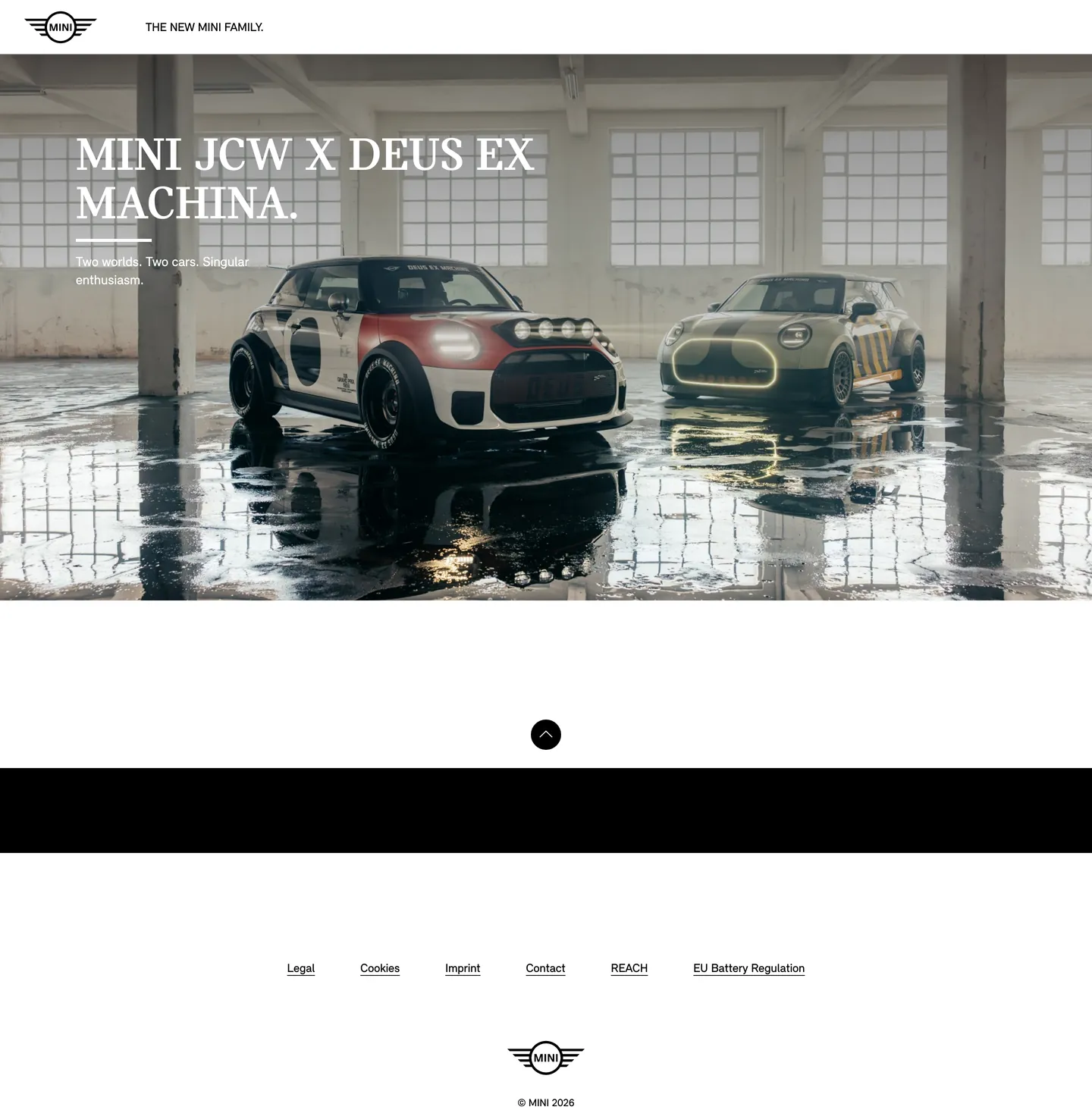
MINI's marketing page does something almost no other category brand attempts. The above-fold hero is a single cinematic warehouse photograph — high-ceiling industrial space, wet concrete floor reflecting overhead light, two MINI cars parked at off-axis angles, a red and cream JCW rally build on the left and an olive and yellow electric build on the right — and a 64px MINIBold uppercase serif headline floor-stamps over it in white at the lower-left third reading "MINI JCW X DEUS EX MACHINA." The period after the headline is not punctuation; it is a brand typographic signature that runs across MINI's print campaigns, dealership signage, and the heading on every model page. Where most automakers fill the hero with chrome — model badges, configuration CTAs, financing hooks — MINI ships nothing above the fold but the photograph, the headline, the small sub-line "Two worlds. Two cars. Singular enthusiasm.", and the wings logo flush left in the nav. There is no primary CTA above the fold at all.

The DESIGN.md file packages the system into a machine-readable spec for React and AI tools. Inside: four color tokens (true black, true white, and two near-white surface tones for footer chrome), seven typography tokens split across the two families (MINIBold at the single 64px display tier, MINISansReg at six chrome tiers from 14px to 18px), one radius value (50% circular, used on the scroll-to-top button and the wings logo container), nine spacing values built around fluid 15px and 50-140px ladders, and ten component definitions covering the photographic hero, the headline-over-photo treatment, the circular scroll button, the wings-logo lockup, the minimal nav link, and the typography-only footer.

Feed this file to Claude or Cursor and the agent reproduces MINI's specific moves: full-bleed cinematic photograph as the page floor, single uppercase MINIBold serif headline floor-stamped over the photograph in white, the period-as-brand-mark typographic signature, the squared-everywhere-except-circles binary radius discipline, and the no-CTA-above-the-fold restraint. The token references resolve cleanly — `{colors.ink}` for black, `{colors.canvas}` for white, `{rounded.full}` for the circle, `{typography.display-xl}` for the headline tier — so the AI never has to invent a value. The one move worth borrowing only if your product is itself this photogenic: the willingness to ship zero CTAs above the fold and let the photograph do the entire job of brand assertion. MINI gets away with it because the cars are the brand and the photograph is the campaign. Most teams need a CTA.

What makes it distinct

5 highlights

  1. Photograph as floorEvery above-fold pixel is the warehouse hero shot; brand chrome is the MINI wings logo flush left, one nav link, and the headline floor-stamped over the photograph
  2. Two-family typographic splitMINIBold (slab-display serif) carries the single hero headline at 64px, MINISansReg carries every nav, label, and footer link at 14-16px
  3. Period as brand markEvery headline ends in a period ("MINI JCW X DEUS EX MACHINA."), an editorial typographic signature that runs across MINI's print and digital campaigns
  4. Binary radius scaleEvery surface is squared except a single 50% circular scroll-to-top button and the circular wings logo treatment
  5. Pure monochrome chromeTrue black ink and true white headline-over-photo are the entire palette; the only color on the page belongs to the cars themselves

Live at mini.com

MINI in production, as captured. Scroll the window to see the whole page.

MINI's website at mini.com

4 colors

MINI's system runs on #000000 as its primary voltage, used in 8 of 10 components. Type is set in MINISansReg across 7 tokens from 14px to 64px, weights 400–700. Shape language is sharp — components average 0px corner radius, favoring crisp rectangles.

Surface

Page and card backgrounds · 3

Text

Headlines, body, captions · 1

7 type tokens

Set in MINISansReg across 7 tokens, from 14px to 64px, weights 400–700. Shown in its own stack: where the font isn't installed, the fallback the file names stands in.

  • display-xl64px · weight 400 · lh 64pxThe quick brown fox jumps over the lazy dog
  • body-lg18px · weight 400 · lh 24pxThe quick brown fox jumps over the lazy dog
  • body-md16px · weight 400 · lh 24pxThe quick brown fox jumps over the lazy dog
  • body-md-bold16px · weight 700 · lh 20pxThe quick brown fox jumps over the lazy dog
  • nav-link16px · weight 400 · lh 16pxThe quick brown fox jumps over the lazy dog
  • label-caps14px · weight 400 · lh 18pxThe quick brown fox jumps over the lazy dog
  • body-sm16px · weight 400 · lh 20pxThe quick brown fox jumps over the lazy dog

Radii and spacing

2 corner radii and 10 spacing values. Shape language: sharp, on a 0px base radius.

Radii2

  • none0px
  • full9999px

Spacing10

  • xs4px
  • sm10px
  • base15px
  • md16px
  • lg30px
  • xl32px
  • 2xl50px
  • 3xl56px
  • 4xl100px
  • 5xl140px

10 components

Each rendered from its tokens (color, type, radius, padding) on MINI's own canvas.

  • Hero Section
    Hero Sectionhero-section
  • Hero Heading
    Hero Headinghero-heading
  • Body Paragraph
    Body Paragraphbody-paragraph
  • Body Paragraph Ink
    Body Paragraph Inkbody-paragraph-ink
  • Top Nav
    Top Navtop-nav
  • Nav Link
    Nav Linknav-link
  • Wings Logo
    Wings Logowings-logo
  • Scroll To Top
    Scroll To Topscroll-to-top
  • Footer Band
    Footer Bandfooter-band
  • Footer Link
    Footer Linkfooter-link

The system, in use

MINI's tokens on the kind of product it builds.

Marketing heroThe homepage: its nav, a headline and the main call to action.
Test drive

Engineered for every road ahead

The performance, comfort and technology that make every drive feel new.

Build yoursFind a dealer
J
AllModelsElectricOffersOwners
Explore modelsSee all
Sport sedanFrom $42,900Electric SUVFrom $56,400Touring coupeFrom $68,200CompactFrom $29,500Grand tourerFrom $96,000
Editorial articleA story page: the masthead, the headline and the opening.
Subscribe
ModelsStoriesDesignHeritage
Stories

The long way home, along the coast

Two thousand miles of coast road, three countries and one tank of patience in the new grand tourer.

MINI staff · 8 min read

Some roads are only worth it if you take your time. The people who build the places we live are starting to plan for decades, not seasons, and the work is already changing what gets made.

MINI design system FAQ

MINI's tokens, its components and how to use this DESIGN.md in your project.

What are the color tokens in the MINI DESIGN.md?

MINI's DESIGN.md has 4 color tokens: ink (#000000), canvas (#ffffff), surface-1 (#f1f1f1) and surface-2 (#e5e5e5). Every value is a quoted hex you can copy.

What is MINI's primary color hex code?

The color token `ink` is #000000, used by 8 components. The surface behind it is `canvas` (#ffffff).

How do I use MINI's colors in Tailwind CSS?

Map the tokens to your CSS variables: `ink` (#000000) to `--primary`, `canvas` (#ffffff) to `--background`, `ink` (#000000) to `--foreground`. shadcn/ui's Tailwind setup maps them to classes such as `bg-primary` and `text-foreground`, so they then use MINI's palette.

What is MINI's primary brand color?

MINI's marketing system is functionally monochrome. The dominant chrome is true black ink on the off-white footer and the wings-logo strokework, plus true white for the headline floor-stamped over the warehouse photograph. Black renders 168 times on the captured page as text (82), border (82), and background (4); white renders 31 times. Two near-white tones (#f1f1f1 and #e5e5e5) handle background surface variation. There is no held-in-reserve brand accent in the chrome at all — MINI historically uses British Racing Green and Chili Red as model paint colors but neither renders as a CSS token on the marketing surface. The voltage, such as it is, comes from the photographic surfaces; the cars' paint colors do the chromatic work.

Use MINI in your project

One machine-readable file. Drop it into Claude Code, Cursor, VS Code or any AI tool that reads DESIGN.md.

Download DESIGN.md
  1. Download the DESIGN.md

    One machine-readable file: every color, type, radius, spacing, and component token of MINI.

  2. Feed it to your AI tool

    Drop it into Claude, Cursor, or GitHub Copilot. The agent writes React components and Tailwind classes that match MINI's visual language.

  3. Reference the tokens directly

    Or paste the values into your Tailwind config, CSS variables, or component library: every color, size and radius is a quoted, ready-to-copy value.

Read the full DESIGN.md overview, rationale, do’s and don’ts

Overview

MINI's marketing page inverts the automotive-marketing convention of chrome above the fold. Photograph as floor. The above-fold hero on mini.com is a single cinematic warehouse shot — high-ceiling industrial interior, wet reflective concrete, two MINIs parked at off-axis angles — and the 64px MINIBold uppercase serif headline "MINI JCW X DEUS EX MACHINA." sits floor-stamped over the lower-left third in white. The wings logo sits flush left in the nav strip with a single uppercase nav link "THE NEW MINI FAMILY." beside it. There is no primary CTA above the fold at all. Where Volvo runs documentary photography surrounded by ink-on-white type chrome and Aston Martin runs a static country-selector splash with a single ENTER pill, MINI ships the photograph and the headline and trusts the brand to carry the rest.

The chromatic discipline reinforces the move. The captured page renders true black {colors.ink} 168 times — 82 as text, 82 as border, 4 as background — and true white {colors.canvas} 31 times. Two near-white tones ({colors.surface-1} at #f1f1f1 and {colors.surface-2} at #e5e5e5) handle background surface variation inside the footer chrome. That is essentially the entire palette. There are no brand-accent CSS variables declared on the page — no Chili Red, no British Racing Green, no held-in-reserve voltage. The brand voltage, such as it is, comes from the cars themselves: the JCW rally build's red and cream livery and the electric build's olive and yellow paint do the chromatic work a brand accent would do elsewhere.

Typography splits across two families. MINIBold is a heavy slab-display serif used for the single hero headline only at 64px in weight 400 uppercase — it never appears as running text or label. MINISansReg is the chrome workhorse — sans-serif at weight 400 (and one weight 700 instance) covering nav links, sub-headlines, footer chrome, and the small uppercase label inside the breadcrumb strip. The pairing — uppercase serif display plus utilitarian sans chrome — does not appear elsewhere in the directory. Where most automakers run a single sans family across every tier, MINI splits the labor, and the period-after-every-headline ("MINI JCW X DEUS EX MACHINA.", "THE NEW MINI FAMILY.") is the editorial typographic signature that ties both families together.

Key Characteristics:

  • Photographic hero — full-bleed warehouse interior carries the entire above-fold surface; no overlay gradient, no decorative frame, no second band.
  • Two-family typographic split — MINIBold uppercase serif at 64px for the single hero headline, MINISansReg at 14-18px for every other surface.
  • Period as brand mark — every headline ends with a period, an editorial signature that runs across MINI's print and digital campaigns.
  • No primary CTA above the fold — only the wings logo, one nav link, the headline, a sub-line, and a circular scroll-to-top button.
  • Binary radius scale — every surface squared at zero, except the 50% circular scroll button and the circular wings-logo container.
  • Pure monochrome chrome — true black {colors.ink} and true white {colors.canvas} are the entire palette; the cars' paint colors carry the only chromatic load.
  • Fluid spacing — 15px is the dominant gap value (7 captured occurrences) with 50px to 140px outer-margin tokens for the wide editorial padding.
  • Typography-only footer — link-row chrome at 14px MINISansReg, no badges, no surface fill, no decorative chrome.

Colors

Structural

  • Ink ({colors.ink} — #000000): frequency 168. Used as text (82), border (82), background (4). The dominant chrome color — carries the nav logo strokework, every nav and footer link, the scroll-to-top circular button fill, and the footer-band background. True black, not a near-black graphite.
  • Canvas ({colors.canvas} — #ffffff): frequency 31 — used as background (9), text (11), border (11). The hero headline color floor-stamped over the photograph, the page floor below the photographic hero, and the body chrome on every text-only band.
  • Surface-1 ({colors.surface-1} — #f1f1f1): a near-white background tone used as the footer-secondary surface fill. Single captured occurrence.
  • Surface-2 ({colors.surface-2} — #e5e5e5): a slightly-deeper near-white used as the hairline-divider tone inside the footer-link strip. Single captured occurrence.

There are no brand-accent CSS variables declared on the captured page. No Chili Red, no British Racing Green, no held-in-reserve cobalt — the palette is exactly four tokens, all near-monochrome. The discipline is closer to Patagonia's monochrome restraint than to a typical automotive brand chrome.

Typography

Font Families

The system runs two licensed families. MINIBold is a heavy slab-display serif — uppercase, geometric, slab-terminal — used for the single hero headline only at 64px in weight 400. The fallback stack walks Georgia, serif. It never appears as running text or as a label.

MINISansReg is the chrome workhorse — sans-serif at weight 400 (and one captured instance at weight 700) covering nav links, sub-headlines, footer chrome, and the small uppercase label inside the breadcrumb strip. The fallback stack walks Arial, sans-serif. The family does the labor of every typographic surface outside the single hero headline.

There is no third family — no monospace, no italic, no second display tier. The two-family split is the entire typographic system.

Hierarchy

TokenSizeWeightLine HeightUse
{typography.display-xl}64px40064pxHero h2 ("MINI JCW X DEUS EX MACHINA.") — MINIBold uppercase
{typography.body-lg}18px40024pxSub-headline beneath display ("Two worlds. Two cars. Singular enthusiasm.")
{typography.body-md}16px40024pxDefault running text
{typography.body-md-bold}16px70020pxThe single bold-emphasis tier inside body copy
{typography.body-sm}16px40020pxHeadline accent (tight line-height variant)
{typography.nav-link}16px40016pxTop-nav link labels
{typography.label-caps}14px40018pxUppercase label inside breadcrumb strip and footer chrome

Principles

The single hero headline is the entire display tier. There is no h1 token, no h3 token, no editorial-spread heading. The discipline reflects MINI's decision to ship one editorial moment per page rather than a hierarchical heading ladder. The period after every headline (the period after "MACHINA." in the hero, the period after "FAMILY." in the nav link, the periods inside the sub-line "Two worlds. Two cars. Singular enthusiasm.") is the typographic signature that ties the two families together — each statement reads as complete on its own rather than as a fragment leading into a CTA.

Note on Font Substitutes

MINIBold and MINISansReg are licensed proprietary families. For MINIBold the closest open-source substitutes are Antonio Bold or Oswald Bold at the same uppercase treatment — both carry the slab-display geometry needed for the 64px hero scale. For MINISansReg, Inter or Söhne at weight 400 transfer cleanly at the 14-18px chrome sizes. The preserved move across substitutions is the period-after-every-headline editorial signature, which works with any display family.

Layout

Spacing System

  • Base unit: 15px — the dominant gap value with 7 captured occurrences. Atypical for an automotive system, which usually anchors on 8 or 16; MINI's 15px anchor reads as deliberately off-grid.
  • Tokens: {spacing.xs} 4px · {spacing.sm} 10px · {spacing.base} 15px · {spacing.md} 16px · {spacing.lg} 30px · {spacing.xl} 32px · {spacing.2xl} 50px · {spacing.3xl} 56px · {spacing.4xl} 100px · {spacing.5xl} 140px.
  • Section padding (vertical): ~100px between the photographic hero and the footer band, with 56px x 140px on the outer editorial padding strip.
  • Hero padding: 50px x 50px x 100px inside the hero photograph frame, with the headline floor-stamped at the lower-left third — no centered alignment.
  • Footer padding: 56px x 140px outer, with 32px between footer link items.

Grid & Container

  • Max content width: the page does not declare a max content width — the hero is true full-bleed and the footer band stretches edge-to-edge. The editorial chrome stays inside a 140px-margin frame on wide desktop.
  • Hero: full-bleed cinematic photograph, headline overlaid flush-left at the lower-left third.
  • Below-fold sections: a single black footer band stretches edge-to-edge with the wings logo centered and the footer-link row beneath at 32px gaps.
  • No card grids, no two-column splits, no carousels — the page is one photograph plus one footer plus the wings-logo lockup.

Rhythm

The page is single-band: one photographic hero, one black footer band, one wings-logo signature lockup. There is no editorial card-stack, no feature-row, no spec-table. The cadence is closer to a print-magazine cover than to a typical automotive marketing page — the rhythm depends entirely on the photograph carrying the visual weight and the headline landing at the lower-left third without competition.

Elevation

The system has essentially no shadow tier. The captured page renders zero shadow occurrences in any structural CSS — depth comes entirely from the photographic surface (the warehouse interior lighting carries its own depth via reflective concrete, overhead window-light pooling, and ambient haze) and from binary surface contrast (the ink-black footer band lifted against the white body floor below).

  • Flat (no shadow): every chrome surface — nav, footer, wings-logo container, scroll button — sits at zero elevation.
  • Tonal lift: the black footer band against the white body floor reads as the single elevation moment on the page, achieved by surface-color contrast alone.
  • Photographic depth: the warehouse lighting inside the hero shot does the depth work — the reflective floor doubling the cars, the overhead window pool, the deep recessed shadows behind the parked vehicles — without any drawn shadow in the chrome.

Shapes

The radius scale is binary: every surface squared at zero, except the circular elements.

  • {rounded.none} 0px — the structural default. Every nav band, every footer link, every hairline divider, every breadcrumb cell sits at zero.
  • {rounded.full} 9999px (rendered as 50% on square elements) — the scroll-to-top button at 48px square renders as a full circle; the wings-logo container at 72px square renders as a full circle behind the wings strokework.

There is no rounded-but-not-circular tier. No 4px corner, no 8px card radius, no 12px button rounding. When softness happens, it happens only at the circular elements — the scroll button and the wings logo. Everything else is squared.

Components

hero-section — Full-bleed cinematic warehouse photograph, 100x140 padding on the inner content stack, no border-radius. The headline sits floor-stamped at the lower-left third in white over the photograph; the sub-line sits immediately beneath.

hero-heading — White text on the photograph, MINIBold 64px / 400 uppercase. The single display tier on the page — confidence by typeface choice and scale.

body-paragraph — White text on photograph at 18px / 400, used for the hero sub-line "Two worlds. Two cars. Singular enthusiasm."

body-paragraph-ink — Ink text on white at 16px / 400, used for any below-photograph editorial body copy that appears on model-detail pages.

top-nav — White {colors.canvas} surface, 72px height, no bottom border. The MINI wings logo sits flush left inside a circular 50% container at 72px square; the single nav link "THE NEW MINI FAMILY." sits beside it in MINISansReg 16px / 400 uppercase. No right-aligned cluster, no search, no account icon, no shopping cart.

nav-link — Transparent background, ink text in MINISansReg 16px / 400, 0x32 padding. No hover background visible — the hover state is an underline.

wings-logo — Transparent fill, ink strokework, 50% circular container, 72px height. The MINI wings emblem (a roundel with two stylized wings emerging from each side) renders inside the circular container with a 1px ink border. The logo appears twice on the captured page — once flush left in the nav and once centered above the footer-link strip.

scroll-to-top — Ink-black {colors.ink} fill, white up-arrow icon, 50% circular container, 48px square. Anchored at the bottom-center of the viewport beneath the hero photograph as the only interactive element above the fold besides the nav link.

footer-band — Ink-black {colors.ink} fill, white text, 56x140 padding, no border-radius. The black band stretches edge-to-edge beneath the photographic hero with no copy inside on the captured page — the band reads as breathing room between the hero and the footer-link strip.

footer-link — Transparent background, ink text in MINISansReg 14px / 400 (Legal, Cookies, Imprint, Contact, REACH, EU Battery Regulation), 0x32 padding. Underlined by default — no hover state shift on the captured surface.

Do's and Don'ts

Do trust the cinematic photograph to carry the entire above-fold surface. The single defining move is the no-CTA-above-the-fold restraint — adding a "Build & Price" or "Find a Dealer" button to the hero would convert the editorial campaign image into a conversion surface and lose the brand's editorial register.

Do end every headline with a period. "MINI JCW X DEUS EX MACHINA.", "THE NEW MINI FAMILY.", "Two worlds. Two cars. Singular enthusiasm." — the period-as-brand-mark is the typographic signature that ties the two families together and signals declarative confidence rather than teaser fragmentation.

Do keep the MINIBold display tier reserved for the single hero headline. Multiplying the 64px uppercase serif across additional sub-headings dilutes the editorial moment and weakens the two-family split.

Do use 50% radius (rendered as {rounded.full} 9999px) on the scroll-to-top button and the wings-logo container only. Multiplying the circle treatment across additional chrome elements softens the squared editorial discipline.

Don't introduce a brand-accent color (Chili Red, British Racing Green, or any historical MINI paint hue) as a CSS chrome token. The marketing system is functionally monochrome — true black plus true white plus two near-white surface tones. Importing a red link color or a green emphasis fill creates a chromatic register that the photographic surfaces already carry.

Don't add a rounded-card tier at 8 or 16 pixels. The system is binary — squared everywhere or full circle. Adding a soft-corner card style softens the squared editorial discipline and creates a third radius register the page does not need.

Don't use MINISansReg at 64px or larger as a display substitute. The MINIBold uppercase serif is the defined display tier; running MINISansReg at display sizes would lose the slab-serif editorial signature and read as a chrome heading rather than as a campaign headline.

Don't swap the hero photograph for a flat-color hero or a video carousel. The cinematic warehouse shot is the system — replacing it with a flat orange canvas or a continuously-playing video loop would lose the editorial print-magazine register that the photograph plus the floor-stamped headline together create.

Known Gaps

  • Hover and focus states: the captured marketing page exposes the resting state of the nav link and the footer links only; the full state matrix (focus rings, active press, disabled tints) lives inside the configurator and model-detail pages and is not represented here.
  • Form input states: no input components render on the captured page. The build-quote forms, the dealer-locator search, and the test-drive booking carry their own input chrome inside the configurator and are not exposed on the marketing surface.
  • Primary CTA button: the captured marketing page has no primary CTA above the fold; the configurator-level pill button is not exposed here. Build CTAs render on model-detail pages with a typically squared rectangular treatment.
  • Dark mode: the captured marketing surface is light-only outside the photograph; no dark-mode variant exists on the public marketing pages.
  • Configurator chrome: this DESIGN.md captures the home page only. The build-your-MINI configurator (build.mini.com) carries a richer token system — swatch chips, accessory cards, financing tables, side-by-side spec comparators — that is not represented here.
  • Model-detail pages: the JCW, Cooper, Countryman, and Aceman product pages each carry additional component chrome — spec cards, configurator entry points, dealer-locator forms — not represented in this file.
  • Motion: the hero photograph crops dynamically on scroll and the scroll-to-top button animates on hover, but the spec captures end-state values only. Easing curves and the scroll-parallax stagger are not exposed.
  • Brand-accent color tokens: MINI uses Chili Red and British Racing Green as historical paint colors but neither is declared as a CSS variable on the marketing surface; these would need to be added as separate tokens if used in chrome.

More systems like this

Acura, Alfa Romeo, BMW and 40 more in Automotive: each brand's colors, type and components in one file your AI agent builds from.

Build it with Pro

The DESIGN.md files are free. Pro adds 6,000+ blocks, premium templates and the MCP server, so your AI editor builds in your system for you.

4.9/5 out of 5 · 150+ reviewsfrom 150+ founders and developers.

Billed once a year in USD. Cancel anytime.

Individual

For personal projects & open source

$32instead of $49/mo

$389 billed yearly

  • How many people can use the license.Seats: 1 seat
  • Client work, SaaS products and anything you charge for.Commercial use: Personal & open source only
  • Page sections in 56 categories, from heroes and pricing tables to dashboards and settings, on every framework and UI library, in your theme.Blocks: All 6,181 blocks
  • Complete Next.js sites for startups, SaaS, agencies and portfolios, every page designed, ready to ship.Templates: All 14 templates
  • Your AI agent searches, previews and installs any component, block, icon or DESIGN.md from a prompt: 22 tools in Claude Code, Cursor, VS Code and 35 more clients.MCP server: 38 AI clients
  • Buttons with motion and states of their own, from an arrow that slides in to a burst of confetti.Animated buttons: All 35 buttons
  • Typewriters, scrambles, counters and more, for headlines, labels and numbers.Text effects: All 97 effects
  • Animated backgrounds for heroes, sections and cards, from a soft aurora to a flock that flees the cursor. Most are pure CSS.Backgrounds: All 100 backgrounds
  • WebGPU shaders, from a slow aurora to a black hole, each drawing only while it's on screen.Shaders: All 100 shaders
  • One design and one theme on all four: the components, blocks and effects are built for each framework.Frameworks: React, Vue, Svelte, Solid
  • React on Base UI, Radix UI, React Aria or Ark UI: install the version for the library your project already uses. Vue, Svelte and Solid run on Ark UI.UI libraries: Base UI, Radix, Aria, Ark
  • From a button to a date picker, a color picker or a guided tour: accessible, typed in TypeScript, each with live demos.Components: All 174 components
  • Real-world patterns built from the components, in 53 galleries: forms, tables, menus, dialogs and more.Examples: All 1,103 examples
  • Area, bar, line, pie, radar and radial charts on TanStack Charts, on every framework. React also gets the Recharts originals.Charts: All 70 charts
  • Debounce, local storage, media queries and more: each hook is one typed file you own.React hooks: All 35 hooks
  • From 222 libraries, Lucide, Heroicons, Tabler and Material Symbols among them, as SVG or a React component in one command.Icons: 294k+ icons
  • Stripe, Linear, Apple and 497 more: a brand's colors, typography and components in one file your AI agent builds from.DESIGN.md files: All 500 brands
  • Restyle every component and block at once: 8 styles, 7 grays, 18 colors and 5 radii, shared as a shadcn preset code.Theme builder: 8 styles × 18 colors
  • Priority requests are answered first.Support: Standard

Team

Most popular

For freelancers, agencies & startups

$66instead of $99/mo

$789 billed yearly · ≈ $13/dev/mo

Everything in Individual, plus

  • How many people can use the license.Seats: Up to 5 seats
  • Client work, SaaS products and anything you charge for.Commercial use: Included
  • Priority requests are answered first.Support: Priority

Organization

For companies with larger teams

$132instead of $199/mo

$1,589 billed yearly

Everything in Team, plus

  • How many people can use the license.Seats: Unlimited seats
  • Secure checkout via Stripe
  • Code lives in your repo
  • Keep what you've shipped if you cancel
  • License terms

4.9 out of 5 from 150+ developers

Your system, built for you

Every block, template and icon, installed by your AI agent in your design system. The DESIGN.md files stay free.

Get Pro
  • Cancel anytime
  • Keep what you've shipped