Mintlify Design System
Mintlify's design system as a DESIGN.md file.
About Mintlify DESIGN.md
Curated by Dov AzencotUpdated Source mintlify.com
- Documentation & Knowledge
- Developer Tools & IDEs
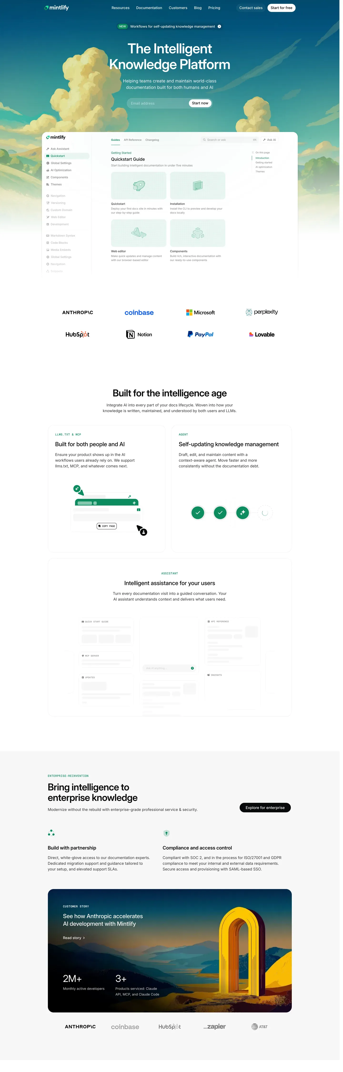
Mintlify sits at the seam between polished SaaS marketing and developer-grade documentation density. The homepage opens with a cinematic sky-gradient hero (a cloud illustration backdrop washing from "#87a8c8" sky-blue to "#f5e9d8" cream) and the startups page swaps in a dark teal-to-mint band with a rocket-launch illustration cutting across "#1a3d4a" to "#2d5a4f". Then the deeper surfaces collapse into a strict 3-column documentation grid — left sidebar nav at 240px, center prose capped at 720px, right table of contents at 200px. Inter carries every UI surface and Geist Mono shows up only for code blocks, inline references, and type signatures. The signature mint "#00d4a4" appears sparingly: hero "Get started" pill, green checkmarks on features, the 2px featured-pricing border, sidebar active indicators.
This page packages the full Mintlify spec as a single DESIGN.md file using the Google Labs DESIGN.md format. Inside: 32 color tokens (brand mint plus deep "#00b48a" and soft "#7cebcb" variants, plus testimonial coral "#f55a3c", documentation tag blue "#3772cf", and the hero atmospheric gradient stops), 22 typography tokens spanning a 72px hero display down to 11px uppercase micro labels, an 8px-base spacing scale running through 12 tokens up to 120px hero padding, a 7-step border-radius scale, and 49 components covering buttons, cards, inputs, badges, code surfaces, sidebar and TOC navigation, hero bands, and the FAQ accordion.
Feed the file to Claude, Cursor, or GitHub Copilot when building documentation portals, developer landing pages, or API reference surfaces. The agent reads token references directly — `{colors.brand-green}`, `{rounded.full}`, `{typography.code-md}` — and writes React components and Tailwind classes that match Mintlify's voice instead of a generic shadcn theme. Or use the file as a reference audit: drop it next to your own design tokens and run a diff against discipline that already works. The system is worth studying because it solves the rare problem of presenting marketing atmosphere and developer density in the same brand language without either surface feeling diluted.
What makes it distinct
- Dual-mode aestheticatmospheric sky-gradient marketing heroes paired with dense 3-column developer documentation surfaces
- Signature mint #00d4a4 reserved for accent CTAs, active states, and feature checkmarksnever on body text
- Inter + Geist Mono pairingInter carries all UI prose, Geist Mono surgically marks code blocks, type signatures, and inline references
- Black-pill primary buttons with rounded.full (9999px) corners dominate marketing; white pills invert on dark hero bands
- Tight 14px body type with 1.50 line-height anchors documentation reading; hero displays push to 72px / weight 600
Live at mintlify.com
A snapshot of the brand in production. Hover the frame to scroll the page; click to visit.
 mintlify.com
Explore Mintlify
Pick what you want to see — mockups, colors, typography, layout, or the full component list.
Brand & Accent
Sparing, CTA-only voltage.
Surface
Page and card backgrounds.
Text
Headlines, body, captions, muted.
Borders & Hairlines
Dividers, outlines, structural rules.
Other
Specialty colors.
Mintlify design system FAQ
Common questions about Mintlify's tokens, components, and how to use this DESIGN.md in your project.
Related reading
Specs, directories, and component libraries that pair with this design system.
Browse all design systems
The full directory of DESIGN.md files on shadcn.io, with live mockups for each.
Mintlify product site
The live homepage, startups program, pricing, and documentation surfaces this spec was extracted from.
The DESIGN.md specification
Google Labs' open spec for machine-readable design system files — the format this page is built on.