Roam Research Design System
Roam Research's near-monochrome charcoal and white with one mid-blue, Inter at 500 and testimonials as the hero, as a DESIGN.md for React and AI tools.
- Primary color
- #137cbd
- Typeface
- Inter
- Shape
- Soft
- Base radius
- 8px
- Colors
- 12
- Type tokens
- 11
- Components
- 14
- Spacing values
- 9
About Roam Research DESIGN.md
Curated by Dov Azencot, updated May 19, 2026. Source roamresearch.com (opens in a new tab).
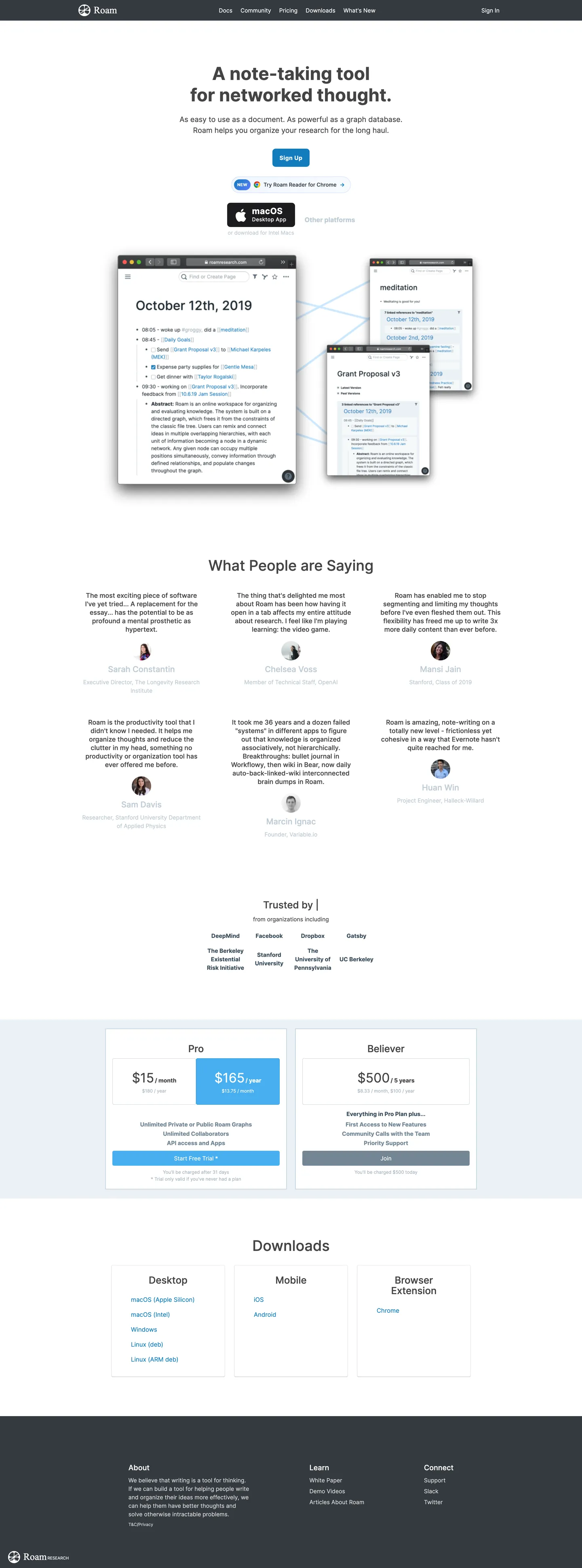
Roam Research's marketing page opens with no hero illustration, no gradient, and no product screenshot. The first thing a visitor reads is "A note taking tool for networked thought" in 36px Inter weight 500, followed immediately by a dense grid of user testimonials — six attributed paragraphs from researchers, writers, and academics describing what happened to their thinking after switching to Roam. This is a rare rhetorical choice: trust the testimony of the community entirely, rather than mediating the first impression through brand imagery. Where Notion uses carefully cropped product screenshots with friendly pastel color, and where Obsidian leads with the graph visualization as visual spectacle, Roam's above-fold experience is literary.
The DESIGN.md file packages the system into a machine-readable spec for React tooling. Inside: 12 colors tokens built on a near-monochrome foundation — the dominant ink is an anonymous charcoal (#444444) appearing 178 times across text and borders, with the single mid-blue voltage (#137cbd, the Blueprint UI blue) appearing 20 times as links, CTA fills, and a gradient stop; 11 typography tokens running Inter across every tier from 44px display to 10.5px fine-print caption; 5 corner-radius tokens centered on a 3px minimum that gives the UI an archival-document feel; and 14 components definitions.
Feed this file to an AI coding tool and it reproduces Roam's specific moves: near-monochrome document aesthetic instead of SaaS color palette, Inter weight 500 as the structural weight rather than 700, Blueprint-blue as the sole interactive signal, and 3px corner rounding as the near-flat default. The one discipline worth studying here is the testimony-as-hero move — it only works for a product with an unusually fervent user base willing to articulate specific, technical, and personal ways the tool changed how they work.
What makes it distinct
5 highlights
- Testimony-as-heroThe page leads with dense user quotes rather than a product screenshot or gradient illustration, trusting written endorsements to sell a writing tool
- Single mid-blue voltageThe Blueprint blue (#137cbd) appears 20 times as links, CTA buttons, pricing highlights, and the lone gradient; no secondary accent exists
- Inter weight 500 throughoutThe dominant weight is medium, not bold; even the 36px h1 sits at 500, a quietness that positions Roam as a thinking tool rather than a productivity dashboard
- Razor-thin radius scaleThe dominant radius is 3px (9 instances), giving every card, button, and chip a near-flat document feel with only the slightest softening
- Serif insert in product screenshotsTimes New Roman appears in the embedded Roam app mockups, signaling that the editor is writing-first rather than structured-data-first
Live at roamresearch.com
Roam Research in production, as captured. Scroll the window to see the whole page.
12 colors
Roam Research's system runs on #137cbd as its primary voltage, used in 2 of 14 components. Type is set in Inter across 11 tokens from 10px to 44px, weights 400–700. Shape language is soft — components average 12px corner radius, with no sharp interactive edges.
Brand & Accent
Sparing, CTA-only voltage · 2
Surface
Page and card backgrounds · 4
Text
Headlines, body, captions · 3
Other
Specialty colors · 3
11 type tokens
Set in Inter across 11 tokens, from 10px to 44px, weights 400–700. Shown in its own stack: where the font isn't installed, the fallback the file names stands in.
- display-xl44px · weight 700 · lh 52px · tracking 0.028pxThe quick brown fox jumps over the lazy dog
- display-md36px · weight 500 · lh 48px · tracking 0.028pxThe quick brown fox jumps over the lazy dog
- heading-lg24px · weight 500 · lh 26px · tracking 0.028pxThe quick brown fox jumps over the lazy dog
- heading-md20px · weight 500 · lh 21px · tracking 0.028pxThe quick brown fox jumps over the lazy dog
- heading-sm18px · weight 500 · lh 19px · tracking 0.028pxThe quick brown fox jumps over the lazy dog
- body-lg16px · weight 500 · lh 21px · tracking 0.028pxThe quick brown fox jumps over the lazy dog
- body-md14px · weight 400 · lh 21px · tracking 0.028pxThe quick brown fox jumps over the lazy dog
- body-bold14px · weight 700 · lh 21px · tracking 0.028pxThe quick brown fox jumps over the lazy dog
- label-caps10px · weight 700 · lh 21px · tracking 0.5pxThe quick brown fox jumps over the lazy dog
- caption10px · weight 400 · lh 21px · tracking 0.028pxThe quick brown fox jumps over the lazy dog
- serif-display24px · weight 400 · lh 21px · tracking 0.028pxThe quick brown fox jumps over the lazy dog
Radii and spacing
6 corner radii and 9 spacing values. Shape language: soft, on a 8px base radius.
Radii6
- none0px
- xs3px
- sm4px
- md8px
- pill70px
- full100px
Spacing9
- xs1px
- sm5px
- md8px
- base10px
- lg12px
- xl16px
- 2xl20px
- 3xl24px
- 4xl48px
14 components
Each rendered from its tokens (color, type, radius, padding) on Roam Research's own canvas.
- Button PrimaryButton Primarybutton-primary
- Button SecondaryButton Secondarybutton-secondary
- Button PlatformButton Platformbutton-platform
- Top NavTop Navtop-nav
- Nav LinkNav Linknav-link
- Hero HeadingHero Headinghero-heading
- Section HeadingSection Headingsection-heading
- Body ParagraphBody Paragraphbody-paragraph
- Testimonial CardTestimonial Cardtestimonial-card
- CardCardcard
- Pricing CardPricing Cardpricing-card
- Pricing Card FeaturedPricing Card Featuredpricing-card-featured
- Product ScreenshotProduct Screenshotproduct-screenshot
- FooterFooterfooter
The system, in use
Roam Research's tokens on the kind of product it builds.
Plan, build and ship in one place
Bring your team's work together, from the first idea to the final release.
Simple pricing for every team
MonthlyYearly- Up to 3 projects
- Unlimited members
- Community support
- Unlimited projects
- Advanced reports
- Priority support
- SSO and SCIM
- Audit log
- Dedicated manager
Roam Research design system FAQ
Roam Research's tokens, its components and how to use this DESIGN.md in your project.
Related reading
Specs, directories and component libraries that pair with this design system.
- Browse all design systemsThe full directory of DESIGN.md files on shadcn.io, with live mockups for each.shadcn.io
- Roam Research — official siteRoam Research's public marketing site — the source of truth for the live tokens captured in this file.roamresearch.com (opens in a new tab)
- The DESIGN.md specificationGoogle Labs' open spec for machine-readable design system files — the format this page is built on.github.com (opens in a new tab)
Use Roam Research in your project
One machine-readable file. Drop it into Claude Code, Cursor, VS Code or any AI tool that reads DESIGN.md.
Download the DESIGN.md
One machine-readable file: every color, type, radius, spacing, and component token of Roam Research.
Feed it to your AI tool
Drop it into Claude, Cursor, or GitHub Copilot. The agent writes React components and Tailwind classes that match Roam Research's visual language.
Reference the tokens directly
Or paste the values into your Tailwind config, CSS variables, or component library: every color, size and radius is a quoted, ready-to-copy value.
Read the full DESIGN.md overview, rationale, do’s and don’ts
Overview
Roam Research's marketing page is a confidence act. Testimony as architecture. The page opens with text — no hero graphic, no full-screen screenshot, no gradient band — and that text is not the brand's description of itself, but six attributed quotes from researchers, writers, and academics explaining what the tool did to their thinking. The hero is, in effect, a collection of book blurbs for software.
Unlike Notion, which leads with carefully staged product screenshots in pastel-tinted interface frames, and unlike Obsidian, which makes the knowledge graph the marketing image, Roam trusts the written word to sell a writing tool. The page structure mirrors the product's positioning in the Tools for Thought movement: if your users are researchers at Stanford and the Berkshire Hathaway Initiative, showing rather than telling is secondary.
Chromatically the system is near-monochrome. The dominant ink tone (#444444) is not black — it's an anonymous middle charcoal that reads as text-color without reading as heavy. The single chromatic element is Blueprint-blue (#137cbd), inherited from the Blueprint UI component library that Roam is built on. The marketing site did not override the framework default; instead it adopted it as the brand voltage.
Key Characteristics:
- Blueprint blue (#137cbd, --primary-color) is the sole interactive color — CTAs, links, pricing highlights, and the lone gradient stop.
- Inter weight 500 is the structural display weight; the 36px hero headline sits at weight 500, not 700 — document-tool register rather than SaaS marketing.
- The near-flat 3px corner radius (9 occurrences) gives cards and containers an archival-document feel.
- Times New Roman appears inside embedded product mockup panels — a deliberate serif insert that signals the app is for writing, not structured data.
- The dark nav (#182026, --dark-bg-4 / themeColor) contrasts with the bone-white body canvas (#ebf1f5), creating a document-with-chrome frame.
- No hero illustration, no background gradient, no decorative chrome — the page's structural bet is that testimony is more convincing than marketing imagery for this audience.
- Pricing uses a 3-tier layout (Pro / Believer / Enterprise) with the middle tier highlighted in Blueprint blue — the only fill-color use of the voltage on the page.
Colors
Brand
- Blueprint Blue (
{colors.primary}— #137cbd): frequency 20. Used as text (9), border (9), bg (1), gradient (1). Every interactive element — links, CTAs, pricing highlight border — in the system. The Blueprint UI default primary color, adopted rather than designed. - Blueprint Light (
{colors.primary-light}— #48aff0): frequency 2. Used as bg (2). Hover-state fill for the download platform buttons. Lighter tint of the Blueprint voltage.
Ink
- Charcoal (
{colors.ink}— #444444): frequency 178. Used as text (91), border (87). The dominant text and border color — an anonymous middle-gray rather than true black, keeping the page in document register. - Mid Blue-Gray (
{colors.ink-muted}— #738694): frequency 13. Used as text (6), border (6), bg (1). Secondary text: attribution bylines under testimonials, sub-labels in pricing. - Light Blue-Gray (
{colors.ink-light}— #a7b6c2): frequency 10. Used as text (5), border (5). Tertiary text and the dark-mode icon color (--dark-icon-color).
Canvas
- Bone White (
{colors.canvas}— #ebf1f5): frequency 1. The page body background (--background-color) — a slightly blue-tinted off-white rather than pure white. - White (
{colors.canvas-white}— #ffffff): frequency 95. Used as text (45), border (44), bg (6). Pure white for card fills, nav text, and button labels on dark surfaces. Wired as --dark-ff.
Surfaces
- Blue-Gray Hairline (
{colors.surface-1}— #bfccd6): frequency 28. Used as text (14), border (14). The standard card border and divider tone across the page. - Light Gray (
{colors.surface-2}— #d3d3d3): frequency 22. Used as text (9), border (13). Secondary borders and input edges.
Dark Mode / Nav
- Dark Canvas (
{colors.dark-canvas}— #182026): frequency 4. Used as bg (1), text (2), border (1). The top navigation surface and footer background — the themeColor declared in the page's<meta>. - Dark Surface (
{colors.dark-surface}— #343a40): frequency 4. Used as bg (2), text (1), border (1). Elevated dark panels — the left sidebar color in the embedded app screenshot (--dark-left-bg). - Shadow (
{colors.shadow}— #10161a): frequency 6 as shadow only. The Blueprint-standard shadow color, used on cards in the product screenshot panels.
Typography
Font Family
The system runs Inter across every marketing-surface typographic tier — a deliberate choice for a tool targeting researchers and developers who associate the typeface with documentation and technical writing. The only exception is Times New Roman, which appears inside the embedded product-screenshot panels at 24px weight 400: it represents the Roam editor's own serif rendering, not the marketing chrome. Times New Roman signals that Roam's notes are writing documents, not database rows.
Hierarchy
| Token | Size | Weight | Line Height | Use |
|---|---|---|---|---|
{typography.display-xl} | 44px | 700 | 52px | Large display heading, pricing feature numbers |
{typography.display-md} | 36px | 500 | 48px | Hero h1 — "A note taking tool for networked thought" |
{typography.heading-lg} | 24px | 500 | 26px | Section h3 headings ("What People are Saying") |
{typography.heading-md} | 20px | 500 | 21px | Feature sub-headings and pricing tier names |
{typography.heading-sm} | 18px | 500 | 19px | h4 pricing descriptions |
{typography.body-lg} | 16px | 500 | 21px | Lead paragraphs and testimonial excerpt text |
{typography.body-md} | 14px | 400 | 21px | Standard body copy, nav links, attribution |
{typography.body-bold} | 14px | 700 | 21px | Button labels, pricing highlights |
{typography.label-caps} | 10px | 700 | 21px | Uppercase category labels with letter-spacing |
{typography.caption} | 10px | 400 | 21px | Fine-print footnotes and pricing asterisks |
{typography.serif-display} | 24px | 400 | 21px | Times New Roman inside product-screenshot panels |
Principles
The system uses weight 500 as the primary emphasis tier rather than 700. The hero h1 at 36px / 500 reads as editorial declaration rather than SaaS imperative — a quietness suited to a tool that positions itself as infrastructure for thought. Weight 700 appears only at 44px for the large display number moments (pricing feature counts). The combination of 500 for everything from h1 to body leads creates typographic uniformity that reinforces the archival aesthetic.
Note on Font Substitutes
Inter is freely available. No substitution is needed. The Times New Roman insert inside product screenshots is intentional semantic content — if you're building a Roam-inspired interface, any legible serif (Georgia, Lora, or system Times) serves the signal that this is a writing surface.
Layout
Spacing System
- Base unit: 8px, with 10px as an unusual non-4px base from the Blueprint grid.
- Tokens:
{spacing.xs}1px ·{spacing.sm}5px ·{spacing.md}8px ·{spacing.base}10px ·{spacing.lg}12px ·{spacing.xl}16px ·{spacing.2xl}20px ·{spacing.3xl}24px ·{spacing.4xl}48px. - Section padding: 98px top for the hero area, 24x48px for sections, matching Blueprint's
--s4(32px) and--s3(24px) spacing variables. - Card internal padding: 10px for small cards, 24px for pricing panels.
Grid & Container
- Max content width: ~1080px — the full-width testimonial grid fills the viewport at 1440px.
- Hero: centered text column (headline + sub-copy + sign-in CTA + download button) above two overlapping product-screenshot panels.
- Testimonials: 3-column grid of attributed quotes with name + affiliation below each.
- Pricing: 3-column comparison (Pro $15/mo · Believer $165/yr · Enterprise $500/5 years) with the Believer column highlighted by Blueprint-blue border.
- Downloads section: 3-column layout (Desktop / Mobile / Browser Extension) with platform links as underlined text rather than buttons.
- Footer: dark (#182026) surface with 4-column link grid.
Rhythm
The page uses alternating density — the testimonials section is text-dense (six full paragraphs), the product-screenshot section is image-dominant, the pricing section is structured, and the downloads section is spare. Each section does one job and transitions directly to the next without decorative inter-band treatments.
Elevation
The system uses the Blueprint shadow convention: rgba(16,22,26,0.15) 0 0 0 1px, rgba(16,22,26,0.15) 0 1px 1px 0 for card lift, derived from the dark shadow token (#10161a). This is a 1px hairline shadow rather than a diffuse glow — close to no shadow, used only on the product-screenshot panels that need to read as floating application windows.
All other surfaces sit flat against their background without shadow. The pricing cards use border-only differentiation; the testimonials have no elevation treatment at all.
Shapes
The radius scale is near-flat with a pill exception:
{rounded.none}0px — text elements, footer grid.{rounded.xs}3px — the dominant card and container radius (frequency 9). Barely-rounded — reads as document-tool, not consumer app.{rounded.sm}4px — small chips and secondary interactive surfaces.{rounded.md}8px — form inputs and slightly larger interactive components.{rounded.pill}70px — the primary CTA button only. A generous pill that contrasts with the 3px card corners.{rounded.full}100px — secondary pill variant for download buttons.
The 3px default is the defining choice. At this scale the corners are visible but minimal — a concession to softness without committing to the 8px-plus radius that most SaaS products use as default. The effect is that cards feel like index cards from a filing system rather than floating UI tiles.
Components
button-primary — Blueprint blue (#137cbd) fill, white text, 70px pill radius, 10x21px padding, 60px height, 0.42px letter-spacing. "Sign Up" is the canonical hero instance.
button-secondary — Dark-canvas (#182026) fill, white text, 8px radius. The platform download buttons ("macOS Desktop App") use this treatment at the same height.
button-platform — Dark-canvas fill with white text, 3px radius, 5x10px padding, 40px height. The individual platform download options (macOS (Silicon), macOS (Intel), Linux, iOS, Android) below the CTA.
top-nav — Dark-canvas (#182026) background, white text, 0x15px padding, 40px height. Houses the Roam logo, Docs / Community / Pricing / Downloads / What's New links, and a Sign In text-link on the right — no pill button in the nav.
nav-link — Transparent, white text at 14px weight 400. Links in the dark nav band.
hero-heading — Charcoal (#444444) text, Inter 36px weight 500. "A note taking tool for networked thought."
section-heading — Charcoal text, 24px weight 500. "What People are Saying," "Trusted by," "Downloads."
body-paragraph — Charcoal text, 16px weight 500. Testimonial excerpts and section descriptions.
testimonial-card — Transparent fill, charcoal text, 3px radius, 8x0px padding. Six attributed testimonials in a 3-column grid — no card background, just text blocks with attribution lines below.
card — White fill, 3px radius, 10px padding, blue-gray (#bfccd6) hairline border. Small UI containers in the product-screenshot region.
pricing-card — White fill, 4px radius, 24px padding, light-gray (#d3d3d3) border. The standard tier (Pro / Enterprise).
pricing-card-featured — White fill, 4px radius, 24px padding, Blueprint-blue (#137cbd) border. The Believer tier — border highlight, not background fill.
product-screenshot — White fill, 3px radius, 0 padding, blue-gray border. The embedded application panels showing Roam's dark-themed editor UI.
footer — Dark-canvas (#182026) fill, light blue-gray (#a7b6c2) text, 24x48px padding. A 4-column link grid (About / Learn / Connect) with the Roam wordmark below.
Do's and Don'ts
Do use Blueprint blue (#137cbd) exclusively for interactive and clickable elements. Every link, every CTA, every interactive signal in the system runs on this one voltage — using it on a passive surface (a section heading, a decorative rule) would break the interactive contract.
Do keep the hero headline at weight 500, not 700. The 36px h1 at weight 500 is the quietness that positions Roam as a thinking tool for researchers. Bumping to 700 shifts the register from academic monograph to enterprise SaaS.
Do use 3px corner radius for cards and containers, and reserve the pill radius (70px) for the primary CTA only. The near-flat card corners read as archival document surfaces; mixing in 8px or 12px rounding would shift the aesthetic toward consumer app territory.
Do render product screenshots in the dark Blueprint theme (dark-canvas #182026 background, dark-surface #343a40 sidebar) — the contrast between the bone-white marketing canvas and the dark product interior reinforces that entering the app is entering a focused work environment.
Don't add a second accent color alongside Blueprint blue. The system's visual argument is built on near-monochrome restraint — introducing a secondary tint (say, a green for success states or a red for urgency) would break the document-tool register. Use charcoal grays (#738694, #a7b6c2) for semantic variation.
Don't replace the user testimonials with product screenshots in the hero. Roam's above-fold choice to lead with testimony rather than imagery is a deliberate rhetorical stance for a specific audience. A product screenshot hero would be more conventional, but it would undermine the claim that the tool's value is experiential and transformative rather than visual.
Don't use the Times New Roman serif token ({typography.serif-display}) in the marketing chrome. It belongs only inside embedded product-screenshot panels where it represents the Roam editor's own rendering. Using it in headings or body copy would create a mixed-register confusion between the marketing layer and the product layer.
Don't use a drop shadow heavier than the Blueprint 1px hairline shadow on product-screenshot cards. The 1px shadow (rgba(16,22,26,0.15)) is deliberately close to invisible. A diffuse glow-shadow would make the product panels feel like promotional imagery rather than actual application windows.
Known Gaps
- Dark-mode tokens: the product uses an extensive dark-mode token system (--dark-bg, --dark-bg-2 through --dark-bg-4, --dark-hl, --dark-left-bg, etc.) visible in the CSS extraction. The marketing site renders in light mode only; dark-mode variants are not captured here.
- Interactive states: hover and focus states are not captured from the static extraction. Blueprint's interaction model (hover: light blue-gray tint, focus: Blueprint primary ring, active: slightly darker blue-gray) lives in the component library CSS.
- Block-reference and page-link styling: the inline bidirectional link format (double-bracket references) that defines Roam's interface has its own typography and color conventions inside the product — not represented here.
- Mobile layout: the page uses responsive breakpoints that stack the 3-column testimonial grid and collapse the pricing comparison, but mobile token overrides are not captured.
- Animation: the product screenshot shows overlapping panels with z-index depth, but any transition or hover-parallax behavior is not captured in static extraction.
- Highlight colors: the CSS declares --highlight-color (warm yellow) and --dark-highlight-yellow (amber) for Roam's inline text-highlight feature — these are product tokens, not marketing chrome.
More systems like this
Airtable, Amie, Anytype and 50 more in Productivity & SaaS: each brand's colors, type and components in one file your AI agent builds from.
Build it with Pro
The DESIGN.md files are free. Pro adds 6,000+ blocks, premium templates and the MCP server, so your AI editor builds in your system for you.
4.9/5 out of 5 · 150+ reviewsfrom 150+ founders and developers.
Billing
Billed once a year in USD. Cancel anytime.
- How many people can use the license.
- Client work, SaaS products and anything you charge for.
- Page sections in 56 categories, from heroes and pricing tables to dashboards and settings, on every framework and UI library, in your theme.
- Complete Next.js sites for startups, SaaS, agencies and portfolios, every page designed, ready to ship.
- Your AI agent searches, previews and installs any component, block, icon or DESIGN.md from a prompt: 22 tools in Claude Code, Cursor, VS Code and 35 more clients.
- Buttons with motion and states of their own, from an arrow that slides in to a burst of confetti.
- Typewriters, scrambles, counters and more, for headlines, labels and numbers.
- Animated backgrounds for heroes, sections and cards, from a soft aurora to a flock that flees the cursor. Most are pure CSS.
- WebGPU shaders, from a slow aurora to a black hole, each drawing only while it's on screen.
- One design and one theme on all four: the components, blocks and effects are built for each framework.
- React on Base UI, Radix UI, React Aria or Ark UI: install the version for the library your project already uses. Vue, Svelte and Solid run on Ark UI.
- From a button to a date picker, a color picker or a guided tour: accessible, typed in TypeScript, each with live demos.
- Real-world patterns built from the components, in 53 galleries: forms, tables, menus, dialogs and more.
- Area, bar, line, pie, radar and radial charts on TanStack Charts, on every framework. React also gets the Recharts originals.
- Debounce, local storage, media queries and more: each hook is one typed file you own.
- From 222 libraries, Lucide, Heroicons, Tabler and Material Symbols among them, as SVG or a React component in one command.
- Stripe, Linear, Apple and 497 more: a brand's colors, typography and components in one file your AI agent builds from.
- Restyle every component and block at once: 8 styles, 8 grays, 18 colors and 5 radii, shared as a shadcn preset code.
- Priority requests are answered first.
Individual
For personal projects & open source
$32instead of $49/mo
$389 billed yearly
- Seats: 1 seat
- Commercial use: Personal & open source only
- Blocks: All 6,181 blocks
- Templates: All 14 templates
- MCP server: 38 AI clients
- Animated buttons: All 35 buttons
- Text effects: All 97 effects
- Backgrounds: All 100 backgrounds
- Shaders: All 100 shaders
- Frameworks: React, Vue, Svelte, Solid
- UI libraries: Base UI, Radix, Aria, Ark
- Components: All 174 components
- Examples: All 1,103 examples
- Charts: All 70 charts
- React hooks: All 35 hooks
- Icons: 294k+ icons
- DESIGN.md files: All 500 brands
- Theme builder: 8 styles × 18 colors
- Support: Standard
Team
Most popularFor freelancers, agencies & startups
$66instead of $99/mo
$789 billed yearly · ≈ $13/dev/mo
- Seats: Up to 5 seats
- Commercial use: Included
- Blocks: All 6,181 blocks
- Templates: All 14 templates
- MCP server: 38 AI clients
- Animated buttons: All 35 buttons
- Text effects: All 97 effects
- Backgrounds: All 100 backgrounds
- Shaders: All 100 shaders
- Frameworks: React, Vue, Svelte, Solid
- UI libraries: Base UI, Radix, Aria, Ark
- Components: All 174 components
- Examples: All 1,103 examples
- Charts: All 70 charts
- React hooks: All 35 hooks
- Icons: 294k+ icons
- DESIGN.md files: All 500 brands
- Theme builder: 8 styles × 18 colors
- Support: Priority
Organization
For companies with larger teams
$132instead of $199/mo
$1,589 billed yearly
- Seats: Unlimited seats
- Commercial use: Included
- Blocks: All 6,181 blocks
- Templates: All 14 templates
- MCP server: 38 AI clients
- Animated buttons: All 35 buttons
- Text effects: All 97 effects
- Backgrounds: All 100 backgrounds
- Shaders: All 100 shaders
- Frameworks: React, Vue, Svelte, Solid
- UI libraries: Base UI, Radix, Aria, Ark
- Components: All 174 components
- Examples: All 1,103 examples
- Charts: All 70 charts
- React hooks: All 35 hooks
- Icons: 294k+ icons
- DESIGN.md files: All 500 brands
- Theme builder: 8 styles × 18 colors
- Support: Priority
Billed once a year in USD. Cancel anytime.
Individual
For personal projects & open source
$32instead of $49/mo
$389 billed yearly
- How many people can use the license.Seats: 1 seat
- Client work, SaaS products and anything you charge for.Commercial use: Personal & open source only
- Page sections in 56 categories, from heroes and pricing tables to dashboards and settings, on every framework and UI library, in your theme.Blocks: All 6,181 blocks
- Complete Next.js sites for startups, SaaS, agencies and portfolios, every page designed, ready to ship.Templates: All 14 templates
- Your AI agent searches, previews and installs any component, block, icon or DESIGN.md from a prompt: 22 tools in Claude Code, Cursor, VS Code and 35 more clients.MCP server: 38 AI clients
- Buttons with motion and states of their own, from an arrow that slides in to a burst of confetti.Animated buttons: All 35 buttons
- Typewriters, scrambles, counters and more, for headlines, labels and numbers.Text effects: All 97 effects
- Animated backgrounds for heroes, sections and cards, from a soft aurora to a flock that flees the cursor. Most are pure CSS.Backgrounds: All 100 backgrounds
- WebGPU shaders, from a slow aurora to a black hole, each drawing only while it's on screen.Shaders: All 100 shaders
- One design and one theme on all four: the components, blocks and effects are built for each framework.Frameworks: React, Vue, Svelte, Solid
- React on Base UI, Radix UI, React Aria or Ark UI: install the version for the library your project already uses. Vue, Svelte and Solid run on Ark UI.UI libraries: Base UI, Radix, Aria, Ark
- From a button to a date picker, a color picker or a guided tour: accessible, typed in TypeScript, each with live demos.Components: All 174 components
- Real-world patterns built from the components, in 53 galleries: forms, tables, menus, dialogs and more.Examples: All 1,103 examples
- Area, bar, line, pie, radar and radial charts on TanStack Charts, on every framework. React also gets the Recharts originals.Charts: All 70 charts
- Debounce, local storage, media queries and more: each hook is one typed file you own.React hooks: All 35 hooks
- From 222 libraries, Lucide, Heroicons, Tabler and Material Symbols among them, as SVG or a React component in one command.Icons: 294k+ icons
- Stripe, Linear, Apple and 497 more: a brand's colors, typography and components in one file your AI agent builds from.DESIGN.md files: All 500 brands
- Restyle every component and block at once: 8 styles, 8 grays, 18 colors and 5 radii, shared as a shadcn preset code.Theme builder: 8 styles × 18 colors
- Priority requests are answered first.Support: Standard
Team
Most popularFor freelancers, agencies & startups
$66instead of $99/mo
$789 billed yearly · ≈ $13/dev/mo
Everything in Individual, plus
- How many people can use the license.Seats: Up to 5 seats
- Client work, SaaS products and anything you charge for.Commercial use: Included
- Priority requests are answered first.Support: Priority
Organization
For companies with larger teams
$132instead of $199/mo
$1,589 billed yearly
Everything in Team, plus
- How many people can use the license.Seats: Unlimited seats
- Secure checkout via Stripe
- Code lives in your repo
- Keep what you've shipped if you cancel
- License terms
4.9 out of 5 from 150+ developers


Your system, built for you
Every block, template and icon, installed by your AI agent in your design system. The DESIGN.md files stay free.
- Cancel anytime
- Keep what you've shipped