Make your AI a shadcn expert

Morgan Stanley Design System

Morgan Stanley's marketing-site design system as DESIGN.md.

About Morgan Stanley DESIGN.md

Curated by Dov AzencotUpdated Source morganstanley.com

  • Banking & Payments
  • Fintech & Crypto

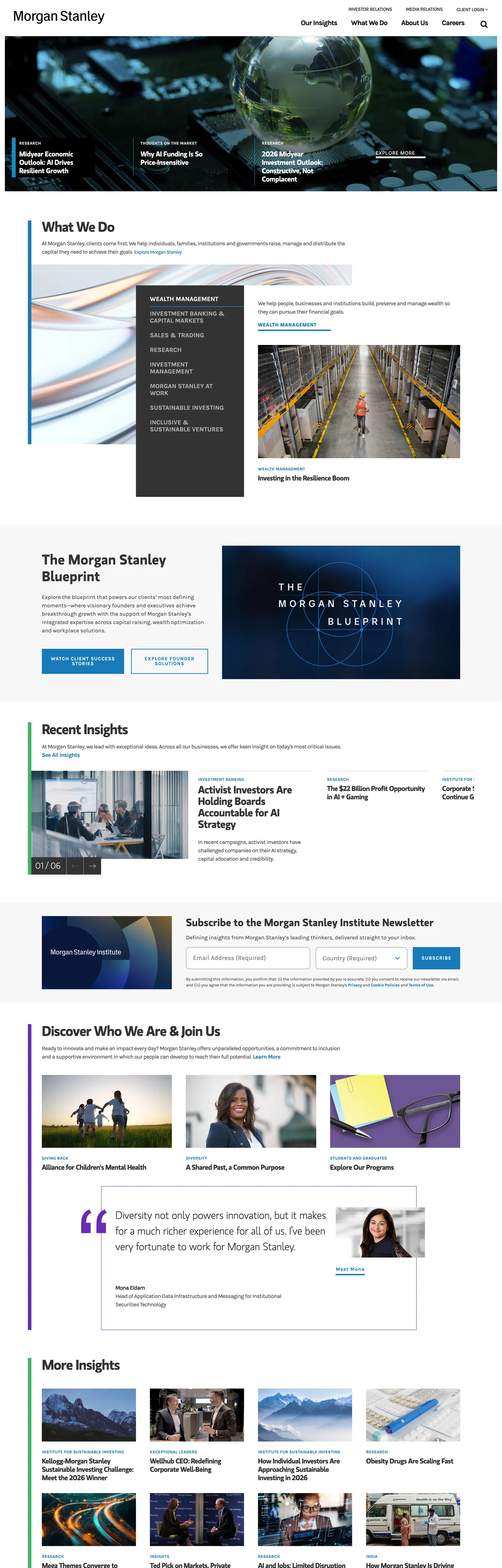
Morgan Stanley's marketing site announces authority through absence. No gradient hero, no photography overlay with a glowing CTA pill — the above-fold is a full-bleed documentary image (a globe rendered in blue light) with the wordmark set in white Karla Bold at 12px uppercase in the top-left corner, nothing else. The only color decision is the background: black. Below the fold, a white canvas opens and the system's two typefaces take over: MS Gloriola II Std in weight 500 at 40px with tight -1.45px tracking for section headings, and Karla Regular at 16px with no tracking for body copy. Where Goldman Sachs leans on a bold weight-700 sans and JPMorgan Chase uses a conventional blue primary, Morgan Stanley keeps its headings in a semi-serif display family that reads closer to a financial-publication editorial voice than a typical investment-bank marketing system.

The DESIGN.md file captures the system in machine-readable form. Inside: 12 color tokens organized around a pure-ink dominant (503 occurrences), a single steel-blue interactive layer (#187aba, 210 occurrences split equally between text and border roles), and structural mid-grays at #4c4c4c and #333333. Twelve typography tokens span MS Gloriola II Std across three heading sizes and Karla across body, label, nav, and CTA roles — including the uppercase-tracked 12px Karla Bold used on every navigation link and CTA. One radius value (10px on the newsletter input), an 8-step spacing scale, and 16 component definitions cover the hero image band, the sectional display headings, the uppercase-link CTAs, the zero-radius navigation, and the newsletter subscription form.

Feed this file to Claude or Cursor and it reproduces Morgan Stanley's specific discipline: two proprietary typefaces in strict division, near-monochrome palette with a single blue link layer, flat 0px surfaces everywhere except the newsletter email input, and no decorative background fills outside the hero photography band. The system is worth studying not for its visual warmth — it has none — but for how far a brand can lean into typographic voice and ink-to-paper contrast as its sole differentiator. The display font is doing the work that color and gradient do in every competitor's system.

What makes it distinct

  1. Two-typeface splitMS Gloriola II Std owns every heading tier; Karla handles every label, nav item, and CTA in uppercase-tracked sans
  2. Near-monochrome palettepure black (#000000) dominates at 503 occurrences; the only chromatic note is steel blue (#187aba) for links and borders
  3. Zero roundingevery surface including the newsletter input sits at 0px border-radius; the only detected radius is a single 10px on the email field
  4. Uppercase CTA labels at 1.1px trackingKarla Bold at 14px / weight 700 in all-caps is the system's only typographic warmth signal
  5. No shadows, no background fillsdepth comes from a 1px black border and column-level ink contrast alone

Live at morganstanley.com

A snapshot of the brand in production. Hover the frame to scroll the page; click to visit.

Screenshot of Morgan Stanley's website at morganstanley.commorganstanley.com

Explore Morgan Stanley

Pick what you want to see — mockups, colors, typography, layout, or the full component list.

Brand & Accent

Sparing, CTA-only voltage.

Surface

Page and card backgrounds.

Text

Headlines, body, captions, muted.

Borders & Hairlines

Dividers, outlines, structural rules.

Morgan Stanley design system FAQ

Common questions about Morgan Stanley's tokens, components, and how to use this DESIGN.md in your project.

Specs, directories, and component libraries that pair with this design system.

Use Morgan Stanley in your project

One machine-readable file. Drop it into Claude, Cursor, or any AI tool that reads DESIGN.md.

Download DESIGN.md