Neon Design System
Neon's serverless Postgres design language as a DESIGN.md file.
About Neon DESIGN.md
Curated by Dov AzencotUpdated Source neon.com
- Backend, Database & DevOps
- Developer Tools & IDEs
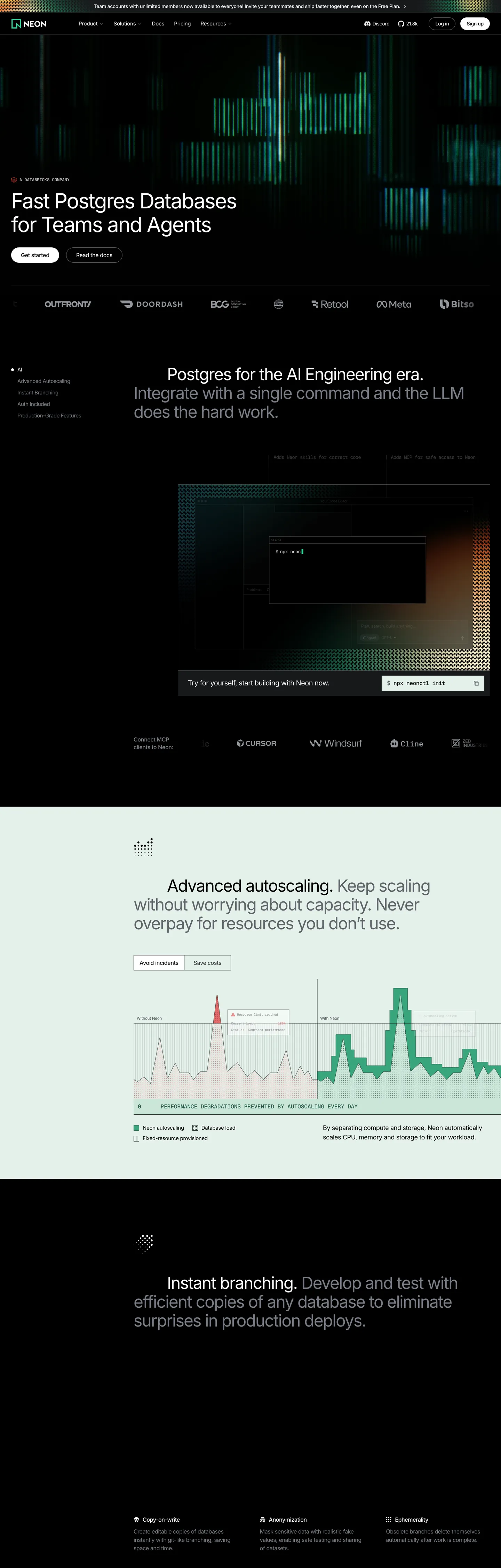
Neon's marketing surface is the inverse of the developer-database category. Where Supabase commits to a white canvas with a green accent and Postgres-the-marketing-site usually leans editorial-light, Neon defaults to true black (#000000) and lets a single emerald (#34d59a) carry every link underline, every code-keyword highlight, and the lit autoscaling-graph spikes that visualize the product. Type runs Inter at weight 400 across the entire display tier — the 80px hero pulls -3.2px tracking out of the geometric letterforms to compensate for the absent weight. There's no second accent color, no gradient mesh, no brand-blue link. The greens, the black, and the gray ladder from #94979e to #18191b are the entire palette.
This page packages that system into a single DESIGN.md file in the Google Labs open spec. Inside: 22 color tokens (2 emerald variants, 8 grays, 4 surface fills, dark and light ink pairs, and the 4 Shiki syntax-highlight hues the brand reuses from its code blocks), 11 typography styles split between Inter and GeistMono, 4 radius tokens anchored at 4px, an 8-step spacing scale rooted on the brand's 4px grid, and 18 component recipes spanning the dark primary CTA, the inverted light-band autoscaling card, the GeistMono code block at #000000, and the underline-only nav link pattern that does most of the chrome work.
Feed the file to Claude, Cursor, or GitHub Copilot and the agent reproduces Neon's specific discipline — black-first marketing, weight-400 displays with aggressive negative tracking, emerald reserved for code and graphs, square 4px corners instead of pills. Reference the tokens directly inside a Tailwind config, or audit an existing React app against them. The system is worth studying because it proves a Postgres brand can ship a serious marketing track without a white canvas and without a single bold weight — the graph spikes do the work that bold type usually does.
What makes it distinct
- Black canvas as default#000000 carries hero, footer, and feature bands; the white sections are interruptions, not the baseline
- Inter at weight 400 / 80px / -3.2pxthe display tier refuses bold weights and earns presence by tracking compression instead
- Two greens, two jobs#34d59a (CSS --shiki-token-keyword) for code and links; #00e599 reserved for autoscaling-graph spikes
- Square 4px radii everywhere63 of 73 captured radius events resolve to 4px; pills exist only on a handful of badge chips
- GeistMono at 12px / 16px for technical labels and code blocksthe brand's developer DNA is visible in every snippet
Live at neon.com
A snapshot of the brand in production. Hover the frame to scroll the page; click to visit.
 neon.com
Explore Neon
Pick what you want to see — mockups, colors, typography, layout, or the full component list.
Brand & Accent
Sparing, CTA-only voltage.
Surface
Page and card backgrounds.
Text
Headlines, body, captions, muted.
Borders & Hairlines
Dividers, outlines, structural rules.
Other
Specialty colors.
Neon design system FAQ
Common questions about Neon's tokens, components, and how to use this DESIGN.md in your project.
Related reading
Specs, directories, and component libraries that pair with this design system.
Browse all design systems
The full directory of DESIGN.md files on shadcn.io, with live mockups for each.
Neon — official site
The serverless Postgres platform built for teams and AI agents — branching, autoscaling, and instant provisioning.
The DESIGN.md specification
Google Labs' open spec for machine-readable design system files.