OpenAI Design System
OpenAI's site as a DESIGN.md: one black headline on white, a chat-style input pill in the hero and product screenshot cards, for React and AI tools.
- Primary color
- #1e60e4
- Typeface
- OpenAI Sans
- Shape
- Soft
- Base radius
- 6px
- Colors
- 15
- Type tokens
- 10
- Components
- 15
- Spacing values
- 8
About OpenAI DESIGN.md
Curated by Dov Azencot, updated May 18, 2026. Source openai.com (opens in a new tab).
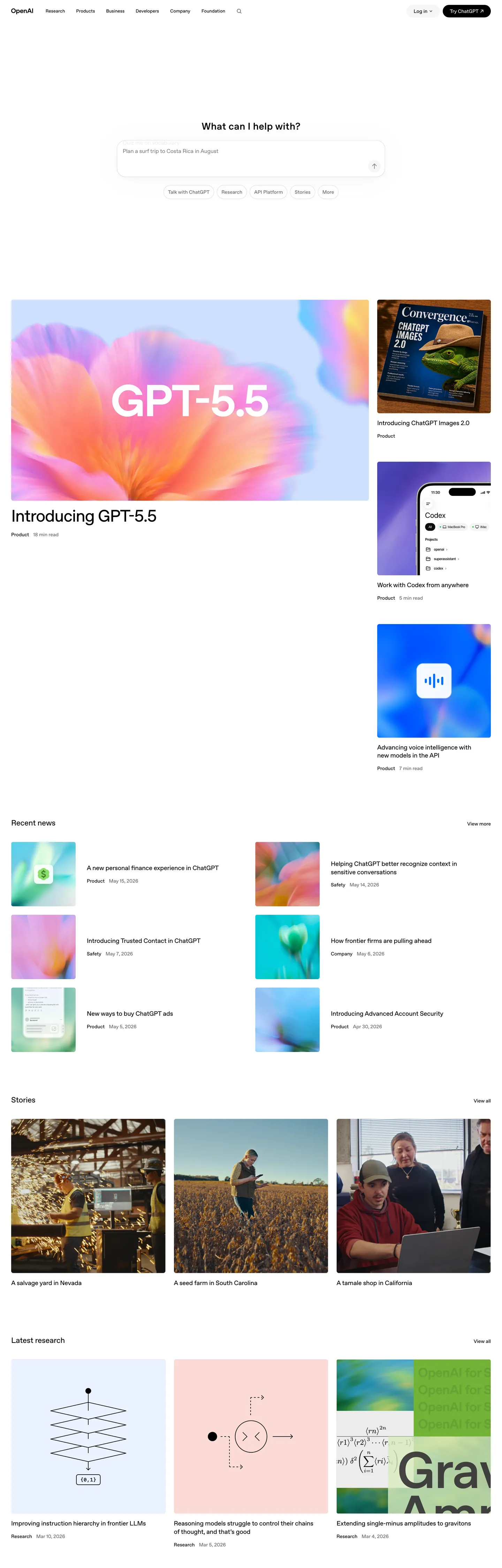
OpenAI's marketing site does something almost no other AI-lab brand attempts: it deletes the marketing. The above-fold is a near-empty white canvas with a thin top-nav, a small "What can I help you with?" prompt, a fully-rounded chat-style input pill underneath, and a row of suggestion chips. There is no hero headline, no chest-pounding tagline, no gradient mesh, no product mockup overlay. The page IS the conversational onboarding affordance — type and you are already in product flow. Below the fold, an asymmetric grid of full-bleed product screenshots (GPT-5.5 announcement, sample outputs, customer stories) does every chromatic job the brand chrome refuses to do.
The DESIGN.md file packages the system into a machine-readable spec for React tooling. Inside: a deliberately tiny color set — pure black ink with usage 563 (the dominant text and background voltage), pure white canvas, and a single light hairline gray with 535 border occurrences. Every other declared CSS variable in the source (an entire pink / blue / green / orange / yellow / lime / magenta palette mapped to `--color-hue-*` and `--color-syntax-*`) sits at usage 0 in the captured marketing surface; those tokens belong to the in-product chat interface, not the marketing chrome. Typography runs OpenAI Sans across nine tiers — 13px nav labels at weight 500, 17px nav links at weight 400, 48px display at weight 500 with tight -1.44px tracking. There is no second typeface, no serif tier, no monospace moment on the page.
Feed this file to Claude or Cursor and it reproduces OpenAI's specific moves: pure-white canvas instead of cream or off-white, ink-on-canvas with no held-in-reserve brand color, OpenAI Sans at weight 400-500 across every tier, fully-rounded pill for the single interactive hero element, and 6.08px small-step rounding on every card. The one thing worth borrowing only if your product is itself a conversational interface: the willingness to put a chat input where most brands put a CTA. Most teams need a headline.
What makes it distinct
5 highlights
- Two-color structurePure black ink on pure white canvas, with a single hairline gray for card outlines; no brand color is held in reserve
- Input-as-heroThe only above-fold interactive element is a fully-rounded chat-style input pill, not a CTA button; the brand fronts the product UX, not a slogan
- OpenAI Sans across every tier13px nav up to 48px display in weight 500, with a single weight-600 small-caps moment for the wordmark
- Asymmetric screenshot gridA large 16:9 product card sits beside two stacked square cards, then a 3-up image row below; the imagery is the marketing
- Pill input plus 40px CTA radiusBoth interactive surfaces are fully-rounded; cards use a tight 6px rounding instead of the warm rounding the product brand uses
Live at openai.com
OpenAI in production, as captured. Scroll the window to see the whole page.
15 colors
OpenAI's system anchors on #1e60e4 (syntax-keyword) as its primary color. Type is set in OpenAI Sans across 10 tokens from 13px to 48px, weights 400–600. Shape language is soft — components average 19px corner radius, with no sharp interactive edges.
Surface
Page and card backgrounds · 3
Text
Headlines, body, captions · 3
Borders & Hairlines
Dividers, outlines, rules · 1
Semantic
Status, errors, success, links · 1
Other
Specialty colors · 7
10 type tokens
Set in OpenAI Sans across 10 tokens, from 13px to 48px, weights 400–600. Shown in its own stack: where the font isn't installed, the fallback the file names stands in.
- display-xl48px · weight 500 · lh 55.68px · tracking -1.44pxThe quick brown fox jumps over the lazy dog
- display-md28px · weight 600 · lh 34px · tracking 0.3pxThe quick brown fox jumps over the lazy dog
- heading-md22px · weight 500 · lh 27.72px · tracking -0.22pxThe quick brown fox jumps over the lazy dog
- heading-sm18px · weight 500 · lh 23.76px · tracking -0.18pxThe quick brown fox jumps over the lazy dog
- nav-link17px · weight 400 · lh 28px · tracking -0.17pxThe quick brown fox jumps over the lazy dog
- body-md16px · weight 400 · lh 24px · tracking -0.16pxThe quick brown fox jumps over the lazy dog
- body-sm14px · weight 500 · lh 19.6pxThe quick brown fox jumps over the lazy dog
- label-md13px · weight 500 · lh 19.68pxThe quick brown fox jumps over the lazy dog
- button-md14px · weight 500 · lh 14pxThe quick brown fox jumps over the lazy dog
- mono-sm14px · weight 400 · lh 21pxThe quick brown fox jumps over the lazy dog
Radii and spacing
6 corner radii and 8 spacing values. Shape language: soft, on a 6px base radius.
Radii6
- none0px
- sm4px
- md6px
- lg24px
- pill40px
- full9999px
Spacing8
- xs4px
- sm8px
- md12px
- base16px
- lg24px
- xl32px
- 2xl40px
- 3xl64px
15 components
Each rendered from its tokens (color, type, radius, padding) on OpenAI's own canvas.
- Button PrimaryButton Primarybutton-primary
- Button SecondaryButton Secondarybutton-secondary
- Top NavTop Navtop-nav
- Nav LinkNav Linknav-link
- Hero HeadingHero Headinghero-heading
- Section HeadingSection Headingsection-heading
- Body ParagraphBody Paragraphbody-paragraph
- Body Paragraph MutedBody Paragraph Mutedbody-paragraph-muted
- Type here…Text Inputtext-input
- Card ScreenshotCard Screenshotcard-screenshot
- Card NewsCard Newscard-news
- Suggestion ChipSuggestion Chipsuggestion-chip
- WordmarkWordmarkwordmark
- FooterFooterfooter
- Code BlockCode Blockcode-block
The system, in use
OpenAI's tokens on the kind of product it builds.
Think bigger with an AI at your side
Ask anything, write and analyze, and build with an assistant that understands your work.
OpenAI design system FAQ
OpenAI's tokens, its components and how to use this DESIGN.md in your project.
What are the color tokens in the OpenAI DESIGN.md?
What is OpenAI's primary color hex code?
How do I use OpenAI's colors in Tailwind CSS?
What is OpenAI's primary brand color?
What fonts does OpenAI use?
What is OpenAI's type scale?
What can I use if I don't have OpenAI's font?
What typeface does OpenAI use, and what should I use as a substitute?
Which components does the OpenAI DESIGN.md define?
What corner radius and spacing does OpenAI use?
What is OpenAI's corner-radius philosophy?
How do I apply the OpenAI design system to a shadcn/ui project?
How do I use the OpenAI DESIGN.md with Claude Code or Cursor?
Is the OpenAI DESIGN.md free to download?
How was the OpenAI DESIGN.md made?
Is the OpenAI DESIGN.md official?
Why is OpenAI's canvas pure white instead of a warm off-white?
Can I use this DESIGN.md to build my own AI-product marketing site in the OpenAI design system?
Related reading
Specs, directories and component libraries that pair with this design system.
- Browse all design systemsThe full directory of DESIGN.md files on shadcn.io, with live mockups for each.shadcn.io
- OpenAI — official siteOpenAI's public marketing site — the source of truth for the live tokens captured in this file.openai.com (opens in a new tab)
- The DESIGN.md specificationGoogle Labs' open spec for machine-readable design system files — the format this page is built on.github.com (opens in a new tab)
Use OpenAI in your project
One machine-readable file. Drop it into Claude Code, Cursor, VS Code or any AI tool that reads DESIGN.md.
Download the DESIGN.md
One machine-readable file: every color, type, radius, spacing, and component token of OpenAI.
Feed it to your AI tool
Drop it into Claude, Cursor, or GitHub Copilot. The agent writes React components and Tailwind classes that match OpenAI's visual language.
Reference the tokens directly
Or paste the values into your Tailwind config, CSS variables, or component library: every color, size and radius is a quoted, ready-to-copy value.
Read the full DESIGN.md overview, rationale, do’s and don’ts
Overview
OpenAI's marketing site does something almost no other AI-lab brand attempts. Marketing as input. The above-fold is a near-empty white canvas with a thin top-nav, a small "What can I help you with?" prompt, a fully-rounded chat-style input pill underneath, and a row of suggestion chips. There is no hero headline, no chest-pounding tagline, no gradient mesh, no product mockup overlay — the page IS the conversational onboarding affordance. Where Anthropic frames Claude with editorial display in a serif moment and Google paints the Gemini hero with brand-saturated imagery, OpenAI inverts the relationship: type and you are already inside ChatGPT.
The system's chromatic restraint reinforces the move. There is exactly one structural color stack — pure ink ({colors.ink} — #000000) and pure canvas ({colors.canvas} — #ffffff), with a single hairline ({colors.hairline} — #e5e7eb) marking card edges. Ink appears 563 times across the page (521 as text, 24 as background, 13 as shadow, 5 as border); the hairline carries 535 of the border occurrences. Every other color declared in the source CSS — an extensive {colors.syntax-keyword} / {colors.syntax-string} / {colors.syntax-operator} / {colors.syntax-function} / {colors.syntax-data} set wired to --color-hue-* and --color-syntax-* variables — sits at usage 0 in the captured marketing surface. Those tokens belong to the in-product chat interface, not the brand chrome.
Typography is OpenAI Sans across every tier — a custom proprietary sans that does the work of display, heading, body, button, nav, and label. Display tops out at 48px in weight 500 with tight -1.44px tracking; body and nav sit at 14-17px in weight 400-500; the only weight-600 moment on the page is the OpenAI wordmark itself at 28px. The hero h2 "Get started with ChatGPT" at 48px / 500 is the loudest typographic moment in the system, deliberately measured so the asymmetric product-screenshot grid below it remains visually dominant.
Key Characteristics:
- Pure white canvas (
{colors.canvas}— #ffffff), not the warm cream Cloudflare or Patagonia use — the page floor recedes so the model-generated imagery in the screenshot grid can carry every chromatic moment. - Ink (
{colors.ink}— #000000) for every text, button fill, and shadow tone — 563 total occurrences, 521 as text. No softened off-black. - Hairline (
{colors.hairline}— #e5e7eb) for every card outline, input field border, and divider — 535 of 540 border occurrences in the captured page. - OpenAI Sans across nine tiers — 13px label / 14px button / 17px nav / 22px section / 48px display — with the wordmark as the lone weight-600 moment.
- Binary radius split: 6.08px on cards (39 of 60 occurrences), fully-rounded pill on interactive surfaces (input, suggestion chips, primary CTA at 40px).
- Asymmetric screenshot grid below the fold: a large 16:9 announcement card beside two stacked square cards, then a 3-up image row, then a 3-up news strip.
- No second typeface, no serif tier, no in-marketing monospace — mono is reserved for the in-product chat code blocks.
- The entire
{colors.syntax-keyword}/{colors.syntax-string}/{colors.syntax-operator}family is declared in CSS but never rendered on the marketing surface.
Colors
Structural
- Ink (
{colors.ink}— #000000): frequency 563 — used as text (521), background (24), shadow (13), border (5). The dominant voltage of the system. Wired as--color-black,--color-primary-100,--color-primary-solid-100, and--color-syntax-copy. Every headline, every body paragraph, every wordmark, the primary CTA fill, and every shadow ink resolves to pure black. - Ink Soft (
{colors.ink-soft}— #47484f): declared as--color-gray-100. Not rendered as a primary running-text tone in the captured page — reserved for secondary text in the in-product surfaces. - Ink Muted (
{colors.ink-muted}— #707070): declared as--color-primary-solid-inactive,--color-secondary-solid-44,--color-primary-solid-nav, and--color-tertiary-solid-hint. The inactive-state ink tone for nav links and disabled buttons. - Canvas (
{colors.canvas}— #ffffff): the page floor below and above the fold. Wired as--color-background,--color-white,--color-secondary-100, and--color-primary-nav. Pure white, never softened. - Surface-1 (
{colors.surface-1}— #f1f1f1): the warm-gray surface for the dark-tertiary fills. Used inside in-product code blocks (--color-tertiary-100,--color-gray-20). Not rendered as a primary marketing surface. - Surface-2 (
{colors.surface-2}— #1f1f1f): declared as--color-secondary-solid-12. The dark variant for dark-mode product surfaces; absent from the captured light-mode marketing chrome.
Hairline
- Hairline (
{colors.hairline}— #e5e7eb): frequency 535, all as border. The dominant — and effectively only — border tone in the system. Wired as--color-primary-solid-12,--color-gray-40, and--color-gray-200. Marks every card outline, input field edge, divider rule, and dropdown border. - Gray-60 (
{colors.gray-60}— #bcbec4): declared as--color-gray-60and--color-tertiary-solid-80. Reserved for secondary chrome states; not rendered on the captured marketing surface. - Gray-80 (
{colors.gray-80}— #767881): declared as--color-gray-80. The mid-gray for product surface text labels.
Syntax (product surface)
The captured CSS exposes a full syntax-highlighting palette wired into the in-product chat code blocks. None of these tokens appears on the marketing surface; all carry usage 0 in the extraction.
- Syntax Keyword (
{colors.syntax-keyword}— #1e60e4): wired as--color-syntax-keyword. The cobalt-blue tone forfunction/const/importkeywords inside in-product code blocks. - Syntax String (
{colors.syntax-string}— #027f41): wired as--color-syntax-stringand--color-green-700. String literals in chat code. - Syntax Operator (
{colors.syntax-operator}— #c93b00): wired as--color-syntax-operatorand--color-orange-700. Operators and punctuation in chat code. - Syntax Function (
{colors.syntax-function}— #7a4ff5): wired as--color-syntax-function. The violet-blue tone for function calls. - Syntax Data (
{colors.syntax-data}— #1d7899): wired as--color-syntax-data. Property names and identifiers. - Syntax Error (
{colors.syntax-error}— #f53255): wired as--color-hue-redand--color-syntax-error. The error-state red — distinct from the syntax-operator orange.
Typography
Font Family
The system runs OpenAI Sans for everything — a custom proprietary sans-serif OpenAI ships with the marketing site. Fallbacks walk system-ui, -apple-system, sans-serif. There is no separate display family, no serif tier, no in-marketing monospace voice; one variable-weight sans does every job. The only place a second family appears is inside in-product code blocks (SF Mono, Consolas, Liberation Mono, ui-monospace), which are not rendered on the captured marketing surface.
Hierarchy
| Token | Size | Weight | Line Height | Letter Spacing | Use |
|---|---|---|---|---|---|
{typography.display-xl} | 48px | 500 | 55.68px | -1.44px | Hero h2 ("Get started with ChatGPT"), section openers |
{typography.display-md} | 28px | 600 | 34px | 0.3px | OpenAI wordmark — the single weight-600 moment on the page |
{typography.heading-md} | 22px | 500 | 27.72px | -0.22px | Section h2 ("Recent news", "Stories") |
{typography.heading-sm} | 18px | 500 | 23.76px | -0.18px | Card titles in the news + announcement grid |
{typography.nav-link} | 17px | 400 | 28px | -0.17px | Top-nav link labels ("Research", "Safety", "ChatGPT") |
{typography.body-md} | 16px | 400 | 24px | -0.16px | Default running text below the screenshot grid |
{typography.body-sm} | 14px | 500 | 19.6px | 0 | Card metadata, dateline rows, "5 min read" tags |
{typography.label-md} | 13px | 500 | 19.68px | 0 | Small labels, category chips, footer link rows |
{typography.button-md} | 14px | 500 | 14px | 0 | Primary CTA label ("Try ChatGPT"), suggestion chips |
{typography.mono-sm} | 14px | 400 | 21px | 0 | In-product code blocks only — never on marketing |
Principles
Display weight tops out at 500, never 700+. The 48px hero with -1.44px tracking is editorial confidence by tracking and color contrast, not by weight. The wordmark at 28px in weight 600 is the single semibold moment on the page — every other tier holds at 400 or 500. The absence of a 700+ tier reinforces the "marketing is product UX" stance: the page never raises its voice because the input field is already doing the work a hero headline would do elsewhere.
Note on Font Substitutes
OpenAI Sans is proprietary. Inter at the same weights is the closest open-source substitute; the proportions transfer cleanly and Inter's slightly looser counters read close to OpenAI Sans at the 16-17px body sizes. For the 48px display tier with -1.44px tracking, Geist (Vercel's open-source sans) has comparable cap height; General Sans is closer in proportion but not free. The mono tier is already a system stack (SF Mono, Consolas) and needs no substitution.
Layout
Spacing System
- Base unit: 4px (with 8px and 16px as the dominant modules).
- Tokens:
{spacing.xs}4px ·{spacing.sm}8px ·{spacing.md}12px ·{spacing.base}16px ·{spacing.lg}24px ·{spacing.xl}32px ·{spacing.2xl}40px ·{spacing.3xl}64px. - Section padding (vertical): ~80px between major editorial bands, tightening to ~48px between row groups inside the screenshot grid.
- Card internal padding:
{spacing.base}(16px) inside news cards; 0 on the screenshot tiles — the image fills the card edge to edge. - Nav padding:
{spacing.xl}(32px) horizontal, 0 vertical — the 64px nav height is set by the nav-link line height alone. - Hero padding: ~96px top, ~64px bottom — the only generous band on the page.
Grid & Container
- Max content width: 1440px (
--document-width: 1440px), with a 200px nav rail on desktop. - Hero: centered single column at ~720px max-width, holding the "What can I help you with?" prompt + input pill + suggestion chip row.
- Screenshot grid: asymmetric — a large 16:9 announcement card on the left (~720px wide) beside two stacked ~360x300 square cards on the right; below that a 3-up image row of square cards, then a 3-up news strip.
- Stories band: 3-column layout of full-bleed photographic cards at ~480x300 each.
- Latest research: 3-up of taller mixed-media cards, each with a thumbnail at top and metadata strip below.
Rhythm
The page alternates between empty above-fold and dense image-packed below. The hero is generous (single input, three chips, vast surrounding white space). The screenshot grid immediately below is dense (asymmetric 5-card composition with zero gaps between groups). The news strip returns to a tighter grid. There is no atmospheric gradient between bands — every section terminates on the same pure-white canvas, and depth comes from the screenshot imagery itself, never from background-color shifts.
Elevation
The system has essentially no shadow tier. The captured page has 13 occurrences of {colors.ink} used as shadow ink, almost all confined to faint card-elevation halos on the news cards and the suggestion chip row. The single hairline {colors.hairline} carries 535 of the page's 540 captured border occurrences and does the entire elevation job that a layered shadow tier would do on a typical dashboard product.
- Flat (no shadow): hero, screenshot grid, stories band, footer — 95% of surfaces.
- Hairline outlines: every card, input, and suggestion chip uses a 1px
{colors.hairline}border. The hairline IS the elevation. - Faint card shadows: news cards and the input pill carry a sub-pixel
rgba(0,0,0,0.04)halo — readable only as a soft seat against the canvas, not as a layered shadow.
Shapes
The radius scale is binary: small-step rounding on cards, full pill on interactive surfaces.
- Small-step:
{rounded.sm}4px (4 occurrences — sub-corners on small chips),{rounded.md}6.08px (39 occurrences — the dominant card radius across the screenshot grid, news cards, and editorial tiles),{rounded.lg}24px (1 occurrence — a single large feature card). - Pill:
{rounded.pill}40px (3 occurrences — the primary CTA "Try ChatGPT" in the nav),{rounded.full}9999px (13 occurrences — the hero input pill, suggestion chips, sub-nav indicators). - No middle tier: the scale skips 8 / 12 / 16 / 20px entirely. Either a surface uses the 6.08px card radius or it goes to a fully-rounded pill — there is no rounded-but-not-pill middle.
The pill treatment is the warmest surface in the system. The fully-rounded input pill in the hero is the single most-tappable element on the page; the 40px-radius primary CTA in the nav is the second.
Components
button-primary — The signature CTA. Pure-ink {colors.ink} fill, white text, {rounded.pill} 40px radius, 0x20 padding, 36px height. "Try ChatGPT" in the top-right of the nav is the canonical instance.
button-secondary — White {colors.canvas} fill, ink text, 1px {colors.hairline} border, {rounded.pill} 40px radius. Used for the "Log in" link beside the primary CTA.
top-nav — White surface flush with the page floor (no bottom hairline), 64px height, 32px horizontal padding. Houses the OpenAI wordmark flush left, the product / research / safety / company / news link rail center, and the log-in + primary CTA cluster flush right.
nav-link — Transparent background, ink text in {typography.nav-link} (17px / 400), 0x12 padding, 64px height. The active state carries no visible underline or fill in the captured surface — the link itself just sits in ink.
hero-heading — Ink text on the white canvas, {typography.display-xl} (48px / 500). 0 horizontal padding because the hero content is centered in the viewport via container width alone.
section-heading — Ink text, {typography.heading-md} (22px / 500). Used for "Recent news", "Stories", "Latest research" section openers.
body-paragraph — Default ink running-text at {typography.body-md} (16px / 400) below the screenshot grid.
body-paragraph-muted — {colors.ink-muted} (#707070) variant for caption rows and metadata strips under news cards.
text-input — White {colors.canvas} fill, ink text, 1px {colors.hairline} border, {rounded.full} 9999px (fully-rounded pill), 10x24x10x52 padding (the left padding leaves room for the search-icon glyph), 40px height. The single most-tappable element on the page — the hero "What can I help you with?" pill.
card-screenshot — White surface with a 1px {colors.hairline} outline, {rounded.md} 6.08px radius, 0 padding. The screenshot image fills the card edge to edge; titles sit beneath the card, not inside it. Used for the asymmetric announcement grid (GPT-5.5 card + two stacked product cards) and the 3-up image strip.
card-news — White surface, 1px hairline border, {rounded.md} radius, 16px internal padding. Holds a "Product / N min read" metadata row at top, then a single-line headline, then a Lucide-style external-link icon flush right.
suggestion-chip — White fill, ink text, 1px hairline border, {rounded.full} pill, 8x12 padding, 32px height. The row of suggestion prompts directly beneath the hero input.
wordmark — Plain ink text at {typography.display-md} (28px / 600) — the only weight-600 typographic moment on the page. No icon mark, no logotype glyph.
footer — White canvas, ink-muted text at {typography.label-md} (13px / 500), 32x0 padding. No surface contrast against the page floor — the footer continues the canvas with a single hairline rule at the top.
code-block — {colors.surface-1} warm-gray fill, ink text in {typography.mono-sm}, {rounded.sm} 4px radius. Reserved for the in-product chat surface; not rendered on the captured marketing page.
Do's and Don'ts
Do delete the hero headline entirely if your product is a conversational interface. The defining move of this system is the absent hero — a chat input pill where most brands put a tagline. Adding a 48px hero "Build with AI" sentence above the input dilutes the input-as-hero principle.
Do keep the canvas pure {colors.canvas} (#ffffff). The page floor must recede so the model-generated imagery in the screenshot grid carries every chromatic moment. Warming the canvas to cream forces every screenshot card to compete with the surface.
Do use the {colors.hairline} (#e5e7eb) for every card edge. The single hairline tone carries 535 of 540 captured borders; introducing a darker divider tone breaks the quiet-card discipline.
Do restrict OpenAI Sans weight 600 to the wordmark only. Every other tier holds at 400-500. A second weight-600 moment (e.g. on a CTA or section heading) flattens the wordmark's status as the lone semibold voice.
Don't use the syntax-highlight colors ({colors.syntax-keyword}, {colors.syntax-string}, {colors.syntax-operator}, {colors.syntax-function}) anywhere outside in-product code blocks. They are wired as --color-hue-* and --color-syntax-* for the chat surface, not the brand palette.
Don't introduce a brand voltage. The marketing system has no held-in-reserve accent. Adding a teal or cobalt CTA color reads as borrowed from another infra brand and breaks the two-color structural discipline.
Don't add a middle radius tier between 6.08px and the fully-rounded pill. The binary split is the system's only shape gesture — a 12 or 16px middle softens the contrast between quiet cards and warm interactive pills.
Don't add a tinted shadow layer. The system has 13 captured shadow occurrences and they all use neutral ink at very low opacity. Tinting shadows or layering elevation reads decorative rather than structural.
Known Gaps
- Hover and focus states: the primary CTA, nav links, and input pill carry resting-state styling only; the full hover / active / focus matrix lives inside the ChatGPT product surface and is not captured here.
- Form input error states:
{component.text-input}carries the resting state; error / validation styling lives inside the product surface. - Dark mode: the captured marketing surface is light-only. The declared
{colors.surface-2}(#1f1f1f) and--color-secondary-*family belong to the dark-mode product chrome but are absent from the rendered marketing page. - Motion: the hero input field has subtle placeholder-text cycling and the screenshot grid animates on scroll-into-view, but the spec captures end-state values only. Easing curves and duration live in the live runtime.
- Product surfaces: this DESIGN.md captures the marketing site only. ChatGPT itself (
chat.openai.com) carries a much richer token system — sidebar layouts, message-bubble surfaces, code-block syntax highlighting, model-selector chrome — that is not represented here. - The full hue palette: the CSS exposes
--color-hue-blue,--color-hue-magenta,--color-hue-lime,--color-hue-yellowand their corresponding 20 / 40 / 60 / 80 / 100 / 200 ramps. None of these tokens render on marketing chrome — they belong to in-product chart and badge surfaces. - API platform surface:
platform.openai.comcarries its own brand chrome (a separate top-nav, dashboard cards, API key management surfaces) that is not represented here.
More systems like this
Algolia, Anthropic, Arc and 61 more in AI & LLM Platforms: each brand's colors, type and components in one file your AI agent builds from.
Build it with Pro
The DESIGN.md files are free. Pro adds 6,000+ blocks, premium templates and the MCP server, so your AI editor builds in your system for you.
4.9/5 out of 5 · 150+ reviewsfrom 150+ founders and developers.
- Secure checkout via Stripe
- Code lives in your repo
- Keep what you've shipped if you cancel
- License terms
4.9 out of 5 from 150+ developers


Your system, built for you
Every block, template and icon, installed by your AI agent in your design system. The DESIGN.md files stay free.
- Cancel anytime
- Keep what you've shipped