Pinecone Design System
Pinecone's design system as a DESIGN.md file.
About Pinecone DESIGN.md
Curated by Dov AzencotUpdated Source pinecone.io
- Backend, Database & DevOps
- AI & LLM Platforms
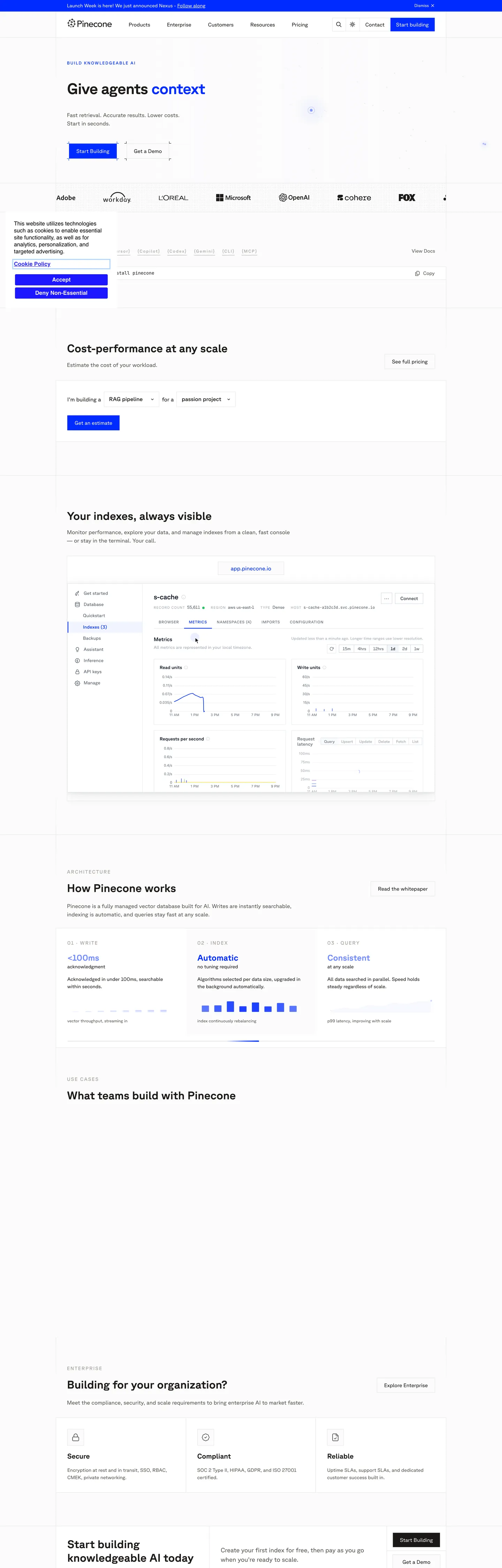
Pinecone's page is the vector database rendered as a technical brochure. The canvas commits to pure white (#ffffff), text lands in a warm near-black (#1c1917) rather than the cool #000000 the page's CSS exposes, and the one chromatic event on the hero is the electric blue primary at #002bff — used inside the inline "context" word of the headline, the filled Start Building button, and the secondary nav CTA. Where most developer-infra brands soften the corner radius to 6px or 8px, Pinecone holds every button at 0px. The square edge is the signature. Sub-brand violet (#3d11a0) and frost-blue (#b3d5ff) sit declared in CSS variables but stay almost entirely off-page on the home surface — reserved for product UI accents and chart strokes.
This page packages the system into a single DESIGN.md file following the Google Labs open spec. Inside: 22 color tokens (one primary, one primary-dark navy, three sub-brand accents, a five-step warm grey ladder from #e7e5e4 hairline to #1c1917 ink, plus four semantic info / success / warning / error roles), 11 typography styles running GT Planar at weights 400 / 500 / 600 / 700 with a JetBrains Mono companion at 12px and an Apple II Pro terminal accent for the integration bracket row, 4 radius tokens topping at 50% for avatar circles, an 8-step spacing scale anchored at 16px, and 18 component recipes — the square Start Building primary, the outlined Get a Demo, the app-pinecone.io URL pill at the top of the dashboard mockup, the install-pinecone code block, and the architecture three-column card row.
Feed the file to Claude, Cursor, or GitHub Copilot when you want a React surface that reads as Pinecone rather than another shadcn theme. The agent reproduces the specific moves: 0px buttons in #002bff with white text, 44px bold display at -0.88px tracking, warm #1c1917 ink rather than pure black, and a single electric blue voltage that refuses to share the page with a secondary accent. Reference the tokens inside Tailwind config or treat the spec as an audit checklist — every hex is quoted so it pastes cleanly into theme files. The system is worth studying because of what it refuses: no rounded buttons, no atmospheric gradient, no display weight below 700.
What makes it distinct
- Square 0px button radiusthe Start Building CTA at #002bff never rounds, where every other developer SaaS pills its buttons
- Single electric voltage#002bff appears 41 times (21 text, 12 bg, 7 border) and is the only chromatic event above the fold
- Bold-700 display tier44px hero at weight 700 with -0.88px tracking, where Stripe and Vercel hold display at 300 / 600
- Apple II Pro terminal font appears oncethe bracketed [Cursor] [Copilot] [Codex] [Gemini] [CLI] [MCP] row signals the agent-integration story typographically
- 509-occurrence #e7e5e4 hairlinethe warmest near-white border in the palette carries every card divider and section split
Live at pinecone.io
A snapshot of the brand in production. Hover the frame to scroll the page; click to visit.
 pinecone.io
Explore Pinecone
Pick what you want to see — mockups, colors, typography, layout, or the full component list.
Brand & Accent
Sparing, CTA-only voltage.
Surface
Page and card backgrounds.
Text
Headlines, body, captions, muted.
Borders & Hairlines
Dividers, outlines, structural rules.
Semantic
Status, errors, success, inline links.
Other
Specialty colors.
Pinecone design system FAQ
Common questions about Pinecone's tokens, components, and how to use this DESIGN.md in your project.
Related reading
Specs, directories, and component libraries that pair with this design system.