Polestar Design System
Polestar's Swedish minimalist EV system as a DESIGN.md file.
About Polestar DESIGN.md
Curated by Dov AzencotUpdated Source polestar.com
- Automotive
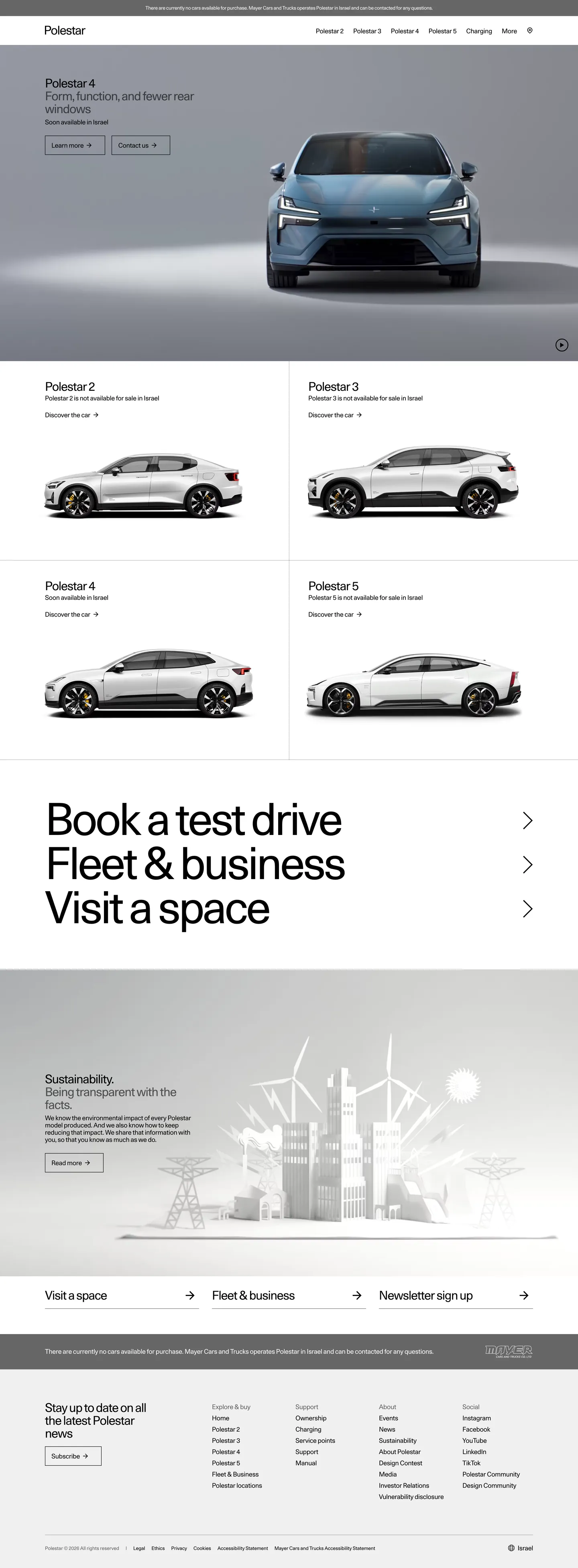
Polestar's site reads as a Stockholm gallery rather than an automotive marketing page. The hero band is a pale studio-gray stage (a near-#efefef wash) holding one car in three-quarter view — no driver, no road, no motion. The model name sits above the photograph at 30px in Polestar Unica weight 400 with -1.2px letter-spacing, and two stacked link CTAs ("Learn more →", "Contact →") read as plain anchored text rather than filled buttons. Below the hero, a 2×2 grid of product cards repeats the same studio treatment on white surfaces, and the page closes with a dark anthracite footer that inverts ink from black to white. The chrome refuses to compete with the cars.
This DESIGN.md captures the full Polestar system in machine-readable form: 19 color tokens spanning a single ink + canvas pair plus structural grays and the dark-footer inversion, 10 typography tokens all running Polestar Unica at weight 400 (the family has no other weight in production use), 9 spacing tokens on a 4px base, a two-step radius scale (0px and 50%), and 19 component definitions covering the hero stage, product card, link-CTA, top nav, footer, and the persistent legal-strip. The file follows the Google Labs DESIGN.md specification so AI coding tools can parse the tokens directly.
Feed it to Claude, Cursor, or GitHub Copilot and the agent reproduces Polestar's restraint — single-weight type, hard-edged rectangles, link-style CTAs, studio-still photography on gray — rather than a generic EV theme. You can also paste the tokens directly into Tailwind config or CSS variables. The system is worth studying because it commits harder than almost any other car brand to the idea that the typeface, not the color, is the brand voice — confidence by typographic monoculture rather than chromatic noise.
What makes it distinct
- Single-weight typographyPolestar Unica runs only at weight 400 across every size from 12px legal to 110px hero numerals
- Tracked-tight negative letterspacingdisplay sits at -1.2px and the hero numeral at -4.95px, so cap-heights nearly touch
- Studio-still photographyevery car sits centered on the same pale-gray no-horizon backdrop, no tracks, no drivers, no motion
- Binary radius0px on every rectangular surface, 50% on exactly one element (the video play circle); nothing in between
- Pale-gray stage canvasthe hero band uses a soft #efefef studio backdrop rather than the white that paginates the rest of the site
Live at polestar.com
A snapshot of the brand in production. Hover the frame to scroll the page; click to visit.
 polestar.com
Explore Polestar
Pick what you want to see — mockups, colors, typography, layout, or the full component list.
Surface
Page and card backgrounds.
Text
Headlines, body, captions, muted.
Borders & Hairlines
Dividers, outlines, structural rules.
Other
Specialty colors.
Polestar design system FAQ
Common questions about Polestar's tokens, components, and how to use this DESIGN.md in your project.
Related reading
Specs, directories, and component libraries that pair with this design system.