Porsche Design System
Porsche's site as a DESIGN.md: Porsche Next at weight 400, 32px-radius photo tiles and a fluid clamp type scale, with components for React and AI tools.
- Primary color
- #010205
- Typeface
- Porsche Next
- Shape
- Soft
- Base radius
- 6px
- Colors
- 18
- Type tokens
- 9
- Components
- 18
- Spacing values
- 9
About Porsche DESIGN.md
Curated by Dov Azencot, updated May 13, 2026. Source porsche.com (opens in a new tab).
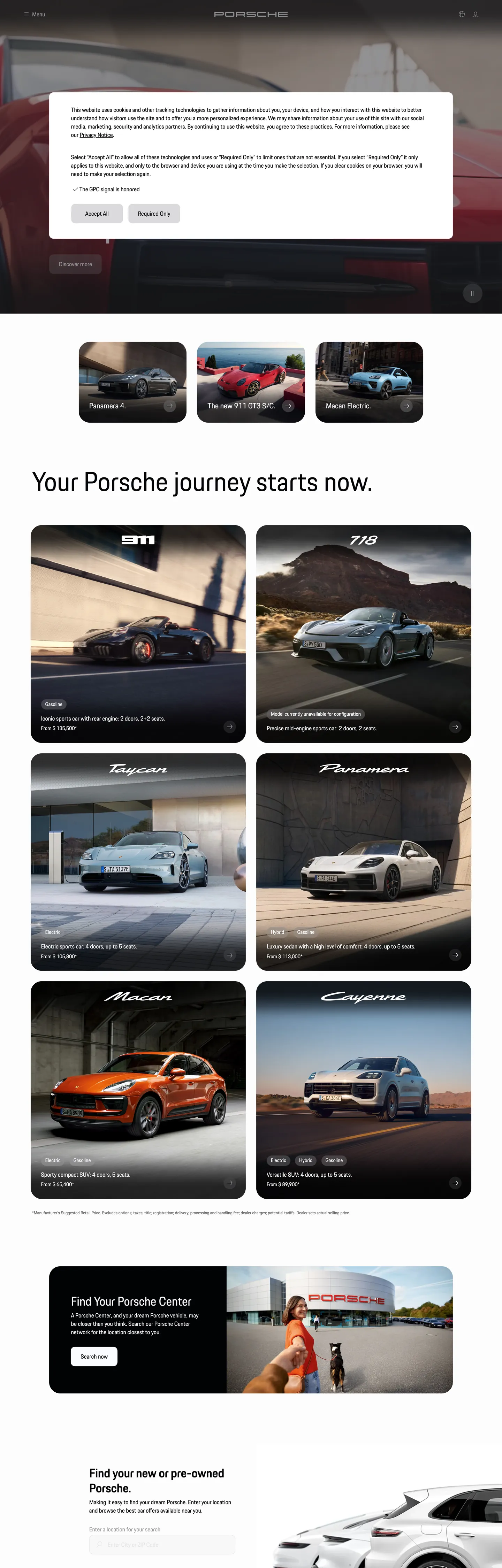
Porsche's marketing surface is the inverse of Ferrari's. Where Maranello stages near-black cinema with sharp 0px CTAs and a single Rosso Corsa voltage, Stuttgart runs a near-white canvas (#ffffff) holding deep black display type, softens every photo tile to a generous 32px radius, and lets the photography do the chromatic work — the cars themselves carry the color. The custom face is Porsche Next, declared in CSS as `"Porsche Next", "Arial Narrow", Arial, "Heiti SC", SimHei, sans-serif`. It runs at weight 400 across every text role captured on the page: 94.72px h1, 72.51px h2, 16px body, 12px caption. Letter-spacing stays at `normal` across the whole scale. The single chromatic accent surfaces only inside `--p-color-focus` and `--p-color-info` as Indigo Blue (#1a44ea) — never as a CTA fill.
This page packages the system into a single DESIGN.md file using the Google Labs open spec. Inside: 18 colors tokens grouped into canvas, ink, photo-overlay, and semantic accents; 9 typography tokens running through Porsche Next at weight 400 across a fluid clamp() scale (`--p-typescale-2xs` 0.75rem through `--p-typescale-5xl` clamp(2.28rem, 5.2vw + 1.24rem, 7.48rem)); 6 corner-radius values capped by a dominant 32px on photo tiles; 9 spacing tokens on the brand's fluid clamp() ladder; and 18 components covering top nav, model-photo tile, hero band, locator card, mosaic grid, and the dark-on-photo CTA pattern.
Feed the file to Claude, Cursor, or GitHub Copilot and the agent writes React surfaces that read as Porsche — Porsche Next at 400, 32px softened photo tiles, fluid type that resizes between viewports, indigo only on focus rings — rather than a generic dark-luxury theme. Reference the `{token.refs}` directly in Tailwind config, or use the spec as an audit lens: most luxury-auto sites copy Stuttgart's white canvas but miss the radius and the held-at-400 typographic discipline that make it work.
What makes it distinct
5 highlights
- Single typeface, single weightPorsche Next at 400 carries h1 (94px) down to caption (12px) with letter-spacing held at normal
- Generous 32px radius photo tilesWhere Ferrari runs 0px sharp corners on every card, Porsche softens to a dominant 32px on 10 of 13 captured shapes
- Fluid clamp() typescale`--p-typescale-5xl` resolves clamp(2.28rem, 5.2vw + 1.24rem, 7.48rem), eliminating breakpoint ladders entirely
- Cinema hero over white bodyBlack 1440x900 hero band sits above an all-white model grid, photography handles the depth
- Indigo Blue focus accent (#1a44ea)The brand reserves chromatic voltage for `--p-color-focus` and `--p-color-info` only, never for CTAs
Live at porsche.com
Porsche in production, as captured. Scroll the window to see the whole page.
18 colors
Porsche's system anchors on #010205 (primary) as its primary color. Type is set in Porsche Next across 9 tokens from 12px to 94px, weights 400–400. Shape language is soft — components average 24px corner radius, with no sharp interactive edges.
Brand & Accent
Sparing, CTA-only voltage · 1
Surface
Page and card backgrounds · 4
Text
Headlines, body, captions · 7
Borders & Hairlines
Dividers, outlines, rules · 1
Semantic
Status, errors, success, links · 4
Other
Specialty colors · 1
9 type tokens
Set in Porsche Next across 9 tokens, from 12px to 94px, weights 400–400. Shown in its own stack: where the font isn't installed, the fallback the file names stands in.
- display-5xl94px · weight 400 · lh 1.19The quick brown fox jumps over the lazy dog
- display-4xl72px · weight 400 · lh 1.21The quick brown fox jumps over the lazy dog
- display-3xl48px · weight 400 · lh 1.2The quick brown fox jumps over the lazy dog
- display-2xl36px · weight 400 · lh 1.2The quick brown fox jumps over the lazy dog
- heading-xl24px · weight 400 · lh 1.3The quick brown fox jumps over the lazy dog
- body-lg18px · weight 400 · lh 1.5The quick brown fox jumps over the lazy dog
- body-md16px · weight 400 · lh 1.5The quick brown fox jumps over the lazy dog
- body-sm14px · weight 400 · lh 1.55The quick brown fox jumps over the lazy dog
- caption12px · weight 400 · lh 1.625The quick brown fox jumps over the lazy dog
Radii and spacing
10 corner radii and 9 spacing values. Shape language: soft, on a 6px base radius.
Radii10
- none0px
- xs2px
- sm4px
- md6px
- lg8px
- xl12px
- 2xl16px
- 3xl24px
- 4xl32px
- full9999px
Spacing9
- 2xs4px
- xs8px
- sm13px
- md16px
- base30px
- lg48px
- xl63px
- 2xl80px
- 3xl92px
18 components
Each rendered from its tokens (color, type, radius, padding) on Porsche's own canvas.
- Top NavTop Navtop-nav
- Hero Band CinemaHero Band Cinemahero-band-cinema
- Hero HeadlineHero Headlinehero-headline
- Section HeadlineSection Headlinesection-headline
- Model Photo TileModel Photo Tilemodel-photo-tile
- Model Photo Tile DarkModel Photo Tile Darkmodel-photo-tile-dark
- Locator CardLocator Cardlocator-card
- Button PrimaryButton Primarybutton-primary
- Button Secondary On PhotoButton Secondary On Photobutton-secondary-on-photo
- Button Tertiary TextButton Tertiary Textbutton-tertiary-text
- Nav LinkNav Linknav-link
- Cookie BannerCookie Bannercookie-banner
- Type here…Text Inputtext-input
- Type here…Text Input Focustext-input-focus
- Mosaic Tile PhotoMosaic Tile Photomosaic-tile-photo
- Badge PillBadge Pillbadge-pill
- FooterFooterfooter
- Footer LinkFooter Linkfooter-link
The system, in use
Porsche's tokens on the kind of product it builds.
Engineered for every road ahead
The performance, comfort and technology that make every drive feel new.
Porsche design system FAQ
Porsche's tokens, its components and how to use this DESIGN.md in your project.
What are the color tokens in the Porsche DESIGN.md?
What is Porsche's primary color hex code?
How do I use Porsche's colors in Tailwind CSS?
What is Porsche's primary brand color?
What fonts does Porsche use?
What is Porsche's type scale?
What can I use if I don't have Porsche's font?
What typography does Porsche use, and what should I use if Porsche Next isn't available?
Which components does the Porsche DESIGN.md define?
What corner radius and spacing does Porsche use?
Why does Porsche use such a generous 32px corner radius?
How do I apply the Porsche design system to a shadcn/ui project?
How do I use the Porsche DESIGN.md with Claude Code or Cursor?
Is the Porsche DESIGN.md free to download?
How was the Porsche DESIGN.md made?
Is the Porsche DESIGN.md official?
What is Porsche's fluid clamp() typescale and why does it matter?
Can I use this DESIGN.md to build a React car-configurator or marketing surface in the Porsche design system?
What's missing from this DESIGN.md spec in the Porsche design system?
Related reading
Specs, directories and component libraries that pair with this design system.
- Browse all design systemsThe full directory of DESIGN.md files on shadcn.io, with live mockups for each.shadcn.io
- Porsche.com — United StatesThe live brand site for the U.S. market — see the white-canvas model grid, 32px radius photo tiles, and Porsche Next typography in production.porsche.com (opens in a new tab)
- The DESIGN.md specificationGoogle Labs' open spec for machine-readable design system files — the format this page is built on.github.com (opens in a new tab)
Use Porsche in your project
One machine-readable file. Drop it into Claude Code, Cursor, VS Code or any AI tool that reads DESIGN.md.
Download the DESIGN.md
One machine-readable file: every color, type, radius, spacing, and component token of Porsche.
Feed it to your AI tool
Drop it into Claude, Cursor, or GitHub Copilot. The agent writes React components and Tailwind classes that match Porsche's visual language.
Reference the tokens directly
Or paste the values into your Tailwind config, CSS variables, or component library: every color, size and radius is a quoted, ready-to-copy value.
Read the full DESIGN.md overview, rationale, do’s and don’ts
Overview
Porsche's marketing surface is the inverse of Ferrari's — where Maranello stages near-black cinema with sharp 0px CTA corners and a single Rosso Corsa voltage, Stuttgart runs a near-white canvas ({colors.canvas} — #ffffff) holding deep black display type and softens every photo tile to a generous 32px radius. The single chromatic accent ({colors.focus} — #1a44ea Indigo Blue) surfaces only on keyboard focus rings and info notices, never as a CTA fill. The cars themselves carry the color.
Held-at-400: where most luxury-auto brands lean on weight 500 or 600 for display authority, Porsche holds every captured text role — 94.72px hero h1, 72.51px h2, 16px body, 12px caption — at weight 400 with letter-spacing pinned at normal. The discipline reads as engineered restraint. Display headlines do not bold; section labels do not uppercase-track; nav items do not promote weight on hover.
Radius as restraint: of 13 distinct corner-radius values captured, 32px ({rounded.4xl}) appears 10 times across model tiles, locator cards, the find-your-dealer panel, and the mosaic grid. The full radius vocabulary spans 2px through 32px plus pill — but the dominant value is the softened 32px, closer to consumer-tech surfaces than the racing-precision 0px of Ferrari or the binary 0/pill of Bugatti.
Key Characteristics:
- Single typeface: Porsche Next at weight 400 across every captured text role.
- White canvas (
{colors.canvas}— #ffffff) with full-bleed cinema hero over a dark band ({colors.canvas-dark}— #010205). - Dominant 32px (
{rounded.4xl}) radius on photo tiles and cards. - Fluid clamp() typescale — display sizes interpolate between viewports rather than stepping at breakpoints.
- Indigo Blue (
{colors.focus}— #1a44ea) reserved for focus rings and info, never CTAs. - Letter-spacing held at
normalacross the entire scale. - Photography carries every chromatic moment.
Colors
Brand & Accent
- Porsche Black (
{colors.primary}— #010205) — frequency 2. Used as bg (2). The brand's deep canvas-dark used for cinema hero band and locator card backgrounds — not pure black, slight blue tilt. - Pure Ink (
{colors.ink}— #000000) — frequency 621. Used as text (217), border (217), gradient (180), bg (7). The dominant display-text color across white-canvas sections.
Surface
- Canvas (
{colors.canvas}— #ffffff) — frequency 44 (clustered with the #fafbff near-white variant). Used as bg (6), text (19), border (19). The primary page floor under the model grid and footer. - Canvas Elevated (
{colors.canvas-elevated}— #fafbff) — frequency 44 (same cluster, near-white tilted faintly cool). Used for cookie banners and elevated panels. - Canvas Soft (
{colors.canvas-soft}— #f1f1f4) — declared in--p-color-surfacelight-dark token. Used as soft photo-tile backdrop before the photograph renders. - Canvas Dark (
{colors.canvas-dark}— #010205) — frequency 2. Used as bg (2). The cinema-band and locator-card backdrop.
Hairlines & Borders
- Hairline (
{colors.hairline}— #d5d5d5) — frequency 1. Used as bg (1). 1px divider on light bands and form-input border. - Hairline Muted (
{colors.hairline-muted}— #9e9eff) — frequency 12. Used as text (6), border (6). A desaturated periwinkle that surfaces on muted text and decorative dividers — closest hex Porsche has to a "secondary" voice.
Text
- Ink Soft (
{colors.ink-soft}— #1a1a1e) — frequency 2. Used as text (1), border (1). Footer link color, lower-contrast text. - Ink Muted (
{colors.ink-muted}— #2b2c2f) — frequency 4. Used as text (2), border (2). Tertiary text and disabled states. - Body on Dark (
{colors.body-on-dark}— #fafbff) — same cluster as canvas-elevated. White text on the cinema hero band. - On Photo (
{colors.on-photo}— #fafbff) — h1 text color over the dark hero photograph.
Semantic (from CSS variables)
- Focus (
{colors.focus}— #1a44ea): Indigo Blue, bound to--p-color-focus. The only saturated brand voltage — keyboard focus rings only. - Info (
{colors.info}— #1a44ea): Same Indigo Blue, bound to--p-color-info. Info notices, inline anchor cues. - Warning (
{colors.warning}— #ac5102): Deep amber, bound to--p-color-warning. Validation warnings. - Error (
{colors.error}— #ba171f): Deep red, bound to--p-color-error. Form validation errors. - Success (
{colors.success}— #197e10): Forest green, bound to--p-color-success. Confirmation.
Typography
Font Family
Porsche Next is the licensed single sans family across every text role. The CSS declaration is "Porsche Next", "Arial Narrow", Arial, "Heiti SC", SimHei, sans-serif — with Arial Narrow as the documented fallback and CJK families for Chinese-market support. No display/body family split.
Hierarchy
| Token | Size | Weight | Line Height | Letter Spacing | Use |
|---|---|---|---|---|---|
{typography.display-5xl} | 94px | 400 | 1.19 | 0 | Homepage hero h1 (clamps fluidly) |
{typography.display-4xl} | 72px | 400 | 1.21 | 0 | Section h2 ("Your Porsche journey starts now.") |
{typography.display-3xl} | 48px | 400 | 1.2 | 0 | Sub-section headlines |
{typography.display-2xl} | 36px | 400 | 1.2 | 0 | Card titles, mosaic labels |
{typography.heading-xl} | 24px | 400 | 1.3 | 0 | Model tile names |
{typography.body-lg} | 18px | 400 | 1.5 | 0 | Locator card body |
{typography.body-md} | 16px | 400 | 1.5 | 0 | Default body, nav, button labels |
{typography.body-sm} | 14px | 400 | 1.55 | 0 | Footer, cookie banner |
{typography.caption} | 12px | 400 | 1.625 | 0 | Photo captions, badges |
Principles
- Every weight is 400. Display does not promote to 500 or 700; emphasis comes from size and case rather than weight.
- Letter-spacing is
normaleverywhere. No tracking on display, no uppercase tracking on CTAs or nav. The system rejects the typographic-muscle move that fintech and most luxury-auto brands use. - Fluid clamp() between viewports.
--p-typescale-5xlresolvesclamp(2.28rem, 5.2vw + 1.24rem, 7.48rem)— a 94.72px desktop hero gracefully interpolates to ~36px mobile without a single media-query break.
Note on Font Substitutes
Porsche Next is licensed. Documented fallback: Arial Narrow at weight 400. Open-source approximation: Inter at weight 400 with tracking: 0; Söhne for closer humanist proportions on paid licenses.
Layout
Spacing System
- Base unit: the brand uses a fluid 30px base for major rhythm —
--p-spacing-fluid-mdresolvesclamp(16px, 1.25vw + 12px, 36px). - Tokens:
{spacing.2xs}4px ·{spacing.xs}8px ·{spacing.sm}13px ·{spacing.md}16px ·{spacing.base}30px ·{spacing.lg}48px ·{spacing.xl}63px ·{spacing.2xl}80px ·{spacing.3xl}92px. - Section padding: 63px vertical / 92px horizontal is the dominant band rhythm (captured as
81.2px 0px 62.6pxand30px 91.76px 0pxin extracted values).
Grid & Container
- Hero photography goes full-bleed at 1440px.
- Model grid: 2-up at desktop (Cayenne / 718, Taycan / Panamera, Macan / Cayenne stacked pairs).
- Footer: full-width centered.
Whitespace Philosophy
Generous editorial pacing. The cinema hero owns the top viewport, then the model grid breathes with 30px tile gaps and 32px tile radius. Body sections sit on the white canvas; the locator-card injects a single dark band before the footer.
Elevation & Depth
The system uses photographic depth + radius-step elevation. Drop shadows are declared (--p-shadow-sm 0px 3px 8px rgba(0,0,0,.16), --p-shadow-md 0px 4px 16px rgba(0,0,0,.16), --p-shadow-lg 0px 8px 40px rgba(0,0,0,.16)) but the marketing surface relies primarily on the 32px radius cards and full-bleed photography.
| Level | Treatment | Use |
|---|---|---|
| Flat (canvas) | {colors.canvas} (#ffffff) | Body bands, footer |
| Tile | {colors.canvas-soft} (#f1f1f4) + 32px radius | Model photo tile backdrop |
| Cinema | {colors.canvas-dark} (#010205) + photograph | Hero band, locator card |
| Hairline | 1px {colors.hairline} (#d5d5d5) | Form input borders, dividers |
| Soft drop | 0px 3px 8px rgba(0,0,0,0.16) | Captured shadow-sm (rare use) |
| Photographic | Full-bleed model imagery | Hero band, model tiles |
Decorative Depth
- Full-bleed model photography is the brand's primary depth treatment — every model tile is a photograph at 32px radius rather than a flat fill.
- Frosted blur (
--p-blur-frosted: blur(32px)): Used inside cookie banner and modal backdrops over photography.
Shapes
Border Radius Scale
| Token | Value | Use |
|---|---|---|
{rounded.none} | 0px | Hero band edge-to-edge |
{rounded.xs} | 2px | Compact badges |
{rounded.sm} | 4px | Tight inline tags |
{rounded.md} | 6px | Form selects (rare) |
{rounded.lg} | 8px | Form inputs |
{rounded.xl} | 12px | Compact tooltips |
{rounded.2xl} | 16px | Mid-step cards |
{rounded.3xl} | 24px | Larger panels |
{rounded.4xl} | 32px | Dominant — every photo tile, locator card, mosaic |
{rounded.full} | 9999px | CTA buttons, badge pills, avatars |
The radius vocabulary is softened by default. 32px ({rounded.4xl}) is the dominant value across photo tiles and locator cards — appearing 10 of 13 times in the captured set. Buttons are fully pill ({rounded.full}); inputs sit at {rounded.lg} (8px). The brand never uses sharp 0px corners outside the full-bleed hero band edge.
Components
Top Navigation
top-nav — White-canvas top nav, 82px tall, padded 0px × 30px. Layout: Porsche wordmark left, primary horizontal menu (Models / Approved Pre-owned / Configurator / Owners / Locator), search + utilities right. Nav links render in body-md (16px / 400) — never uppercase-tracked.
Hero Bands
hero-band-cinema — Full-bleed black cinema band. Background {colors.canvas-dark} (#010205) holds the model photograph; display h1 in {typography.display-5xl} (94px / 400, fluid clamp) renders white over the photo bottom edge. Zero padding — photograph fills edge-to-edge.
hero-headline — Transparent overlay headline on the cinema photograph. Text {colors.on-photo} (#fafbff), typography {typography.display-5xl}.
section-headline — White-canvas section headline below the cinema band. Background transparent, text {colors.ink}, typography {typography.display-4xl} (72px / 400), padded 63px top, 92px sides, 81px bottom.
Tiles & Cards
model-photo-tile — The brand's signature surface. Soft {colors.canvas-soft} (#f1f1f4) backdrop holds the model photograph; tile rounded at {rounded.4xl} (32px); typography {typography.heading-xl} for the model name. Zero padding — photograph fills the rounded frame.
model-photo-tile-dark — Dark variant for select model tiles (Panamera, Cayenne). Background {colors.canvas-dark}, text {colors.on-photo}, same 32px radius.
locator-card — "Find Your Porsche Center" card. Background {colors.canvas-dark}, text {colors.on-photo}, body in {typography.body-lg}, 30px padding, 32px radius. Holds a CTA + map glyph.
mosaic-tile-photo — Editorial mosaic-grid tile. Background {colors.canvas-soft}, same 32px radius, typography {typography.heading-xl}.
Buttons
button-primary — White-fill pill on dark bands. Background {colors.canvas} (#ffffff), text {colors.ink}, typography {typography.body-md} (16px / 400 / no tracking), padding 13px × 30px, height 54px, rounded {rounded.full} (pill). Where Ferrari's button is a sharp 0px Rosso Corsa rectangle, Porsche's is a fully pilled white slug.
button-secondary-on-photo — Transparent pill with 1px white outline over photograph. Background transparent, text {colors.on-photo}, 1px white border, pill radius.
button-tertiary-text — Inline text link. Background transparent, text {colors.ink}, body-md typography.
Forms
text-input — Background {colors.canvas-elevated} (#fafbff), text {colors.ink}, body-md typography, rounded {rounded.lg} (8px), padding 13px × 16px, height 54px, 1px {colors.hairline} border.
text-input-focus — Focus state. 1px {colors.focus} (#1a44ea Indigo Blue) border — the only place chromatic voltage surfaces in the form chrome.
Misc
cookie-banner — Soft elevated banner. Background {colors.canvas-elevated}, text {colors.ink}, body-sm typography, 30px padding, 32px radius.
badge-pill — Small caption pill. Background {colors.canvas-soft}, text {colors.ink}, caption typography (12px / 400), pill radius, 4px × 13px padding.
nav-link — Background transparent, text {colors.ink}, body-md typography, padded 0 × 16px horizontal.
Footer
footer — Closing white footer. Background {colors.canvas}, text {colors.ink-soft} (#1a1a1e), body-sm typography, 63px × 30px padding. Multi-column link list.
footer-link — Background transparent, text {colors.ink-muted} (#2b2c2f), body-sm typography.
Do's and Don'ts
Do
- Hold every text role at weight 400. The brand never promotes display to 500 or 700.
- Pin letter-spacing at
normalacross the full scale, including buttons and nav. - Round every photo tile and card to
{rounded.4xl}(32px) — the brand signature. - Render CTA buttons as fully-pilled
{rounded.full}rectangles, never as sharp 0px. - Use the fluid clamp() typescale —
--p-typescale-5xlinterpolates 94px down to 36px without media queries. - Reserve
{colors.focus}(#1a44ea Indigo Blue) for focus rings and info notices only.
Don't
- Don't fill the primary CTA with
{colors.focus}(#1a44ea). It's a focus-ring token, not a brand voltage — Indigo Blue appears on--p-color-focusand--p-color-infoonly, never onbutton-primary. For primary CTAs, use white-on-photo or black-on-light. - Don't add uppercase tracking to nav links or CTAs the way Ferrari and Bugatti do. Porsche's CTA renders in body-md (16px / 400 / no tracking) — uppercase-tracked labels break the held-at-400 discipline.
- Don't use sharp 0px corners on photo tiles. The brand's tile radius is 32px (
{rounded.4xl}); dropping to 0px reads as Ferrari, not Porsche. - Don't promote any display token to weight 500 or 700. Emphasis comes from size and case — the 94px h1 and the 12px caption both render at 400.
- Don't paint
{colors.hairline-muted}(#9e9eff) as a background fill. It's a 12-occurrence border + muted-text token; using it as a bg surface reads as a chip rather than a divider. - Don't ladder type at media-query breakpoints. The clamp() typescale handles 320px-to-1440px interpolation natively; stepping at sm/md/lg/xl undoes the fluid signature.
- Don't extract a CTA color from a third-party widget (cookie consent, OneTrust). The brand's CTA color is what appears on actual product CTAs.
Known Gaps
- The extractor captured 7 base colors on the U.S. landing page; the configurator surface (paint pickers, interior swatches, wheel options) holds dozens of model-specific tokens not visible on the marketing landing page.
- Porsche Next is a licensed typeface; Arial Narrow at weight 400 is the documented fallback declared in the CSS font-stack.
- The full
--p-color-*token system supports light/dark via the CSSlight-dark()function on every color token; only light mode was captured on the U.S. landing page. - Animation easing tokens (
--pcom-motion-easing-basecubic-bezier(.25,.1,.25,1),--pcom-motion-duration-moderate.4s) are captured but not exercised on the marketing page. - Form validation states beyond focus, the Porsche ID account surface, and the in-product configurator are out of scope.
- Drop shadow tokens (
--p-shadow-sm,--p-shadow-md,--p-shadow-lg) are declared at root but rarely surface on the captured marketing page — radius and photography carry the depth.
More systems like this
Acura, Alfa Romeo, BMW and 40 more in Automotive: each brand's colors, type and components in one file your AI agent builds from.
Build it with Pro
The DESIGN.md files are free. Pro adds 6,000+ blocks, premium templates and the MCP server, so your AI editor builds in your system for you.
4.9/5 out of 5 · 150+ reviewsfrom 150+ founders and developers.
Billing
Billed once a year in USD. Cancel anytime.
- How many people can use the license.
- Client work, SaaS products and anything you charge for.
- Page sections in 56 categories, from heroes and pricing tables to dashboards and settings, on every framework and UI library, in your theme.
- Complete Next.js sites for startups, SaaS, agencies and portfolios, every page designed, ready to ship.
- Your AI agent searches, previews and installs any component, block, icon or DESIGN.md from a prompt: 22 tools in Claude Code, Cursor, VS Code and 35 more clients.
- Buttons with motion and states of their own, from an arrow that slides in to a burst of confetti.
- Typewriters, scrambles, counters and more, for headlines, labels and numbers.
- Animated backgrounds for heroes, sections and cards, from a soft aurora to a flock that flees the cursor. Most are pure CSS.
- WebGPU shaders, from a slow aurora to a black hole, each drawing only while it's on screen.
- One design and one theme on all four: the components, blocks and effects are built for each framework.
- React on Base UI, Radix UI, React Aria or Ark UI: install the version for the library your project already uses. Vue, Svelte and Solid run on Ark UI.
- From a button to a date picker, a color picker or a guided tour: accessible, typed in TypeScript, each with live demos.
- Real-world patterns built from the components, in 53 galleries: forms, tables, menus, dialogs and more.
- Area, bar, line, pie, radar and radial charts on TanStack Charts, on every framework. React also gets the Recharts originals.
- Debounce, local storage, media queries and more: each hook is one typed file you own.
- From 222 libraries, Lucide, Heroicons, Tabler and Material Symbols among them, as SVG or a React component in one command.
- Stripe, Linear, Apple and 497 more: a brand's colors, typography and components in one file your AI agent builds from.
- Restyle every component and block at once: 8 styles, 7 grays, 18 colors and 5 radii, shared as a shadcn preset code.
- Priority requests are answered first.
Individual
For personal projects & open source
$32instead of $49/mo
$389 billed yearly
- Seats: 1 seat
- Commercial use: Personal & open source only
- Blocks: All 6,181 blocks
- Templates: All 14 templates
- MCP server: 38 AI clients
- Animated buttons: All 35 buttons
- Text effects: All 97 effects
- Backgrounds: All 100 backgrounds
- Shaders: All 100 shaders
- Frameworks: React, Vue, Svelte, Solid
- UI libraries: Base UI, Radix, Aria, Ark
- Components: All 174 components
- Examples: All 1,103 examples
- Charts: All 70 charts
- React hooks: All 35 hooks
- Icons: 294k+ icons
- DESIGN.md files: All 500 brands
- Theme builder: 8 styles × 18 colors
- Support: Standard
Team
Most popularFor freelancers, agencies & startups
$66instead of $99/mo
$789 billed yearly · ≈ $13/dev/mo
- Seats: Up to 5 seats
- Commercial use: Included
- Blocks: All 6,181 blocks
- Templates: All 14 templates
- MCP server: 38 AI clients
- Animated buttons: All 35 buttons
- Text effects: All 97 effects
- Backgrounds: All 100 backgrounds
- Shaders: All 100 shaders
- Frameworks: React, Vue, Svelte, Solid
- UI libraries: Base UI, Radix, Aria, Ark
- Components: All 174 components
- Examples: All 1,103 examples
- Charts: All 70 charts
- React hooks: All 35 hooks
- Icons: 294k+ icons
- DESIGN.md files: All 500 brands
- Theme builder: 8 styles × 18 colors
- Support: Priority
Organization
For companies with larger teams
$132instead of $199/mo
$1,589 billed yearly
- Seats: Unlimited seats
- Commercial use: Included
- Blocks: All 6,181 blocks
- Templates: All 14 templates
- MCP server: 38 AI clients
- Animated buttons: All 35 buttons
- Text effects: All 97 effects
- Backgrounds: All 100 backgrounds
- Shaders: All 100 shaders
- Frameworks: React, Vue, Svelte, Solid
- UI libraries: Base UI, Radix, Aria, Ark
- Components: All 174 components
- Examples: All 1,103 examples
- Charts: All 70 charts
- React hooks: All 35 hooks
- Icons: 294k+ icons
- DESIGN.md files: All 500 brands
- Theme builder: 8 styles × 18 colors
- Support: Priority
Billed once a year in USD. Cancel anytime.
Individual
For personal projects & open source
$32instead of $49/mo
$389 billed yearly
- How many people can use the license.Seats: 1 seat
- Client work, SaaS products and anything you charge for.Commercial use: Personal & open source only
- Page sections in 56 categories, from heroes and pricing tables to dashboards and settings, on every framework and UI library, in your theme.Blocks: All 6,181 blocks
- Complete Next.js sites for startups, SaaS, agencies and portfolios, every page designed, ready to ship.Templates: All 14 templates
- Your AI agent searches, previews and installs any component, block, icon or DESIGN.md from a prompt: 22 tools in Claude Code, Cursor, VS Code and 35 more clients.MCP server: 38 AI clients
- Buttons with motion and states of their own, from an arrow that slides in to a burst of confetti.Animated buttons: All 35 buttons
- Typewriters, scrambles, counters and more, for headlines, labels and numbers.Text effects: All 97 effects
- Animated backgrounds for heroes, sections and cards, from a soft aurora to a flock that flees the cursor. Most are pure CSS.Backgrounds: All 100 backgrounds
- WebGPU shaders, from a slow aurora to a black hole, each drawing only while it's on screen.Shaders: All 100 shaders
- One design and one theme on all four: the components, blocks and effects are built for each framework.Frameworks: React, Vue, Svelte, Solid
- React on Base UI, Radix UI, React Aria or Ark UI: install the version for the library your project already uses. Vue, Svelte and Solid run on Ark UI.UI libraries: Base UI, Radix, Aria, Ark
- From a button to a date picker, a color picker or a guided tour: accessible, typed in TypeScript, each with live demos.Components: All 174 components
- Real-world patterns built from the components, in 53 galleries: forms, tables, menus, dialogs and more.Examples: All 1,103 examples
- Area, bar, line, pie, radar and radial charts on TanStack Charts, on every framework. React also gets the Recharts originals.Charts: All 70 charts
- Debounce, local storage, media queries and more: each hook is one typed file you own.React hooks: All 35 hooks
- From 222 libraries, Lucide, Heroicons, Tabler and Material Symbols among them, as SVG or a React component in one command.Icons: 294k+ icons
- Stripe, Linear, Apple and 497 more: a brand's colors, typography and components in one file your AI agent builds from.DESIGN.md files: All 500 brands
- Restyle every component and block at once: 8 styles, 7 grays, 18 colors and 5 radii, shared as a shadcn preset code.Theme builder: 8 styles × 18 colors
- Priority requests are answered first.Support: Standard
Team
Most popularFor freelancers, agencies & startups
$66instead of $99/mo
$789 billed yearly · ≈ $13/dev/mo
Everything in Individual, plus
- How many people can use the license.Seats: Up to 5 seats
- Client work, SaaS products and anything you charge for.Commercial use: Included
- Priority requests are answered first.Support: Priority
Organization
For companies with larger teams
$132instead of $199/mo
$1,589 billed yearly
Everything in Team, plus
- How many people can use the license.Seats: Unlimited seats
- Secure checkout via Stripe
- Code lives in your repo
- Keep what you've shipped if you cancel
- License terms
4.9 out of 5 from 150+ developers


Your system, built for you
Every block, template and icon, installed by your AI agent in your design system. The DESIGN.md files stay free.
- Cancel anytime
- Keep what you've shipped