Snapchat Design System
Snapchat's desktop site keeps its yellow for the ghost logo: white canvas, graphite #121314 pill CTAs and Avenir Next, as tokens for React and AI tools.
- Primary color
- #121314
- Typeface
- Avenir Next
- Shape
- Soft
- Base radius
- 20px
- Colors
- 17
- Type tokens
- 11
- Components
- 16
- Spacing values
- 8
About Snapchat DESIGN.md
Curated by Dov Azencot, updated May 19, 2026. Source snapchat.com (opens in a new tab).
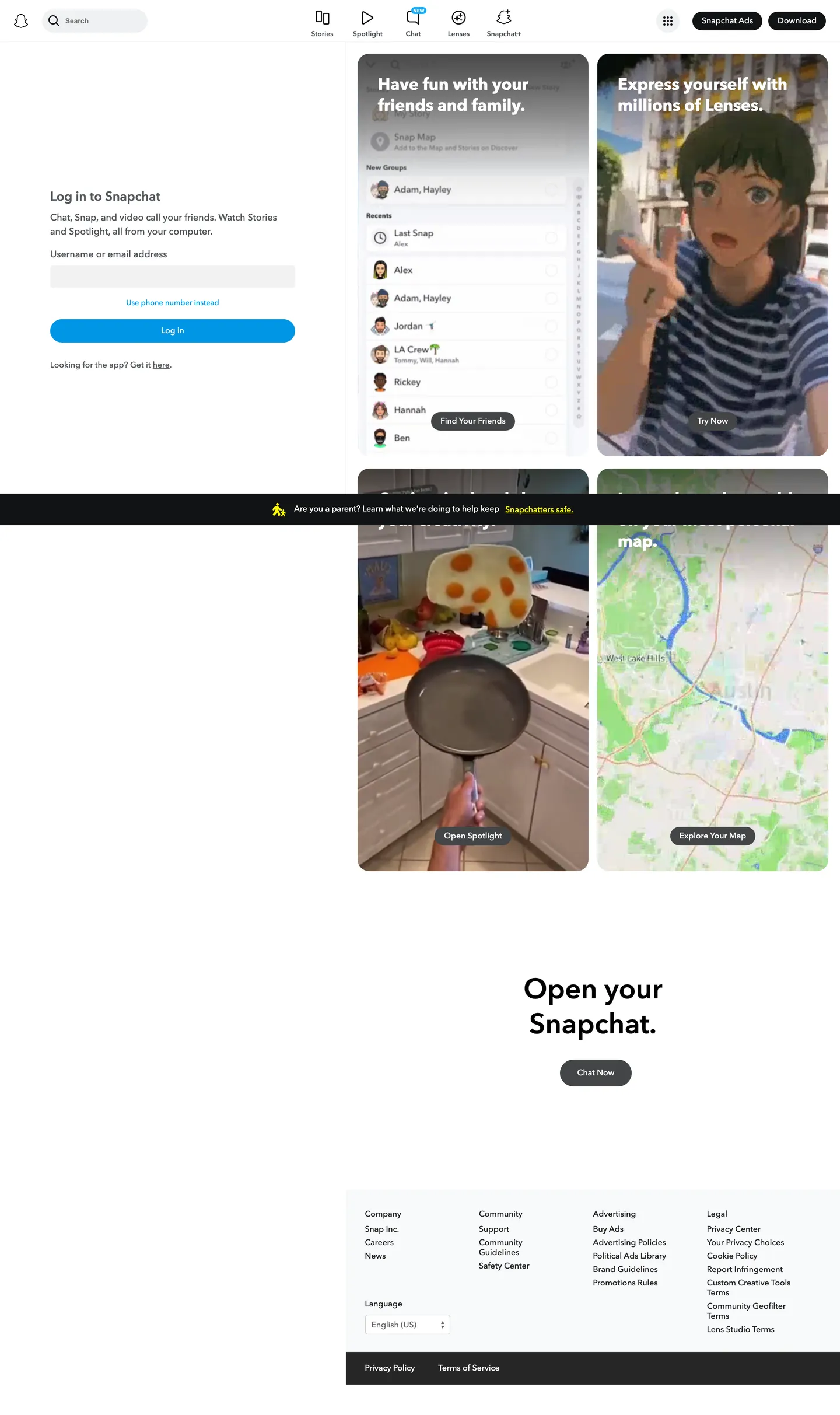
Snapchat's desktop chrome is the inverse of the brand most viewers carry in memory. There is no chrome yellow above the fold, no ghost logo at hero size, no purple gradient — just a white canvas, a 48px Avenir Next h1 reading "Open your Snapchat." in ink black, and a graphite pill CTA at #121314 sitting where a consumer brand would put a brand-coloured button. The yellow ghost wordmark hides at 24px in the top-left corner. The four content tiles on the right of the fold render full phone-shaped Snap mockups in their native product colours — the chat list, the Lenses preview, a Spotlight kitchen scene, the Snap Map — and those mockups, not the marketing chrome, are where the brand's personality lives.
The DESIGN.md file captures the moves: 13 colour tokens drawn from the page's white canvas and graphite text ladder plus the brand yellow held in reserve and a single web-blue accent #0096e5 used for the secondary CTA pill in the log-in card; 11 typography tokens running Avenir Next at sizes from 12.8px to 48px and weights from 400 to 700, with a 28px / 700 h2 ("Log in to Snapchat") as the loudest below-the-fold moment; 5 radius tokens centred on 100px pills and 20px cards; and 16 components covering the graphite pill CTA, the blue secondary pill, the four Snap mockup tiles, the input on the log-in card, the top-nav cluster, and the wide black ghost-warning ribbon that floats at the bottom of the page.
Feed this file to Claude or Cursor and it will reproduce the specific moves: pure white canvas instead of brand yellow, graphite CTA instead of a coloured pill, Avenir Next at modest weights rather than the heavier display tier most consumer apps reach for, and brand colour relegated to logo and decorative hairlines. The one move worth borrowing only if you have a strong product-screenshot story: trusting the screenshots to carry the chromatic identity. Snapchat gets away with a graphite chrome because the four Snap mockups on the right of the fold are vivid enough to do that work; most teams that copy the layout end up with a flat enterprise page instead.
What makes it distinct
5 highlights
- Held-back yellow voltageBrand yellow #fffc00 is wired into CSS as `--colors-2019__main__brand-yellow` but appears just twice on the page, both times as a hairline border, never as fill
- Graphite pill CTAsPrimary actions render in near-black #121314 with full 100px pill rounding at 32px height, a fintech-style cluster rather than a consumer chip
- Avenir Next across every tierDisplay at 48px / 600, h2 at 28px / 700, body at 14px / 500, no second family above 12px
- Three-column Snap mockup gridPhone-shaped feed cards in real product colours carry every chromatic moment on the page, framing the product as the brand
- 100px pills plus 20px cardsThe radius scale is binary: fully-rounded chips for buttons and avatars, soft 20px corners for the four content tiles
Live at snapchat.com
Snapchat in production, as captured. Scroll the window to see the whole page.
17 colors
Snapchat's system runs on #121314 as its primary voltage, used in 2 of 16 components. Type is set in Avenir Next across 11 tokens from 12px to 48px, weights 400–700. Shape language is soft — components average 81px corner radius, with no sharp interactive edges.
Brand & Accent
Sparing, CTA-only voltage · 5
Surface
Page and card backgrounds · 3
Text
Headlines, body, captions · 5
Borders & Hairlines
Dividers, outlines, rules · 2
Other
Specialty colors · 2
11 type tokens
Set in Avenir Next across 11 tokens, from 12px to 48px, weights 400–700. Shown in its own stack: where the font isn't installed, the fallback the file names stands in.
- display-xl48px · weight 600 · lh 60pxThe quick brown fox jumps over the lazy dog
- display-md28px · weight 700 · lh 36pxThe quick brown fox jumps over the lazy dog
- heading-md22px · weight 600 · lh 28pxThe quick brown fox jumps over the lazy dog
- heading-sm16px · weight 500 · lh 24pxThe quick brown fox jumps over the lazy dog
- body-md14px · weight 500 · lh 20pxThe quick brown fox jumps over the lazy dog
- body-sm14px · weight 400 · lh 17pxThe quick brown fox jumps over the lazy dog
- label-md14px · weight 500 · lh 16pxThe quick brown fox jumps over the lazy dog
- caption12px · weight 600 · lh 16pxThe quick brown fox jumps over the lazy dog
- button-md14px · weight 500 · lh 16pxThe quick brown fox jumps over the lazy dog
- button-sm12.8px · weight 400 · lh 16pxThe quick brown fox jumps over the lazy dog
- nav-link14px · weight 500 · lh 23pxThe quick brown fox jumps over the lazy dog
Radii and spacing
6 corner radii and 8 spacing values. Shape language: soft, on a 20px base radius.
Radii6
- none0px
- xs5px
- sm8px
- md20px
- pill100px
- full9999px
Spacing8
- xs4px
- sm8px
- md10px
- base15px
- lg20px
- xl35px
- button-x16px
- button-y8px
16 components
Each rendered from its tokens (color, type, radius, padding) on Snapchat's own canvas.
- Button PrimaryButton Primarybutton-primary
- Button Primary HoverButton Primary Hoverbutton-primary-hover
- Button SecondaryButton Secondarybutton-secondary
- Button TertiaryButton Tertiarybutton-tertiary
- Top NavTop Navtop-nav
- Nav ChipNav Chipnav-chip
- Search PillSearch Pillsearch-pill
- Hero HeadingHero Headinghero-heading
- Section HeadingSection Headingsection-heading
- Body ParagraphBody Paragraphbody-paragraph
- Mockup TileMockup Tilemockup-tile
- Mockup CtaMockup Ctamockup-cta
- Type here…Text Inputtext-input
- Warning RibbonWarning Ribbonwarning-ribbon
- FooterFooterfooter
- Footer BarFooter Barfooter-bar
The system, in use
Snapchat's tokens on the kind of product it builds.
Stay close to the people who matter
Share moments, start conversations and find your communities, on any device.
Snapchat design system FAQ
Snapchat's tokens, its components and how to use this DESIGN.md in your project.
Related reading
Specs, directories and component libraries that pair with this design system.
- Browse all design systemsThe full directory of DESIGN.md files on shadcn.io, with live mockups for each.shadcn.io
- Snapchat — official siteSnapchat's public marketing site — the source of truth for the live tokens captured in this file.snapchat.com (opens in a new tab)
- The DESIGN.md specificationGoogle Labs' open spec for machine-readable design system files — the format this page is built on.github.com (opens in a new tab)
Use Snapchat in your project
One machine-readable file. Drop it into Claude Code, Cursor, VS Code or any AI tool that reads DESIGN.md.
Download the DESIGN.md
One machine-readable file: every color, type, radius, spacing, and component token of Snapchat.
Feed it to your AI tool
Drop it into Claude, Cursor, or GitHub Copilot. The agent writes React components and Tailwind classes that match Snapchat's visual language.
Reference the tokens directly
Or paste the values into your Tailwind config, CSS variables, or component library: every color, size and radius is a quoted, ready-to-copy value.
Read the full DESIGN.md overview, rationale, do’s and don’ts
Overview
Snapchat's desktop chrome inverts the brand most viewers carry in memory. Restrained voltage. The hero is a white canvas with a 48px Avenir Next h1 in ink black, a graphite pill CTA at {colors.primary} (#121314), and a yellow ghost wordmark hidden at 24px in the top-left corner. Where Discord paints its hero in Blurple and TikTok runs neon-on-black, Snapchat's chrome reads almost like a consumer-bank page — the brand colour is held back to logo and hairline use only, and four phone-shaped Snap mockups on the right do every chromatic job the chrome refuses.
The yellow itself is still in the system. {colors.brand-yellow} (#fffc00) is wired into the page CSS as --colors-2019__main__brand-yellow and --yellow-v100, but across the captured page it shows up just twice, both times as hairline borders — never as fill, never as a background block. The graphite {colors.primary} carries every primary action (the "Snapchat Ads" pill in the nav, the "Chat Now" pill below the fold, the four "Try Now / Find Your Friends / Open Spotlight / Explore Your Map" pills sitting on top of the mockups). A single web-blue {colors.brand-blue} (#0096e5) appears once, as the wider secondary pill in the log-in card.
Typography is Avenir Next across every tier, at modest weights. The hero h1 at 48px / 600 is heavier than the system's body but lighter than the 28px / 700 used on the log-in card h2 — the heaviest typographic moment on the page sits below the fold, not in the hero. Body lives at 14px in weight 500. The pill CTAs match the body at 14px / 500. There is no 32-40px display tier between the 28px headings and the 48px hero — the system jumps.
Key Characteristics:
- White canvas (
{colors.canvas}— #ffffff), not the brand yellow most viewers remember; the surface ladder runs canvas →{colors.surface-1}(#f7f8f9) →{colors.surface-2}(#f0f1f2) entirely in cool warm-grays. - Graphite pill CTAs (
{colors.primary}— #121314) at 32px height with 100px corner rounding. A single web-blue secondary pill ({colors.brand-blue}) appears once, in the log-in card. - Avenir Next at 400-700 weights only. The 48px / 600 hero is heavier than body but lighter than the 28px / 700 h2 below the fold.
- Brand yellow
{colors.brand-yellow}reserved for the ghost wordmark and a single hairline. Never as background fill on the marketing surface. - Binary radius scale: 100px pills for every interactive chip, 20px corners for content tiles, nothing in between.
- Three-column Snap mockup grid carries the chromatic personality. Each mockup is a full phone-shaped scene in the product's native colors — chat list, Lenses preview, Spotlight kitchen clip, Snap Map.
- A dark warning ribbon at
{colors.ink}floats above the fold ("Are you a parent? Learn what we're doing to help keep Snapchatters safe."). The only persistent dark surface in the system, with a yellow{colors.alert-yellow}icon as its lone yellow accent.
Colors
Brand
- Brand Yellow (
{colors.brand-yellow}— #fffc00): frequency 4. Used as border (2), text (2). Wired as--colors-2019__main__brand-yellowand--yellow-v100. The heritage colour — the ghost logo and a hairline accent. Never used as fill on the marketing surface. - Brand Blue (
{colors.brand-blue}— #0096e5): frequency 3. Used as text (1), bg (1), border (1). Wired as--sds-webc-color-surface-buttonbg-primary-altand--sds-webc-color-highlight-action. The secondary CTA pill on the log-in card and a single inline accent. - Brand Blue Active (
{colors.brand-blue-active}— #0894fa): wired as--blue-v400. Reserved for the active state on the blue secondary pill.
Surface
- Canvas (
{colors.canvas}— #ffffff): frequency 84. Used as bg (6), text (39 on dark surfaces), border (39). Wired across--white,--sds-webc-color-surface-pagebg,--sds-webc-color-surface-background,--card-bg-color. The dominant surface — the whole marketing chrome rests on this. - Surface-1 (
{colors.surface-1}— #f7f8f9): the soft tile background used on the four Snap mockup container tiles. Wired as--card-bg-colorand--sds-webc-color-surface-cardbg. - Surface-2 (
{colors.surface-2}— #f0f1f2): frequency 2 as bg. Wired as--sds-webc-color-surface-buttonbg-secondary,--gray-v100. The text-input fill on the log-in card and the disabled-button background.
Text
- Ink (
{colors.ink}— #000000): frequency 171. Used as text (82), bg (5), border (80). Wired as--colors-2019__gray__blackand--black-v200. The hero h1 sits here. Pure black across the typographic load. - Ink Soft (
{colors.ink-soft}— #121314): frequency 6. Used as text (2), bg (3), border (1). Wired as--content-primary-colorand--sds-webc-color-surface-buttonbg-primary. The primary-CTA pill fill — a graphite-near-black, not pure black. - Ink Muted (
{colors.ink-muted}— #53575b): frequency 58. Used as text (29), border (29). Wired as--content-secondary-colorand--gray-425. The body-paragraph default colour. Surprisingly cool — a blue-leaning grey, not warm. - Ink Tertiary (
{colors.ink-tertiary}— #cccccc): wired as--gray-v200. The disabled-text and divider tone.
Hairlines
- Hairline (
{colors.hairline}— #e9eaeb): wired as--gray-v150and--sds-webc-color-interaction-button-secondary-hover. The default border / divider on cards. - Hairline Soft (
{colors.hairline-soft}— #edeeef): wired as--gray-v-54and--sds-webc-color-icon-button-background. The icon-button rest state.
Link / Alert
- Link (
{colors.link}— #0000ee): frequency 2. The default UA link colour, used unstyled on a few footer links — the only non-brand chromatic moment in the type ladder. - Alert Red (
{colors.alert-red}— #f23c57): wired as--red-v100. Reserved for error states; not visible on the marketing surface. - Alert Yellow (
{colors.alert-yellow}— #ffc131): wired as--off-yellow. The icon colour on the dark warning ribbon — the only yellow on the page besides the ghost wordmark.
Typography
Font Family
The system runs Avenir Next across every tier — declared on CSS as --font-primary: "Avenir Next, Helvetica, sans-serif". A secondary family Graphik is wired as --font-secondary: "Graphik, Helvetica, sans-serif" but doesn't surface on the captured page. The input field is the lone exception — it renders in plain Arial, the browser default for <input>. There is no display serif, no mono, no second family in active use.
Hierarchy
| Token | Size | Weight | Line Height | Use |
|---|---|---|---|---|
{typography.display-xl} | 48px | 600 | 60px | Hero h1 ("Open your Snapchat.") |
{typography.display-md} | 28px | 700 | 36px | Log-in card h2 ("Log in to Snapchat") |
{typography.heading-md} | 22px | 600 | 28px | Mockup-tile titles ("Express yourself with millions of Lenses.") |
{typography.heading-sm} | 16px | 500 | 24px | h3 / label |
{typography.body-md} | 14px | 500 | 20px | Body paragraph default |
{typography.body-sm} | 14px | 400 | 17px | Top-nav link labels |
{typography.label-md} | 14px | 500 | 16px | Pill CTA labels |
{typography.caption} | 12px | 600 | 16px | Footnotes, warning-ribbon text |
{typography.button-md} | 14px | 500 | 16px | Primary pill button |
{typography.button-sm} | 12.8px | 400 | 16px | Tertiary chip |
{typography.nav-link} | 14px | 500 | 23px | Secondary nav rows |
Principles
The heaviest weight on the page is 700, used once on the 28px log-in h2. The hero h1 at 48px / 600 is deliberately lighter than that — a restrained signal that the hero text exists to label the page, not to shout. Body lives at 14px in weight 500, and the pill CTA labels match the body at 14px / 500 rather than running heavier. There is no 32-40px display tier between the 28px headings and the 48px hero — the system jumps that range, which keeps the visual hierarchy binary (small-and-medium chrome below, one large hero above).
Note on Font Substitutes
Avenir Next is licensed. The closest open-source substitute is Nunito Sans at the same weights — the warm geometric counters of Avenir Next read close. Inter at 95% line-height is a tighter alternative if you need slightly more density at the 14-16px body sizes. For the 48px / 600 hero, DM Sans is a decent free swap. The 48px / 600 hero weight is the move to preserve when substituting — do not bump to 700.
Layout
Spacing System
- Base unit: 4px (with 8px as the dominant module on padding shorthands).
- Tokens:
{spacing.xs}4px ·{spacing.sm}8px ·{spacing.md}10px ·{spacing.base}15px ·{spacing.lg}20px ·{spacing.xl}35px. - Pill padding:
{spacing.button-y}8px vertical,{spacing.button-x}16px horizontal on the 32px-tall primary chip. - Mockup-tile gutter: ~24px between the four phone-shaped mockup tiles in the right column.
- Section padding (vertical): ~80-96px between major sections.
Grid & Container
- Top-fold split: the page divides vertically at ~620px from the left edge. The left column carries the log-in card (white canvas, anchored upper-third); the right column carries the 2x2 mockup grid that stretches to the right edge.
- Mockup grid: 2 columns x 2 rows of phone-shaped Snap mockups, each ~410px wide x 660px tall, soft 20px corners on a
{colors.surface-1}tile. - Below-fold heading: centered "Open your Snapchat." section sits on the same white canvas, with a single graphite pill CTA centered beneath.
- Footer: 4-column link grid plus a language selector, capped at ~1280px content width, terminating in a 35px-tall black
{component.footer-bar}with the privacy / terms links.
Rhythm
The page alternates between dense mockup grid above the fold and anchored editorial stack below. There is no decorative gradient, no atmospheric band, no parallax — the visual rhythm comes entirely from the phone-shaped mockup tiles on the right and the centered "Open your Snapchat." heading that mirrors the hero text on the left. The black {component.warning-ribbon} floats above the fold as the page's only persistent dark surface.
Elevation
The system runs essentially no shadow tier on the marketing surface. Cards lift through tonal contrast, not drop shadows.
- Flat surfaces: the canvas, the hero card, the footer — 95% of the page sits at z=0.
- Tonal lift:
{colors.surface-1}(#f7f8f9) tiles sit on{colors.canvas}(#ffffff) — a ~3-point lightness gap that reads as elevation only because the canvas itself is pure white. - Soft elevation on chips: the
{colors.surface-2}text input on the log-in card is the only inset-style surface. No raised shadow on the primary pill button. - Black overlay strip: the 80px-tall dark
{component.warning-ribbon}at the bottom of the hero is the only z>0 surface, lifted by colour contrast rather than shadow.
Shapes
The radius scale is binary: pills or soft tiles. There is no medium-corner tier.
{rounded.none}0px — only on headings and the hero block itself.{rounded.xs}5px — the text input on the log-in card. The lone "small but not zero" radius.{rounded.sm}8px — a single chip (navLink wrapper).{rounded.md}20px — every content tile. The four Snap mockup containers, the log-in card.{rounded.pill}100px — every interactive chip. The primary CTA, secondary CTA, tertiary chip, search pill, top-nav button cluster, mockup overlay CTAs.{rounded.full}9999px — circular avatars and icon buttons.
There is no 12px or 16px tier. The system reads as "pills for actions, soft 20px tiles for content," and almost nothing in between.
Components
button-primary — The graphite-CTA pill. {colors.primary} (#121314) fill, white text, {typography.button-md} (14px / 500), {rounded.pill} (100px) radius, 8x16 padding, 32px height. "Snapchat Ads" and "Chat Now" are the canonical instances. Width hugs the label rather than stretching.
button-primary-hover — Background flips from {colors.primary} to {colors.primary-hover} (#000000) — graphite to pure black, a subtle deepening of the rest state.
button-secondary — The blue pill. {colors.brand-blue} (#0096e5) fill, white text, {rounded.pill} (100px) radius, 12x20 padding, 44px height — taller than the primary because it carries the "Log in" CTA on the centred log-in card.
button-tertiary — A neutral chip. {colors.surface-2} (#f0f1f2) fill, graphite text, {rounded.pill} (100px). The disabled state on the primary pill and the icon-button background.
top-nav — White canvas, 72px height, 8x16 padding. Houses the ghost logo (left), the icon-pill cluster for Stories / Spotlight / Chat / Lenses / Snapchat+ (center, each rendered as transparent text with a small inline icon), and the right-aligned "Snapchat Ads" + "Download" pair (both primary-graphite pills).
nav-chip — Transparent fill, graphite text, {typography.label-md}. Used inside the centre nav cluster — a chipless chip, where the icon does the visual lift.
search-pill — {colors.surface-1} fill, muted-grey placeholder text, {rounded.pill} 100px, 8x16 padding, 40px height. The leftmost search field at the top of the nav.
hero-heading — White canvas (transparent), {colors.ink} (#000000) text, {typography.display-xl} (48px / 600). "Open your Snapchat." is the canonical instance. Sits centered at the bottom-center of the page; the heading at the top of the log-in card uses {typography.display-md} instead.
section-heading — Used on the log-in card h2, {typography.display-md} (28px / 700) in {colors.ink-muted} rather than ink black — the only place the muted-grey colour carries a heading.
body-paragraph — Default {colors.ink-muted} text at {typography.body-md} (14px / 500). "Chat, Snap, and video call your friends. Watch Stories and Spotlight, all from your computer."
mockup-tile — {colors.surface-1} (#f7f8f9) tile, {rounded.md} 20px radius, 0 padding (the phone-shaped Snap mockup fills the tile edge-to-edge). Four instances on the page: chat list, Lenses preview, Spotlight kitchen clip, Snap Map. The tile is just a frame — every chromatic moment inside it belongs to the product, not the chrome.
mockup-cta — Dark pill overlay sitting at the bottom of each mockup tile. {colors.ink-soft} fill at 85% opacity, white text, {typography.label-md} (14px / 500), {rounded.pill} 100px, 8x16 padding, 32px height. "Try Now / Find Your Friends / Open Spotlight / Explore Your Map" are the four instances.
text-input — {colors.surface-2} (#f0f1f2) fill, dark text at {typography.heading-sm} (16px / 500), {rounded.xs} 5px radius, 7px padding, 38px height. The username-or-email field on the log-in card. Note the 5px radius — the only place in the system that isn't a pill or 20px tile.
warning-ribbon — {colors.ink} (#000000) fill, white text, {typography.caption} (12px / 600), 10x30x10x40 padding. The "Are you a parent?" persistent ribbon. The yellow icon at the start uses {colors.alert-yellow} (#ffc131) — the only yellow on the marketing surface besides the ghost logo.
footer — White canvas, {colors.ink-soft} text, {typography.body-md}, 35px padding. 4-column link grid plus a language selector. Terminates in a slimmer black {component.footer-bar} carrying the privacy/terms cluster.
footer-bar — 35px-tall black strip at the very bottom, {typography.caption} text in white. Houses Privacy Policy and Terms of Service as the page's only persistent dark surface besides the warning ribbon.
Do's and Don'ts
Do treat the brand yellow as logo-only chrome. The captured page uses {colors.brand-yellow} (#fffc00) just twice and only as a hairline; a fill in this colour anywhere on the surface immediately reads as a different system.
Do use the graphite {colors.primary} (#121314) rather than pure black for primary CTAs. The 7-point lightness gap between graphite and pure ink reads as a designed restraint rather than a missed token.
Do keep pills at 100px radius regardless of height. The 32px primary, the 44px secondary, the 40px search field, the avatar chips — all use 100px (which renders fully rounded at every size in the system). Switching to a fixed 16-24px breaks the binary radius rhythm.
Do carry the chromatic personality in product screenshots rather than the chrome. The four phone-shaped Snap mockups on the right of the fold do work that a yellow canvas would do in a louder system. If you do not have vivid screenshots, do not adopt the graphite-CTA chrome — the page will read as enterprise.
Don't add yellow fills under buttons or text. The --colors-2019__main__brand-yellow token exists but is never used as a backgroundColor on the marketing surface. A yellow CTA pill instantly breaks the system's restraint.
Don't introduce a 12-16px corner-radius tier on cards or chips. The system is binary — 100px pills or 20px tiles — and a half-rounded 12px chip reads as a different brand altogether. If you need a "card with rounded chip inside," nest a 100px pill inside the 20px tile.
Don't render the hero h1 at weight 700. The hero is deliberately 48px / 600 so the 28px / 700 log-in h2 below it can be the loudest typographic moment on the page. Bumping the hero to 700 flattens that hierarchy.
Don't add drop shadows to the mockup tiles. The system uses tonal lift ({colors.surface-1} on {colors.canvas}) rather than shadow. A drop shadow on a Snap mockup tile undermines the flat-canvas restraint and pulls visual weight away from the product screenshot inside.
Known Gaps
- Hover and focus states: only the primary-pill press is captured. Full focus rings, disabled tints, error states for the input live in the product app and are not exposed on the marketing surface.
- Form input error states:
{component.text-input}carries only the rest state. The brand's red{colors.alert-red}(#f23c57) is wired into CSS but doesn't render on the captured page. - Mobile and tablet layouts: the capture is desktop-only. The mobile site is a full-bleed dark experience with the ghost wordmark at brand size — a different visual system that is not represented here.
- Snap product chrome: every distinctive visual element on the page (the chat list, the Lenses anime preview, the Spotlight clip, the Snap Map) is inside a Snap mockup rather than in the marketing system. The product's own design tokens — yellow chat bubbles, Bitmoji styling, the carousel chrome — are not captured here.
- Motion: the mockup tiles auto-play video previews. The marketing surface itself is static; transitions and parallax on the mockup carousel are not captured.
- Sub-brand systems: "Snapchat Ads" and "Snapchat+" each have their own marketing surfaces with different typographic and chromatic moves; only the main snapchat.com fold is represented.
More systems like this
Bluesky, BuzzFeed, Discord and 14 more in Social & Community: each brand's colors, type and components in one file your AI agent builds from.
Build it with Pro
The DESIGN.md files are free. Pro adds 6,000+ blocks, premium templates and the MCP server, so your AI editor builds in your system for you.
4.9/5 out of 5 · 150+ reviewsfrom 150+ founders and developers.
Billing
Billed once a year in USD. Cancel anytime.
- How many people can use the license.
- Client work, SaaS products and anything you charge for.
- Page sections in 56 categories, from heroes and pricing tables to dashboards and settings, on every framework and UI library, in your theme.
- Complete Next.js sites for startups, SaaS, agencies and portfolios, every page designed, ready to ship.
- Your AI agent searches, previews and installs any component, block, icon or DESIGN.md from a prompt: 22 tools in Claude Code, Cursor, VS Code and 35 more clients.
- Buttons with motion and states of their own, from an arrow that slides in to a burst of confetti.
- Typewriters, scrambles, counters and more, for headlines, labels and numbers.
- Animated backgrounds for heroes, sections and cards, from a soft aurora to a flock that flees the cursor. Most are pure CSS.
- WebGPU shaders, from a slow aurora to a black hole, each drawing only while it's on screen.
- One design and one theme on all four: the components, blocks and effects are built for each framework.
- React on Base UI, Radix UI, React Aria or Ark UI: install the version for the library your project already uses. Vue, Svelte and Solid run on Ark UI.
- From a button to a date picker, a color picker or a guided tour: accessible, typed in TypeScript, each with live demos.
- Real-world patterns built from the components, in 53 galleries: forms, tables, menus, dialogs and more.
- Area, bar, line, pie, radar and radial charts on TanStack Charts, on every framework. React also gets the Recharts originals.
- Debounce, local storage, media queries and more: each hook is one typed file you own.
- From 222 libraries, Lucide, Heroicons, Tabler and Material Symbols among them, as SVG or a React component in one command.
- Stripe, Linear, Apple and 497 more: a brand's colors, typography and components in one file your AI agent builds from.
- Restyle every component and block at once: 8 styles, 8 grays, 18 colors and 5 radii, shared as a shadcn preset code.
- Priority requests are answered first.
Individual
For personal projects & open source
$32instead of $49/mo
$389 billed yearly
- Seats: 1 seat
- Commercial use: Personal & open source only
- Blocks: All 6,181 blocks
- Templates: All 14 templates
- MCP server: 38 AI clients
- Animated buttons: All 35 buttons
- Text effects: All 97 effects
- Backgrounds: All 100 backgrounds
- Shaders: All 100 shaders
- Frameworks: React, Vue, Svelte, Solid
- UI libraries: Base UI, Radix, Aria, Ark
- Components: All 174 components
- Examples: All 1,103 examples
- Charts: All 70 charts
- React hooks: All 35 hooks
- Icons: 294k+ icons
- DESIGN.md files: All 500 brands
- Theme builder: 8 styles × 18 colors
- Support: Standard
Team
Most popularFor freelancers, agencies & startups
$66instead of $99/mo
$789 billed yearly · ≈ $13/dev/mo
- Seats: Up to 5 seats
- Commercial use: Included
- Blocks: All 6,181 blocks
- Templates: All 14 templates
- MCP server: 38 AI clients
- Animated buttons: All 35 buttons
- Text effects: All 97 effects
- Backgrounds: All 100 backgrounds
- Shaders: All 100 shaders
- Frameworks: React, Vue, Svelte, Solid
- UI libraries: Base UI, Radix, Aria, Ark
- Components: All 174 components
- Examples: All 1,103 examples
- Charts: All 70 charts
- React hooks: All 35 hooks
- Icons: 294k+ icons
- DESIGN.md files: All 500 brands
- Theme builder: 8 styles × 18 colors
- Support: Priority
Organization
For companies with larger teams
$132instead of $199/mo
$1,589 billed yearly
- Seats: Unlimited seats
- Commercial use: Included
- Blocks: All 6,181 blocks
- Templates: All 14 templates
- MCP server: 38 AI clients
- Animated buttons: All 35 buttons
- Text effects: All 97 effects
- Backgrounds: All 100 backgrounds
- Shaders: All 100 shaders
- Frameworks: React, Vue, Svelte, Solid
- UI libraries: Base UI, Radix, Aria, Ark
- Components: All 174 components
- Examples: All 1,103 examples
- Charts: All 70 charts
- React hooks: All 35 hooks
- Icons: 294k+ icons
- DESIGN.md files: All 500 brands
- Theme builder: 8 styles × 18 colors
- Support: Priority
Billed once a year in USD. Cancel anytime.
Individual
For personal projects & open source
$32instead of $49/mo
$389 billed yearly
- How many people can use the license.Seats: 1 seat
- Client work, SaaS products and anything you charge for.Commercial use: Personal & open source only
- Page sections in 56 categories, from heroes and pricing tables to dashboards and settings, on every framework and UI library, in your theme.Blocks: All 6,181 blocks
- Complete Next.js sites for startups, SaaS, agencies and portfolios, every page designed, ready to ship.Templates: All 14 templates
- Your AI agent searches, previews and installs any component, block, icon or DESIGN.md from a prompt: 22 tools in Claude Code, Cursor, VS Code and 35 more clients.MCP server: 38 AI clients
- Buttons with motion and states of their own, from an arrow that slides in to a burst of confetti.Animated buttons: All 35 buttons
- Typewriters, scrambles, counters and more, for headlines, labels and numbers.Text effects: All 97 effects
- Animated backgrounds for heroes, sections and cards, from a soft aurora to a flock that flees the cursor. Most are pure CSS.Backgrounds: All 100 backgrounds
- WebGPU shaders, from a slow aurora to a black hole, each drawing only while it's on screen.Shaders: All 100 shaders
- One design and one theme on all four: the components, blocks and effects are built for each framework.Frameworks: React, Vue, Svelte, Solid
- React on Base UI, Radix UI, React Aria or Ark UI: install the version for the library your project already uses. Vue, Svelte and Solid run on Ark UI.UI libraries: Base UI, Radix, Aria, Ark
- From a button to a date picker, a color picker or a guided tour: accessible, typed in TypeScript, each with live demos.Components: All 174 components
- Real-world patterns built from the components, in 53 galleries: forms, tables, menus, dialogs and more.Examples: All 1,103 examples
- Area, bar, line, pie, radar and radial charts on TanStack Charts, on every framework. React also gets the Recharts originals.Charts: All 70 charts
- Debounce, local storage, media queries and more: each hook is one typed file you own.React hooks: All 35 hooks
- From 222 libraries, Lucide, Heroicons, Tabler and Material Symbols among them, as SVG or a React component in one command.Icons: 294k+ icons
- Stripe, Linear, Apple and 497 more: a brand's colors, typography and components in one file your AI agent builds from.DESIGN.md files: All 500 brands
- Restyle every component and block at once: 8 styles, 8 grays, 18 colors and 5 radii, shared as a shadcn preset code.Theme builder: 8 styles × 18 colors
- Priority requests are answered first.Support: Standard
Team
Most popularFor freelancers, agencies & startups
$66instead of $99/mo
$789 billed yearly · ≈ $13/dev/mo
Everything in Individual, plus
- How many people can use the license.Seats: Up to 5 seats
- Client work, SaaS products and anything you charge for.Commercial use: Included
- Priority requests are answered first.Support: Priority
Organization
For companies with larger teams
$132instead of $199/mo
$1,589 billed yearly
Everything in Team, plus
- How many people can use the license.Seats: Unlimited seats
- Secure checkout via Stripe
- Code lives in your repo
- Keep what you've shipped if you cancel
- License terms
4.9 out of 5 from 150+ developers


Your system, built for you
Every block, template and icon, installed by your AI agent in your design system. The DESIGN.md files stay free.
- Cancel anytime
- Keep what you've shipped