Snowflake Design System
Heavy 88px Texta headlines, isometric line art and one snowflake-blue #249edc CTA pill: Snowflake's site as colors, type and components for React.
- Primary color
- #249edc
- Typeface
- Texta
- Shape
- Soft
- Base radius
- 12px
- Colors
- 16
- Type tokens
- 12
- Components
- 15
- Spacing values
- 9
About Snowflake DESIGN.md
Curated by Dov Azencot, updated May 19, 2026. Source snowflake.com (opens in a new tab).
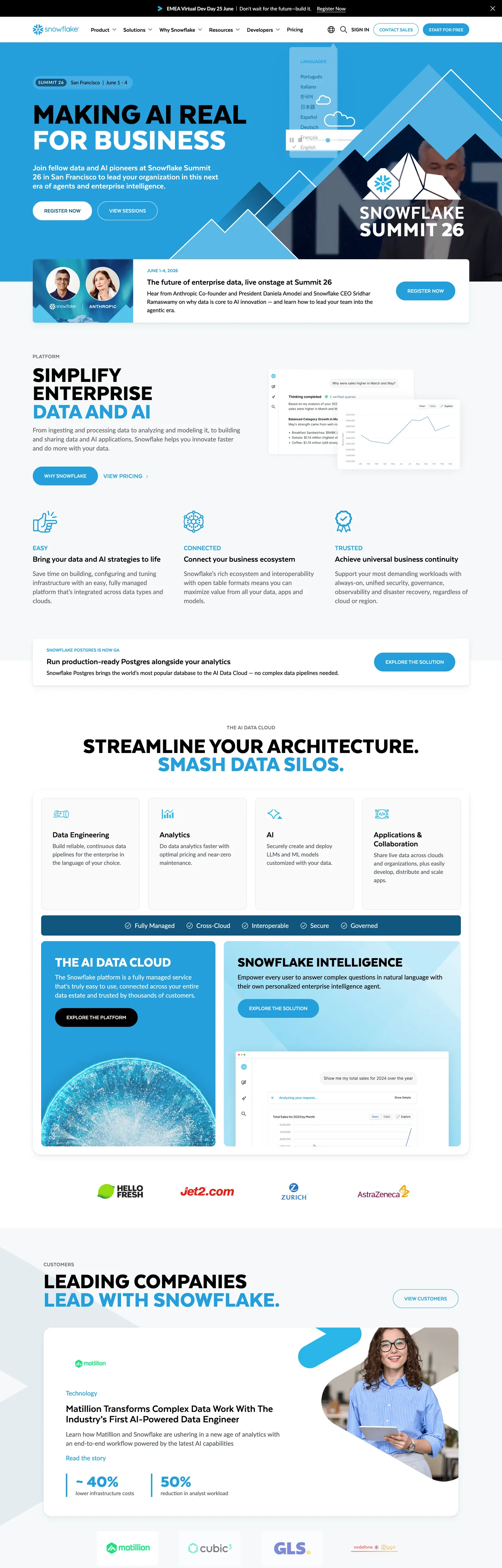
Snowflake's marketing site holds a position the rest of the data-cloud category abandoned. The hero headline "Making AI Real for Business" sits at 88px Texta at weight 900, all-caps, pure black on pure white, with no tracking adjustment and no underlying gradient. Where Databricks and dbt lean on chromatic gradients and product-screen collages, Snowflake renders an axonometric line-art city in single-pixel snowflake blue beside the headline. The composition reads closer to a corporate annual report than to a SaaS hero — heavy display type plus technical illustration, no photography, no motion overlay above the fold.
The DESIGN.md file packages the system into a machine-readable spec for React tooling. Inside: 16 colors tokens drawn from the 120 CSS custom properties Snowflake exposes on the page, organized into a brand-voltage tier centered on snowflake blue (#249edc), a structural ink-on-canvas split (black for body, deep navy #11567f for the inverted band), and a small set of semantic accents the page barely renders. 11 typography tokens span Texta in three display sizes plus an uppercase eyebrow tier at 12–16px / 800, and Lato across body, nav, and small-label tiers. 15 components cover the hero, the snowflake-blue pill CTA, the 8px-rounded feature cards on the white canvas, the dark navy panel beneath the platform diagram, and the form-input ladder.
Feed this file to Claude or Cursor and it reproduces Snowflake's specific moves: heavy 800–900-weight Texta display rather than the 500–600 weights most data brands use, single snowflake-blue voltage rather than a multi-accent palette, isometric line-art instead of product screenshots, and the bimodal radius split between 8px cards and 45px pills. The one move worth borrowing only if you have a single recognizable brand color and one product story to tell: the heavy-display-over-line-art composition, which trades visual softness for editorial weight.
What makes it distinct
5 highlights
- Heavy editorial display88px Texta at weight 900 carries the hero, the heaviest display weight in the data-cloud category
- Single cool-blue voltageSnowflake blue #249edc fills the CTA pill, link text, and the platform-diagram icons; 133 occurrences total
- Bimodal radius scale8px on cards (21 occurrences), 45px fully-rounded pills on CTAs (32 occurrences); the system skips 16–24px corners on interactive elements
- Texta + Lato pairingTexta carries display and uppercase eyebrows, Lato runs every body and nav surface; no third typeface anywhere
- Isometric line-art over photographyAxonometric city scenes in single-pixel snowflake blue replace stock photography in every above-fold composition
Live at snowflake.com
Snowflake in production, as captured. Scroll the window to see the whole page.
16 colors
Snowflake's system runs on #249edc as its primary voltage, used in 3 of 15 components. Type is set in Texta across 12 tokens from 12px to 88px, weights 400–900. Shape language is soft — components average 21px corner radius, with no sharp interactive edges.
Brand & Accent
Sparing, CTA-only voltage · 4
Surface
Page and card backgrounds · 1
Text
Headlines, body, captions · 6
Borders & Hairlines
Dividers, outlines, rules · 2
Other
Specialty colors · 3
12 type tokens
Set in Texta across 12 tokens, from 12px to 88px, weights 400–900. Shown in its own stack: where the font isn't installed, the fallback the file names stands in.
- display-xl88px · weight 900 · lh 74pxThe quick brown fox jumps over the lazy dog
- display-lg64px · weight 900 · lh 52.48pxThe quick brown fox jumps over the lazy dog
- display-md48px · weight 900 · lh 43.2pxThe quick brown fox jumps over the lazy dog
- heading-lg30px · weight 700 · lh 30pxThe quick brown fox jumps over the lazy dog
- heading-sm24px · weight 800 · lh 26pxThe quick brown fox jumps over the lazy dog
- eyebrow-md16px · weight 800 · lh 17.6px · tracking 0.4pxThe quick brown fox jumps over the lazy dog
- eyebrow-sm14px · weight 800 · lh 18pxThe quick brown fox jumps over the lazy dog
- body-lg18px · weight 400 · lh 26pxThe quick brown fox jumps over the lazy dog
- body-md16px · weight 400 · lh 24pxThe quick brown fox jumps over the lazy dog
- body-sm14px · weight 400 · lh 21pxThe quick brown fox jumps over the lazy dog
- caption12px · weight 500 · lh 16pxThe quick brown fox jumps over the lazy dog
- nav-link14px · weight 500 · lh 18.2pxThe quick brown fox jumps over the lazy dog
Radii and spacing
8 corner radii and 9 spacing values. Shape language: soft, on a 12px base radius.
Radii8
- none0px
- xs2px
- sm8px
- md12px
- lg16px
- xl24px
- pill45px
- full9999px
Spacing9
- xs4px
- sm8px
- md12px
- base16px
- lg24px
- xl32px
- 2xl48px
- 3xl64px
- 4xl96px
15 components
Each rendered from its tokens (color, type, radius, padding) on Snowflake's own canvas.
- Button PrimaryButton Primarybutton-primary
- Button SecondaryButton Secondarybutton-secondary
- Button DarkButton Darkbutton-dark
- Top NavTop Navtop-nav
- Nav LinkNav Linknav-link
- Hero HeadingHero Headinghero-heading
- Section HeadingSection Headingsection-heading
- Eyebrow LabelEyebrow Labeleyebrow-label
- Body ParagraphBody Paragraphbody-paragraph
- Card FeatureCard Featurecard-feature
- Card StatCard Statcard-stat
- Card DarkCard Darkcard-dark
- Card Light BlueCard Light Bluecard-light-blue
- Type here…Text Inputtext-input
- Divider RuleDivider Ruledivider-rule
The system, in use
Snowflake's tokens on the kind of product it builds.
Plan, build and ship in one place
Bring your team's work together, from the first idea to the final release.
Simple pricing for every team
MonthlyYearly- Up to 3 projects
- Unlimited members
- Community support
- Unlimited projects
- Advanced reports
- Priority support
- SSO and SCIM
- Audit log
- Dedicated manager
Snowflake design system FAQ
Snowflake's tokens, its components and how to use this DESIGN.md in your project.
Related reading
Specs, directories and component libraries that pair with this design system.
- Browse all design systemsThe full directory of DESIGN.md files on shadcn.io, with live mockups for each.shadcn.io
- Snowflake — official siteSnowflake's public marketing site — the source of truth for the live tokens captured in this file.snowflake.com (opens in a new tab)
- The DESIGN.md specificationGoogle Labs' open spec for machine-readable design system files — the format this page is built on.github.com (opens in a new tab)
Use Snowflake in your project
One machine-readable file. Drop it into Claude Code, Cursor, VS Code or any AI tool that reads DESIGN.md.
Download the DESIGN.md
One machine-readable file: every color, type, radius, spacing, and component token of Snowflake.
Feed it to your AI tool
Drop it into Claude, Cursor, or GitHub Copilot. The agent writes React components and Tailwind classes that match Snowflake's visual language.
Reference the tokens directly
Or paste the values into your Tailwind config, CSS variables, or component library: every color, size and radius is a quoted, ready-to-copy value.
Read the full DESIGN.md overview, rationale, do’s and don’ts
Overview
Snowflake's marketing site holds the heaviest display weight in the data-cloud category. Industrial display, line-art chrome. The hero "Making AI Real for Business" runs at 88px Texta weight 900 in pure ink ({colors.ink} — #000000) on pure canvas ({colors.canvas} — #ffffff), all-caps, with normal letter-spacing and a 74px line-height that pulls the words into a compact rectangle. Where Databricks runs DM Sans at weight 500 and dbt sets Polymath at weight 600, Snowflake commits to weight 900 — the heaviest available cut, sustained across hero (88px), h2 (48px), and h3 (24px) tiers. The display tier never softens.
Beside the headline sits an axonometric line-art city — buildings, roads, and a single rotated snowflake mark drawn in single-pixel snowflake-blue strokes ({colors.primary} — #249edc) on a soft sky-blue base. Where most data brands lean on dashboard collages or photographic mood pieces, Snowflake commits to technical illustration — the city scene reads as infrastructure metaphor without ever showing a product UI. This is the city-as-system move: the brand's marketing chrome treats data infrastructure the way an annual report treats a transport network.
The chromatic system is binary plus voltage. Black and white carry every typographic surface; snowflake blue (133 occurrences) does the entire chromatic load — CTA fills, link text, eyebrow labels, the line-art illustration, and the snowflake icons in the platform diagram. A deep navy ({colors.navy-deep} — #11567f) handles the single inverted band below the fold ("Streamline your architecture. Smash data silos."), and a pale sky-blue ({colors.primary-pale} — #c6edf1) carries soft surface tints. There are no chromatic accents beyond these.
Key Characteristics:
- Heavy Texta display tier — 88px / 900 hero, 48px / 900 h2, 24px / 800 h3. No 500–700 weight tier exists for headlines anywhere on the page.
- Single snowflake-blue voltage (
{colors.primary}— #249edc) — 133 occurrences across CTA pill fills, link text, the eyebrow labels above feature cells, and the line-art illustration. - Pure black ink on pure white canvas —
{colors.ink}is true #000000 and{colors.canvas}is true #ffffff; no near-black tone for body text and no off-white for surfaces. - Texta + Lato split — Texta carries every display and uppercase eyebrow, Lato runs body and nav. No third typeface.
- Bimodal radius scale —
{rounded.sm}8px on feature cards (21 occurrences) and{rounded.pill}45px on CTAs (32 occurrences — dominant). No 12–24px middle tier on interactive elements. - Isometric line-art over photography — single-pixel snowflake-blue strokes replace dashboard collages in every above-fold composition.
- Single inverted band —
{colors.navy-deep}(#11567f) carries one full-bleed section below the platform diagram; the rest of the page sits on white. - 16px base spacing module (42 occurrences). Major rhythm at
{spacing.base}(16px),{spacing.xl}(32px),{spacing.2xl}(48px), with section padding at 96px.
Colors
Brand
- Snowflake Blue (
{colors.primary}— #249edc): frequency 133. Used as text (58), border (64), background (11). The single brand voltage — fills the hero CTA pill, the eyebrow labels above feature cells, every inline link, the snowflake icons inside the platform diagram, and the line-art illustration strokes. Wired in CSS as--ui-01,--text-02, and--summit-bg-blue. Does the entire chromatic load. - Snowflake Pale (
{colors.primary-pale}— #c6edf1): frequency 6, all as background. Used as the soft sky-blue tint on the hero illustration backdrop and on the "lead with Snowflake" testimonial card. Wired as a brand-layer color the extraction surfaces but with no canonical CSS variable. - Snowflake Light (
{colors.primary-light}— #76d0f1): declared as--ui-11and--text-06. Reserved for the platform-diagram icon accents and not rendered prominently on the captured marketing surface. - Snowflake Soft (
{colors.primary-soft}— #ecf1f5): frequency 12 as background. The pale steel-blue used on the statistic tiles ("the Snowflake Cloud" stat block) and on the secondary feature cards. Wired as--summit-bg-ltblueand--ui-background-08.
Navy
- Navy Deep (
{colors.navy-deep}— #11567f): frequency 4 — 2 as text, 2 as background. Carries the single inverted band beneath the platform diagram ("Streamline your architecture. Smash data silos."). Wired as--ui-02,--ui-background-04,--text-07. The only saturated dark in the system. - Navy Darker (
{colors.navy-darker}— #042130): frequency 2, as background. Used inside the dark testimonial overlay band.
Text
- Ink (
{colors.ink}— #000000): frequency 2920 as text — the dominant text color. Every display, every h2, every body paragraph. Wired as--text-01,--ui-background-02,--ui-03. Pure black, never softened to a near-black; the heavy Texta display tier needs the maximum contrast to read as editorial. - Ink Soft (
{colors.ink-soft}— #333333): frequency 21. Secondary running-text tone — used inside longer-form paragraphs and on the testimonial body copy. Wired as--ui-background-09. - Ink Muted (
{colors.ink-muted}— #535862): frequency 25. Tertiary text on caption rows and small labels. - Ink Secondary (
{colors.ink-secondary}— #666666): frequency 33. The body-paragraph color the marketing hero uses below the H1 — slightly lighter than the body display ink. Wired as--text-05. - Ink Tertiary (
{colors.ink-tertiary}— #706f6f): the secondary-text variable Snowflake exposes as--text-secondarybut uses sparingly.
Surface
- Canvas (
{colors.canvas}— #ffffff): frequency 382 — 171 as text (when reversed on the navy band), 44 as background, 167 as border. Pure white floor, never softened to a cream. Wired as--ui-background-01,--ui-background-05,--text-04,--ui-05.
Hairline
- Divider (
{colors.divider}— #a0bbcc): the hairline between body sections — a soft slate-blue rule used as the divider beneath the platform diagram and around the testimonial cards. Wired as--divider-01and--text-03. - Hairline (
{colors.hairline}— #cccccc): frequency 16 as border. Used inside the form-input field borders and around small chip elements. Wired as--ui-06,--ui-12, and--summit-border.
Semantic
- Link Classic (
{colors.link-classic}— #0000ee): frequency 30 as text. The browser-default blue used on a small number of inline links the page hasn't overridden. Distinct from the snowflake-blue voltage; reads as a residual default rather than as a brand decision. - Shadow (
{colors.shadow}— #98a2b3): frequency 16, all as shadow. The system uses a cool slate-gray for elevation rather than tinted black — wired as--ui-13.
Typography
Font Families
The system runs two voices: Texta for every display, h2, h3, and uppercase eyebrow surface (weights 700–900), and Lato for every body, nav, and small-caption surface (weights 400–500). Fallbacks walk to sans-serif with no system-ui safety stack declared on the captured surface. The pairing is deliberate — heavy editorial display in a contemporary grotesk plus open-source workhorse sans for running text — closer to a corporate annual report than to a typical SaaS marketing page.
Hierarchy
| Token | Size | Weight | Line Height | Use |
|---|---|---|---|---|
{typography.display-xl} | 88px | 900 | 74px | Hero h1 ("Making AI Real for Business") |
{typography.display-lg} | 64px | 900 | 52.48px | Large section displays — uppercase, all-caps |
{typography.display-md} | 48px | 900 | 43.2px | Section h2 ("Simplify Enterprise Data and AI") |
{typography.heading-lg} | 30px | 700 | 30px | Sub-section titles |
{typography.heading-sm} | 24px | 800 | 26px | h3 / feature-card titles |
{typography.eyebrow-md} | 16px | 800 | 17.6px | Uppercase eyebrow labels above feature cells (0.4px tracking, snowflake blue) |
{typography.eyebrow-sm} | 14px | 800 | 18px | Smaller uppercase eyebrow labels |
{typography.body-lg} | 18px | 400 | 26px | Hero sub-paragraph and primary running text |
{typography.body-md} | 16px | 400 | 24px | Default running text |
{typography.body-sm} | 14px | 400 | 21px | Caption rows, secondary copy |
{typography.caption} | 12px | 500 | 16px | Small uppercase labels and footnote text |
{typography.nav-link} | 14px | 500 | 18.2px | Top-nav link labels |
Principles
Display weight stays at 900. The hero h1 at 88px / 900 with 74px line-height is the editorial weight statement — confidence by mass, not by tracking or color. Stripe at weight 300 sits at the opposite end; Snowflake holds the maximum cut. The 48px h2 and 24px h3 maintain weight 800–900 rather than stepping down to a 500–600 sub-heading tier. There is no semibold or medium variant of Texta on the page.
Lato carries the body register. The 18px / 400 hero sub-paragraph is the workhorse running-text style; the 16px / 400 body is the default everywhere else. Lato 14px / 500 carries the top-nav links — slightly heavier than body to read against the white canvas. The uppercase eyebrow tier (Texta at 12–16px / 800 with 0.4px tracking) carries small-caps duty that an italic or small-caps variant would normally handle.
Note on Font Substitutes
Texta is a licensed display family from Latinotype. The closest open-source substitute at the 800–900 weights is Manrope at weight 800, or Inter at weight 900 with -0.04em tracking adjustment to match Texta's tighter cap height. Lato is itself open-source via Google Fonts and transfers cleanly at every body size; no substitute is needed.
Layout
Spacing System
- Base unit: 16px — the dominant gap value, appearing 42 times in the captured page.
- Tokens:
{spacing.xs}4px ·{spacing.sm}8px ·{spacing.md}12px ·{spacing.base}16px ·{spacing.lg}24px ·{spacing.xl}32px ·{spacing.2xl}48px ·{spacing.3xl}64px ·{spacing.4xl}96px. - Section padding (vertical): ~96px between major sections on the white canvas; ~128px around the hero.
- Card internal padding:
{spacing.xl}(32px) for feature cards and{spacing.2xl}(48px) for the dark navy panel — the inverted band sits noticeably more generous than the white cards. - Top-nav padding:
{spacing.base}(16px) vertical,{spacing.xl}(32px) horizontal.
Grid & Container
- Max content width: ~1200px on the hero and platform diagram, ~1280px on the testimonial band.
- Hero block: white canvas with the headline + CTA stack left-aligned at ~50% column width, and the axonometric line-art illustration occupying the right ~50%.
- Below-fold sections: centered displays with 3-up feature cells split into three equal columns, each cell carrying an icon, a snowflake-blue eyebrow, an h3 title, and a 1–2 line body paragraph.
- Platform diagram: a single full-width composition mapping the Snowflake AI Data Cloud's modules — Apps and Collaboration, Snowflake Intelligence, Apps and Applications, and so on — with snowflake-icon nodes wired by 1px lines.
- Dark navy band: full-bleed
{colors.navy-deep}panel beneath the platform diagram, carrying the "Streamline your architecture" headline in reversed white on the saturated navy.
Rhythm
The page alternates between white-canvas density and a single inverted band. The hero is generous (96px top/bottom, single sentence). The platform diagram is dense. The "Streamline your architecture. Smash data silos." band inverts the chrome to navy with white text. The testimonial card grid returns to white. This single moment of inversion is the page's structural device — every other section terminates on the same pure-white floor.
Elevation
The system has essentially no shadow tier. The captured page has 16 shadow occurrences — almost all confined to a soft cool-gray ({colors.shadow} — #98a2b3) used on the platform-diagram node tiles and the testimonial card hover states. Depth comes from surface-color contrast (navy band over white canvas, pale-blue stat cards over white) rather than from layered elevation.
- Flat (no shadow): hero, every editorial band, feature cells, footer — 99% of surfaces.
- Card elevation: the platform-diagram node tiles sit with a
card-shadow: 0 16px 16px rgba(0,0,0,.16)— the only meaningful shadow on the page. - Tonal lift: the pale-blue statistic tiles (
{colors.primary-soft}) lift off the white floor by ~3% lightness — visible but soft.
Shapes
The radius scale is bimodal: 8px on cards, fully-rounded pills on every interactive surface.
- Small-step (cards):
{rounded.xs}2px (9 occurrences — text input borders and small chips),{rounded.sm}8px (21 — feature cards, statistic tiles, navy band, testimonial cards),{rounded.md}12px (18 — secondary card layouts),{rounded.lg}16px (6 — larger feature cards),{rounded.xl}24px (5 — the platform-diagram outer container). - Pill (interactive):
{rounded.pill}45px (32 occurrences — dominant) carries the hero CTA, the secondary "Try Snowflake" pill, the inverted-band CTA on the navy panel, and the testimonial badges. A 48px pill variant appears 5 times for larger CTA surfaces. - No middle tier on interactive elements: the scale skips 12–24px corners entirely on buttons and links. Either a surface is a small-step rounded card or it's a fully-rounded pill.
The pill treatment is the warmest surface in the system. The snowflake-blue pill on the white hero is the single most-tappable element on the page.
Components
button-primary — The signature CTA. Snowflake-blue {colors.primary} fill, white text, fully-rounded {rounded.pill} 45px pill, 8x16 padding, 38px height. "Summit 26" registration is the canonical above-fold instance, paired with a left-aligned snowflake mark.
button-secondary — Transparent fill with snowflake-blue text and a 1px snowflake-blue border, {rounded.pill} 45px pill. Used for "Learn more" and tertiary CTAs across the feature cells.
button-dark — Navy {colors.navy-deep} fill with white text, fully-rounded pill. The CTA variant that appears on the inverted band beneath the platform diagram.
top-nav — White {colors.canvas} surface, 80px height, 16x32 padding. Snowflake wordmark flush left, product-nav links (Why Snowflake, Platform, Solutions, Resources, About) center, "Login" + "Get Started" cluster flush right.
nav-link — Transparent background, black ink text in {typography.nav-link} (14px / 500 Lato), 8x12 padding. No hover background visible in the captured surface.
hero-heading — Black text on the white hero, Texta 88px / 900, all-caps with normal tracking. The display tier — confidence by mass, sustained across every h-level.
section-heading — Black text, Texta 48px / 900 with 43.2px line-height. Used for "Simplify Enterprise Data and AI," "Leading companies lead with Snowflake," and the inverted-band display reversed in white.
eyebrow-label — Snowflake-blue text in Texta 16px / 800 uppercase with 0.4px letter-spacing. Sits above every feature-cell title and above section displays — the small-caps tier the system uses instead of a serif sub-head.
body-paragraph — Default body running-text at Lato 18px / 400 in {colors.ink-secondary} (#666666). The hero sub-paragraph and section leads use this color rather than pure black ink.
card-feature — White surface, 1px {colors.divider} border, {rounded.sm} 8px radius, 32px internal padding. The default content card on the white canvas — holds feature explanations, snowflake-icon pictograms, and a snowflake-blue eyebrow.
card-stat — Pale-blue {colors.primary-soft} fill, black text, {rounded.sm} 8px radius, 32px padding. The statistic tile — carries large numerics (-40% / 50%) on the testimonial strip.
card-dark — Navy {colors.navy-deep} fill, white text, {rounded.sm} 8px radius, 48x32 padding. The "Streamline your architecture" panel — the single inverted card on the page.
card-light-blue — Pale snowflake-blue {colors.primary-pale} fill (#c6edf1), black text, {rounded.sm} 8px radius. Carries the soft-blue testimonial cards in the customer band.
text-input — Transparent fill, white text, 1px white border (sits on the dark navy panel where the form lives), {rounded.xs} 2px radius, 12x18 padding, 47px height. The newsletter form sits inside the dark band.
divider-rule — 1px {colors.divider} rule used between body sections and beneath the testimonial band.
Do's and Don'ts
Do keep the display tier at Texta weight 900. The hero at 88px / 900 with 74px line-height is the editorial weight statement; dropping to weight 700 or 500 softens the page into a generic SaaS marketing site and loses the annual-report tone.
Do treat snowflake blue as the single chromatic voltage. The system has exactly one brand color across all 133 occurrences — multiplying it into a multi-accent palette dilutes the only chromatic signal on the page.
Do use isometric line-art instead of dashboard collages. The single-pixel snowflake-blue strokes are the page's signature visual move — replacing them with product screenshots or photography breaks the city-as-system metaphor.
Do keep CTAs on the 45px pill. Every interactive surface on the page uses the fully-rounded pill; mixing in a 6–8px rounded button creates two competing button languages.
Don't soften pure black ink to a near-black charcoal or warm-gray. The system uses true {colors.ink} for body text (2920 occurrences); the heavy Texta display tier needs the maximum contrast against the pure-white canvas. A near-black ink reads as a corporate convention compromise on this surface.
Don't introduce a 12–24px middle radius on interactive elements. The system is bimodal — small-step (2–8px) on cards or full pill (45px) on CTAs. Adding a 16px button radius reads as borrowed from a different design language.
Don't use the navy {colors.navy-deep} (#11567f) for body text or borders. It is the inverted-band canvas color — using it as a structural ink would compete with the pure black body tier and weaken the single-inversion structural device.
Don't render the snowflake blue at saturated CTA strength on background fills larger than the pill. The brand color is a voltage on small surfaces — using it as a full-bleed background steals the role the navy {colors.navy-deep} panel performs.
Known Gaps
- Dark mode: the captured marketing surface is light-only. The Snowflake product app (
app.snowflake.com) carries a dark variant not represented here. - Hover and focus states: the captured surface exposes resting states only. The full state matrix (hover, active, focus ring, disabled tint) for
{component.button-primary}and{component.text-input}lives in the product UI. - Form input error states:
{component.text-input}carries the resting state; error / validation styling is not exposed on the captured marketing surfaces. - Motion: the platform diagram animates on scroll-into-view but the spec captures end-state values only. Easing curves, duration, and stagger timing live in the live page runtime.
- Product surfaces: this DESIGN.md captures the marketing site only. Snowsight (the product dashboard), the Marketplace, and the documentation site carry their own surface tokens not represented here.
- Sub-brand palettes: the declared
{colors.navy-darker}and{colors.primary-light}belong to sub-brand contexts (Summit event chrome, AI feature accents) and appear sparingly on the captured marketing surface. - The CSS exposes a
--text-09purple-to-pink gradient for AI feature accents — this gradient is not rendered on the captured surface but is wired into the system for sub-brand contexts.
More systems like this
Amplitude, Databricks, dbt Labs and 8 more in Analytics & Data: each brand's colors, type and components in one file your AI agent builds from.
Build it with Pro
The DESIGN.md files are free. Pro adds 6,000+ blocks, premium templates and the MCP server, so your AI editor builds in your system for you.
4.9/5 out of 5 · 150+ reviewsfrom 150+ founders and developers.
Billing
Billed once a year in USD. Cancel anytime.
- How many people can use the license.
- Client work, SaaS products and anything you charge for.
- Page sections in 56 categories, from heroes and pricing tables to dashboards and settings, on every framework and UI library, in your theme.
- Complete Next.js sites for startups, SaaS, agencies and portfolios, every page designed, ready to ship.
- Your AI agent searches, previews and installs any component, block, icon or DESIGN.md from a prompt: 22 tools in Claude Code, Cursor, VS Code and 35 more clients.
- Buttons with motion and states of their own, from an arrow that slides in to a burst of confetti.
- Typewriters, scrambles, counters and more, for headlines, labels and numbers.
- Animated backgrounds for heroes, sections and cards, from a soft aurora to a flock that flees the cursor. Most are pure CSS.
- WebGPU shaders, from a slow aurora to a black hole, each drawing only while it's on screen.
- One design and one theme on all four: the components, blocks and effects are built for each framework.
- React on Base UI, Radix UI, React Aria or Ark UI: install the version for the library your project already uses. Vue, Svelte and Solid run on Ark UI.
- From a button to a date picker, a color picker or a guided tour: accessible, typed in TypeScript, each with live demos.
- Real-world patterns built from the components, in 53 galleries: forms, tables, menus, dialogs and more.
- Area, bar, line, pie, radar and radial charts on TanStack Charts, on every framework. React also gets the Recharts originals.
- Debounce, local storage, media queries and more: each hook is one typed file you own.
- From 222 libraries, Lucide, Heroicons, Tabler and Material Symbols among them, as SVG or a React component in one command.
- Stripe, Linear, Apple and 497 more: a brand's colors, typography and components in one file your AI agent builds from.
- Restyle every component and block at once: 8 styles, 8 grays, 18 colors and 5 radii, shared as a shadcn preset code.
- Priority requests are answered first.
Individual
For personal projects & open source
$32instead of $49/mo
$389 billed yearly
- Seats: 1 seat
- Commercial use: Personal & open source only
- Blocks: All 6,181 blocks
- Templates: All 14 templates
- MCP server: 38 AI clients
- Animated buttons: All 35 buttons
- Text effects: All 97 effects
- Backgrounds: All 100 backgrounds
- Shaders: All 100 shaders
- Frameworks: React, Vue, Svelte, Solid
- UI libraries: Base UI, Radix, Aria, Ark
- Components: All 174 components
- Examples: All 1,103 examples
- Charts: All 70 charts
- React hooks: All 35 hooks
- Icons: 294k+ icons
- DESIGN.md files: All 500 brands
- Theme builder: 8 styles × 18 colors
- Support: Standard
Team
Most popularFor freelancers, agencies & startups
$66instead of $99/mo
$789 billed yearly · ≈ $13/dev/mo
- Seats: Up to 5 seats
- Commercial use: Included
- Blocks: All 6,181 blocks
- Templates: All 14 templates
- MCP server: 38 AI clients
- Animated buttons: All 35 buttons
- Text effects: All 97 effects
- Backgrounds: All 100 backgrounds
- Shaders: All 100 shaders
- Frameworks: React, Vue, Svelte, Solid
- UI libraries: Base UI, Radix, Aria, Ark
- Components: All 174 components
- Examples: All 1,103 examples
- Charts: All 70 charts
- React hooks: All 35 hooks
- Icons: 294k+ icons
- DESIGN.md files: All 500 brands
- Theme builder: 8 styles × 18 colors
- Support: Priority
Organization
For companies with larger teams
$132instead of $199/mo
$1,589 billed yearly
- Seats: Unlimited seats
- Commercial use: Included
- Blocks: All 6,181 blocks
- Templates: All 14 templates
- MCP server: 38 AI clients
- Animated buttons: All 35 buttons
- Text effects: All 97 effects
- Backgrounds: All 100 backgrounds
- Shaders: All 100 shaders
- Frameworks: React, Vue, Svelte, Solid
- UI libraries: Base UI, Radix, Aria, Ark
- Components: All 174 components
- Examples: All 1,103 examples
- Charts: All 70 charts
- React hooks: All 35 hooks
- Icons: 294k+ icons
- DESIGN.md files: All 500 brands
- Theme builder: 8 styles × 18 colors
- Support: Priority
Billed once a year in USD. Cancel anytime.
Individual
For personal projects & open source
$32instead of $49/mo
$389 billed yearly
- How many people can use the license.Seats: 1 seat
- Client work, SaaS products and anything you charge for.Commercial use: Personal & open source only
- Page sections in 56 categories, from heroes and pricing tables to dashboards and settings, on every framework and UI library, in your theme.Blocks: All 6,181 blocks
- Complete Next.js sites for startups, SaaS, agencies and portfolios, every page designed, ready to ship.Templates: All 14 templates
- Your AI agent searches, previews and installs any component, block, icon or DESIGN.md from a prompt: 22 tools in Claude Code, Cursor, VS Code and 35 more clients.MCP server: 38 AI clients
- Buttons with motion and states of their own, from an arrow that slides in to a burst of confetti.Animated buttons: All 35 buttons
- Typewriters, scrambles, counters and more, for headlines, labels and numbers.Text effects: All 97 effects
- Animated backgrounds for heroes, sections and cards, from a soft aurora to a flock that flees the cursor. Most are pure CSS.Backgrounds: All 100 backgrounds
- WebGPU shaders, from a slow aurora to a black hole, each drawing only while it's on screen.Shaders: All 100 shaders
- One design and one theme on all four: the components, blocks and effects are built for each framework.Frameworks: React, Vue, Svelte, Solid
- React on Base UI, Radix UI, React Aria or Ark UI: install the version for the library your project already uses. Vue, Svelte and Solid run on Ark UI.UI libraries: Base UI, Radix, Aria, Ark
- From a button to a date picker, a color picker or a guided tour: accessible, typed in TypeScript, each with live demos.Components: All 174 components
- Real-world patterns built from the components, in 53 galleries: forms, tables, menus, dialogs and more.Examples: All 1,103 examples
- Area, bar, line, pie, radar and radial charts on TanStack Charts, on every framework. React also gets the Recharts originals.Charts: All 70 charts
- Debounce, local storage, media queries and more: each hook is one typed file you own.React hooks: All 35 hooks
- From 222 libraries, Lucide, Heroicons, Tabler and Material Symbols among them, as SVG or a React component in one command.Icons: 294k+ icons
- Stripe, Linear, Apple and 497 more: a brand's colors, typography and components in one file your AI agent builds from.DESIGN.md files: All 500 brands
- Restyle every component and block at once: 8 styles, 8 grays, 18 colors and 5 radii, shared as a shadcn preset code.Theme builder: 8 styles × 18 colors
- Priority requests are answered first.Support: Standard
Team
Most popularFor freelancers, agencies & startups
$66instead of $99/mo
$789 billed yearly · ≈ $13/dev/mo
Everything in Individual, plus
- How many people can use the license.Seats: Up to 5 seats
- Client work, SaaS products and anything you charge for.Commercial use: Included
- Priority requests are answered first.Support: Priority
Organization
For companies with larger teams
$132instead of $199/mo
$1,589 billed yearly
Everything in Team, plus
- How many people can use the license.Seats: Unlimited seats
- Secure checkout via Stripe
- Code lives in your repo
- Keep what you've shipped if you cancel
- License terms
4.9 out of 5 from 150+ developers


Your system, built for you
Every block, template and icon, installed by your AI agent in your design system. The DESIGN.md files stay free.
- Cancel anytime
- Keep what you've shipped