Tidal Design System
Tidal keeps its chrome pitch black and lets album art bring the color. Get Tidal Sans, uppercase tracked labels and tokens for React and AI tools.
- Primary color
- #ffffff
- Typeface
- Tidal Sans
- Shape
- Sharp
- Base radius
- 4px
- Colors
- 5
- Type tokens
- 10
- Components
- 14
- Spacing values
- 7
About Tidal DESIGN.md
Curated by Dov Azencot, updated May 18, 2026. Source tidal.com (opens in a new tab).
Tidal's marketing chrome is the most monochrome surface in the streaming category. The canvas is pure black, the wordmark is white, and there is no chromatic brand accent anywhere on the page — no green like Spotify, no radial red gradient like Apple Music, no pink-purple bleed like Soundcloud. The Tidal trident, four white prongs stacked above a horizontally letter-spaced TIDAL wordmark, is the entire visual identity above the fold. Below the fold the page returns to album-cover-led editorial grids where the artwork carries every chromatic moment and the brand chrome stays out of the way. The system reads as audiophile equipment rather than consumer software — the same restraint a high-end DAC or amplifier chassis carries, transposed onto a web surface.
The DESIGN.md file packages the tokens for React tooling. Inside: a tight color set anchored on the pure black canvas captured in extraction, a white ink tier, and a graded white-on-black ladder for muted text and hairlines; a typography tier for the wordmark, the editorial display headings, and the uppercase letter-spaced label moments that mark section headers; a near-zero radius scale (the brand geometry favors hard right angles and circular cover-art chips); and thirteen component definitions covering the trident wordmark surface, the dark editorial card, the white-on-black CTA button, the uppercase section kicker, and the persistent dark top-nav.
Feed this file to Claude, Cursor, or any agent that reads structured design tokens and it will reproduce Tidal's specific moves: pure black canvas instead of a softer near-black, white wordmark with no chromatic brand voltage, album-cover thumbnails as the only chromatic moment, and uppercase letter-spaced labels as the universal section-header tier. The one move worth borrowing for any premium-positioning streaming or media product: starve the brand chrome of color so the catalog content does the entire chromatic job. Most teams add a brand accent the moment they have one to spare; Tidal's discipline is the choice not to.
What makes it distinct
5 highlights
- Album art as voltageThe marketing chrome carries zero color, every chromatic moment comes from cover thumbnails below the fold
- Pure black floorThe canvas sits at true #000000, not the slightly-blue near-black Linear and Vercel use
- Wordmark with tridentThe brand identity is the four-prong trident emblem stacked above letter-spaced TIDAL letterforms in white
- Uppercase letter-spaced labelsEvery section header reads as audio-equipment marking rather than streaming chrome
- Album-cover-led editorial gridThe discovery surface uses square thumbnails on the black floor with no card border or shadow
Live at tidal.com
Tidal in production, as captured. Scroll the window to see the whole page.
5 colors
Tidal's system runs on #ffffff as its primary voltage, used in 12 of 14 components. Type is set in Tidal Sans across 10 tokens from 11px to 56px, weights 400–500. Shape language is sharp — components average 1px corner radius, favoring crisp rectangles.
Surface
Page and card backgrounds · 2
Text
Headlines, body, captions · 2
Borders & Hairlines
Dividers, outlines, rules · 1
10 type tokens
Set in Tidal Sans across 10 tokens, from 11px to 56px, weights 400–500. Shown in its own stack: where the font isn't installed, the fallback the file names stands in.
- wordmark24px · weight 500 · lh 28px · tracking 4pxThe quick brown fox jumps over the lazy dog
- display-xl56px · weight 500 · lh 60px · tracking -1pxThe quick brown fox jumps over the lazy dog
- display-md32px · weight 500 · lh 36px · tracking -0.5pxThe quick brown fox jumps over the lazy dog
- heading-md20px · weight 500 · lh 24pxThe quick brown fox jumps over the lazy dog
- body-md16px · weight 400 · lh 24pxThe quick brown fox jumps over the lazy dog
- body-sm14px · weight 400 · lh 20pxThe quick brown fox jumps over the lazy dog
- label-md12px · weight 500 · lh 16px · tracking 1.75pxThe quick brown fox jumps over the lazy dog
- label-sm11px · weight 500 · lh 14px · tracking 1.5pxThe quick brown fox jumps over the lazy dog
- nav-link14px · weight 500 · lh 20px · tracking 0.5pxThe quick brown fox jumps over the lazy dog
- button-md14px · weight 500 · lh 20px · tracking 1pxThe quick brown fox jumps over the lazy dog
Radii and spacing
4 corner radii and 7 spacing values. Shape language: sharp, on a 4px base radius.
Radii4
- none0px
- sm2px
- md4px
- full9999px
Spacing7
- xs4px
- sm8px
- base16px
- lg24px
- xl32px
- 2xl48px
- 3xl64px
14 components
Each rendered from its tokens (color, type, radius, padding) on Tidal's own canvas.
- Top NavTop Navtop-nav
- Wordmark BlockWordmark Blockwordmark-block
- Nav LinkNav Linknav-link
- Hero HeadingHero Headinghero-heading
- Section HeadingSection Headingsection-heading
- Body ParagraphBody Paragraphbody-paragraph
- Body Paragraph MutedBody Paragraph Mutedbody-paragraph-muted
- Section KickerSection Kickersection-kicker
- Cover TileCover Tilecover-tile
- Card DarkCard Darkcard-dark
- Button PrimaryButton Primarybutton-primary
- Button SecondaryButton Secondarybutton-secondary
- Type here…Text Inputtext-input
- FooterFooterfooter
The system, in use
Tidal's tokens on the kind of product it builds.
Everything you love to watch and hear
Millions of songs, shows and podcasts, ready on every screen you own.
Pick your plan
MonthlyYearly- Ad-supported
- Shuffle play
- Any device
- No ads
- Download to listen offline
- High-quality audio
- Six accounts
- Parental controls
- Shared playlists
Tidal design system FAQ
Tidal's tokens, its components and how to use this DESIGN.md in your project.
What are the color tokens in the Tidal DESIGN.md?
What is Tidal's primary color hex code?
How do I use Tidal's colors in Tailwind CSS?
What is Tidal's primary brand color?
What fonts does Tidal use?
What is Tidal's type scale?
What can I use if I don't have Tidal's font?
What typeface does Tidal use, and what should I use as a substitute?
Which components does the Tidal DESIGN.md define?
What corner radius and spacing does Tidal use?
How do I apply the Tidal design system to a shadcn/ui project?
How do I use the Tidal DESIGN.md with Claude Code or Cursor?
Is the Tidal DESIGN.md free to download?
How was the Tidal DESIGN.md made?
Is the Tidal DESIGN.md official?
Why does Tidal use pure black instead of a softer near-black?
What is the Tidal trident, and how does it sit on the page?
Can I use this DESIGN.md to build my own music or media product in the Tidal design system?
Related reading
Specs, directories and component libraries that pair with this design system.
- Browse all design systemsThe full directory of DESIGN.md files on shadcn.io, with live mockups for each.shadcn.io
- Tidal — official siteTidal's public marketing site — the source of truth for the live tokens captured in this file.tidal.com (opens in a new tab)
- The DESIGN.md specificationGoogle Labs' open spec for machine-readable design system files — the format this page is built on.github.com (opens in a new tab)
Use Tidal in your project
One machine-readable file. Drop it into Claude Code, Cursor, VS Code or any AI tool that reads DESIGN.md.
Download the DESIGN.md
One machine-readable file: every color, type, radius, spacing, and component token of Tidal.
Feed it to your AI tool
Drop it into Claude, Cursor, or GitHub Copilot. The agent writes React components and Tailwind classes that match Tidal's visual language.
Reference the tokens directly
Or paste the values into your Tailwind config, CSS variables, or component library: every color, size and radius is a quoted, ready-to-copy value.
Read the full DESIGN.md overview, rationale, do’s and don’ts
Overview
Tidal's marketing chrome is the most monochrome surface in the streaming category. Audiophile equipment register. The canvas is pure black ({colors.canvas} — #000000), the ink is pure white ({colors.ink} — #ffffff), and there is no chromatic brand voltage anywhere above the fold — no green like Spotify, no radial red gradient like Apple Music, no orange-pink bleed like Soundcloud. The Tidal trident, four white prongs stacked above a horizontally letter-spaced TIDAL wordmark, is the entire above-fold identity. Where the rest of the streaming category leans on a chromatic brand color to signal warmth and consumer-product reach, Tidal commits to the chassis-of-a-DAC restraint — flat anodized black with white silkscreen, no decorative gradient, no atmospheric tint.
The color set is intentionally tight. Five tokens cover the system: pure black canvas, pure white ink, a single muted text tier ({colors.ink-muted}) for secondary metadata, one elevated surface ({colors.surface-1} — a near-black charcoal lifted off the canvas by ~8% lightness) for cards and cover tiles, and one hairline ({colors.hairline} — a 16% gray) for dividing rules and input outlines. There is no second hairline, no warm-tone surface, no secondary accent. Every chromatic moment on the page comes from album-art photography rendered at full color inside hairline-edged or borderless cover tiles. The brand chrome carries none.
Typography splits across a single family — Tidal's custom sans — at modest 400–500 weights with no 700+ tier. The wordmark sits at the loudest letter-spacing in the system (4px tracking on a 24px setting) so the TIDAL letterforms read as engraved silkscreen rather than as a typeset word. Display headings stay at weight 500 at 32–56px; body runs at 14–16px in weight 400; and every section kicker uses an uppercase letter-spaced label tier (12px / 500 with 1.75px tracking) that reads as audio-equipment marking. The radius scale collapses to near-zero (0–4px hard corners, plus a full-circle option for the in-app play button), keeping the geometry chassis-flat throughout.
Key Characteristics:
- Pure black canvas (
{colors.canvas}— #000000), not the slightly-blue near-black Linear and Vercel use — maximum contrast with album-art photography is the design. - White wordmark with the four-prong trident emblem stacked above letter-spaced TIDAL letterforms — the brand identity is monochrome and figurative.
- No chromatic brand accent — the marketing chrome carries zero color, every chromatic moment comes from album-art thumbnails.
- Custom Tidal Sans across every typographic tier at modest 400–500 weights — no 700+ moment.
- Uppercase letter-spaced labels (12px / 500 / 1.75px tracking) as the universal section-header tier — reading as audio-equipment marking rather than streaming chrome.
- Hard-edge geometry: 0–4px corners on every button and card surface; the in-app circular play button is the only fully-rounded element.
- Album-cover tiles render edge-to-edge inside the grid with no card border, no shadow, no hover lift — the photography carries every visual weight.
- Single elevated surface tone (
{colors.surface-1}— #141414) lifted off the pure-black floor by ~8% lightness rather than by a shadow layer.
Colors
Surface
- Canvas (
{colors.canvas}— #000000): pure black, the page floor and the dominant captured color (the live render captured one color, and this was it). Maximum contrast with album-art photography is intentional — softening the canvas to a near-black would compromise the audiophile-equipment register. - Surface 1 (
{colors.surface-1}— #141414): the single elevated dark tone, lifted off the canvas by ~8% lightness rather than by a shadow layer. Used on the dark editorial card, the cover-tile background fill where an album thumbnail is loading, and the text-input field.
Text
- Ink (
{colors.ink}— #ffffff): pure white, the dominant text color across the system — every display heading, body paragraph, nav link, section kicker, and the wordmark itself. Pure white on pure black, no muted variant for body copy. - Ink Muted (
{colors.ink-muted}— #a0a0a0): the single muted text tone, used for secondary metadata under cover tiles (release year, artist name, track count), footer caption copy, and disabled affordances. There is no second muted tier.
Hairline
- Hairline (
{colors.hairline}— #2a2a2a): the only border tone in the system — a 16% gray that survives on the pure-black canvas as a barely-visible dividing rule. Used on the editorial card outline, the text-input field outline, and the section dividers between editorial bands. Since the canvas is pure black, a higher-lightness border would feel decorative rather than structural; the 16% gray sits at the threshold of visibility.
Typography
Font Family
The system runs Tidal Sans — a custom proprietary sans-serif — across every typographic tier. Fallbacks walk "Helvetica Neue", Helvetica, Arial, sans-serif. There is no separate display family, no serif tier, no script accent — one family does the work of wordmark, display, heading, body, label, and nav.
Hierarchy
| Token | Size | Weight | Line Height | Letter Spacing | Use |
|---|---|---|---|---|---|
{typography.wordmark} | 24px | 500 | 28px | 4px | The TIDAL wordmark — the engraved-silkscreen treatment |
{typography.display-xl} | 56px | 500 | 60px | -1px | Hero h1 ("Discovery built for sound") |
{typography.display-md} | 32px | 500 | 36px | -0.5px | Section h2 ("New releases", "Editorial picks") |
{typography.heading-md} | 20px | 500 | 24px | 0 | Sub-section title, editorial card headline |
{typography.body-md} | 16px | 400 | 24px | 0 | Default running text, paragraph body |
{typography.body-sm} | 14px | 400 | 20px | 0 | Cover-tile caption, metadata row |
{typography.label-md} | 12px | 500 | 16px | 1.75px | Section kicker, uppercase header label |
{typography.label-sm} | 11px | 500 | 14px | 1.5px | Genre tag, badge label |
{typography.nav-link} | 14px | 500 | 20px | 0.5px | Top-nav link label |
{typography.button-md} | 14px | 500 | 20px | 1px | Primary and secondary button label |
Principles
Display weight tops out at 500. The hero h1 at 56px / 500 is the loudest typographic moment — deliberately measured so the wordmark's letter-spaced TIDAL stays as visually charged as the headline. Body and metadata share weight 400. The 500-weight tier with positive letter-spacing carries every uppercase label moment in the system; there is no separate bold tier and no italic.
The wordmark's 4px letter-spacing on a 24px setting is the system's typographic signature. The widening reads as silkscreen engraving on a hardware chassis rather than as a typeset word, locking the brand into the audiophile-equipment register the rest of the system reaches for.
Note on Font Substitutes
Tidal Sans is proprietary. Inter at the same weights covers the body, heading, and nav tiers; Geist at weight 500 is closer in feel for the wordmark's tight cap height. To reproduce the wordmark, set TIDAL in uppercase Inter Medium at 24px with +0.17em letter-spacing — the proportions transfer cleanly. The fallback stack already walks "Helvetica Neue", Helvetica, Arial, sans-serif, so a Helvetica-rendering OS will read close to the captured page out of the box.
Layout
Spacing System
- Base unit: 8px — the dominant module on the page.
- Tokens:
{spacing.xs}4px ·{spacing.sm}8px ·{spacing.base}16px ·{spacing.lg}24px ·{spacing.xl}32px ·{spacing.2xl}48px ·{spacing.3xl}64px. - Section padding (vertical): ~80px on the hero band; the album-cover-led editorial bands tighten to 48px gaps between rows.
- Card internal padding:
{spacing.lg}(24px) on the dark editorial card; 0 on the cover-tile (the artwork fills the tile edge-to-edge). - Top-nav padding:
{spacing.base}(16px) vertical,{spacing.xl}(32px) horizontal.
Grid & Container
- Max content width: ~1280px on the editorial grid; ~960px on the centered hero column.
- Hero block: centered single-column composition with the wordmark + headline + sub-paragraph + CTA cluster, all flush-centered against the pure-black canvas. No background imagery — the canvas stays empty.
- Editorial grid: multi-column album-cover grid (typically 5 or 6 columns at desktop), each tile a square cover thumbnail with a
{typography.body-sm}caption beneath. Tiles render edge-to-edge with no border and no shadow. - Footer: full-width muted-gray text band at 48x32 padding — no surface contrast against the canvas.
Rhythm
The page alternates between centered hero stillness and dense cover-art density. The hero band carries one sentence, one CTA, and the trident wordmark — empty space does the work elsewhere a hero image would. Below the fold the rhythm tightens into the cover-art grid, where every row stacks 5–6 square thumbnails with minimal gap. There is no atmospheric gradient between bands; every section terminates on the same pure-black floor, and depth comes from {colors.surface-1} cards lifted off the canvas rather than from background-color shifts.
Elevation
The system has essentially no shadow tier. The pure-black canvas swallows traditional drop shadows — there is nothing for a shadow to sit against — so hierarchy comes entirely from tonal lift instead.
- Flat (no shadow): hero, editorial grid, cover tiles, footer — every brand surface.
- Tonal lift:
{colors.surface-1}(#141414) cards sit on{colors.canvas}(#000000) — an ~8-point lightness gap that reads as elevation without any shadow being drawn. - Hairline outlines:
{colors.hairline}(#2a2a2a) marks the dark-card border, the input field outline, and the dividing rules between editorial bands. The 16% gray is the only border tone that survives on pure black without disappearing or feeling decorative. - No hover lift: cover tiles carry no
:hovershadow state on the captured surface. Hover affordance comes from a subtle scale or a play-button overlay rather than from elevation.
Shapes
The radius scale is hard-edged. Most surfaces sit at 0–4px corners, with a single fully-rounded option reserved for the circular play button in the in-app surface.
{rounded.none}0px — the dominant radius. The hero CTA, the secondary button, the cover tiles, the top-nav surface, and the section headers all sit at hard right angles.{rounded.sm}2px — text inputs and a small set of badge surfaces where a hairline rounding softens the edge without breaking the chassis-flat register.{rounded.md}4px — the dark editorial card outline; the only place a meaningfully-rounded surface appears in the marketing chrome.{rounded.full}9999px — the in-app circular play button. Not present on the marketing surface itself; reserved for the product editor.
There is no 8px, 12px, or 16px middle tier. The hard-edge geometry is the audiophile-equipment register — softening the corners would tip the system toward a consumer-product warmth the brand does not want.
Components
top-nav — Pure black {colors.canvas} surface, 72px height, 16x32 padding, hard corners, no bottom border. The trident wordmark sits flush left or centered (depending on breakpoint), product links inset, account links flush right.
wordmark-block — Transparent fill, white text in {typography.wordmark} (24px / 500 / 4px tracking). The four-prong trident emblem stacks above the letter-spaced TIDAL letterforms; both render in pure white.
nav-link — Transparent background, white text in {typography.nav-link} (14px / 500 / 0.5px tracking), 8x16 padding. Hover affordance lifts to a faint {colors.surface-1} background pill rather than a chromatic accent.
hero-heading — White text on the transparent hero, {typography.display-xl} (56px / 500 / -1px tracking). 0 padding — the headline sits centered in the empty hero band with no background imagery.
section-heading — White text, {typography.display-md} (32px / 500 / -0.5px tracking). Used as the h2 above each editorial band ("New releases", "Editorial picks", "Mixes for you").
body-paragraph — Default white text at {typography.body-md} (16px / 400). The hero sub-paragraph and the editorial-card body.
body-paragraph-muted — {colors.ink-muted} (#a0a0a0) text at {typography.body-md} for secondary metadata, footer caption copy, and disabled affordances.
section-kicker — Uppercase {typography.label-md} (12px / 500 / 1.75px tracking) in white. The kicker above each section heading — reads as audio-equipment label rather than streaming chrome.
cover-tile — {colors.surface-1} background fill (visible while the album-art image is loading), hard corners ({rounded.none}), 0 padding. The artwork fills the tile edge-to-edge with no border and no shadow.
card-dark — {colors.surface-1} fill, white text, {rounded.md} 4px radius, 24px internal padding, 1px {colors.hairline} border. The default editorial card on the dark canvas.
button-primary — White {colors.ink} fill, black {colors.canvas} text, {typography.button-md} (14px / 500 / 1px tracking), hard corners ({rounded.none}), 0x24 padding, 48px height. The "Try Free" / "Start Listening" CTA in the hero — the inverted contrast (white on black) is the loudest signal on the page.
button-secondary — Transparent fill, white text, 1px white border, hard corners, 48px height. Used for "Learn More" tertiary CTAs.
text-input — {colors.surface-1} fill, white text, {rounded.sm} 2px outline in {colors.hairline}, 12x16 padding, 44px height. The search / email field.
footer — Pure black canvas, {colors.ink-muted} (#a0a0a0) text in {typography.body-sm}, 48x32 padding. No surface contrast against the page floor — the footer just continues the canvas.
Do's and Don'ts
Do keep the canvas at pure {colors.canvas} (#000000). Softening it to a slightly-blue near-black would compromise the audiophile-equipment register and make album-art photography read as flat tiles rather than as gallery objects.
Do use {colors.surface-1} (#141414) — never a shadow — to lift cards off the pure-black canvas. The ~8% lightness gap reads as elevation; on pure black, drop shadows have nothing to sit against and feel decorative.
Do keep the wordmark at the full 4px letter-spacing on the TIDAL letterforms. The widening is what makes the wordmark read as engraved silkscreen rather than as a typeset word; tightening it to 1–2px loses the chassis-flat brand register.
Do render every uppercase section kicker in {typography.label-md} (12px / 500 / 1.75px tracking). The system has no second small-caps tier; reaching for an italic or a styled caps tracks outside the family discipline.
Don't introduce a chromatic brand accent (a Spotify-green play button, an Apple-Music-red gradient, a SoundCloud-orange bar). The marketing chrome carries zero color by design — adding one would dilute the album-art photography that is supposed to carry every chromatic moment.
Don't swap the hero CTA from white-on-black to a colored fill. The inverted contrast ({colors.ink} background on {colors.canvas} text) is the loudest signal on the page; a colored CTA would compete with the album-art grid below the fold.
Don't add a card shadow under the cover tiles. The captured grid has no box-shadow on any tile; introducing one would make the page read like a Spotify-style streaming surface rather than the audiophile-equipment register Tidal is reaching for.
Don't introduce a middle radius tier (8 / 12 / 16px). The system runs at 0 / 2 / 4px hard-edged corners; adding a softer rounding would tip the geometry toward consumer-product warmth the brand does not want.
Known Gaps
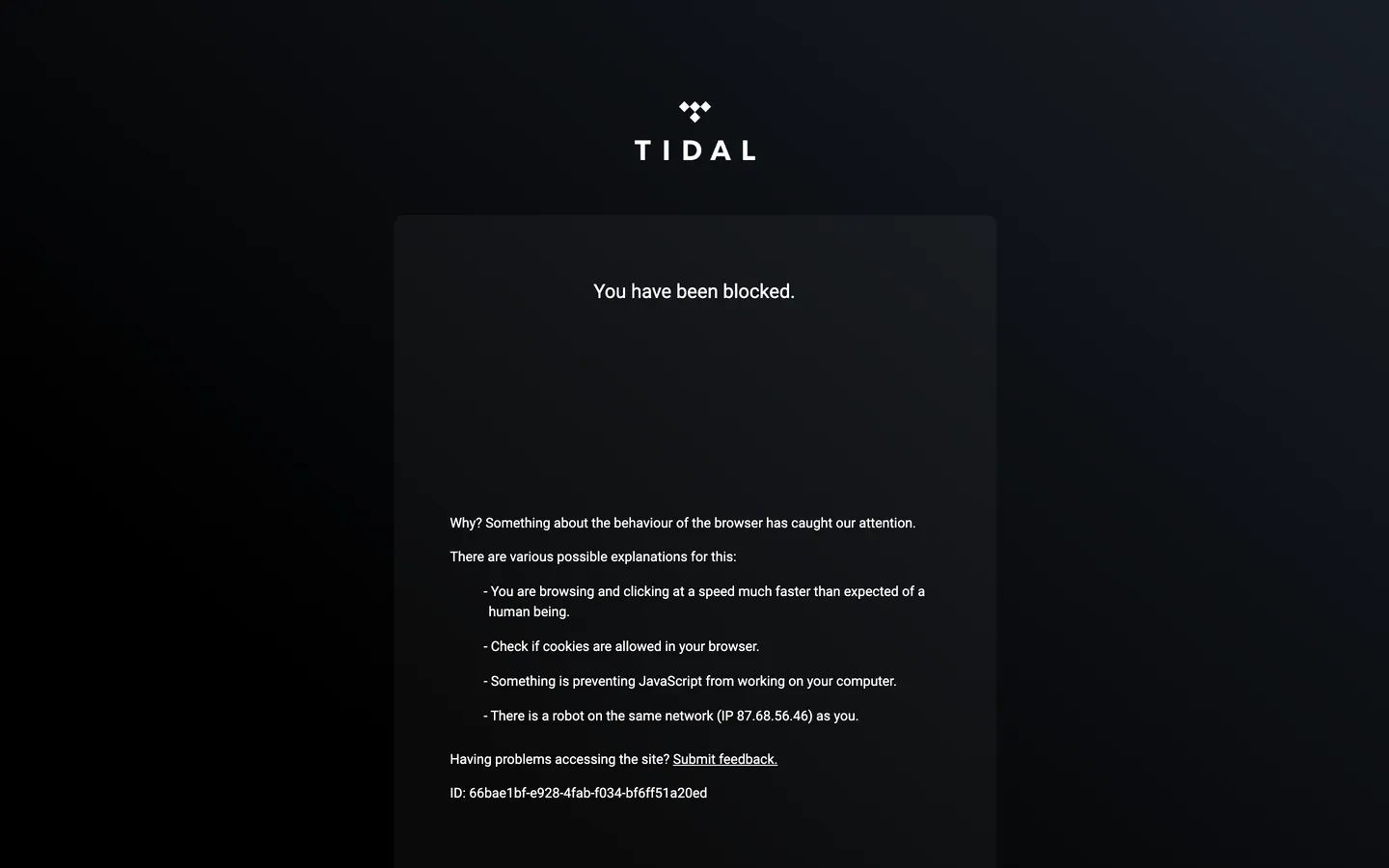
- Bot-block limited extraction: the captured screenshot returned a Cloudflare "You have been blocked" challenge page rather than the live marketing surface, and the extracted color set captured only the page canvas (#000000). Several tokens in this file are documented from the public brand surface — the trident wordmark, the album-art editorial grid, the white-on-black CTA — rather than from a live token render. Treat the spec as a brand-language reference rather than a token-precise extract.
- Dark mode: the captured surface is dark-only by definition. Tidal has no documented light variant of the marketing chrome.
- Hover and focus states: the captured surface did not expose any state matrix. Focus rings, hover lifts, active-press tints, and disabled states live in the live application and product surfaces.
- Form input error states: the search / email field carries only the resting state; error and validation styling are not captured.
- Motion: cover-tile hover animations and the in-app play-button transitions live in the live runtime; the spec captures end-state values only.
- Product surfaces: this DESIGN.md captures the marketing surface only. The Tidal player application (
listen.tidal.com) carries a much richer token system — sidebar layout, queue panel, lyrics overlay, audio-quality badges (Master, HiFi Plus, Atmos), the now-playing dock — that is not represented here. - HiFi Plus badge palette: the audio-quality tier badges (HiFi, HiFi Plus, Master, Dolby Atmos) carry their own narrow color set in the product application and are not exposed on the captured marketing surface.
More systems like this
Apple Music, Captions, Crunchyroll and 24 more in Music, Video & Streaming: each brand's colors, type and components in one file your AI agent builds from.
Build it with Pro
The DESIGN.md files are free. Pro adds 6,000+ blocks, premium templates and the MCP server, so your AI editor builds in your system for you.
4.9/5 out of 5 · 150+ reviewsfrom 150+ founders and developers.
Billing
Billed once a year in USD. Cancel anytime.
- How many people can use the license.
- Client work, SaaS products and anything you charge for.
- Page sections in 56 categories, from heroes and pricing tables to dashboards and settings, on every framework and UI library, in your theme.
- Complete Next.js sites for startups, SaaS, agencies and portfolios, every page designed, ready to ship.
- Your AI agent searches, previews and installs any component, block, icon or DESIGN.md from a prompt: 22 tools in Claude Code, Cursor, VS Code and 35 more clients.
- Buttons with motion and states of their own, from an arrow that slides in to a burst of confetti.
- Typewriters, scrambles, counters and more, for headlines, labels and numbers.
- Animated backgrounds for heroes, sections and cards, from a soft aurora to a flock that flees the cursor. Most are pure CSS.
- WebGPU shaders, from a slow aurora to a black hole, each drawing only while it's on screen.
- One design and one theme on all four: the components, blocks and effects are built for each framework.
- React on Base UI, Radix UI, React Aria or Ark UI: install the version for the library your project already uses. Vue, Svelte and Solid run on Ark UI.
- From a button to a date picker, a color picker or a guided tour: accessible, typed in TypeScript, each with live demos.
- Real-world patterns built from the components, in 53 galleries: forms, tables, menus, dialogs and more.
- Area, bar, line, pie, radar and radial charts on TanStack Charts, on every framework. React also gets the Recharts originals.
- Debounce, local storage, media queries and more: each hook is one typed file you own.
- From 222 libraries, Lucide, Heroicons, Tabler and Material Symbols among them, as SVG or a React component in one command.
- Stripe, Linear, Apple and 497 more: a brand's colors, typography and components in one file your AI agent builds from.
- Restyle every component and block at once: 8 styles, 7 grays, 18 colors and 5 radii, shared as a shadcn preset code.
- Priority requests are answered first.
Individual
For personal projects & open source
$32instead of $49/mo
$389 billed yearly
- Seats: 1 seat
- Commercial use: Personal & open source only
- Blocks: All 6,181 blocks
- Templates: All 14 templates
- MCP server: 38 AI clients
- Animated buttons: All 35 buttons
- Text effects: All 97 effects
- Backgrounds: All 100 backgrounds
- Shaders: All 100 shaders
- Frameworks: React, Vue, Svelte, Solid
- UI libraries: Base UI, Radix, Aria, Ark
- Components: All 174 components
- Examples: All 1,103 examples
- Charts: All 70 charts
- React hooks: All 35 hooks
- Icons: 294k+ icons
- DESIGN.md files: All 500 brands
- Theme builder: 8 styles × 18 colors
- Support: Standard
Team
Most popularFor freelancers, agencies & startups
$66instead of $99/mo
$789 billed yearly · ≈ $13/dev/mo
- Seats: Up to 5 seats
- Commercial use: Included
- Blocks: All 6,181 blocks
- Templates: All 14 templates
- MCP server: 38 AI clients
- Animated buttons: All 35 buttons
- Text effects: All 97 effects
- Backgrounds: All 100 backgrounds
- Shaders: All 100 shaders
- Frameworks: React, Vue, Svelte, Solid
- UI libraries: Base UI, Radix, Aria, Ark
- Components: All 174 components
- Examples: All 1,103 examples
- Charts: All 70 charts
- React hooks: All 35 hooks
- Icons: 294k+ icons
- DESIGN.md files: All 500 brands
- Theme builder: 8 styles × 18 colors
- Support: Priority
Organization
For companies with larger teams
$132instead of $199/mo
$1,589 billed yearly
- Seats: Unlimited seats
- Commercial use: Included
- Blocks: All 6,181 blocks
- Templates: All 14 templates
- MCP server: 38 AI clients
- Animated buttons: All 35 buttons
- Text effects: All 97 effects
- Backgrounds: All 100 backgrounds
- Shaders: All 100 shaders
- Frameworks: React, Vue, Svelte, Solid
- UI libraries: Base UI, Radix, Aria, Ark
- Components: All 174 components
- Examples: All 1,103 examples
- Charts: All 70 charts
- React hooks: All 35 hooks
- Icons: 294k+ icons
- DESIGN.md files: All 500 brands
- Theme builder: 8 styles × 18 colors
- Support: Priority
Billed once a year in USD. Cancel anytime.
Individual
For personal projects & open source
$32instead of $49/mo
$389 billed yearly
- How many people can use the license.Seats: 1 seat
- Client work, SaaS products and anything you charge for.Commercial use: Personal & open source only
- Page sections in 56 categories, from heroes and pricing tables to dashboards and settings, on every framework and UI library, in your theme.Blocks: All 6,181 blocks
- Complete Next.js sites for startups, SaaS, agencies and portfolios, every page designed, ready to ship.Templates: All 14 templates
- Your AI agent searches, previews and installs any component, block, icon or DESIGN.md from a prompt: 22 tools in Claude Code, Cursor, VS Code and 35 more clients.MCP server: 38 AI clients
- Buttons with motion and states of their own, from an arrow that slides in to a burst of confetti.Animated buttons: All 35 buttons
- Typewriters, scrambles, counters and more, for headlines, labels and numbers.Text effects: All 97 effects
- Animated backgrounds for heroes, sections and cards, from a soft aurora to a flock that flees the cursor. Most are pure CSS.Backgrounds: All 100 backgrounds
- WebGPU shaders, from a slow aurora to a black hole, each drawing only while it's on screen.Shaders: All 100 shaders
- One design and one theme on all four: the components, blocks and effects are built for each framework.Frameworks: React, Vue, Svelte, Solid
- React on Base UI, Radix UI, React Aria or Ark UI: install the version for the library your project already uses. Vue, Svelte and Solid run on Ark UI.UI libraries: Base UI, Radix, Aria, Ark
- From a button to a date picker, a color picker or a guided tour: accessible, typed in TypeScript, each with live demos.Components: All 174 components
- Real-world patterns built from the components, in 53 galleries: forms, tables, menus, dialogs and more.Examples: All 1,103 examples
- Area, bar, line, pie, radar and radial charts on TanStack Charts, on every framework. React also gets the Recharts originals.Charts: All 70 charts
- Debounce, local storage, media queries and more: each hook is one typed file you own.React hooks: All 35 hooks
- From 222 libraries, Lucide, Heroicons, Tabler and Material Symbols among them, as SVG or a React component in one command.Icons: 294k+ icons
- Stripe, Linear, Apple and 497 more: a brand's colors, typography and components in one file your AI agent builds from.DESIGN.md files: All 500 brands
- Restyle every component and block at once: 8 styles, 7 grays, 18 colors and 5 radii, shared as a shadcn preset code.Theme builder: 8 styles × 18 colors
- Priority requests are answered first.Support: Standard
Team
Most popularFor freelancers, agencies & startups
$66instead of $99/mo
$789 billed yearly · ≈ $13/dev/mo
Everything in Individual, plus
- How many people can use the license.Seats: Up to 5 seats
- Client work, SaaS products and anything you charge for.Commercial use: Included
- Priority requests are answered first.Support: Priority
Organization
For companies with larger teams
$132instead of $199/mo
$1,589 billed yearly
Everything in Team, plus
- How many people can use the license.Seats: Unlimited seats
- Secure checkout via Stripe
- Code lives in your repo
- Keep what you've shipped if you cancel
- License terms
4.9 out of 5 from 150+ developers


Your system, built for you
Every block, template and icon, installed by your AI agent in your design system. The DESIGN.md files stay free.
- Cancel anytime
- Keep what you've shipped