Trezor Design System
A near-black canvas, 144px uppercase Satoshi headlines and a single electric-mint CTA: Trezor's hardware-wallet site as tokens for React and AI tools.
- Primary color
- #60e198
- Typeface
- satoshiRegularFont
- Shape
- Mixed
- Base radius
- 8px
- Colors
- 15
- Type tokens
- 12
- Components
- 17
- Spacing values
- 7
About Trezor DESIGN.md
Curated by Dov Azencot, updated May 19, 2026. Source trezor.io (opens in a new tab).
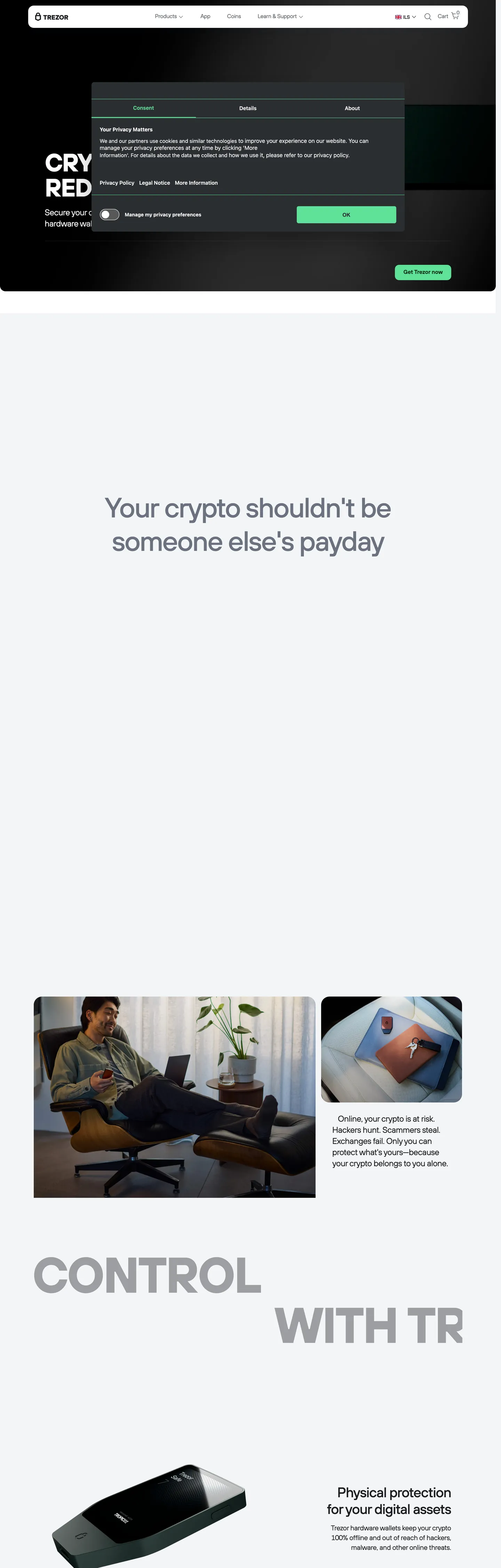
Trezor's marketing page is architecturally austere in a way that is unusual even for crypto hardware brands. The hero opens on a near-black canvas where the product name appears at 144px uppercase with -5.6px tracking — the typographic equivalent of stamping PROPERTY in a legal document. The sole chromatic moment is the CTA button: an electric-mint fill in deep forest green text that reads "Get Trezor now." No gradient wash, no floating geometric shapes, no hero illustration. The hardware device appears in a product photograph, not a render. Where Ledger leans on premium-product gradients and Coldcard commits fully to monospace terminal aesthetics, Trezor achieves its security posture through typographic scale and restraint.
The DESIGN.md file packages the system into a machine-readable spec for React and AI tools. Inside: 15 colors tokens anchored around a near-black canvas (the page floor and the dominant ink), a single electric-mint brand voltage that appears as the primary CTA fill, and a structural grey tier for secondary text and background bands. Twelve typography tokens run the Satoshi family at four cuts — Regular (body, nav), Medium (sub-headings, supporting display), Demibold (button labels, category chips), and Bold (the colossal hero h1 at 144px and a secondary uppercase display at 72px). Six radius tokens run from a tiny 4px for small chips to a 32px large card. Seventeen components cover the hero, mint CTA, photography-anchored feature cards, and hairline-bordered nav.
Feed this file to Claude or Cursor and it will reproduce Trezor's specific moves: near-black canvas with photography-first sections, single electric-mint voltage reserved for the primary action, Satoshi Bold at extreme scale for the headline, and a 4px small-step radius on most UI surfaces with a 32px generous-card exception. The system is worth studying as an example of how to communicate security credibility without design clichés — no shield icons as hero art, no lock animations, just scale and restraint.
What makes it distinct
5 highlights
- Mint reserved for one actionThe electric-mint CTA button is the only chromatic element on an otherwise achromatic page; it appears exactly once above the fold
- 144px uppercase displayThe hero h1 runs Satoshi Bold at 144px uppercase with -5.6px tracking, dwarfing typical SaaS hero conventions
- Photography over decorationLifestyle and product shots carry all the visual energy; the brand never places colored shapes or gradients in the chrome
- Satoshi type family in four cutsRegular, Medium, Demibold, Bold all appear in the same sans stack with no second family
- Near-black not pure blackThe canvas is a slightly blue-grey near-black, not flat zero, softening the hardware-wallet gravity without losing the security signal
Live at trezor.io
Trezor in production, as captured. Scroll the window to see the whole page.
15 colors
Trezor's system runs on #60e198 as its primary voltage, used in 2 of 17 components. Type is set in satoshiRegularFont across 12 tokens from 14px to 144px, weights 400–500. Shape language is mixed across 17 components, blending pills, soft rounds, and squarer corners.
Brand & Accent
Sparing, CTA-only voltage · 2
Surface
Page and card backgrounds · 5
Text
Headlines, body, captions · 5
Borders & Hairlines
Dividers, outlines, rules · 2
Other
Specialty colors · 1
12 type tokens
Set in satoshiRegularFont across 12 tokens, from 14px to 144px, weights 400–500. Shown in its own stack: where the font isn't installed, the fallback the file names stands in.
- display-xl144px · weight 500 · lh 144px · tracking -5.6pxThe quick brown fox jumps over the lazy dog
- display-lg72px · weight 500 · lh 72px · tracking -2.8pxThe quick brown fox jumps over the lazy dog
- display-md80px · weight 500 · lh 96px · tracking -2.72pxThe quick brown fox jumps over the lazy dog
- heading-lg64px · weight 500 · lh 72px · tracking -2.08pxThe quick brown fox jumps over the lazy dog
- heading-md40px · weight 500 · lh 48px · tracking -1.12pxThe quick brown fox jumps over the lazy dog
- heading-sm32px · weight 500 · lh 40px · tracking -0.8pxThe quick brown fox jumps over the lazy dog
- body-lg24px · weight 400 · lh 32px · tracking -0.48pxThe quick brown fox jumps over the lazy dog
- body-md20px · weight 400 · lh 28px · tracking -0.32pxThe quick brown fox jumps over the lazy dog
- body-sm16px · weight 400 · lh 24px · tracking -0.16pxThe quick brown fox jumps over the lazy dog
- label-sm14px · weight 400 · lh 20px · tracking -0.08pxThe quick brown fox jumps over the lazy dog
- button-md16px · weight 400 · lh 24pxThe quick brown fox jumps over the lazy dog
- nav-link14px · weight 400 · lh 21pxThe quick brown fox jumps over the lazy dog
Radii and spacing
8 corner radii and 7 spacing values. Shape language: mixed, on a 8px base radius.
Radii8
- none0px
- xs2px
- sm4px
- md8px
- lg16px
- xl24px
- 2xl32px
- full999px
Spacing7
- xs4px
- sm8px
- md12px
- base16px
- lg32px
- xl48px
- 2xl64px
17 components
Each rendered from its tokens (color, type, radius, padding) on Trezor's own canvas.
- Button PrimaryButton Primarybutton-primary
- Button SecondaryButton Secondarybutton-secondary
- Top NavTop Navtop-nav
- Nav LinkNav Linknav-link
- Hero SectionHero Sectionhero-section
- Hero HeadingHero Headinghero-heading
- Hero SubtextHero Subtexthero-subtext
- Section HeadingSection Headingsection-heading
- Body ParagraphBody Paragraphbody-paragraph
- Body Paragraph MutedBody Paragraph Mutedbody-paragraph-muted
- CardCardcard
- Card DarkCard Darkcard-dark
- Feature CellFeature Cellfeature-cell
- Type here…Text Inputtext-input
- Cookie BannerCookie Bannercookie-banner
- Tab PillTab Pilltab-pill
- Tab Pill ActiveTab Pill Activetab-pill-active
The system, in use
Trezor's tokens on the kind of product it builds.
Money that moves as fast as you do
Send, save and spend with an account built for the way you live and work.
Pick the plan that fits
MonthlyYearly- Free transfers
- Virtual card
- Savings pots
- 1% cashback
- Travel insurance
- Priority support
- 3% cashback
- Lounge access
- Metal card
Trezor design system FAQ
Trezor's tokens, its components and how to use this DESIGN.md in your project.
Related reading
Specs, directories and component libraries that pair with this design system.
- Browse all design systemsThe full directory of DESIGN.md files on shadcn.io, with live mockups for each.shadcn.io
- Trezor — official siteTrezor's public marketing site — the source of truth for the live tokens captured in this file.trezor.io (opens in a new tab)
- The DESIGN.md specificationGoogle Labs' open spec for machine-readable design system files — the format this page is built on.github.com (opens in a new tab)
Use Trezor in your project
One machine-readable file. Drop it into Claude Code, Cursor, VS Code or any AI tool that reads DESIGN.md.
Download the DESIGN.md
One machine-readable file: every color, type, radius, spacing, and component token of Trezor.
Feed it to your AI tool
Drop it into Claude, Cursor, or GitHub Copilot. The agent writes React components and Tailwind classes that match Trezor's visual language.
Reference the tokens directly
Or paste the values into your Tailwind config, CSS variables, or component library: every color, size and radius is a quoted, ready-to-copy value.
Read the full DESIGN.md overview, rationale, do’s and don’ts
Overview
Trezor's marketing site argues security through omission. Scale-as-credential: the hero headline runs at 144px uppercase in Satoshi Bold — a scale so large that the text crops at the viewport edge, demanding the reader scroll to see its full two-word message ("TAKE CONTROL / WITH TREZOR"). This is not decorative maximalism; the extreme scale communicates that Trezor controls the terms. Where Ledger layers gradient blues over product renders to signal modernity, and where most crypto brands deploy lock icons and shield motifs as hero art, Trezor puts the product and the typeface in the same room and steps back.
The single chromatic move is the electric-mint CTA button — a mint-green fill in deep forest-green text that appears exactly once above the fold. The mint does not appear in the nav, the section headings, or the background anywhere on the page. This is the inverse of how most hardware-wallet brands use color: not "use the brand color everywhere to reinforce awareness," but "use the brand color once, on the exact action that generates revenue." The Satoshi family's four named weight cuts (Regular for body, Medium for sub-headings, Demibold for buttons, Bold for display) give the system typographic range without a second family.
The shape language is small-step: 4px is the dominant radius (43 occurrences on chips, nav, and inputs), 8px handles cards, and 32px handles the primary CTA button and large panels. There is no pill-style rounding anywhere — the system never tips into the approachable-consumer direction that circular elements would suggest.
Key Characteristics:
- Near-black canvas (#1d1f23) for the hero and dark sections — not the charcoal-grey of typical fintech brands, but a slightly blue-shifted near-black.
- Single electric-mint voltage (the CTA fill) with deep forest-green text — appears in 4 background occurrences total on the page, all on one button.
- Satoshi Bold at 144px uppercase with -5.6px letter-spacing for the hero h1 — the most extreme display moment in the 71-file directory.
- Photography-driven feature sections: lifestyle shots and device product photography replace any decorative illustration.
- Near-black ink (#1d1f23) carries 221 of 225 text occurrences — near-mono color for text throughout the white body sections.
- 4px as the dominant UI radius (43 occurrences); 32px for buttons and prominent panels (14 occurrences).
- Section transitions alternate between near-black hero and a cool off-white canvas (#f0f1f3) below the fold.
Colors
Brand
- Primary Mint (
{colors.primary}— #60e198): frequency 4. Used as background only — the single primary CTA button. Wired in CSS as--color-light-green-300,--color-light-green-alpha-150/100/50/300. The system's one chromatic voltage; no other brand-layer color appears in the rendered page. - Primary Text (
{colors.primary-text}— #062d16): frequency 9. Used as text (8) and background (1). Deep forest green — the CTA button label and the small "Physical protection" accent heading in the feature section. Wired as--color-light-green-900.
Surface
- Canvas Dark (
{colors.canvas-dark}— #1d1f23): frequency 225. Used as text (221) and background (4). The dominant page tone — used as both the hero section background fill and the near-black body text color across the off-white sections. Wired as--color-light-cool-grey-900. Not split into separate ink and background tokens in the CSS; the same value serves both roles. - Canvas (
{colors.canvas}— #f0f1f3): frequency 14. Used as background (11) and border (3). The off-white page floor below the hero. Wired as--color-light-cool-grey-75and--color-pageBg(a near-identical value merged into this cluster). - Off-white (
{colors.off-white}— #ffffff): frequency 142. Used as text (112), background (21), and border (9). Pure white — appears on the card surfaces, the nav logo zone, and text-on-dark elements.
Text
- Ink (
{colors.ink}— #1d1f23): primary text color across the page. The same token as canvas-dark; see above. - Ink Muted (
{colors.ink-muted}— #5d6268): frequency 22. Used as text (19) and border (3). Secondary body copy, captions. Wired as--color-light-neutral-grey-600and--color-light-cool-grey-600. - Ink Faint (
{colors.ink-faint}— #6b7280): frequency 25, text only. Lighter secondary text. Wired as--color-gray-500. - Ink Subtle (
{colors.ink-subtle}— #7c8187): frequency 4, text only. Tertiary labels. Wired as--color-light-cool-grey-500.
Structural
- Surface-1 (
{colors.surface-1}— #2e3952): frequency 11. Background (9) and border (2). Dark card surfaces inside the hero sections. Wired as--color-light-cool-grey-alpha-50and--color-gray-700. - Hairline (
{colors.hairline}— #dee0e4): declared as--color-light-cool-grey-150. Appears in the card borders and input field outlines. - Shadow Ink (
{colors.shadow-ink}— #002847): frequency 22, shadow only. The tinted shadow used on the surface-action and surface-fixed shadow tokens (--shadow-surface-fixed).
Typography
Font Family
The system runs Satoshi across every typographic surface — a contemporary geometric sans-serif available on Fontshare. Four named CSS weight variables handle the full range: satoshiRegularFont (400) for body, nav, and captions; satoshiMediumFont (500) for sub-headings and the secondary display tier; satoshiDemiboldFont for button labels and category chips; satoshiBoldFont for the colossal hero display. There is no second family; the variation is weight and scale, not typeface.
Hierarchy
| Token | Size | Weight | Line Height | Letter Spacing | Use |
|---|---|---|---|---|---|
{typography.display-xl} | 144px | Bold | 144px | -5.6px | Hero h1 — "TAKE CONTROL WITH TREZOR", uppercase, crops at viewport edge |
{typography.display-lg} | 72px | Bold | 72px | -2.8px | Secondary uppercase display — "CONTROL / WITH TR" section |
{typography.display-md} | 80px | Medium | 96px | -2.72px | Large section leads (count 23) |
{typography.heading-lg} | 64px | Medium | 72px | -2.08px | Section h2 at desktop |
{typography.heading-md} | 40px | Medium | 48px | -1.12px | h3 feature headings |
{typography.heading-sm} | 32px | Medium | 40px | -0.8px | Sub-section h2 ("Trusted by over 2 million users") |
{typography.body-lg} | 24px | Regular | 32px | -0.48px | Hero sub-paragraph and lead text |
{typography.body-md} | 20px | Regular | 28px | -0.32px | Feature section body |
{typography.body-sm} | 16px | Regular | 24px | -0.16px | Default running text |
{typography.label-sm} | 14px | Regular | 20px | -0.08px | Nav links, captions, metadata |
{typography.button-md} | 16px | Demibold | 24px | 0 | CTA button label ("Get Trezor now") |
{typography.nav-link} | 14px | Regular | 21px | 0 | Top-nav links |
Principles
Letter-spacing runs negative at every display tier — from -5.6px at 144px to -0.16px at 16px. This tight tracking is the typographic signature: it reads as precision engineering rather than marketing exuberance. The weight ceiling is the Bold cut used only for the two largest display moments; everything below 64px uses Medium or Regular. The system does not use any uppercase-tracked small-caps labels (unlike Cloudflare or Stripe).
Note on Font Substitutes
Satoshi is open-source on Fontshare. For teams that cannot load it, Plus Jakarta Sans at equivalent weights is the closest commercial alternative. Inter transfers cleanly for the 14-20px body tiers but lacks the slightly-wider cap height that makes Satoshi read confidently at 80px+.
Layout
Spacing System
- Base unit: 8px.
- Tokens:
{spacing.xs}4px ·{spacing.sm}8px ·{spacing.md}12px ·{spacing.base}16px ·{spacing.lg}32px ·{spacing.xl}48px ·{spacing.2xl}64px. - Section padding: ~96px vertical on the hero; ~48px between below-fold sections.
- Card internal padding: 32px uniform.
- Navbar height: declared as
--navbar-height: 96px— the same value as the hero top-padding, which means the hero text starts at exactly 192px from the page top.
Grid & Container
- Max content width:
--max-w-desktop: 120remdeclared in CSS but the captured hero constrains content to approximately 1232px wide. - Hero: near-black full-bleed canvas, centered text column at about 720px. The 144px heading overflows this container and crops at the right edge intentionally.
- Feature sections: 2-column layout pairing photography on the left with text on the right; at narrower widths collapses to 1-column.
- Spec/feature grid: a 2-up card grid with 32px internal padding per card, divided by a 1px hairline border.
Rhythm
The page alternates between dark (the hero and the two large uppercase sections) and light (the off-white photography sections). The dark sections carry all the typographic muscle; the light sections are image-led with minimal heading copy. This alternation prevents the page from feeling either purely dark-themed or purely corporate-light.
Elevation
The system uses shadow-with-color-tint rather than neutral black shadows. The declared CSS variables --shadow-surface-action and --shadow-surface-fixed both use a tinted navy ({colors.shadow-ink} — #002847) as their shadow ink, at low opacity (0f through 14 alpha). This gives card and surface elevations a cool, trust-signaling undertone rather than a neutral grey.
- Flat: hero band, typography sections, footer — no shadow.
- Surface action: the mint CTA button carries a faint navy shadow (using
{colors.shadow-ink}at very low opacity) on the resting state, tightening to a tighter inset on hover. - Surface fixed: sticky nav and modal surfaces use a stronger two-layer navy shadow.
Shapes
The radius scale is functional and grounded, with one clear outlier:
{rounded.xs}2px — rare, for microchip-level accents.{rounded.sm}4px — the dominant radius, 43 occurrences. Small chips, nav hover states, input fields.{rounded.md}8px — cards and panels, 23 occurrences.{rounded.lg}16px — larger feature panels, 10 occurrences.{rounded.xl}24px — 5 occurrences, large card blocks.{rounded.2xl}32px — 14 occurrences. The primary CTA button and the hero cookie-consent panel. The single large-radius moment.
There is no pill (9999px) anywhere. The scale is binary in practice: tight-4px for UI chrome, and 32px for the one large-radius promotional surface.
Components
button-primary — Electric-mint fill (#60e198) with deep-forest-green text (#062d16), Satoshi Demibold 16px, 32px radius, 10×20px padding, 44px height. "Get Trezor now" is the canonical instance — it appears once in the hero and once in the sticky footer band.
button-secondary — Transparent fill, near-black text, 1px hairline border, 32px radius, same dimensions as primary. Used for "Learn more" and secondary actions below the fold.
top-nav — Near-black canvas-dark fill, 96px height, white text in 14px/400 Satoshi Regular. Logo (Trezor shield mark + wordmark) flush left, nav links center (Products, App, Core, Learn & Support), country/language selector + search + cart icon flush right.
nav-link — Transparent background, white text, 14px/400, 4px hover-state radius. No hover background in the captured surface — hover is a color shift, not a fill.
hero-section — Near-black full-bleed, 96×32px padding. Houses the 144px uppercase headline stacked across two lines, a one-sentence sub-paragraph in 24px/400 Regular, and the mint CTA below.
hero-heading — Near-black text (or white when on the dark hero) at Satoshi Bold 144px / -5.6px tracking. The two-word stacked display.
section-heading — Body-section headings at Satoshi Medium 32px / -0.8px, near-black text on the off-white canvas.
body-paragraph — Satoshi Regular 20-24px, near-black text. Runs at 20px in feature cells and 24px in the hero sub-paragraph.
body-paragraph-muted — Ink-muted (#5d6268) text at 14px/400 for captions and metadata.
card — Off-white fill, 1px hairline border, 8px radius, 32px padding. The default feature card below the fold, housing a heading + 2-3 line description.
card-dark — Surface-1 (#2e3952) fill, white text, 16px radius, 32px padding. Used inside dark sections for product-spec cards.
feature-cell — Off-white canvas fill, hairline border, 8px radius, 32px padding. 2-column grid in the "What makes Trezor different" section.
text-input — Off-white fill, near-black text, 1px hairline border, 4px radius, 10×20px padding, 44px height.
cookie-banner — Off-white fill, hairline border, 12px radius. Three-tab interface (Consent / Details / About) with the primary mint "OK" button.
tab-pill — Transparent, hairline border, 4px radius, 6×12px padding. The inactive tab state on the cookie-banner and category selectors.
tab-pill-active — Mint fill, forest-green text, 4px radius — the same mini-CTA treatment scaled down to tab size.
Do's and Don'ts
Do use the mint CTA (#60e198) for exactly one primary action per viewport. The mint's impact comes from its scarcity — it appears once above the fold because there is one action Trezor wants visitors to take.
Do run display headings at negative letter-spacing: -5.6px at 144px, -2.8px at 72px, -2.72px at 80px. The tightened tracking is the visual signal of precision; tracking the same sizes loosely makes the headline read as casual.
Do use the tinted navy shadow (#002847 at 0a-14 alpha) rather than a neutral rgba(0,0,0,0.08) for elevated surfaces. The cool undertone adds brand depth without a second chromatic accent.
Do alternate dark and light section bands. The near-black sections carry the typographic authority; the light photography sections provide relief. Running the entire page on one surface tone would either feel oppressive (all dark) or weak (all light).
Don't use the mint fill on more than one CTA per viewport. Multiplying the mint across section headings, card accents, or icon fills destroys the scarcity that makes the button read as the single most important element on the page.
Don't run the hero h1 below 72px. The Satoshi Bold at 144px-72px is the system's emotional argument; at 48px it looks like a standard fintech section heading, not a claim of control.
Don't add a pill-radius (9999px) to buttons or chips. The system's maximum is 32px — which is already generous for this identity. Pill rounding introduces consumer-app warmth that conflicts with the security-hardware posture.
Don't use #f0f1f3 as a text color. It is the canvas background (11 background occurrences) — placing any text in this color on a white surface produces near-zero contrast.
Known Gaps
- Green CTA hover state: the mint button's hover and active states are not captured from the marketing surface. The CSS declares
--shadow-surface-action-hover(a slightly stronger navy shadow) but the hover background color change is not in the extraction. - Dark mode: the near-black hero and the light body are both declared in the same CSS; there is no declared dark-mode media query variant. The product app (Trezor Suite) ships a full dark mode, not captured here.
- Mobile nav: the top-nav at 96px collapses to a hamburger on mobile; the mobile menu styles are not exposed on the desktop-captured surface.
- Form states: the text input carries only the resting state. Error, focus, disabled, and success states are present in the product app but not on the marketing site.
- Animation: the hero text animates in on load (a fade-up keyframe declared as
--animate-fade-up), and the marquee section runs a scroll animation (--animate-marquee-left). Duration and easing values are in the CSS but not captured as token values. - Product surfaces: this DESIGN.md captures the marketing site only. Trezor Suite (the desktop and web app for managing wallets) has a distinct token system with dark-mode-first surfaces and a richer component library.
More systems like this
Afterpay, Barclays, Betterment and 38 more in Fintech & Crypto: each brand's colors, type and components in one file your AI agent builds from.
Build it with Pro
The DESIGN.md files are free. Pro adds 6,000+ blocks, premium templates and the MCP server, so your AI editor builds in your system for you.
4.9/5 out of 5 · 150+ reviewsfrom 150+ founders and developers.
Billing
Billed once a year in USD. Cancel anytime.
- How many people can use the license.
- Client work, SaaS products and anything you charge for.
- Page sections in 56 categories, from heroes and pricing tables to dashboards and settings, on every framework and UI library, in your theme.
- Complete Next.js sites for startups, SaaS, agencies and portfolios, every page designed, ready to ship.
- Your AI agent searches, previews and installs any component, block, icon or DESIGN.md from a prompt: 22 tools in Claude Code, Cursor, VS Code and 35 more clients.
- Buttons with motion and states of their own, from an arrow that slides in to a burst of confetti.
- Typewriters, scrambles, counters and more, for headlines, labels and numbers.
- Animated backgrounds for heroes, sections and cards, from a soft aurora to a flock that flees the cursor. Most are pure CSS.
- WebGPU shaders, from a slow aurora to a black hole, each drawing only while it's on screen.
- One design and one theme on all four: the components, blocks and effects are built for each framework.
- React on Base UI, Radix UI, React Aria or Ark UI: install the version for the library your project already uses. Vue, Svelte and Solid run on Ark UI.
- From a button to a date picker, a color picker or a guided tour: accessible, typed in TypeScript, each with live demos.
- Real-world patterns built from the components, in 53 galleries: forms, tables, menus, dialogs and more.
- Area, bar, line, pie, radar and radial charts on TanStack Charts, on every framework. React also gets the Recharts originals.
- Debounce, local storage, media queries and more: each hook is one typed file you own.
- From 222 libraries, Lucide, Heroicons, Tabler and Material Symbols among them, as SVG or a React component in one command.
- Stripe, Linear, Apple and 497 more: a brand's colors, typography and components in one file your AI agent builds from.
- Restyle every component and block at once: 8 styles, 8 grays, 18 colors and 5 radii, shared as a shadcn preset code.
- Priority requests are answered first.
Individual
For personal projects & open source
$32instead of $49/mo
$389 billed yearly
- Seats: 1 seat
- Commercial use: Personal & open source only
- Blocks: All 6,181 blocks
- Templates: All 14 templates
- MCP server: 38 AI clients
- Animated buttons: All 35 buttons
- Text effects: All 97 effects
- Backgrounds: All 100 backgrounds
- Shaders: All 100 shaders
- Frameworks: React, Vue, Svelte, Solid
- UI libraries: Base UI, Radix, Aria, Ark
- Components: All 174 components
- Examples: All 1,103 examples
- Charts: All 70 charts
- React hooks: All 35 hooks
- Icons: 294k+ icons
- DESIGN.md files: All 500 brands
- Theme builder: 8 styles × 18 colors
- Support: Standard
Team
Most popularFor freelancers, agencies & startups
$66instead of $99/mo
$789 billed yearly · ≈ $13/dev/mo
- Seats: Up to 5 seats
- Commercial use: Included
- Blocks: All 6,181 blocks
- Templates: All 14 templates
- MCP server: 38 AI clients
- Animated buttons: All 35 buttons
- Text effects: All 97 effects
- Backgrounds: All 100 backgrounds
- Shaders: All 100 shaders
- Frameworks: React, Vue, Svelte, Solid
- UI libraries: Base UI, Radix, Aria, Ark
- Components: All 174 components
- Examples: All 1,103 examples
- Charts: All 70 charts
- React hooks: All 35 hooks
- Icons: 294k+ icons
- DESIGN.md files: All 500 brands
- Theme builder: 8 styles × 18 colors
- Support: Priority
Organization
For companies with larger teams
$132instead of $199/mo
$1,589 billed yearly
- Seats: Unlimited seats
- Commercial use: Included
- Blocks: All 6,181 blocks
- Templates: All 14 templates
- MCP server: 38 AI clients
- Animated buttons: All 35 buttons
- Text effects: All 97 effects
- Backgrounds: All 100 backgrounds
- Shaders: All 100 shaders
- Frameworks: React, Vue, Svelte, Solid
- UI libraries: Base UI, Radix, Aria, Ark
- Components: All 174 components
- Examples: All 1,103 examples
- Charts: All 70 charts
- React hooks: All 35 hooks
- Icons: 294k+ icons
- DESIGN.md files: All 500 brands
- Theme builder: 8 styles × 18 colors
- Support: Priority
Billed once a year in USD. Cancel anytime.
Individual
For personal projects & open source
$32instead of $49/mo
$389 billed yearly
- How many people can use the license.Seats: 1 seat
- Client work, SaaS products and anything you charge for.Commercial use: Personal & open source only
- Page sections in 56 categories, from heroes and pricing tables to dashboards and settings, on every framework and UI library, in your theme.Blocks: All 6,181 blocks
- Complete Next.js sites for startups, SaaS, agencies and portfolios, every page designed, ready to ship.Templates: All 14 templates
- Your AI agent searches, previews and installs any component, block, icon or DESIGN.md from a prompt: 22 tools in Claude Code, Cursor, VS Code and 35 more clients.MCP server: 38 AI clients
- Buttons with motion and states of their own, from an arrow that slides in to a burst of confetti.Animated buttons: All 35 buttons
- Typewriters, scrambles, counters and more, for headlines, labels and numbers.Text effects: All 97 effects
- Animated backgrounds for heroes, sections and cards, from a soft aurora to a flock that flees the cursor. Most are pure CSS.Backgrounds: All 100 backgrounds
- WebGPU shaders, from a slow aurora to a black hole, each drawing only while it's on screen.Shaders: All 100 shaders
- One design and one theme on all four: the components, blocks and effects are built for each framework.Frameworks: React, Vue, Svelte, Solid
- React on Base UI, Radix UI, React Aria or Ark UI: install the version for the library your project already uses. Vue, Svelte and Solid run on Ark UI.UI libraries: Base UI, Radix, Aria, Ark
- From a button to a date picker, a color picker or a guided tour: accessible, typed in TypeScript, each with live demos.Components: All 174 components
- Real-world patterns built from the components, in 53 galleries: forms, tables, menus, dialogs and more.Examples: All 1,103 examples
- Area, bar, line, pie, radar and radial charts on TanStack Charts, on every framework. React also gets the Recharts originals.Charts: All 70 charts
- Debounce, local storage, media queries and more: each hook is one typed file you own.React hooks: All 35 hooks
- From 222 libraries, Lucide, Heroicons, Tabler and Material Symbols among them, as SVG or a React component in one command.Icons: 294k+ icons
- Stripe, Linear, Apple and 497 more: a brand's colors, typography and components in one file your AI agent builds from.DESIGN.md files: All 500 brands
- Restyle every component and block at once: 8 styles, 8 grays, 18 colors and 5 radii, shared as a shadcn preset code.Theme builder: 8 styles × 18 colors
- Priority requests are answered first.Support: Standard
Team
Most popularFor freelancers, agencies & startups
$66instead of $99/mo
$789 billed yearly · ≈ $13/dev/mo
Everything in Individual, plus
- How many people can use the license.Seats: Up to 5 seats
- Client work, SaaS products and anything you charge for.Commercial use: Included
- Priority requests are answered first.Support: Priority
Organization
For companies with larger teams
$132instead of $199/mo
$1,589 billed yearly
Everything in Team, plus
- How many people can use the license.Seats: Unlimited seats
- Secure checkout via Stripe
- Code lives in your repo
- Keep what you've shipped if you cancel
- License terms
4.9 out of 5 from 150+ developers


Your system, built for you
Every block, template and icon, installed by your AI agent in your design system. The DESIGN.md files stay free.
- Cancel anytime
- Keep what you've shipped