Zapier Inspired Design System
Zapier's design language as a DESIGN.md file.
About Zapier Inspired DESIGN.md
Curated by Dov AzencotUpdated Source zapier.com
- Workflow & No-code
- Productivity & SaaS
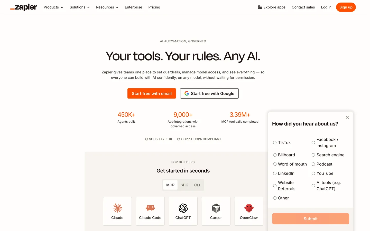
Zapier is the original "connect your apps" automation platform, and the marketing surface today reads as confidently mature rather than playfully startup. The brand pairs a warm-cream canvas at #fffefb with deep coffee ink at #201515 and one saturated orange CTA at #ff4f00. The temperature is the trick — every neutral leans slightly warm, none are cool grey, and the cream-not-white canvas is what carries the brand voice before a single word is read. Cards and buttons share a 12px radius, putting Zapier between the friendly-rounded and technical-square camps with a deliberate middle position.
This page packages the system into a single DESIGN.md file using the Google Labs open spec. Inside: 10 color tokens covering the orange accent, four ink stops, three body greys, and two canvas surfaces; 17 typography styles split between Degular Display 500 for hero work and Inter 400–700 for everything else; 5 radius tokens; 9 spacing tokens on a 4px base unit running up to 64px section padding; and 30 components covering buttons, cards, pricing tiers, hero bands, eyebrows, badges, and a footer along with 11 auto-derived example surfaces.
Feed the file to Claude, Cursor, or GitHub Copilot, and the agent writes React components that respect the warm-cream temperature, the 12px middle radius, and the strict role separation between Degular hero work and Inter body work. Reference tokens directly — every hex, font, weight, and pixel is a quoted value you can drop into Tailwind config or CSS variables. The system is worth studying because it shows how a single saturated accent over a warm neutral ladder can carry a conversion-driven product without ever introducing a second chromatic voice.
What makes it distinct
- Single saturated CTAZapier Orange #ff4f00 carries every primary action; cream and coffee fill the rest of the palette
- Warm-cream canvas #fffefb instead of pure whitethe brand's defining temperature signal lives in the neutrals
- Two-face type systemDegular Display weight 500 for hero, Inter 400–700 for sub-display, body, buttons, eyebrows
- Universal 12px radiusbuttons and cards share rounded.md, sitting between friendly-pill and technical-square camps
- Coffee-ink #201515 replaces pure blackeven the darkest text carries brown warmth across every surface
Live at zapier.com
A snapshot of the brand in production. Hover the frame to scroll the page; click to visit.
 zapier.com
Explore Zapier Inspired
Pick what you want to see — mockups, colors, typography, layout, or the full component list.
Brand & Accent
Sparing, CTA-only voltage.
Surface
Page and card backgrounds.
Text
Headlines, body, captions, muted.
Other
Specialty colors.
Zapier Inspired design system FAQ
Common questions about Zapier Inspired's tokens, components, and how to use this DESIGN.md in your project.
Related reading
Specs, directories, and component libraries that pair with this design system.
The DESIGN.md specification
Google Labs' open spec for machine-readable design system files — the format this page is built on.
Browse all design systems
The full directory of DESIGN.md files on shadcn.io, with live mockups for each.
React blocks for shadcn/ui
Production-ready hero, pricing, CTA, and dashboard sections built with the same Tailwind + shadcn primitives.