Airtable Design System
Airtable's design system as a DESIGN.md file.
About Airtable DESIGN.md
Curated by Dov AzencotUpdated Source airtable.com
- Workflow & No-code
- Productivity & SaaS
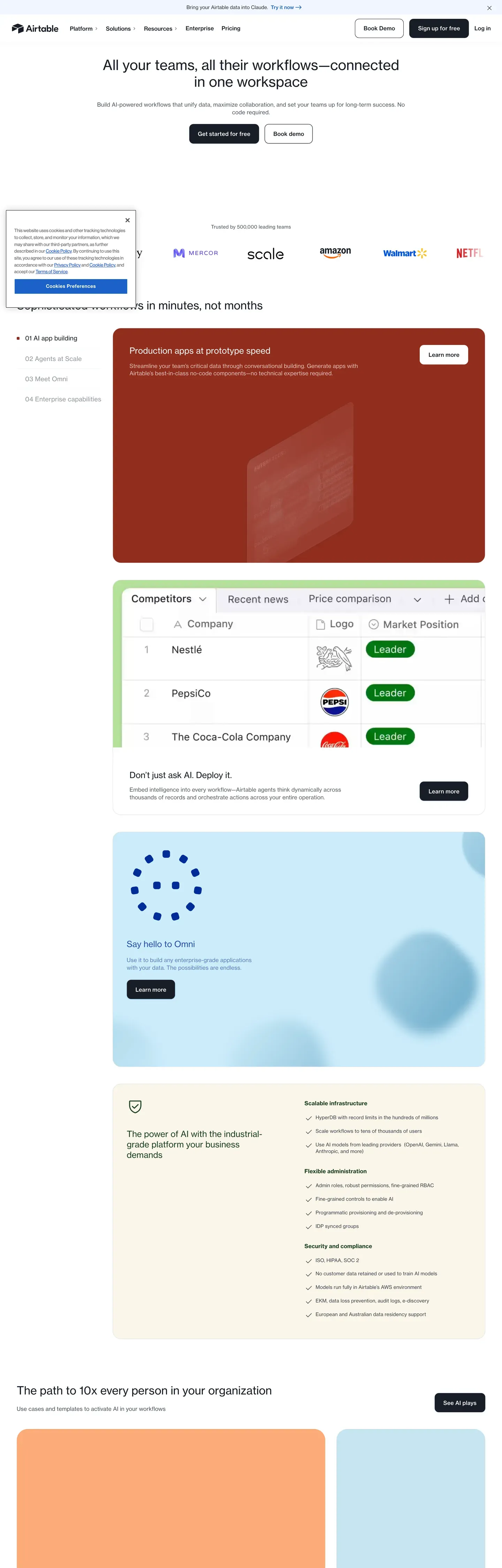
Airtable's marketing site reads like a quiet editorial magazine. The base atmosphere is white canvas, deep #181d26 ink, generous whitespace, and a single confident primary CTA — never a gradient backdrop, never an atmospheric mesh, never the busy aurora that's become the default SaaS template. Nothing fights for attention until a section needs to. Brand voltage doesn't come from accent walls; it comes from full-bleed signature cards in dark coral, deep forest green, navy, and cream that punctuate the long-scroll explainer pages every two or three screens.
This page captures Airtable's marketing system as a DESIGN.md file — Google Labs' open spec for machine-readable design tokens. Inside: 28 color tokens covering brand, surface, text, signature cards, and a pricing sub-system; 14 typography tokens split between Haas Grotesk for the main editorial body and Inter Display at a custom 475 weight for the pricing surface; six radius tokens hierarchically assigned (12px CTAs, 10px cards, 6px inputs, pill for pricing only); and 26 component definitions covering buttons, signature surfaces, demo cards, pricing tiers, and the articles topic rail.
Drop the file into Claude, Cursor, GitHub Copilot, or any AI assistant that reads structured design tokens. The agent will produce React components and Tailwind classes that match Airtable's actual voice — sober editorial calm, not a generic SaaS template. Use it as a reference for design audits, a starting point for your own workflow product, or a teaching artifact for talking about restraint and the discipline of letting whitespace do the framing.
What makes it distinct
- Near-black primary#181d26 is the brand CTA, not the link blue (#1b61c9) hiding in the CSS variables
- Modest type weightsdisplay headlines stay at 400–500; weight is delegated to size and signature surface cards
- Signature surface cardsfull-bleed coral, forest, navy, and cream blocks punctuate long-scroll pages every two or three screens
- Pricing is its own dialectInter Display at weight 475 plus pill-shaped buttons that don't appear anywhere else
- White hero, full stopno gradient, no mesh, no atmospheric backdrop; whitespace and Haas do the framing
Live at airtable.com
A snapshot of the brand in production. Hover the frame to scroll the page; click to visit.
 airtable.com
Explore Airtable
Pick what you want to see — mockups, colors, typography, layout, or the full component list.
Brand & Accent
Sparing, CTA-only voltage.
Surface
Page and card backgrounds.
Text
Headlines, body, captions, muted.
Borders & Hairlines
Dividers, outlines, structural rules.
Semantic
Status, errors, success, inline links.
Other
Specialty colors.
Airtable design system FAQ
Common questions about Airtable's tokens, components, and how to use this DESIGN.md in your project.
Related reading
Specs, directories, and component libraries that pair with this design system.
The DESIGN.md specification
Google Labs' open spec for machine-readable design system files — the format this page is built on.
Browse all design systems
The full directory of DESIGN.md files on shadcn.io, with live mockups for each.
React blocks for shadcn/ui
Production-ready hero, pricing, CTA, and dashboard sections built with the same Tailwind + shadcn primitives.