shadcn.io is an independent project built on shadcn/ui
Two fields with an icon on each side. The card field has a card icon and a lock. The password field has a lock and a help circle. None of the icons are buttons, and none of them are announced.
Use the pair when one icon names the field and the other is only a cue. If the end icon should reveal a password, use Password Input. In React, Ark UI does not treat these icons as controls.
Installation
Anatomy
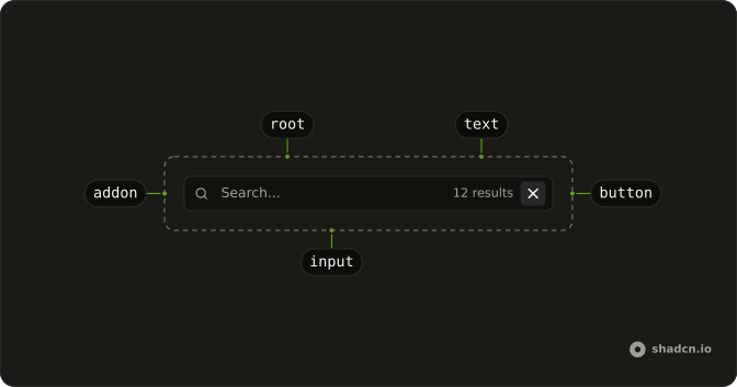
Usage
<div className="flex w-full max-w-sm flex-col gap-4">
  <InputGroup className="bg-background">
    <InputGroupInput
      aria-label="Card number"
      inputMode="numeric"
      placeholder="Card number"
      type="text"
    />
    <InputGroupAddon>
      <CreditCardIcon aria-hidden="true" />
    </InputGroupAddon>
    <InputGroupAddon align="inline-end">
      <LockIcon aria-hidden="true" />
    </InputGroupAddon>
  </InputGroup>
  <InputGroup className="bg-background">
    <InputGroupInput
      aria-label="Password"
      placeholder="Password"
      type="password"
    />
    <InputGroupAddon>
      <LockIcon aria-hidden="true" />
    </InputGroupAddon>
    <InputGroupAddon align="inline-end">
      <HelpCircleIcon aria-hidden="true" />
    </InputGroupAddon>
  </InputGroup>
</div>
FAQ
How do two addons land on both sides?
The first keeps the default inline-start, the second sets align="inline-end". Both are written after the input.
How is the card number field set up?
type="text" with inputMode="numeric", which brings up the number pad without the quirks of type="number". Add autoComplete="cc-number" in a real checkout.
Are the icons buttons?
No, they're decorative and aria-hidden. To make the help circle open help, use a button, as in Help Tooltips.
API Reference
Input Group
Sets aria-label="Card number", inputMode="numeric", placeholder="Card number", type="text", align="inline-end" and aria-label="Password". The rest is on the Input Group page.